15 FAQ eCommerce Pages to Set Your Customers in a Buying Mood
Check out 15 examples of eCommerce FAQ pages and pointers on how to make it right.
Written by Tetiana Shataieva

A good FAQ page is a great asset for any customer-facing website. However, for eCommerce, it often becomes a critical component that can influence purchase decisions. So, let’s see how to make an eCommerce FAQ section for your website to boost conversions and sales.
What is an FAQ page?
An FAQ page is a section where all the common most-asked questions from potential customers are kept. If you’re in eCommerce, implementing it should be at the top of your plan. To connect all the dots even further, you are welcome to read our article where we also share more about it.
Why is an FAQ page important for an eCommerce website?
More than 50% of prospective customers abandoned their purchases due to bad service. FAQ, being one of the customer service resources available to businesses, can improve the situation significantly in more than one way:
- Better user experience. Through an FAQ page, you give customers complete information boosting their trust in your business and making them comfortable while they shop with you.
- Optimization of support expenses. One of the advantages of online stores is that they cater to customers in any region and time zone. However, your support team may not be available 24/7, which may result in some lost sales. An FAQ page may resolve some of the customer issues without the need to expand your team. Include it in your plan of building the best eCommerce customer service.
- Higher conversion rate. Online shopping is usually quick with only minutes passing from opening the website to checking out. Unless it is a house or a vacation, people tend to make decisions quickly, sometimes, even impulsively. However, this impulse may be ruined by unclear delivery or return terms. If customers cannot find the information they need quickly, they might just leave.
- Increased website traffic through better SEO. eCommerce FAQs can drive traffic by capturing organic searches. People nowadays search by asking complete questions, for example, “How to upgrade to another subscription plan?”. This is a ready-made question to use in an eCommerce FAQ list which may boost your SEO ranking.
15 eCommerce FAQ page examples to get your inspiration juice flowing
Now that we’ve looked at how you can build an eCommerce FAQ page that helps both your customers and yourself, let’s look at some examples of effective FAQ pages that show how these techniques can be implemented.
- Adobe Store
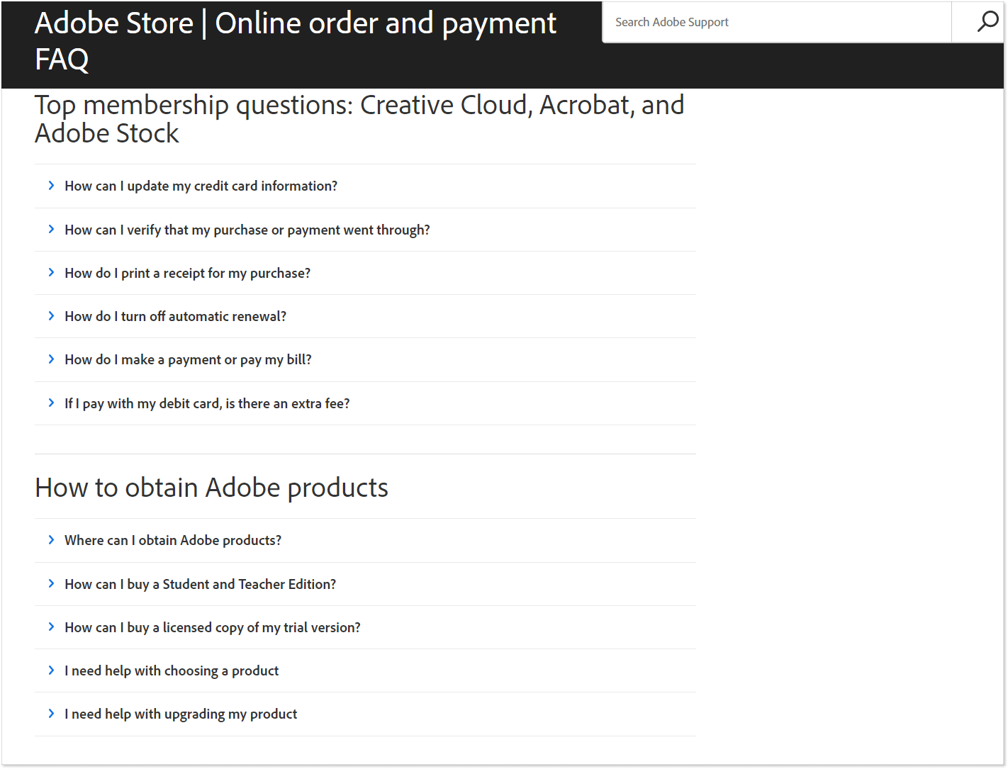
Adobe’s FAQ page seems rather bland with its simple black-and-white design. At the same time, it is an example of how clean and effective a help page may be. Questions are grouped by categories with the most common buyers’ inquiries. The page isn’t cluttered with extra content and serves the sole purpose of providing quick answers.
2. Body Bliss
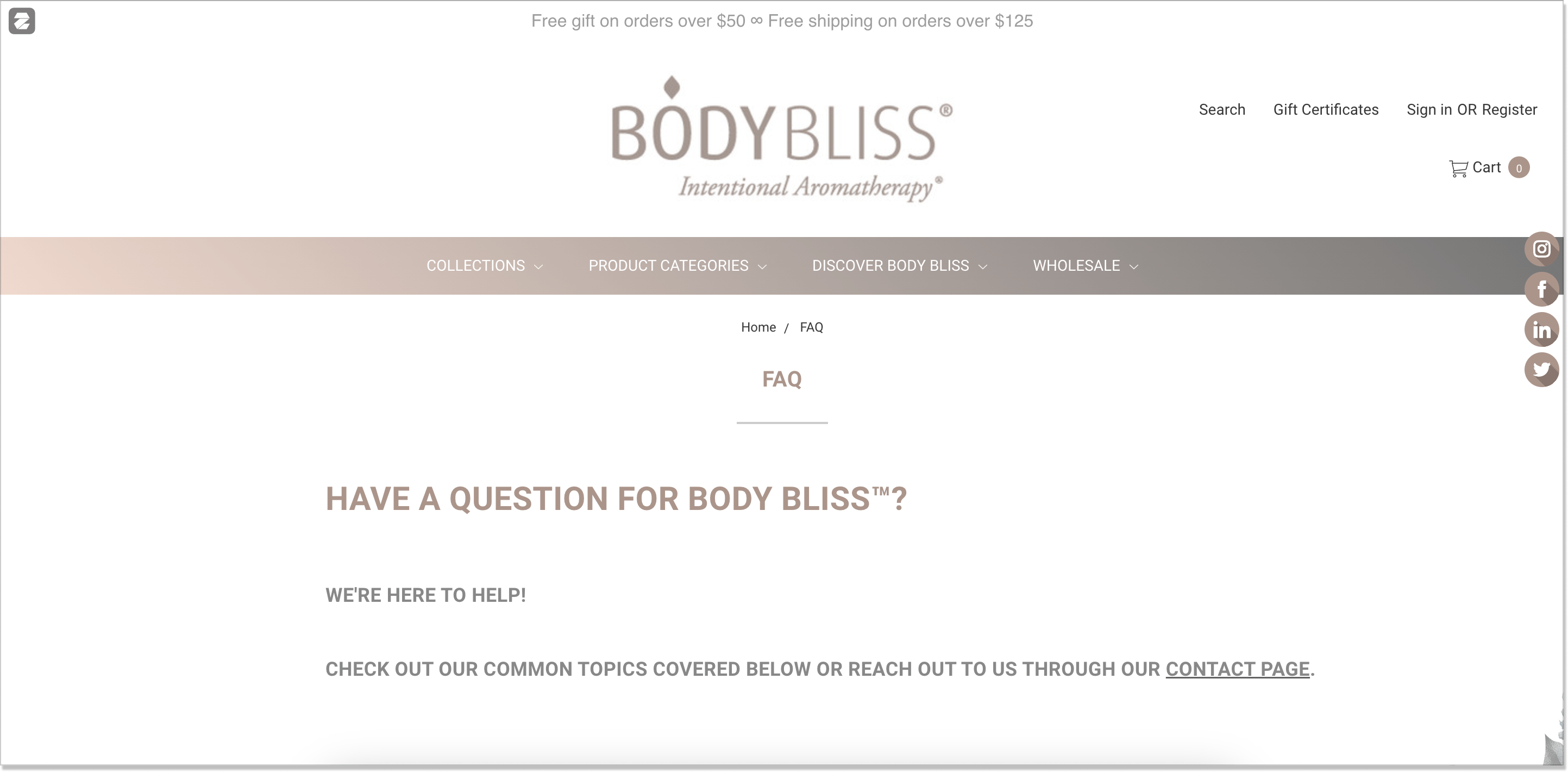
Body Bliss keeps its eCommerce FAQ list of questions and answers neat and short. The company decided to say it, not spray it. One of the most significant features is that a user can go for an alternative. In case there are no answers covered, Body Bliss has a dedicated contact section. Take good notice!
3. Bon Bon Bon
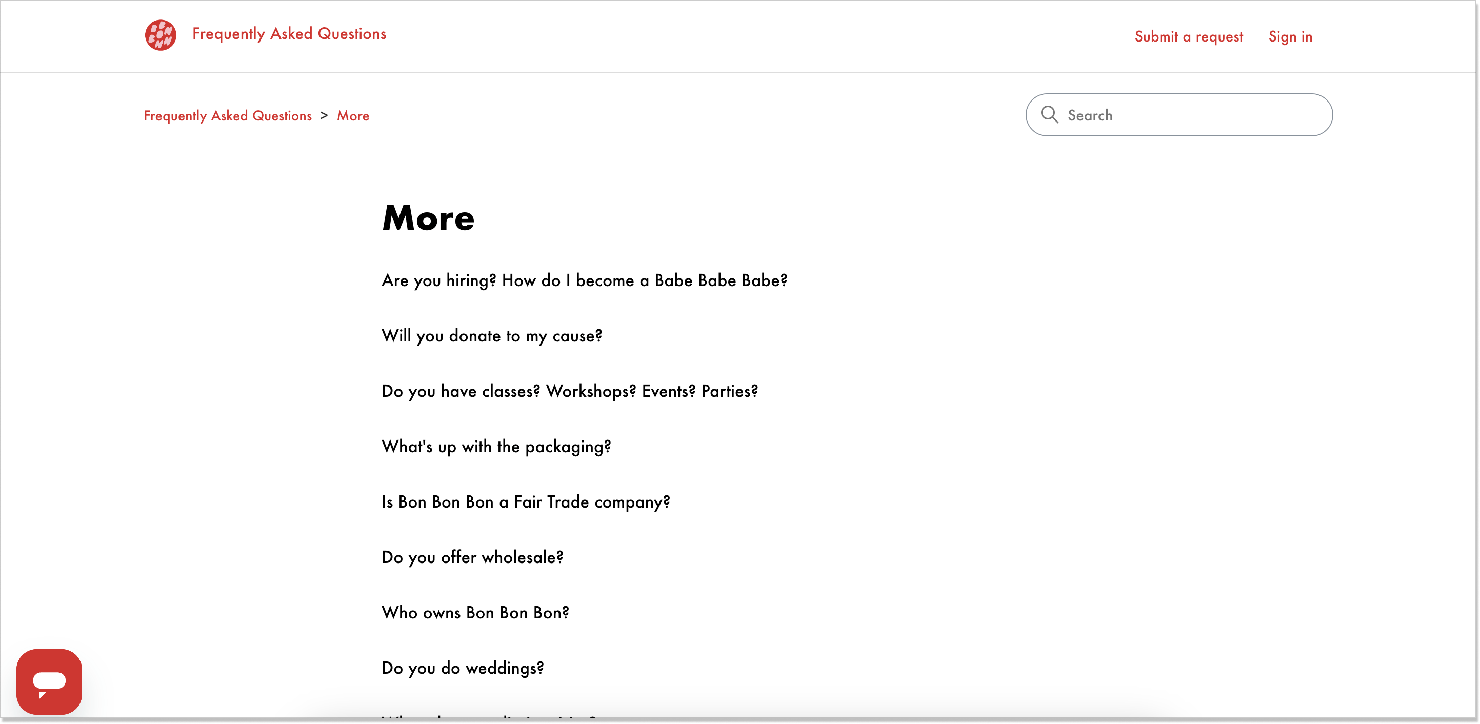
Raise your hand if you have a sweet tooth. 🙋♀ The Bon Bon Bon’s FAQ section is in tune with the brand’s tone of voice. Except for the well-known categories, Bon Bon Bon has added an additional sector – More. It comes in handy if customers have repetitive questions, not really applicable to some standard eCommerce FAQs:
4. H&M
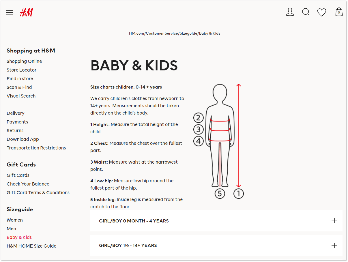
This clothing chain maintains an extensive FAQ page with useful information for customers regardless of their shopping method. For those who prefer brick-and-mortar shops, the page offers a store locator. For online shoppers, it provides information about placing orders, making payments, and return & exchange policies. Plus, H&M uses graphics to enhance the content of its FAQ articles.
5. Bang & Olufsen
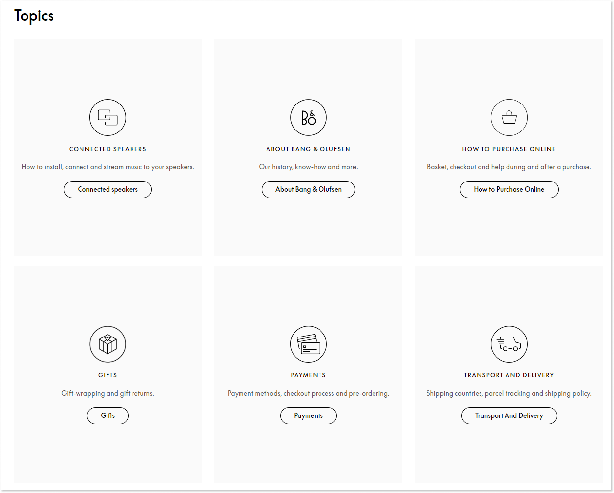
The FAQ page of this audio equipment manufacturer meets you with topics grouping the most popular questions and answers. You can proceed to the topic that interests you right now, for example, Payments or Transport and Delivery. The clean and intuitive design of the FAQ page helps customers navigate the help topics easily.
6. Glossier
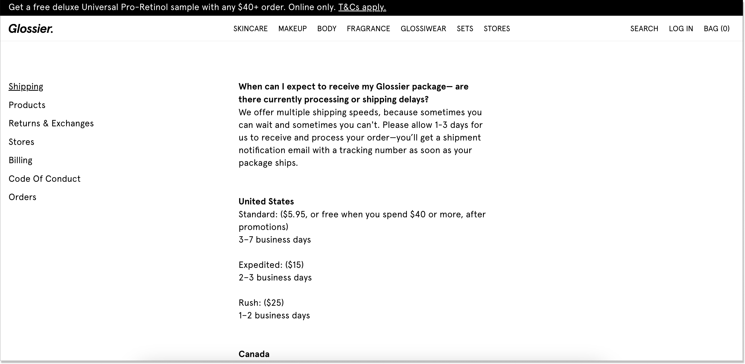
Glossier has a rather canonical FAQ. It’s centered which makes the page stand out from the rest we described today. This highlights the most important info and keeps a reader focused. Besides, they didn’t try to clutter the page with everything they have. There is a clear menu in the left corner – click the category and get transferred to it.
7. Moleskine
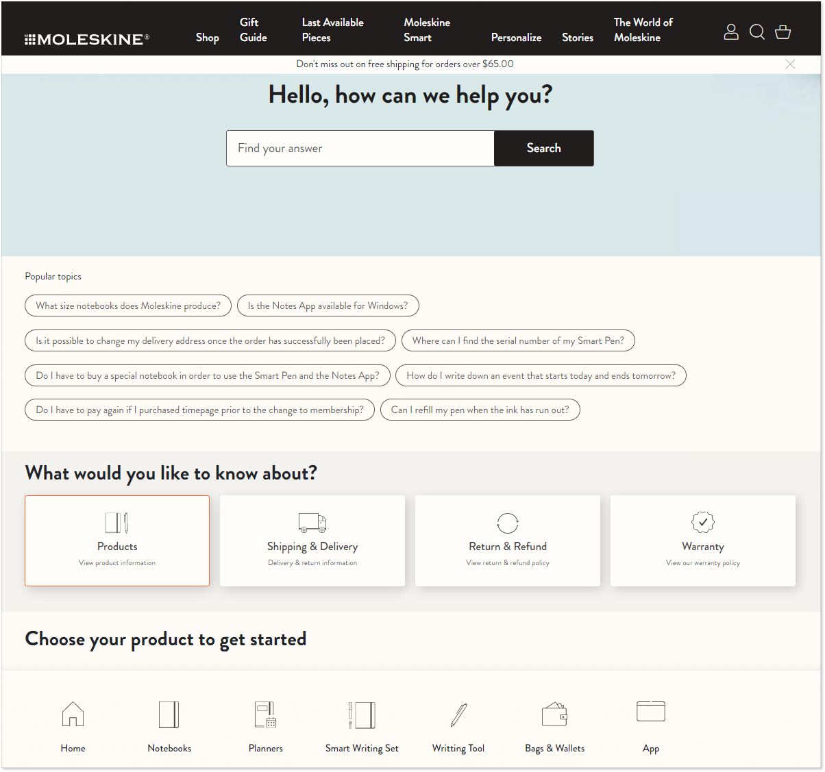
This stationery producer uses a number of FAQ-building techniques to create a convenient and useful help resource. You can search for the topic you need, view featured questions, or browse categories. Moreover, Moleskine implemented two categorization principles: 1) a standard set of categories common to eCommerce websites – Shipping Policy & Delivery, Return & Refund, etc. – 2) categories dedicated to the type of products the brand produces.
8. Macy’s
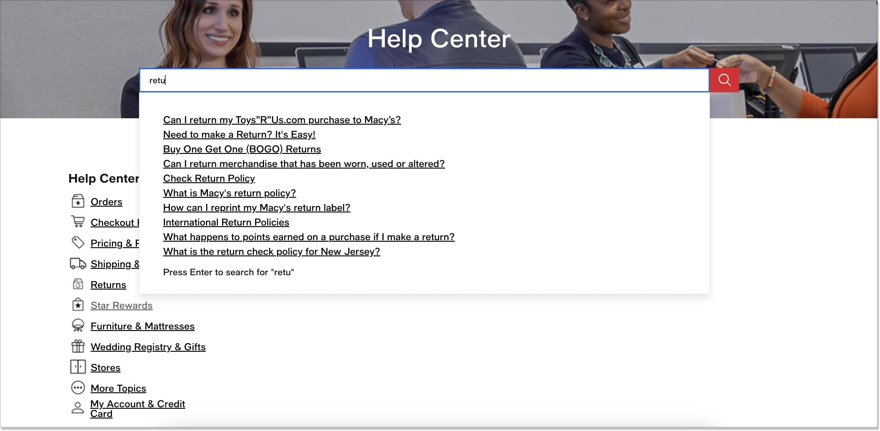
Macy’s FAQ page is brimming with an informational hierarchy. Except for the 6 primary sections with matching badges and TOP questions at your fingertips, there are 5 others that you can also check. What’s more, Macy’s has an intuitive search engine – a must-have feature for that matter. Start typing your query and pick the right answer.
9. Bobbi Brown
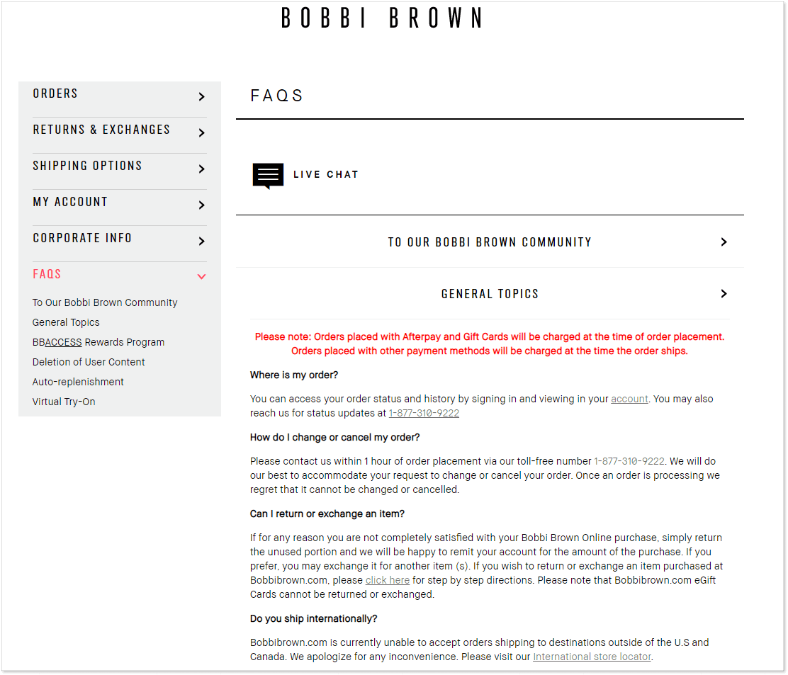
At first glance, it may seem that Bobbi Brown’s FAQ page is nothing special. However, I chose it for the Live Chat link that you find in each FAQ article. This cosmetics brand not only implements a transparent design but also offers an option to connect to the support team immediately.
10. Twinings
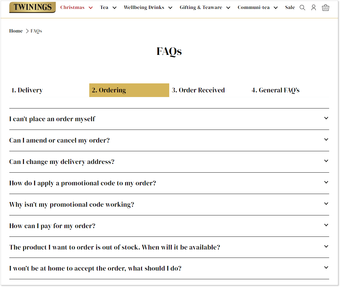
The FAQ page of this English tea brand speaks the language of its customers. In addition to convenient categorization, the questions are phrased exactly as customers would phrase them. “I won’t be at home to accept the order, what should I do?” – this is precisely what you would type in the Google search box.
11. Starbucks
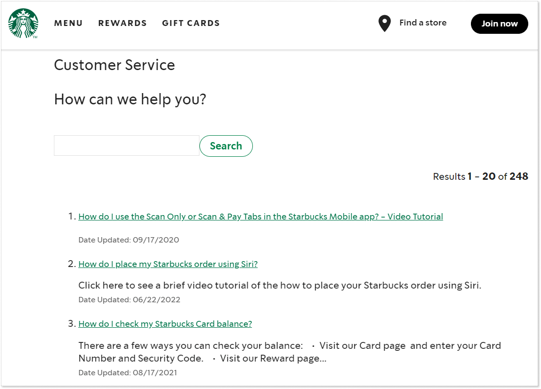
Starbucks maintains a separate FAQ page for users of its mobile app. To help them in the most common situations, Starbucks uses video tutorials that are available on its FAQ page as answers to the most popular questions. With video tutorials, the brand makes sure that the guidance it provides is the clearest, thus improving the user experience.
12. Target
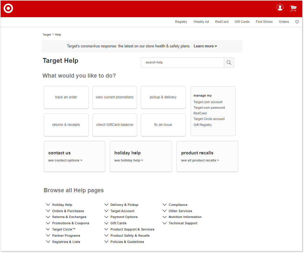
Target’s FAQ page takes a very practical approach to customer questions. It greets them with “What would you like to do?”, thus suggesting the intent with which the visitor came to the page. Besides, Target maintains a rather extensive FAQ library with topics grouped into categories. They are featured at the top with a complete list of available categories following below for easier browsing.
13. Hyphen
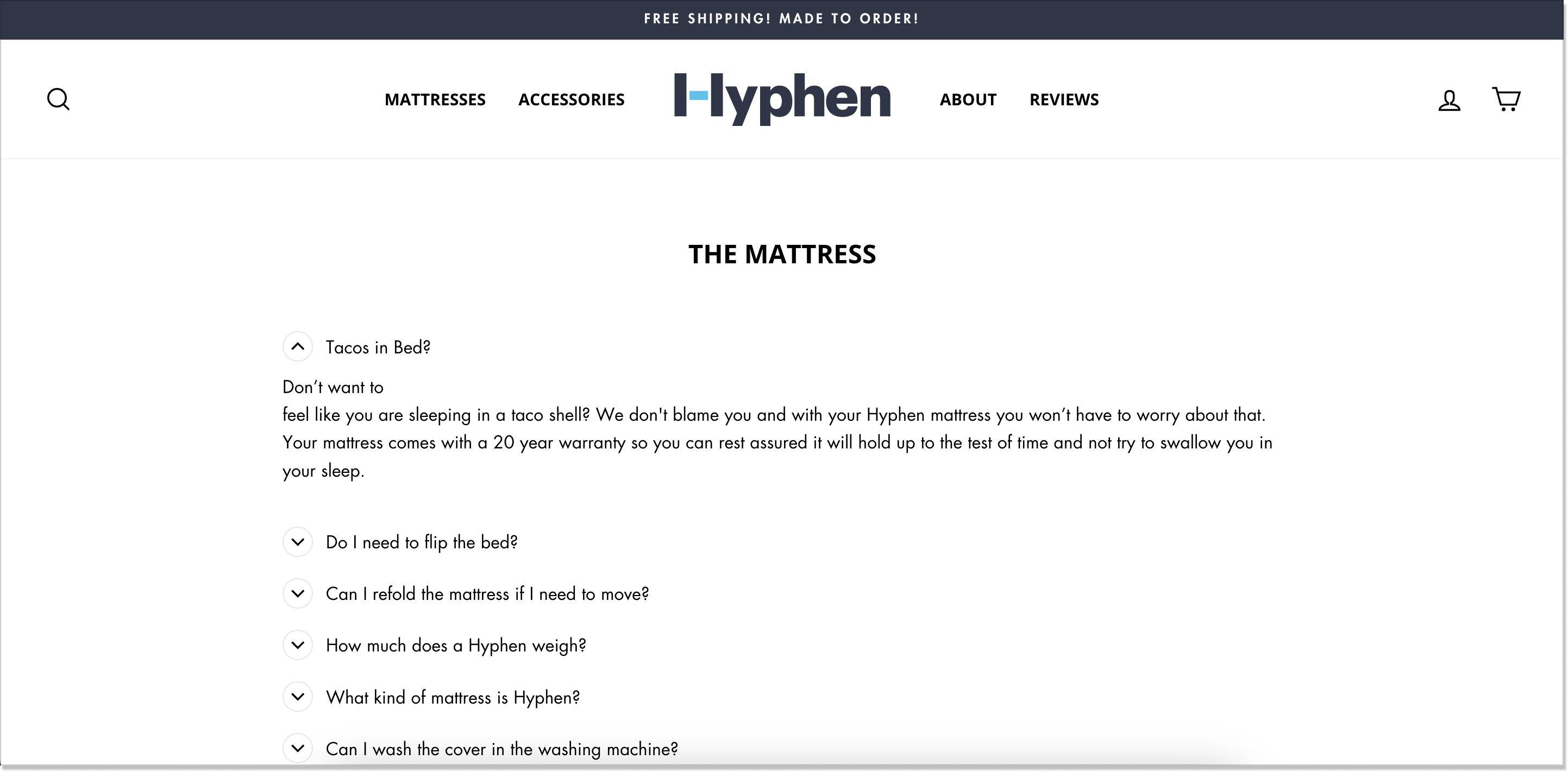
Hyphen’s FAQs are designed in an accordion-like style, the sentences are not too long, and, what’s more important, the team added vibrant language to this section. “Don’t want to feel like you are sleeping in a taco shell?” – everyone has been in a situation like this but I don’t think you somehow associated your mattress with a taco shell.
14. Kulala
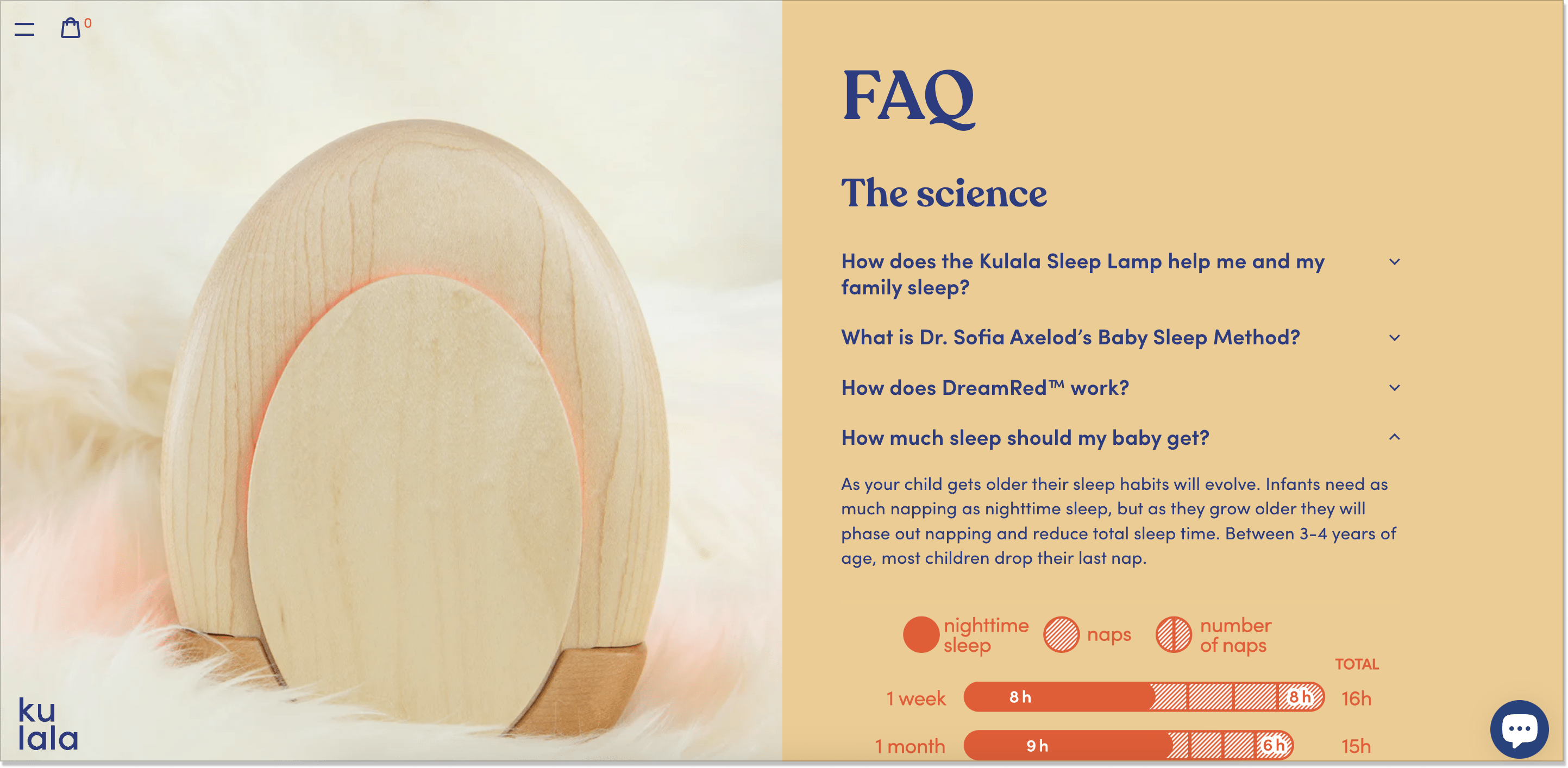
Inspired by a healthy nap, I found this eCommerce shop – Kulala. The brand hangs its hat on its one and only product: the Kulala Sleep Lamp. Once you land on their page, it screams “technology”. The questions are laid out in a drop-down menu and contain perfectly designed illustrations as well as product visuals:
15. The Spice Suite
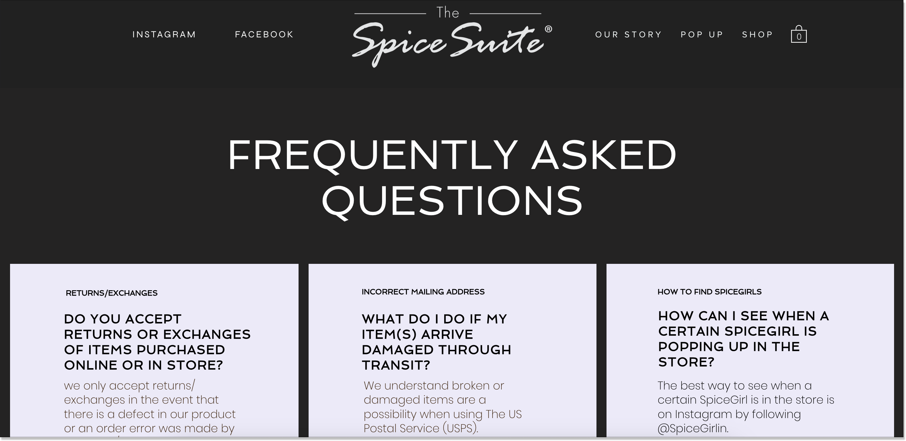
The Spice Suite’s FAQs bear no resemblance to those we talked about today. Their questions are tiled up driving more attention and keeping the reader in. Scrolling down, you’ll also see an additional section – Kitchenware care. This is an opportunity to provide users with extra info about your product or service in an unconventional way.
How to build an effective eCommerce FAQ page?
If you want to create an FAQ page that can promote an online store and bring more customers to you, I have collected some tips to boost your inspiration.
Choose the right tool to build your FAQ page
Your approach to creating an FAQ page depends on the tool you choose. Many eCommerce websites are built on special platforms, such as Magento or Shopify. For example, there are Magento extensions that allow you to integrate a branded FAQ page into your eCommerce website.
On the other hand, you can opt for a dedicated customer relations platform where you can build complete help centers including a communication hub, a knowledge base, and an FAQ page. If you choose, for example, HelpCrunch’s knowledge base tool, you can create FAQs aligned to other customer service resources and manage from a single point.
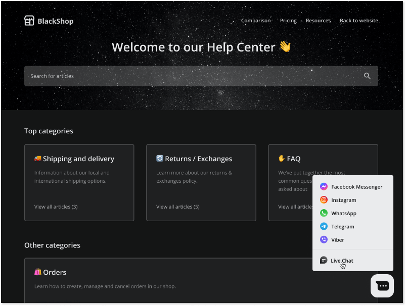
I know…having an FAQ page sounds lucrative. HelpCrunch can provide you with one! Sign up for the 14-day free trial and test our help center functionalities to the fullest extent.
Implement a simple and clean design
While planning your FAQ page design, make sure that it does not distract the customer but, instead, provides quick and clear answers. Customers should not find themselves lost on your FAQ page, they should see what they need immediately or get there in a couple of mouse clicks.
Think about what you should include
Depending on what you offer in your online store, the questions you include on your page may vary (tip: monitor the questions your support agents get, they will surely give you ideas).
At the same time, there are questions that apply to most eCommerce websites – they concern the majority of online buyers:
- How do you deliver?
- How can I exchange or return your product?
- Is payment secure?
- How can I track my order?
Think of providing answers to these and placing them prominently on your FAQ page. Customers should be able to get information immediately to return to their buying process.
However, use FAQs only for short pieces of content answering direct questions. For more detailed topics, a knowledge base is a better place. Because what is a knowledge base? It is a complete library of information about your brand, product manuals, policies, and procedures.
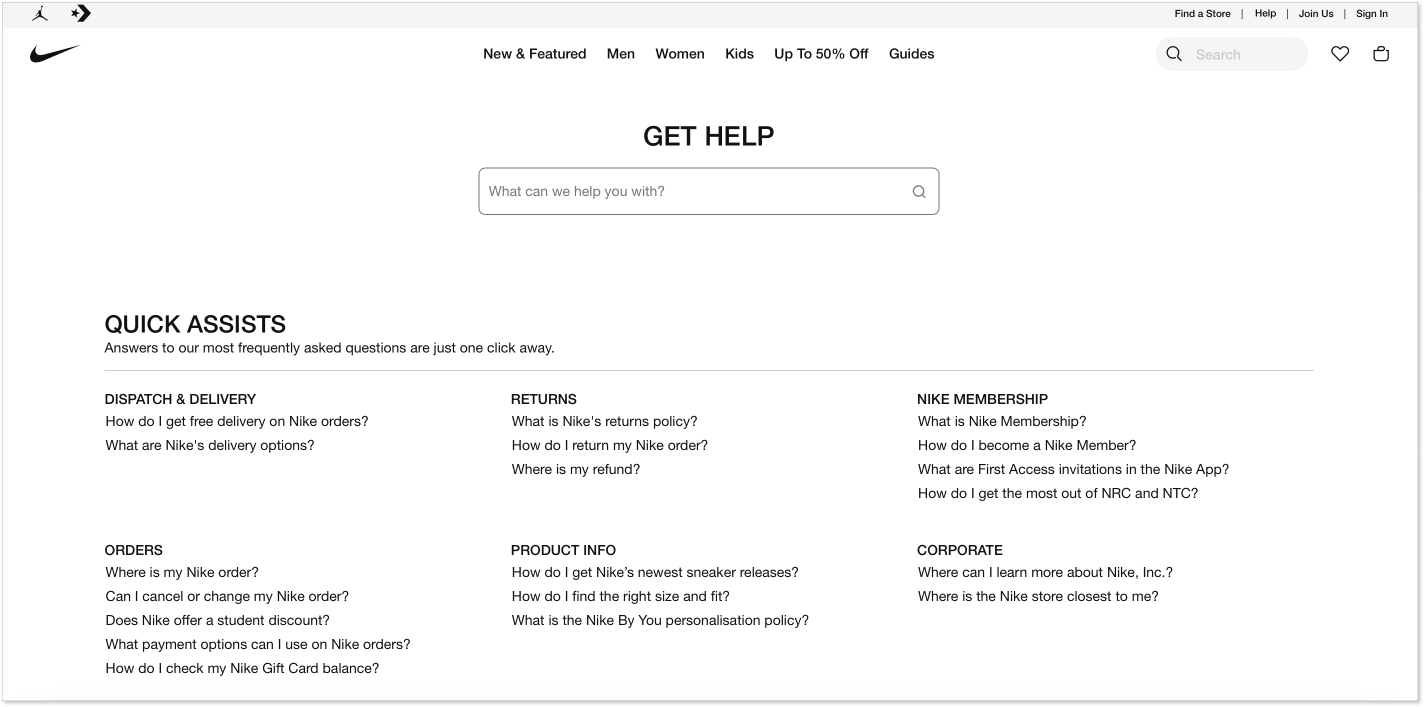
Organize questions and answers in categories
A good practice is placing the most frequent questions directly on the eCommerce FAQ page with categories following them below. This way, the user journey across your help center becomes even quicker.
Use media to supplement your answers
If you are drafting an answer to a question about a procedure, think of using a video or animation to demonstrate it. In fact, our brain processes visual images 60,000 faster than text, therefore, you can expect to get your message across through graphics or video much better than through words. Most FAQ management software supports different media files in FAQ helpful content, so use them to increase the effectiveness of your support resources.
Implement a search mechanism
Add a search engine allowing customers to type in keywords and obtain matching questions and answers. Such a solution may be helpful if you have a large base of recurring questions that may take long to browse. Keyword search will shorten the list of results to the ones that fit what the user is looking for.
Maintain your branding across the FAQ page
Apply your corporate style and branding to the design and phrasing of the FAQ page to make all your support channels look the same and speak the same voice. A good idea may be to use a knowledge base platform to create the FAQ page, too. This way, you will maintain consistent structure and terminology between the resources and can synchronize their maintenance and updates.
Let’s give answers people look for
FAQ pages are created for a reason – they carry a large chunk of your workload. If you set up your page in a way that really helps users, you both make many customers happy and reduce the volume of your customer support flow. I hope the tips and examples gathered in this post give you the inspiration to develop an outstanding FAQ resource that works.

