10 Best Examples of FAQ Pages to Make Your Customers Satisfied
Check out the best FAQ page examples and get inspired or just copy some of the ideas ;)
Written by Olesia Melnichenko
How do you usually imagine an ordinary FAQ page? Well, it has some questions followed by answers. There’s no catch at all.
But your website visitors would always want something more. It goes for everything from the page copy to its overall design. Sometimes, a simple layout with straightforward answers is your best shot, but sometimes you might need to go the extra mile and push your creativity. Luckily, we’ve written this post with you and your customers in mind.
To give you a little nudge for your page with frequently asked questions (or redoing one), we’ve compiled 10 design inspiration ideas worth your attention. Enjoy!
What is an FAQ page?
FAQ means “Frequently Asked Questions.” An FAQ page depicts the questions users usually ask and answers on a website about a product or service. The content is versatile: from the company’s history to shipping details to return and refund policies.
10-15 years ago, FAQ formatting was something kinky. Nowadays, it’s a powerful tool that helps you arm your website visitors and customers with solid knowledge.
Why is a FAQ page necessary for your business?
Let me provide you with reasons why a well-designed FAQ page layout can yield great results:
- Users hate contacting live agents to ask simple questions, like delivery conditions, return policy, etc. So let them find quick answers on demand by themselves.
- Take the load off your customer support team, who have to answer repetitive questions indefinitely, and help them focus on more attention-requiring tasks.
- Make your SEO specialist happy by creating an FAQ page and optimizing it for search engines (not only thanks to keywords but also by interlinking with your website and blog content).
In short, a good FAQ page can save time both for your shoppers/website visitors and your squad.
Today, there is a maze of decent FAQ software worth speaking of.
HelpCrunch, HelpJuice, Tettra, TypeForm, Flowlu – they all have a laudable feature set that can help you design a frequently asked questions page easily and top it up with the sought-for content.
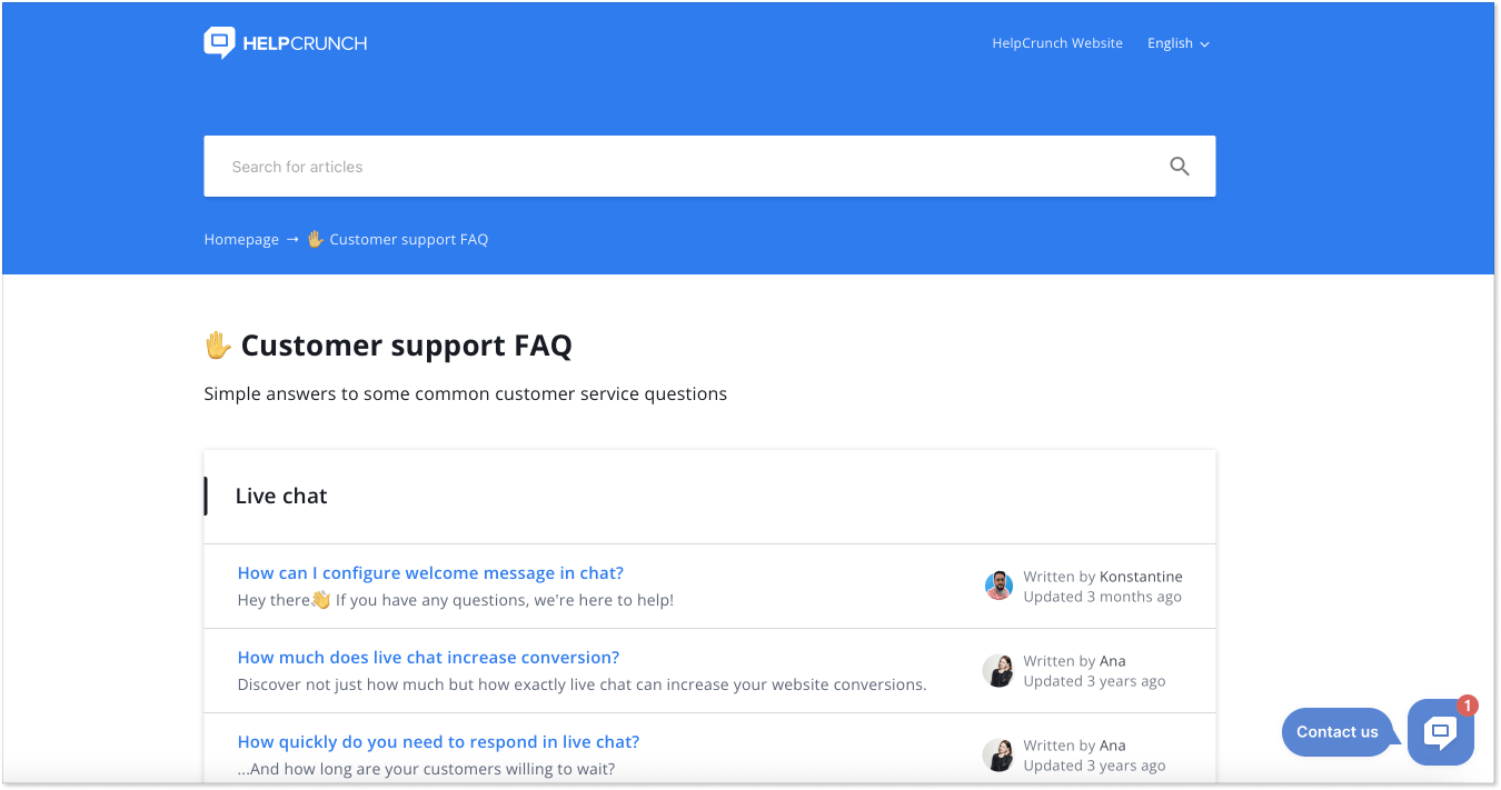
By the way, take a closer look at HelpCrunch – a full-house customer service platform with a top-notch knowledge base feature. Using it, you can create an FAQ page or an all-around help page, aka knowledge base, with comprehensive articles that answer your clients’ most repetitive questions. Sign up for a free 14-day trial to see for yourself.
FAQ layout: things to keep in mind
I could have started this paragraph by listing some boring tips like “keep the answers brief”, “try to cover as many topics as possible”, or “take care of your structure”. But I bet you are well aware of these recommendations.
Instead, let me share my personal findings based on years spent in customer service content production and researching hundreds of brand websites across the web.
In terms of FAQ examples and how they are built, there are three main types of these pages.
Plain simple type. This type usually has a search bar on top, a list of questions in the middle, and a list of sections on the left or on the right of the screen. No icons, no images, no GIFs. Just straight and to the point. I believe it’s the best approach for the B2B, finance, health, education, and whatnot sectors, where people come for information and don’t want to be distracted by unnecessary content.
Simple type with blocks. In this case, all the helpful content is usually broken down into blocks. Users click on a chosen block and get to the list of questions/answers in this section. This type is good for better navigation through the array of information.
A list- or blocks type with images. This type can include either a list or a few section blocks with a search bar on the top. But what makes it special are graphics that illustrate sections or set the tone for the page (happy people, cars, nature, etc.).
What’s great about these types is that you can experiment and mix them as you like. In the FAQ examples below, we picked the most interesting cases and can’t wait to introduce them.
Off we go!
10 FAQ page examples to scan before designing your own
Now that we’ve scratched the surface a little, time to dive deeper into the world of the FAQ page examples. Here you’ll find 10 designs from various brands and niches. All of them use approaches that you can take on board. Ready to see what’s that exactly?
1. Instagram for Creators – keep it stylish and simple
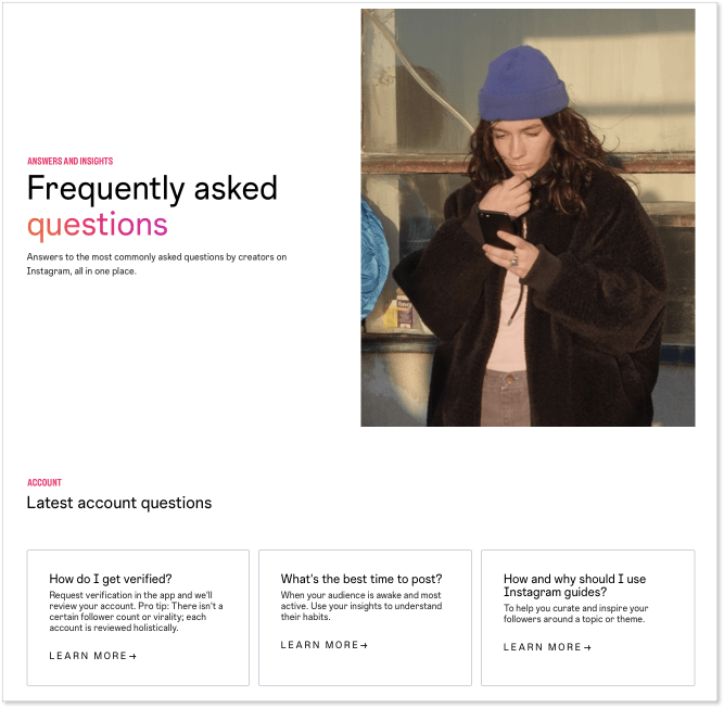
I didn’t mention the good old Instagram we use here because it only has a help center page. Instagram for Creators is a different story. Its FAQ page is uncluttered and straightforward, including only up-to-the-point questions a user might come up with.
However, there is a fly in the ointment. This frequently asked questions page could have been more vibrant (though, the upper part of the page is stylish). At the end of the day, Instagram is a creative space.
What I like in this design is how the guys name one of their sections: Your questions answered. Nice copy! This is an unusual way of putting trivial “FAQs” and calling it a day.
2. Figma – add more colors if you dare
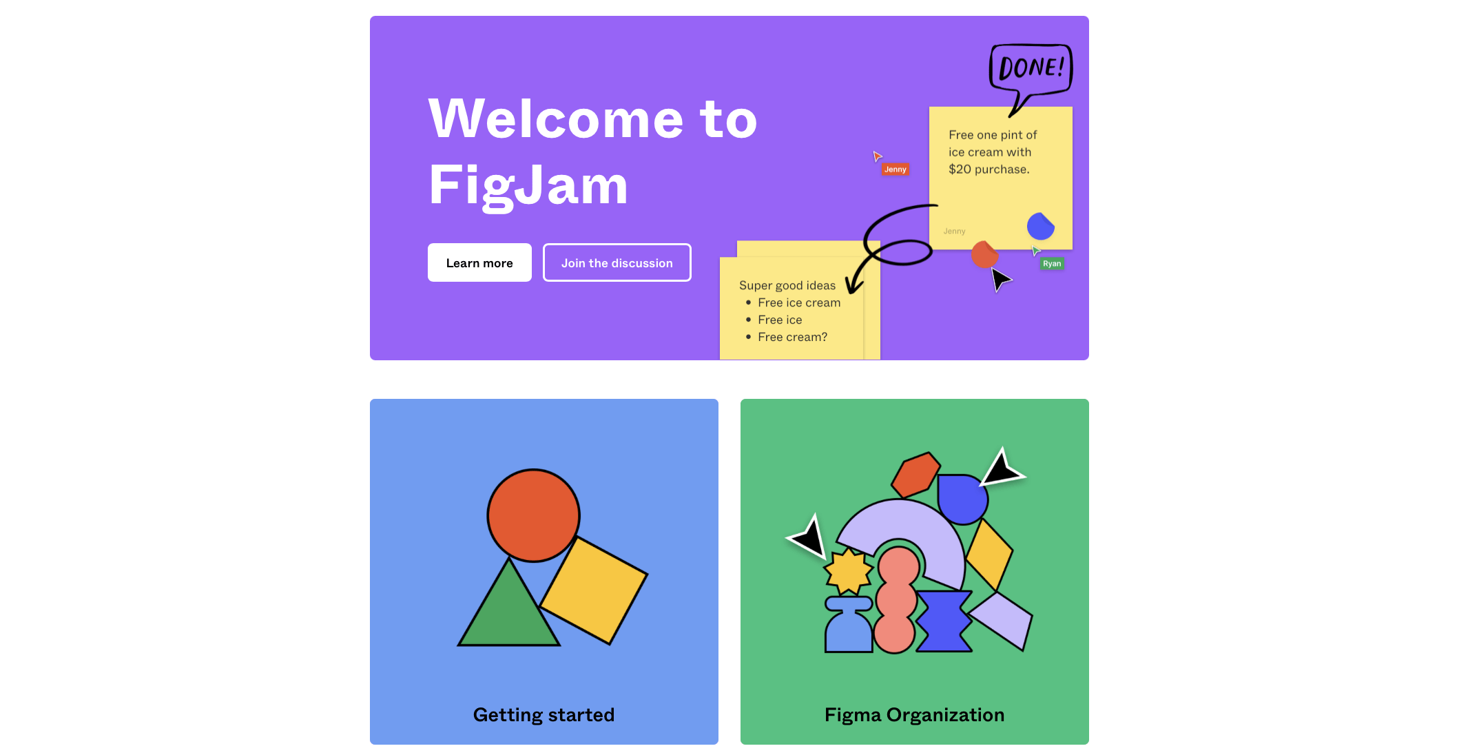
The second FAQ example in my list is the one from Figma, collaborative design software. It’s created as a Help Center page and includes the questions consumers generally ask, for example, what is Figma and how the layers work.
The navigation is pretty easy: the content is divided into a few main categories – for novices and those wanting to learn more about the product.
The icons you see above are all so bright and colorful. But if you click “Getting started” or “Figma organization”, you will land on a very simple black-and-white page with a list of topics to learn more about.
Another pro point is that the names of the articles, aka questions, are depicted with the category name on top. When you click on the article, it will take you to the helpful step-by-step material you can easily follow to solve the issue.
Sure, there is a common search box at the top of the page and a “Help” button in the bottom right corner you can use to search for a relevant knowledge base article.
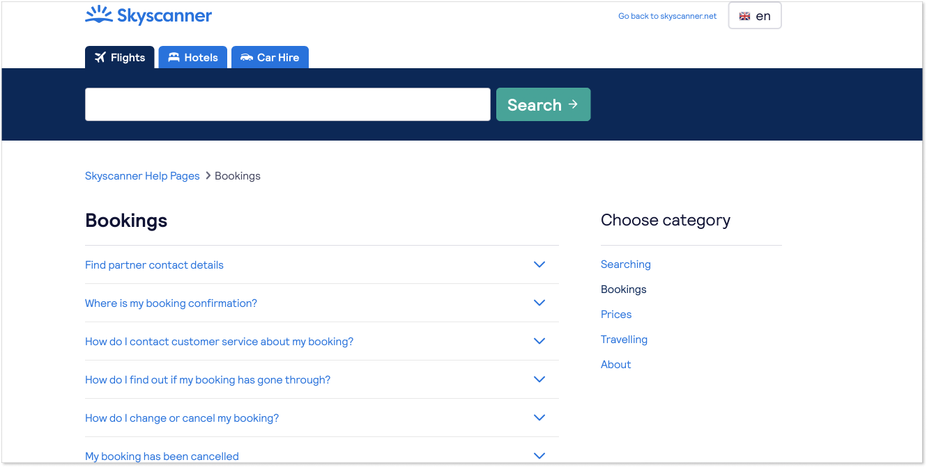
3. Malt – make it simple and easy to use
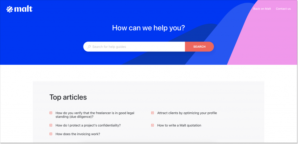
Malt helps both companies and freelancers cooperate. Their FAQ page is designed smartly, maintaining a clean and straightforward interface, bringing out the search box. So, at first sight, this example is pretty similar to the others we described. But not so fast.
A hallmark feature of this FAQ example is the so-called Guides that you can start any time you click the question of your interest.
There, you have interactive content, a progress bar, and minimum information (I mean without the fluff). It goes hand in hand with illustrations, graphics, and other visuals. This is probably, one of the out-of-the-box FAQ pages I’ve seen, for that matter.
4. Netflix – make the information easy to find
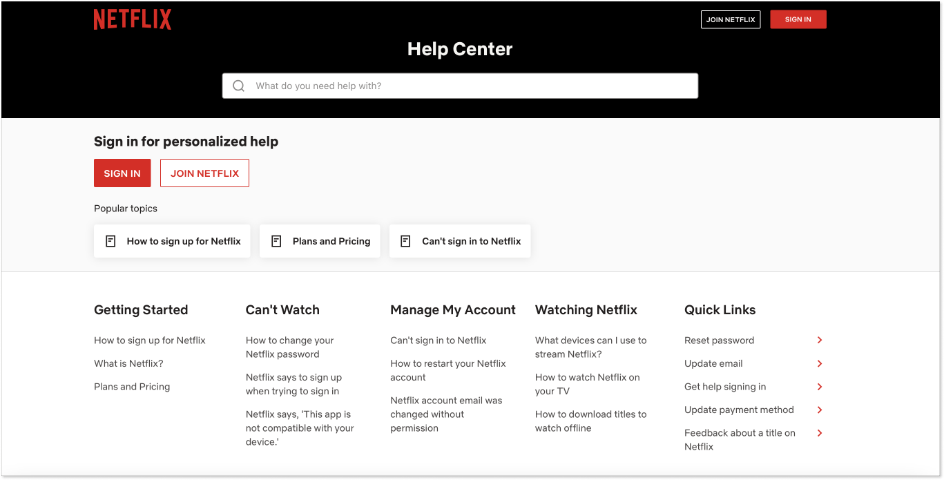
Netflix is not a complicated software to use, and usually, it’s pretty simple to subscribe and start enjoying “You”, “Euphoria”, or “Stranger Things” shows right away. But little hiccups can occur from time to time.
I remember once I was trying to disable this annoying feature of the platform that automatically plays the next episode after the previous one had finished. It made me spend hours and hours watching the whole series in one day because it was just too hard to break away. So, my search led me to the Netflix FAQ page.
After typing my question in the search box, the answer immediately appeared on the screen.
What I also appreciate about this FAQ example is the structure. All questions are split into categories that already mirror the issues a user might experience, such as Getting Started, Can’t Watch, Managing My Account, and Watching Netflix.
5. That’s what she said – add a pinch of humor if it’s appropriate
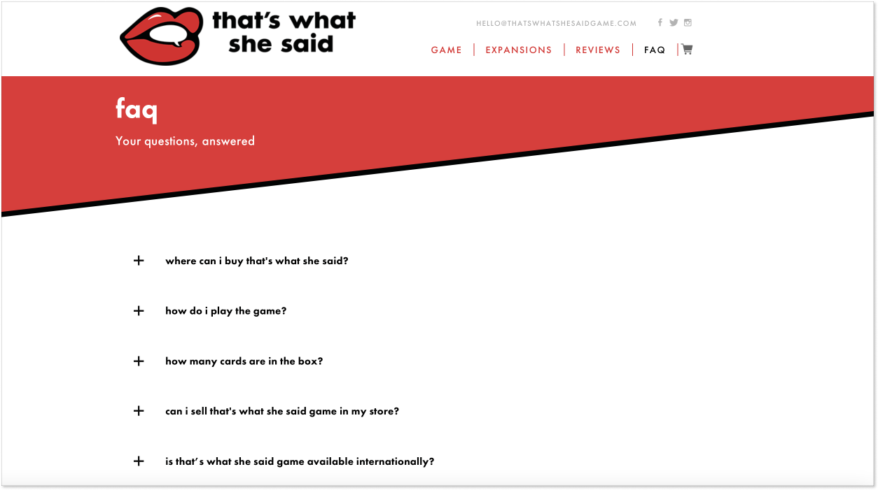
That’s what she said is a party card game of twisted innuendos. I’ve never played it, but already thinking of giving it a shot at our next board game night with friends. But we are here to talk about more serious stuff, like FAQ examples, so let’s get back to it.
This FAQ design looks clean and provocative with the brand’s logo in the form of open red lips in the top left corner of the screen. It’s important to align the FAQ page design with the company’s style in general. In this case, the task is performed with flying colors.
I like the name of the section: faq (small letters make it sound less formal) and a quick line, “Your questions, answered”. Even though the search bar is missing in this example, the list of questions covered all the areas.
One of the questions made me smile and kind of dips you in the vibe of this game: Will this game turn me into a party animal?
So feel free to experiment and add funny questions or humorous replies if your product allows that. Customers love those who make them smile.
6. Shopify – don’t be scared to be boring
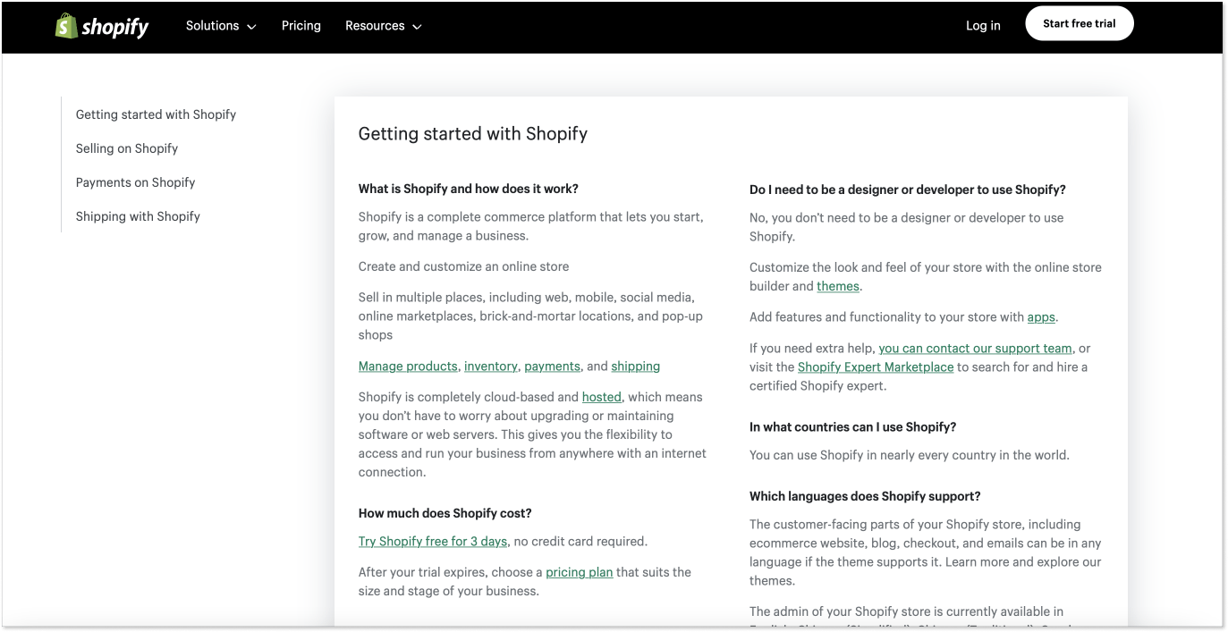
When you look for the best FAQ example, you probably think of creating an unforgettable, jaw-dropping design or structure for your page. But there is no need to go crazy because the FAQ section is supposed to be a source of helpful information, nothing else. So the main thing is to cover all the necessary subjects and organize them in an easy-to-digest structure.
An FAQ page from Shopify is a great example of restraint and minimalism. It has only four main categories, a single-page layout, and content that is straight to the point, as it should be. The categories are shown in the left-hand menu, so you can click the category and jump to it.
This simple FAQ page can be a good role model for many businesses working in the B2B sector and aim to provide useful information rather than entertaining customers.
7. Minecraft – keep branding at the top of your mind
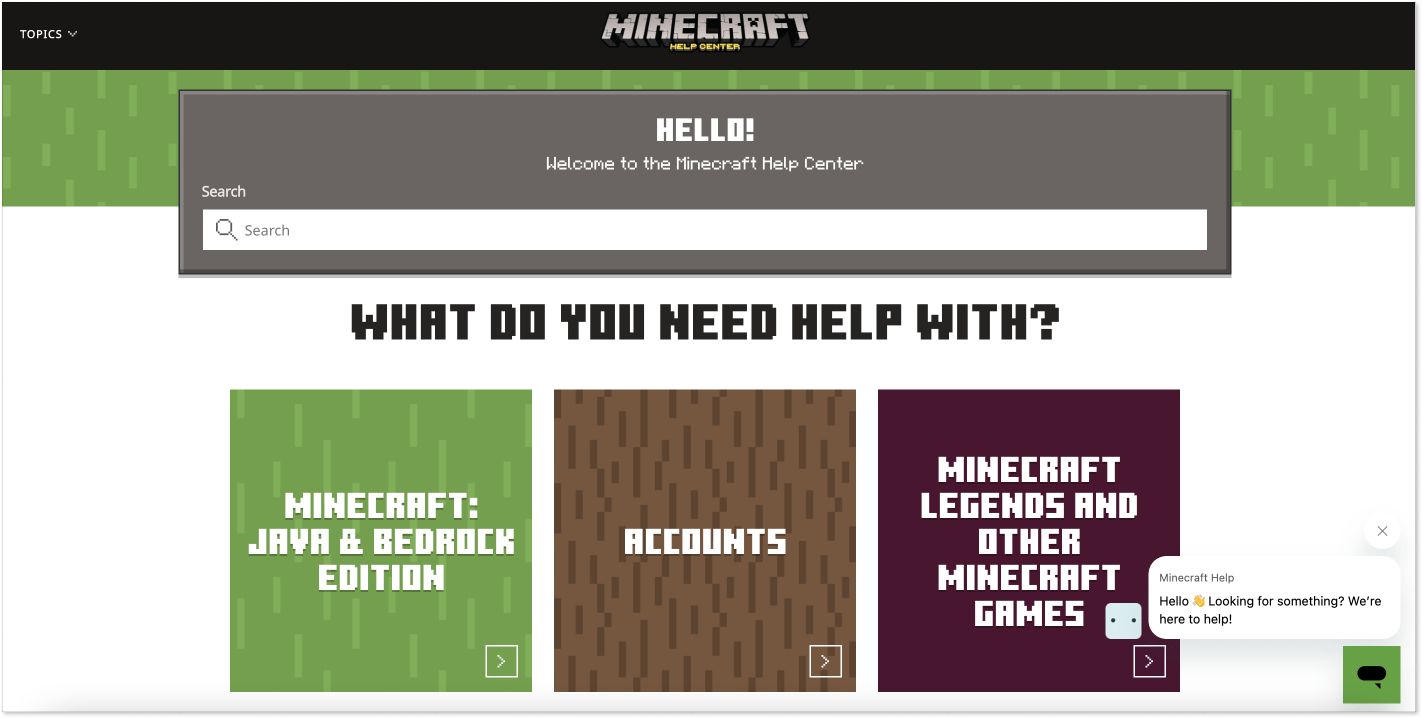
This FAQ example is perfect for game lovers. Minecraft developed its help center page using brand fonts and colors, giving you a game-like feeling outside of it.
It is no coincidence that the green color prevails on the page because it symbolizes knowledge in addition to being one of the four main colors in the game. Isn’t that why you come to the FAQ section in the first place?
Another thing I want to earmark about Minecraft’s FAQ layout is the structured information and easy-to-digest icons split by topics. If you click one of the squares, you will get to another page with more blocks that unveil the chosen topic. Click on the icons again, and a list of helpful materials will appear in front of you.
The articles are well-written and provide useful information. Take a look at the example below. If I were a gamer, I would be quite satisfied with the information provided.
I want to bring your attention to the live chat widget on the right and the proactive message. Even if the user cannot quickly find the answer, they can always contact a support team.
8. Calm – place a picture that sets the tone

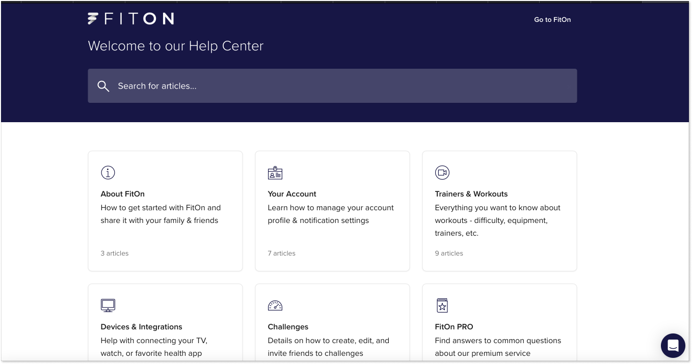
Now comes a wonderful FAQ example that falls in line with the brand’s general idea. Being a meditation app, Calm decided to add a tranquil nature picture on top of its frequently asked question section. So, when you land on it, you get the zen feeling instantaneously.
Plus, the team behind Calm has these unimposing categories that cover the most important topics. This way, you have no diverted attention and can easily grab the category you’re looking for.
Inside the categories, there are subcategories and comprehensive articles regarding such topics as the company’s mission, meditation tips, and how to use Calm’s content to fall asleep, to name just a few. Besides, there is a “Calm through YouTube” section where you can read more on how to use the app’s benefits on the social media platform.
9. Mercedes – include images to make navigation more intuitive
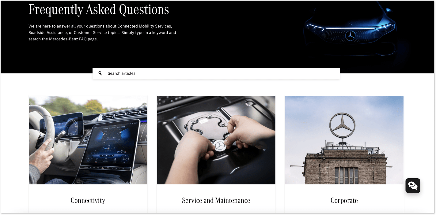
Does any of you have a Mercedes car? I do! Even though only in my dreams…
All jokes aside, these guys know how to make their FAQ design smart, stylish, and intuitive in terms of user experience. Just look at the hood of the car on the top framed in a light neon color with the company logo barely visible from the shadows and easily recognizable. The nifty trick with style.
What makes navigation intuitive are images that illustrate different topics like Connectivity, Service and Maintenance, and Corporate. There is almost no need to read the name of each category, as the images already suggest them.
When you click one of those, you will see a list of popular questions that users usually ask and brief but informative answers. I also appreciate that Mercedes provided a live chat widget button in the bottom right corner. This is a great FAQ example worth considering.
10. Too Good To Go – make it look more authentic
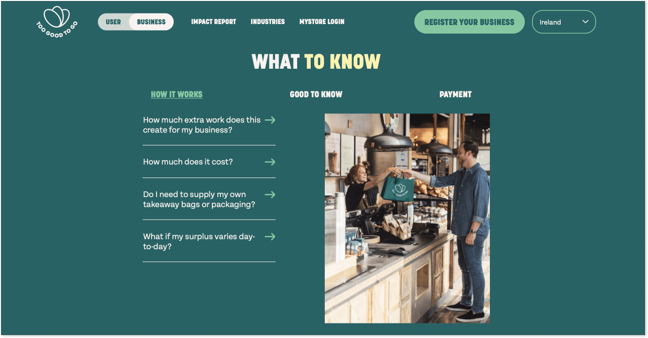
I came across this brand a few years ago when I lived in Poland and worked for a tech publication. As a big foodie, I committed to testing and writing a piece about their app. Guess what? It’s awesome!
The logic is simple: cafés, shops, and restaurants have lots of food left by the end of the day that otherwise would be wasted. The app helps to connect these businesses and customers who wish to buy a takeaway meal tonight with a great discount. For instance, I bought a sushi set for half the original price and enjoyed the food at home… Sorry, going down memory lane took me too far from our main topic today. My bad!
Look at this fantastic FAQ example and how different it is from similar pages. Unlike other brands, these guys placed the image on the right instead of the top of the screen. The section names are on the top, and the questions are on the left, with little arrows calling for clicks.
When you click one of the questions, a brief drop-down reply unfolds. I also like the “Good to know” section, which perfectly echoes the app’s name. The main conclusion here: be brave to experiment and make your FAQ page look authentic 😉
Use FAQ samples to get going
A well-oiled FAQ page is a good call for encouraging customer self-service. Just keep thought-out content and easy-to-digest design in mind. Look at the example above, find the one you like the most, and go from there. Maybe, you’ll create something of the kind so as not to kiss a customer goodbye?