16 Inspirational Knowledge Base Examples Worth Following
Check out the compilation of 16 excellent knowledge base examples and build the most powerful resource hub!
Written by Olesia Melnichenko

Gone are the times when we were sitting in public libraries flicking through tons of books in search of information. Thank God the world is spinning around and technology is continually progressing.
Today, the process of looking for info is streamlined. Customers are tech-savvy and self-sufficient. They know how to search, and they do it fast. In fact, 70% prefer to use a company’s website to get to the bottom of their complex issues instead of using phone or email.
Another statistic says that 45% of brands that offer mobile or web self-service options noticed an increase in traffic and a reduction in phone calls. And what are the online self-service attributes? You guessed it right, thought-through modern knowledge bases.
Get inspired by the 16 creative examples we’ve prepared today. Go ahead, study, and emulate them to shape your own five-star online resource hub.
What is a knowledge base?
A knowledge base (KB) is a self-service online help center where the information about a specific product, service, or topic is organized in articles and stored. It is supposed to assist customers with discovering answers and achieving success in the long run.
Based on their functionalities, there are external and internal knowledge bases. Internal knowledge bases are intended for use by the team and involve everything from onboarding materials and guidelines to special policies, corporate rules about employee benefits, etc.
As for an external, it is public and helps customers gain insight into your product or service using step-by-step guides and other materials. And this is one we will discuss more in the article. So, without further ado, here are resource hub examples worth your attention.
16 best knowledge base examples to put into practice
There are a few knowledge base benefits to enjoy: consistent self-service boosted revenue, and fine-tuned team productivity. How to achieve these? Make your help center well-structured and organized from the ground up. Plus, it should take your breath away at first glance, and the content must be relevant and helpful. Anyway, let’s cut to the chase. These excellent knowledge bases hit the mark:
1. HelpCrunch
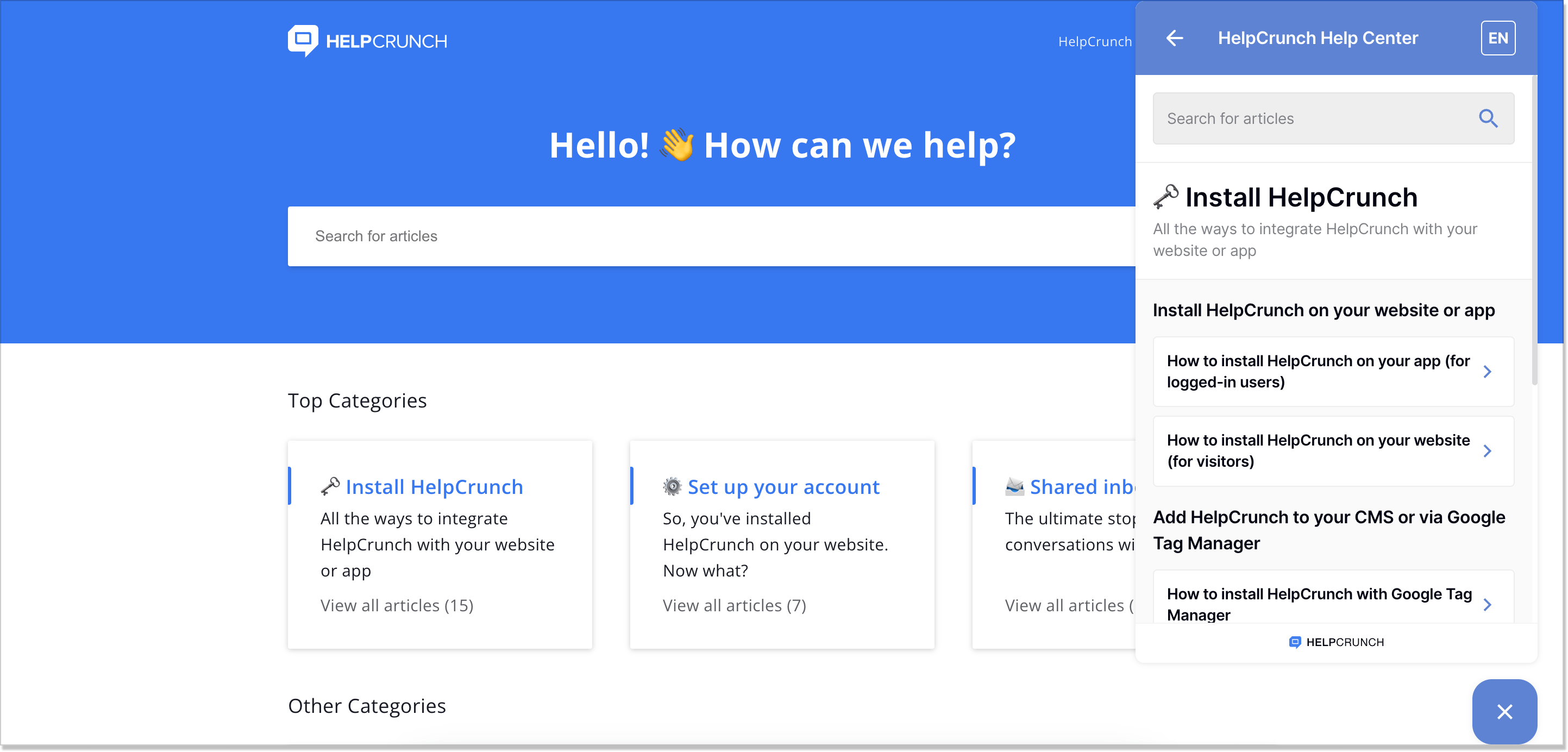
Yeah, we know that modesty is the best policy. Seriously though, could you imagine this list without THE ultimate knowledge base manager? Being an all-in-one customer communication platform, HelpCrunch gathered every bit of valuable information about the business and every product update in its thought-out resource center. This knowledge base solution is all about consistent design and a user-friendly interface.
People usually rack their brains over cluttered FAQ pages where information is not wisely stocked. Luckily, this is not the case. Thanks to a knowledge base search engine, you can type in just a keyword of your query and get quick access to all the relevant articles.
This self-service portal is a good sample with an intuitive content hierarchy. Every piece is neatly distributed into distinct categories with brief descriptions. Plus, you can see the total number of knowledge base articles for each category. Do I need to mention that we update our help center regularly so you always stay in the loop? Besides, you can write an article using samples – knowledge base templates, of which there are many.
HelpCrunch took it further and integrated the help center into the chat widget. So, when customers crave a fast solution, there’s no need to wait for a support agent to answer. They can look for the answers right from the widget and save yourself plenty of time. Besides, it is a very convenient tool for joint knowledge management by remote teams.
Do you want to create such a well-shaped resource hub on your website? In our post, We explained everything in detail on how to create a helpful knowledge base. Feel free to check it out!
2. Google Analytics
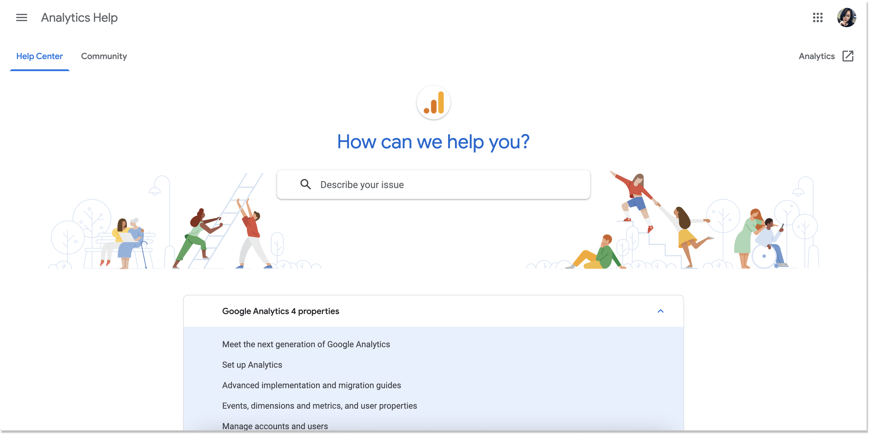
Once I came across this customer service knowledge base from Google Analytics, the graphics immediately caught my attention. The characters are intrinsic to the whole Google stylistics, which makes this resource center eye-catching.
The first thing you see is a highly-functional search bar. It helps customers navigate through the database without hassle. It only takes to type a keyword (or even one letter), and the drop-down menu with related knowledge base articles will pop up.
Besides, there are three categories with the answers to questions a visitor may have: Google Analytics’ four properties, Universal Analytics properties, and Policies. It makes this help center an example of customer-facing knowledge bases.
Do you still need to get all answers? Post your question and let other active users reply. Google’s “Ask the Help Community” is widely spread across the web.
3. Notion
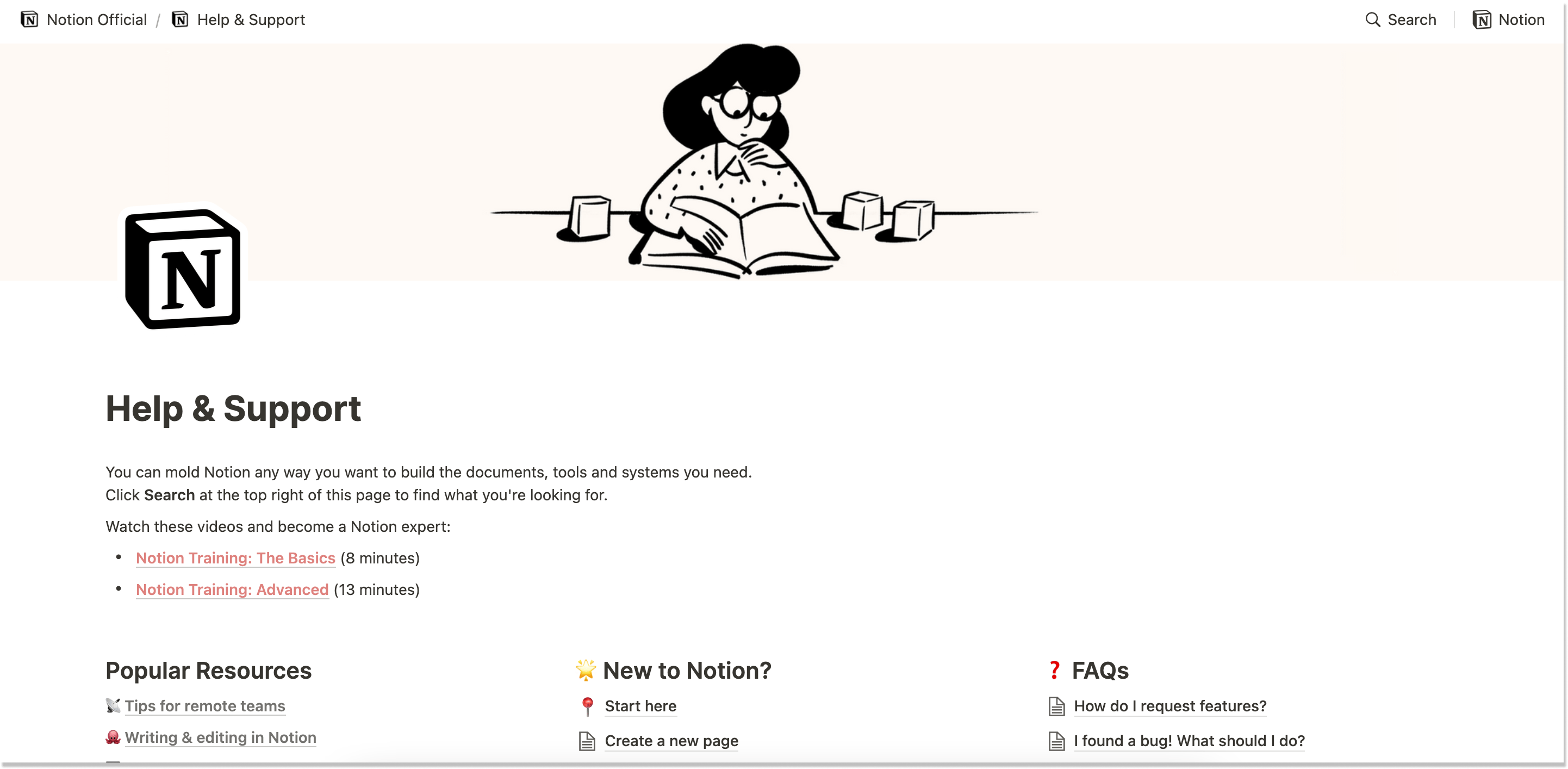
Used by many thriving companies, Notion demonstrates a substantial customer service knowledge base example.
What I really enjoy about this online workspace app’s help center, at first sight, is its emojis. This spiffs up the whole picture and makes this customer knowledge base less formal (which is a good thing).
When you open the platform’s help center, there is online training for the Basics and Advanced levels. Not to throw yourself into a wall of text right off, you can get a handle on Notion by watching insightful videos.
By showing these two items before everything else, Notion ensures that a visitor finds out all the nuts and bolts of the product more practically, a common method among modern knowledge bases. Learn from this example and break down the process so that your customers start with your product as easily as possible.
4. Slack
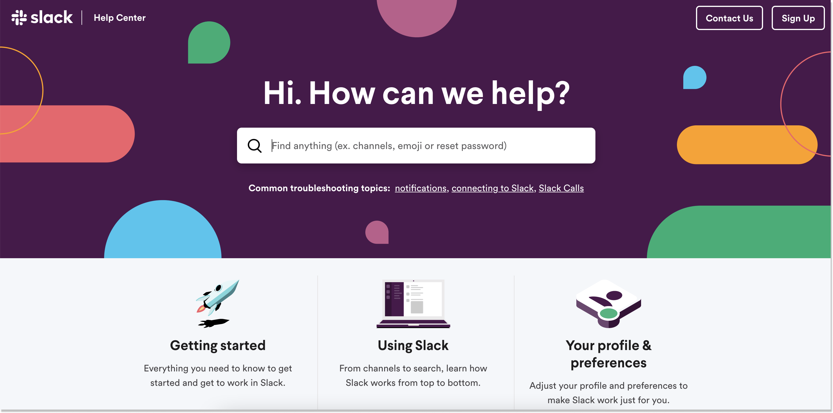
“Find anything” is a phrase that hits the eye once you land on Slack’s help center. And you can do that literally, as the resource hub is perfectly structured. This customer knowledge base example shows how you can kick the goal with just a few details: adding popular topics to a search bar area and including as few categories as possible. Such a well-thought-out information hierarchy helps active users quickly find what they seek without wasting precious time.
The minimalistic design and intuitive navigation are some of the main things to focus on here. Adopt Slack’s practices and write subheadings to the knowledge base interactive categories. This way, you can briefly explain to customers what they will find in this or that group.
What Slack also does great is sharing quick tips on using the product at the bottom of the page. So, you don’t have to sift through dozens of knowledge base articles: everything is vividly shown.
5. Netflix
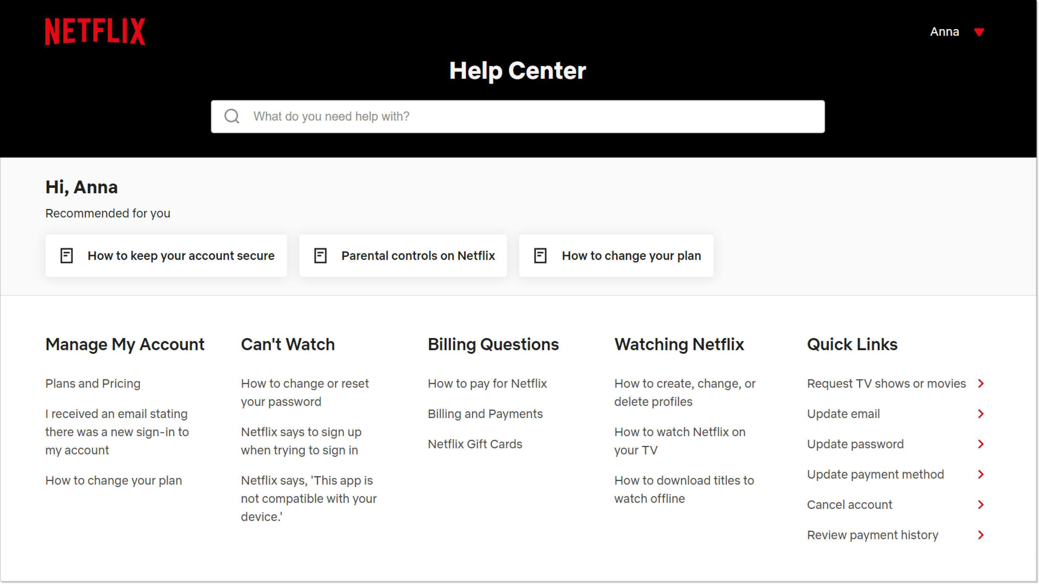
Netflix’s help center is designed to be user-friendly, featuring a search bar and personalized recommended broad categories based on the customer’s account. Personalized recommendations are their primary content distribution model. Therefore, adding the feature to their help center is more of a branding move than a customer benefit.
Scrolling down reveals the main top-level categories, each with articles listed underneath. Quick links are available to help customers easily access pages for changing their account details.
The articles are well-structured with numbered lists and incorporate Netflix’s brand colors. Customers will find it simple to navigate the help content and can provide feedback on its usefulness to employee satisfaction. Keep in mind that your knowledge base tools should allow such things.
6. LinkedIn
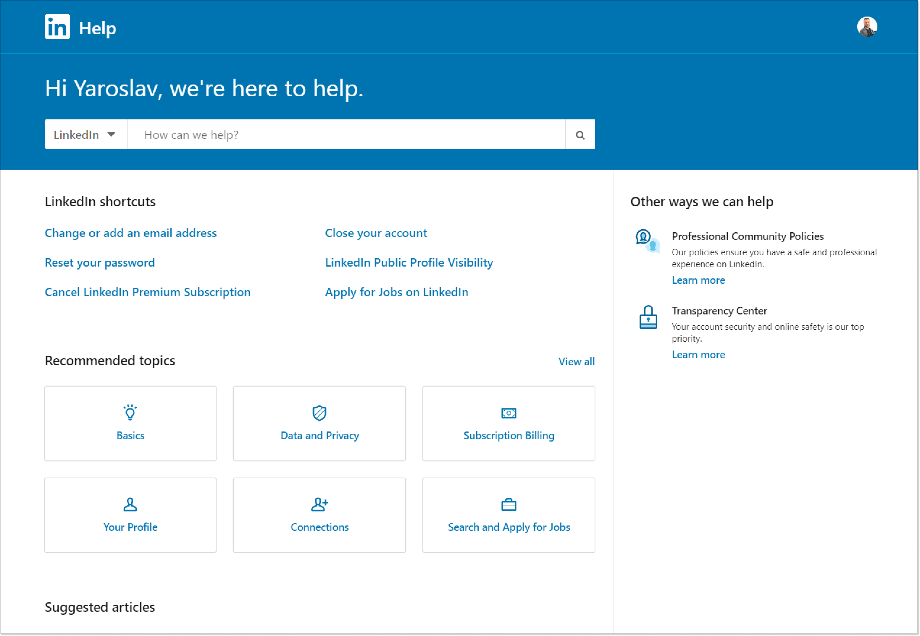
The LinkedIn Help Center contains a wealth of information, so the platform strategically breaks it down to help individual users find answers quickly. Thankfully their modern knowledge base software allows it.
Upon entering the Help Center, people are greeted with Shortcuts, which are the most frequently visited pages in the help center. People can explore Recommended Topics or scroll down for Suggested Articles if their query isn’t covered in these popular topics.
It’s a good move to highlight a few specific pages that receive the highest number of visits in your entire knowledge base. By placing them front and center, you can help potential customers to have convenient access to valuable information.
7. Document360
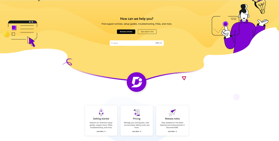
Document360 itself is a knowledge base solution and it has demonstrated in their Self-help pages how to present a knowledge base to the users. We all agree that navigating through a knowledge base can be daunting with limited search and categorization. Document360 self-help pages have been enhanced with the AI Assistant—Ask Eddy feature. It provides more contextual answers with reference articles to reader queries in a simple click. The user doesn’t have to search and read through multiple articles to find the information.
In addition, Document360 has an AI-powered search bar that helps users find relevant articles in a fraction of a second. Moreover, it excites the readers with a presentable portal with branding customizations, collecting feedback from the readers, displaying articles with a table of contents, and callouts and you can even see embedded videos and infographics neatly included in the content. This makes users feel more engaged with content.
Document360’s Help Center consolidates all your support resources into a single, easily navigable platform. This centralized repository ensures that users can quickly locate articles with relevant information without having to sift through multiple channels.
8. Campaign Monitor
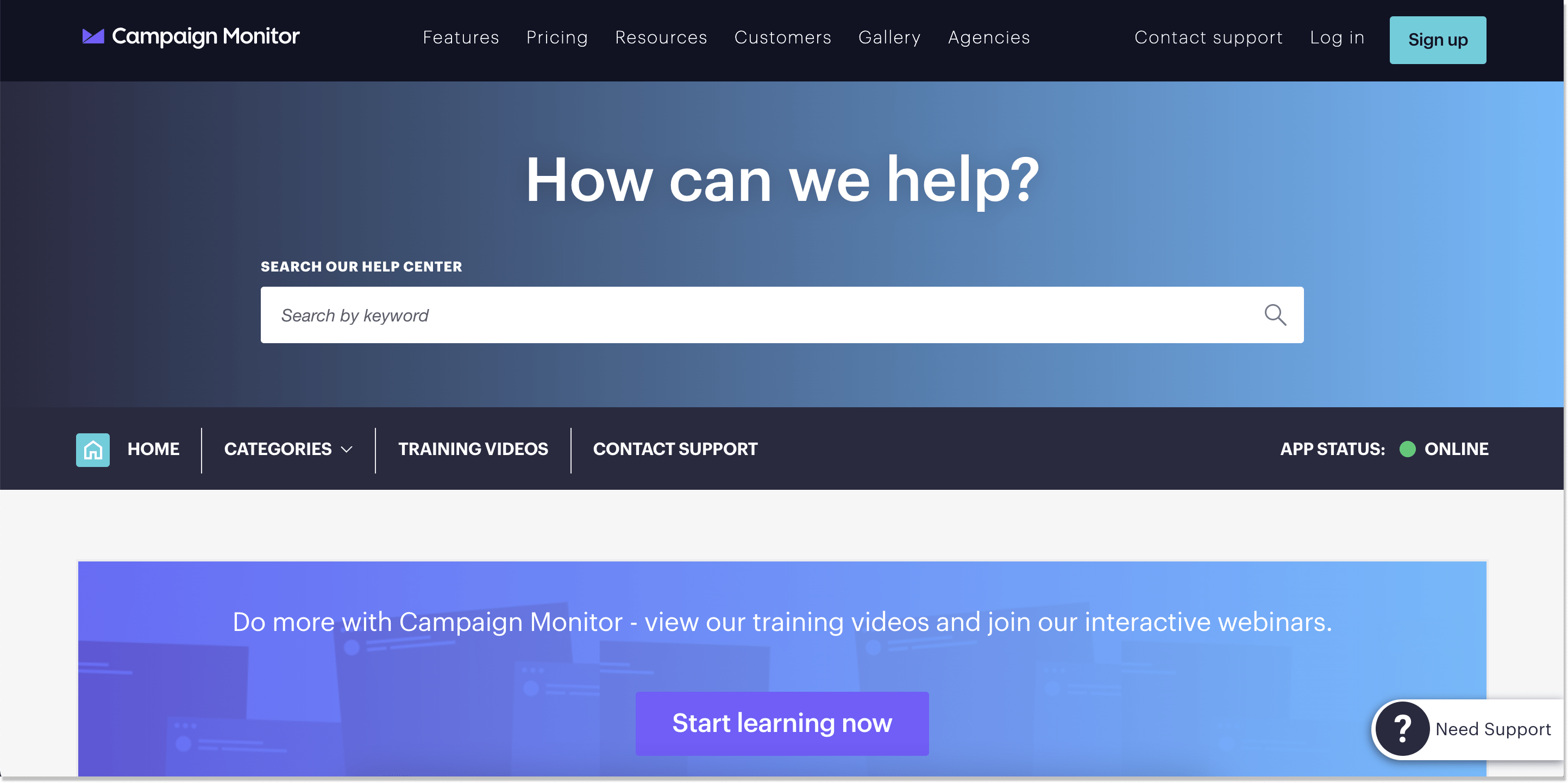
Email marketing SaaS company Campaign Monitor places a premium on the CTAs on their KB page. There are two call-to-action buttons on the page which is fine by me. However, other customers may find it a little obtrusive.
Anyways, let’s look at the common help center blocks typical for modern knowledge base software. The search bar tells you that you can look up a question using a keyword. The knowledge base interactive categories are available both in the drop-down menu and while you scroll the page. Everything is structured, loud, and clear. The articles involve bulleted lists and screenshots, which prevent your eyes from becoming weary.
Another curious element about this example is that there is an app status indicator. This is a very clever way to inform users whether your product operates properly. Campaign Monitor even offers you to subscribe to updates about possible glitches, blackouts, etc. Isn’t it a smart move?
9. Zoom
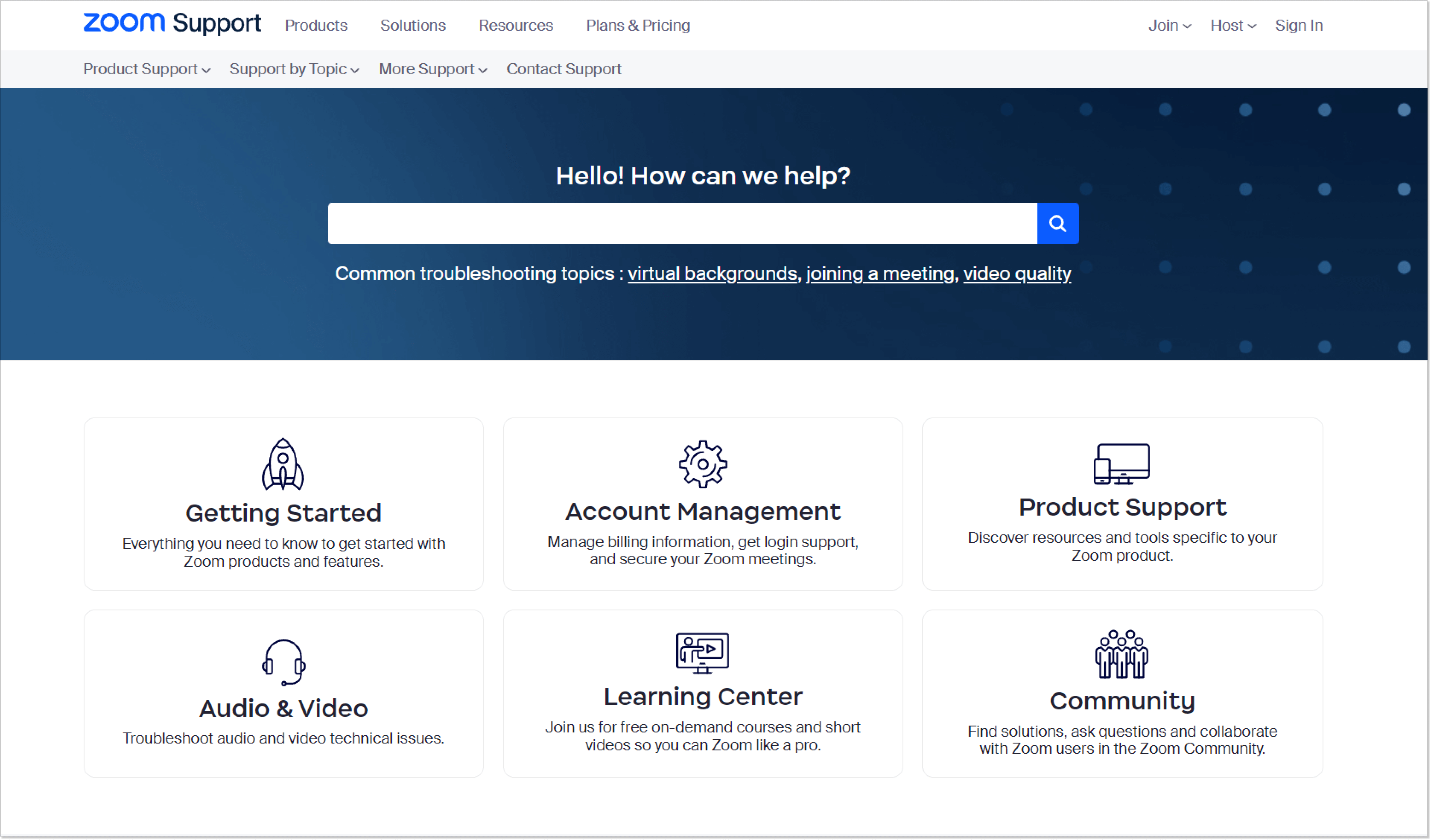
Zoom has become a regular tool for many due to its tremendous growth during the pandemic. Consequently, their help center has evolved significantly.
In 2018, the Zoom KB was among the common types, featuring just a search bar, a few relevant topics, and less than ten video tutorials. However, it has since expanded to include a great many articles.
At the same time, they didn’t change the internal knowledge base software to redesign their help center. That’s why the team added a sub-menu for convenience in addition to the main categories and search bar. It allows you to search by product features or by topics.
The lesson learned is that an effective knowledge base should be adaptable and grow with your company. Start with a solid structure that allows for flexibility and ensures continuous updates based on customer feedback to keep it relevant.
10. Optimizely
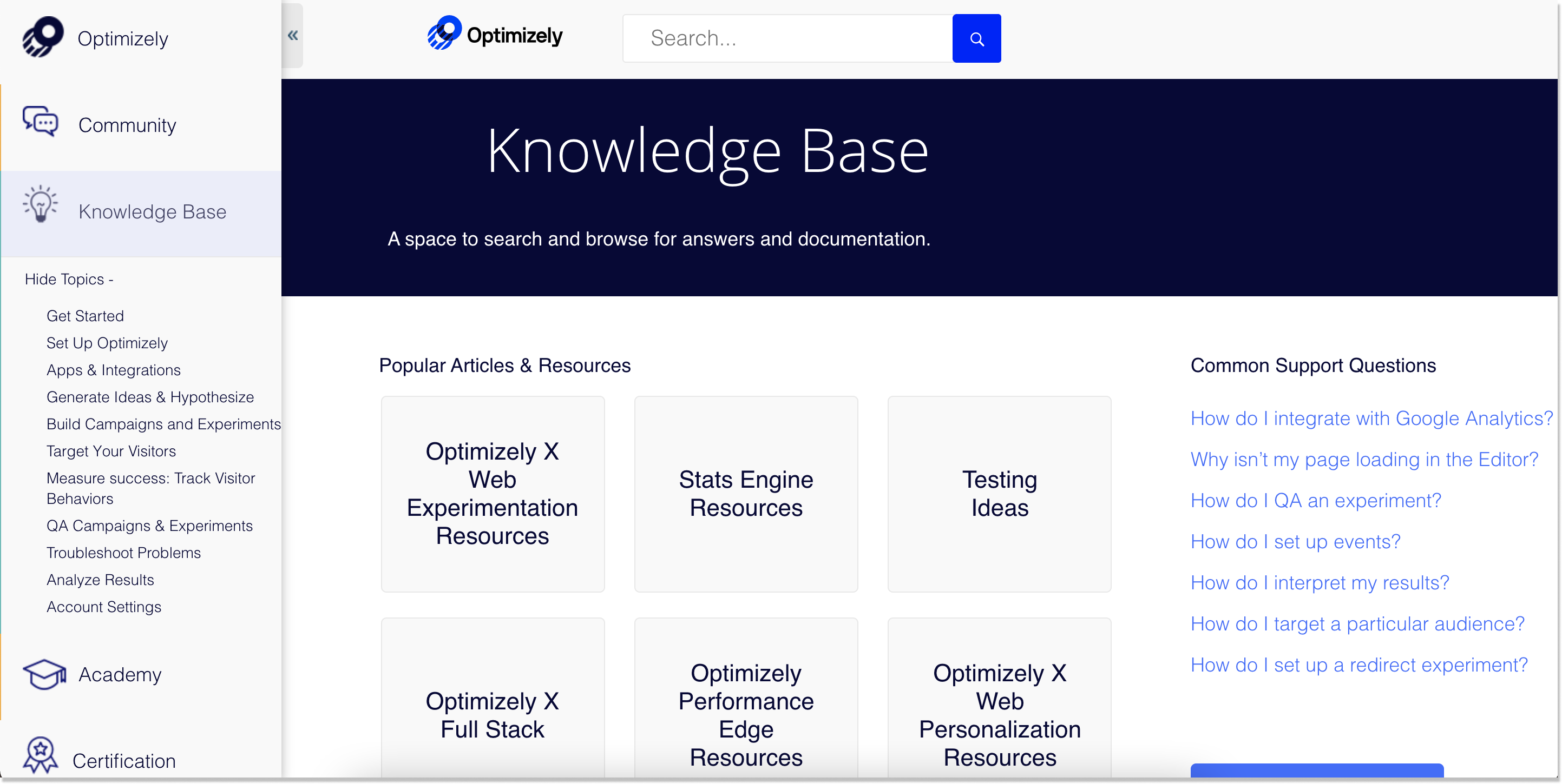
What are the biggest interactive knowledge bases on the list? Well, this one definitely is. Optimizely is a progressive delivery and experimentation company with a huge help center in its arsenal. It contains a community forum, a comprehensive resource hub, developer documentation, certification programs, and a link to a regular customer support team.
This design can hardly be called simplistic. Here, you can see a mixture of the side menu, search functionality, and common support questions. However, this is just the tip of the iceberg.
When you scroll down, there’s a breadth of knowledge base topics Optimizely covers. Click on any, and the depth of the content will wow you. Images and videos are there as well. Besides, you can notice the interlinking between the articles, which is helpful for new customers. So, if you like to outline the information in abundance, this example can be your choice.
11. McDonald’s
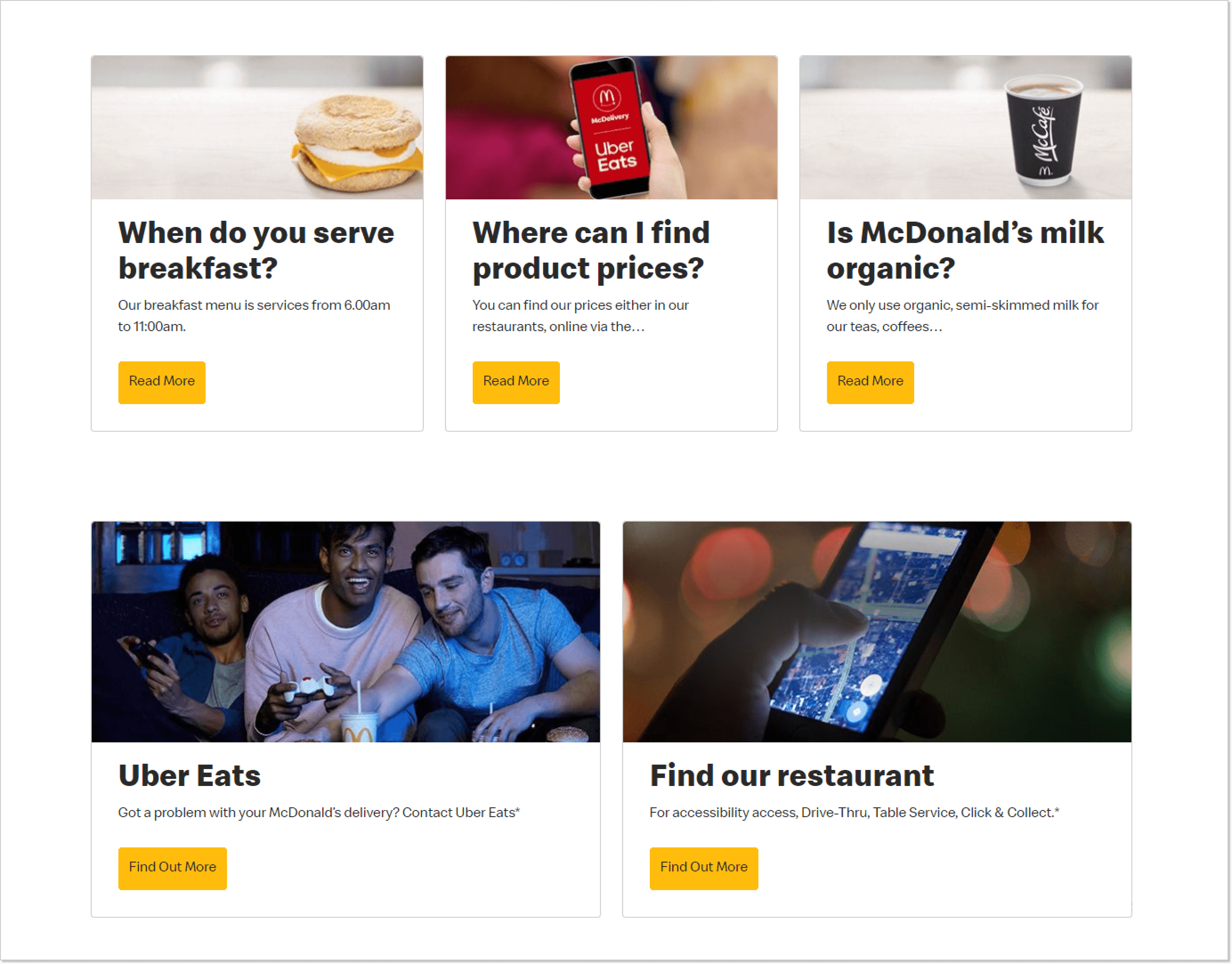
McDonald’s is known for not taking online orders on its website. The company partners with relevant services to organize delivery. This imposes certain restrictions on the site and, at the same time, dictates its mission to be exclusively an information center, opposite to the majority of interactive knowledge bases.
Therefore, it can be said that their entire site is a type of knowledge base. Behind each menu item is a story about one or another aspect of doing business, ingredients and nutritional value of popular products, etc. This is a very convenient model for knowledge management and informing customers of certain types of businesses.
They also have a separate help center section on the same website, where they collect popular questions about breakfast, delivery, etc. Each question is illustrated with a picture, and at the same time, it all looks minimalistic. You don’t have to graduate from design school to make an imposing internal knowledge base.
12. Buffer
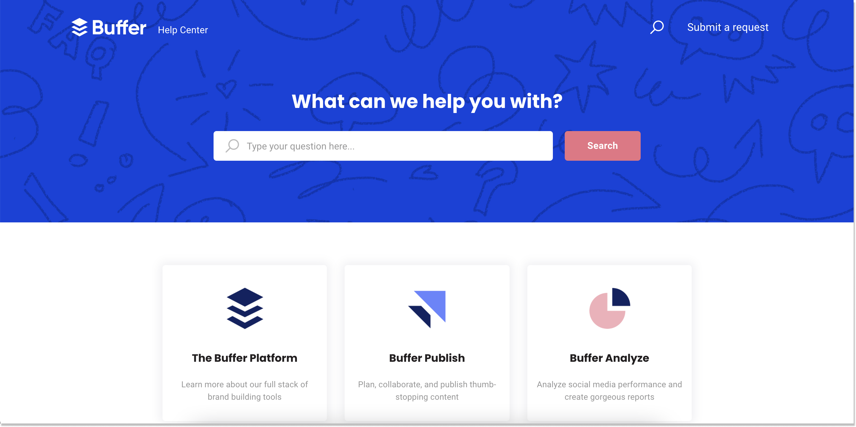
The help center sample from Buffer doesn’t seem much when you first open it and looks like the most interactive knowledge bases. However, this social network tool managed to do more with less.
Buffer has the search bar contrasting with this deep blue color. So, it’s hard not to catch it. The company gains the upper hand by writing articles in a simple and easy-to-search manner. Each topic is covered from A to Z and contains video tutorials, additional tips, and a satisfaction survey at the end.
The three core categories (the Buffer Platform, Buffer Publish, and Buffer Analyze) streamline the relevant content. You won’t have a mishmash in your head from the get-go.
So, what is the building line here? The usage of gifs and video libraries. And as you know, an image is worth a thousand words. Use knowledge base software that allows adding multimedia content. It will help you guide your user base through topics by actually showing them how to do this and that and making their experience easier.
13. Explain Ninja
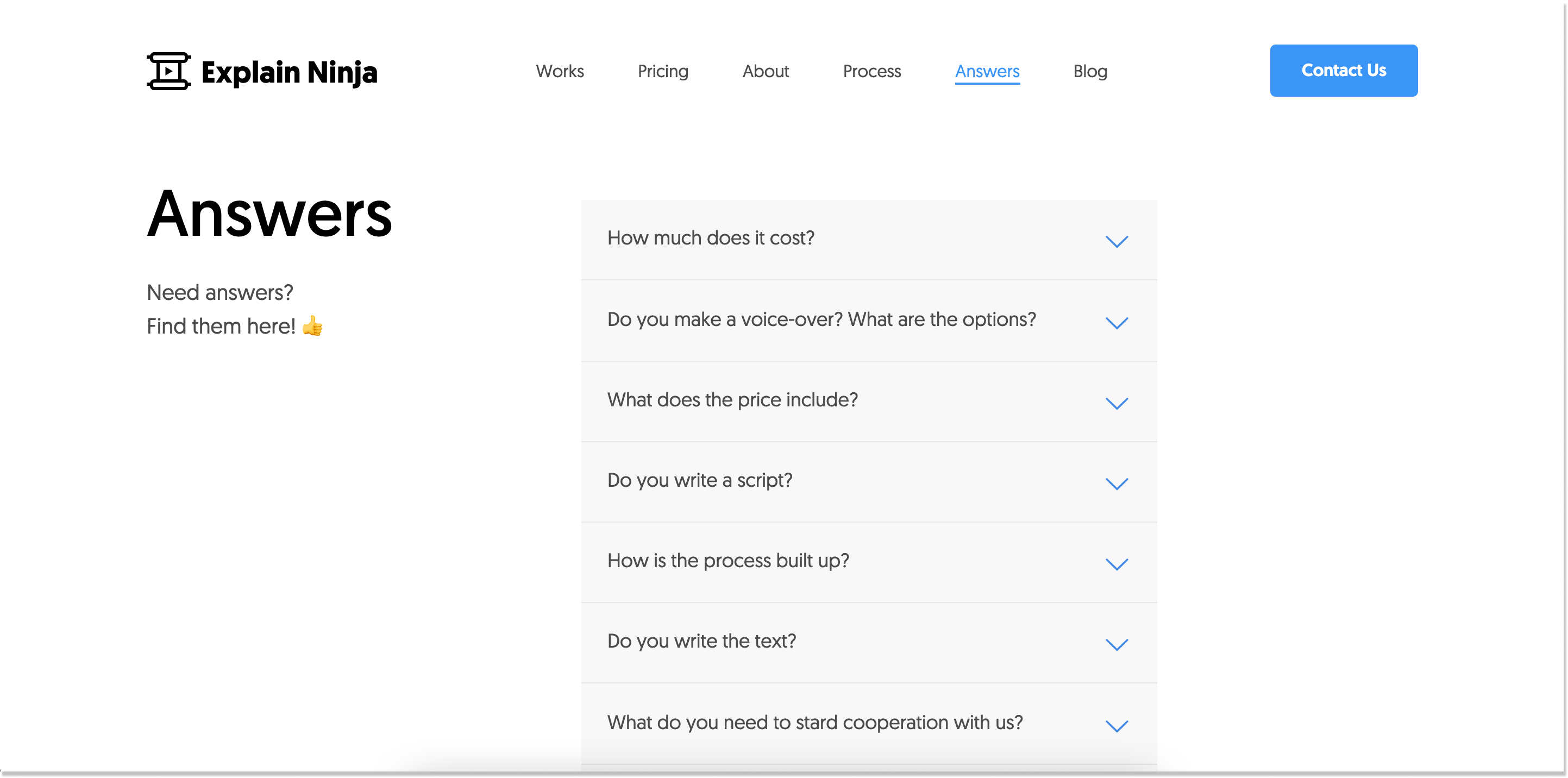
Let’s continue our list of interactive knowledge bases with the example from Explain Ninja. This is what I call less is more.
Its help center’s plain structure distinguishes this animated explainer video production company. They call it “Answers.” An inspirational phrase, “Need answers? Find them here!” fits ideally into the neat concept.
No images, no video, just Q&A with short paragraphs. Maybe, this is for the better. I would say that this option could come in handy for small companies and startups who are just at the dawn of their online presence and don’t have enough content for extensive knowledge bases.
14. Rail Europe
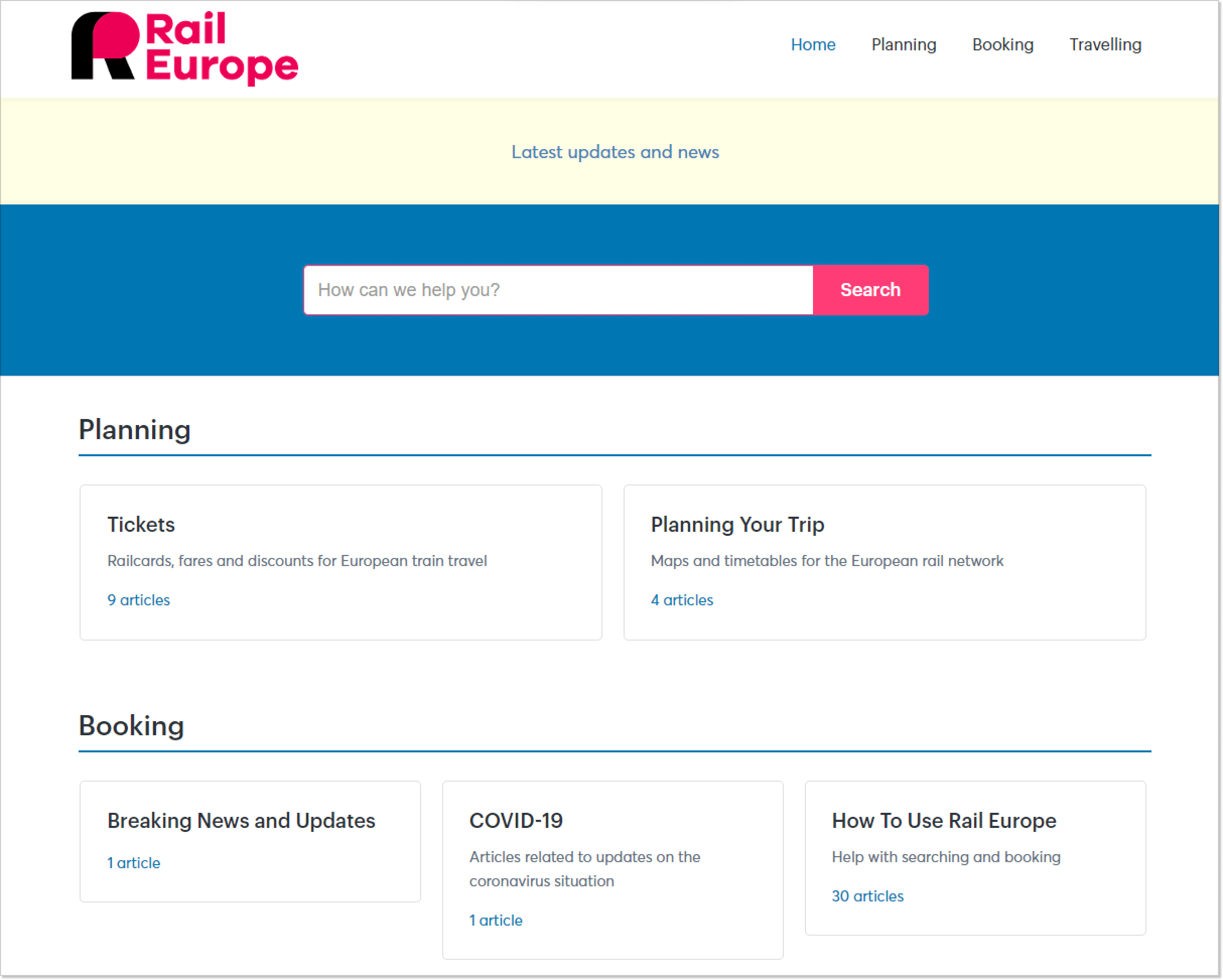
Rail Europe is the app that helps folks plan and manage their train journeys in Europe. Trains are super popular in Europe, and people use them constantly. But using trains can sometimes be a bit of a challenge. People might get all frazzled, confused, and even lost while waiting around at a train station. That’s why Rail Europe’s entire knowledge base is designed to tackle common issues that come with train voyages.
This type of knowledge base is tailor-made for where it’s used, not just who’s using it. By having customized content based on a visitor’s location data, things are made a lot easier. Understanding how people approach a process and where they might face difficulties is crucial!
15. Slite
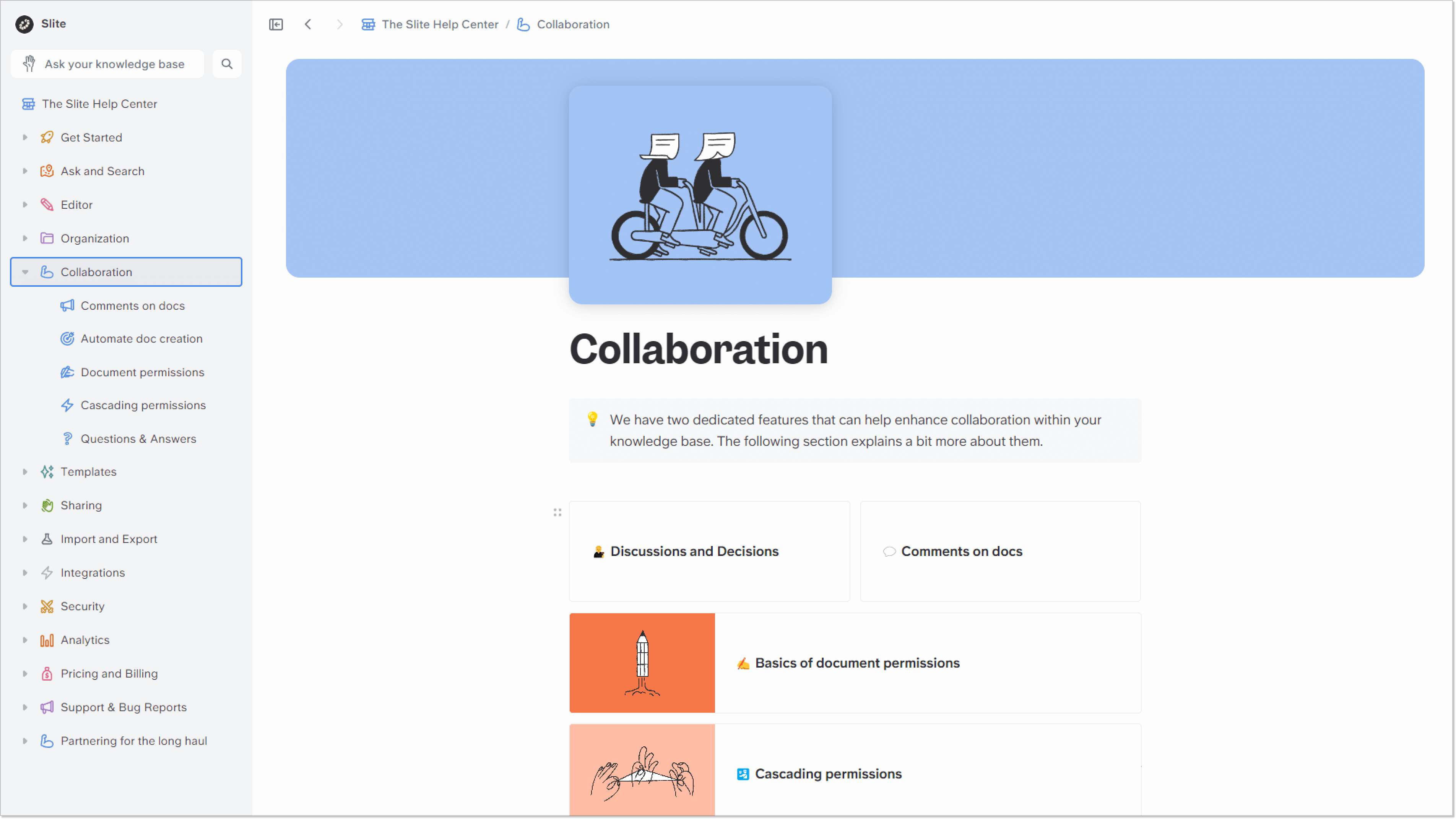
Slite is a SaaS company specializing in knowledge base software, document management, and onboarding. No wonder their personal help center looks so impressive. If you want to keep all your management resources in one place, this example is just what you need for inspiration.
Here you will find literally everything you can about the product. We chose this example for its user-friendliness. Everything is neatly organized, with hyperlinks to additional resources that make every article helpful. The convenient structure and playful graphic design genuinely catch the eye. At the same time, there is also a nice touch of a search bar that does not dominate, leaving room for more content.
16. Wistia
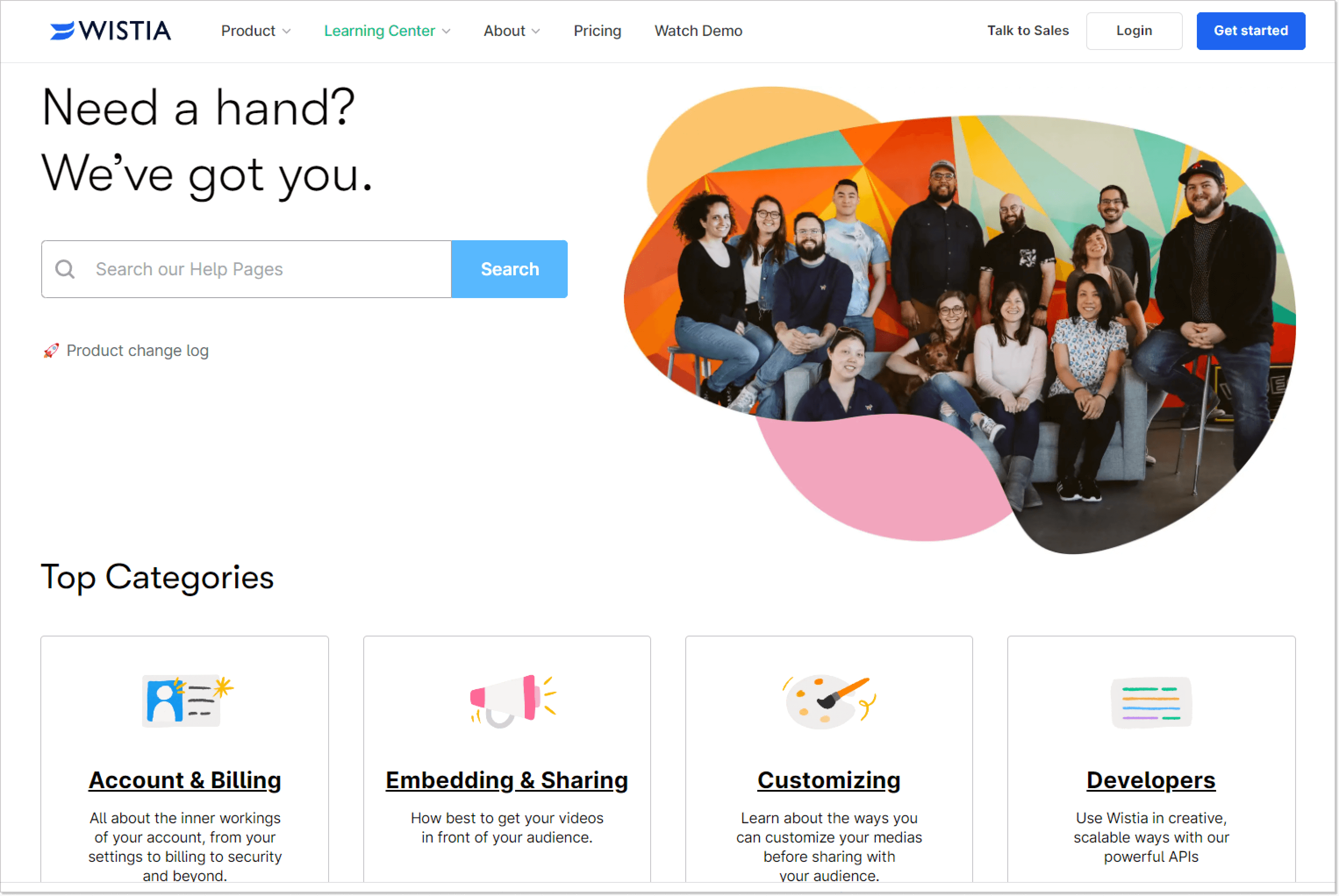
Wistia is a video marketing software that empowers companies to host videos aimed at driving business growth.
The platform features a comprehensive knowledge base with a prominent search bar and a captivating full-color photo of its customer service team. People can easily find what they’re looking for with the top content categories accompanied by colorful icons.
Additionally, the top articles section offers quick answers to common queries, catering to customers in a rush. Within the articles, a table of contents with quick links allows users to navigate directly to the information they need. The knowledge base content layout utilizes white space effectively, ensuring easy skimming to locate the most relevant information.
Analysis and insights from the inspirational examples
A bunch of examples is certainly good, but let’s summarize. What did we learn, what common features did we notice, and what techniques will help to create the help center of your dreams?
a. Common themes and trends in knowledge base design
After analyzing these inspirational knowledge base guides, we can identify common trends in their design:
- User-focused layout: Companies prioritize customer experience with clear categories, easy navigation, and a search function.
- Visual appeal: Many examples use eye-catching visuals like illustrations and icons to enhance the content and make knowledge resources visually appealing.
- Personalization: Some types of knowledge bases offer personalized content recommendations based on customer behavior, tailoring the experience for each individual.
- Multimedia integration: Successful knowledge resources use various media, like videos and interactive elements, to explain complex topics effectively.
b. Key features and strategies to consider
Next, let’s list what you can do to make your help center popular and effective as well. Companies from the examples above follow these key features and strategies:
- Robust search functionality: Include a powerful knowledge base search engine with auto-suggestions and filters for quick information retrieval.
- Clear and concise content: People visit the knowledge base to solve their problems, not to read a story. Provide straightforward answers to common questions without using confusing technical jargon.
- Visual support: Ensure your internal knowledge base software allows you to enhance the help center with visuals, guides, infographics, and interactive tutorials to accommodate various learning styles.
- Proactive content updates: Regularly review and update your content to stay accurate and relevant to product or service changes.
- Customer feedback integration: Allow visitors to give feedback on article usefulness, helping you identify areas for improvement and content gaps.
c. Lessons learned for optimizing your own knowledge base
And, of course, optimization, or a constant process of improvement, without which neither the business as a whole nor individual tools will survive for long.
- Prioritize simplicity: Keep it simple and easy to navigate, avoiding clutter and overwhelming people with too much information. No one likes extensive knowledge bases.
- Empower self-help: Structure it to comprehensively address common queries, encouraging customers to find answers on their own.
- Analyze behavior: Use analytics to track interactions, identify popular articles, and address frequent support needs.
- Embrace continual improvement: Treat it as a dynamic resource, continuously updating and refining content to meet changing customer needs.
Final words
If you want to improve customer satisfaction and retention, make your resource center well-structured, insightful, skimmable, and rich. Educate your clients on common issues at their own pace, encouraging self-service.
Even though all the designs we covered here are different, they have something in common: categorization, easy-to-see search bars, and the lack of cumbersome text. Just create an accessible place where your clients can find the solution 24/7. Speaking of, HelpCrunch’s internal knowledge base software can help you create a resource hub for your clients’ dreams. Create a free account and build your stellar help center using the examples discussed here.

