How to Create an FAQ Page: Inspiring Examples and Tips
Create an FAQ page to help customers find the answers (we explain how!).
Written by Olesia Melnichenko

Out of all customers, 70% utilize self-service channels during their issue resolution journey. But sadly, only 9% completely resolve their problems through these channels.
In other words, searching for answers about a product is integral to the customer experience. But how pleasant or negative this experience is depends on the quality of an FAQ page.
This post won’t debate whether you need an FAQ page. Instead, we will see how to make it as effective and useful for customers as possible. First, let’s discuss practices of creating FAQ and then focus on real-world examples.
Why is an FAQ page so important?
As I have already stressed, most customers try to find answers themselves before contacting support. Therefore, consider an FAQ page as an extension of your customer service efforts.
In this regard, the knowledge base definition suggests that it is a more profound and detailed resource, while FAQs are brief and concise (but not always!). And yet, the latter can significantly improve user experience and increase satisfaction with your brand.
- Increase product adoption: FAQs address practical questions from customers who have already bought or are considering your product.
- Enhance trust in your business: By providing answers, you establish yourself as an expert in the field, earning customers’ trust and appreciation for your helpful information.
- Improve SEO: Well-crafted FAQ pages can drive more traffic to your website as they appear in search results, boosting your SEO efforts.
But first, you must create compelling and valuable FAQs to enjoy these benefits. So let’s get to practical tips about how to build an FAQ page.
How to create an FAQ page
Before I jump into the details of creating FAQ content, one piece of advice: most probably, your knowledge base tool supports creating FAQs, too. Use it to ensure uniformity, consistency, and common management of your self-service resources. Now, let’s start.
1. Watch for the most frequent questions
To create an FAQ page, start by making a list of the most common questions customers have about your products or services. But where exactly to get them?
- Customer support channels. Review customer service records like emails, phone calls, support tickets, and social media comments to create useful FAQs. Then, consult with your support team to identify common questions they frequently address.
- Competitors’ websites. You can get ideas from your competitors’ FAQ pages to address similar questions your customers might have.
- Keywords from outside resources. You can gather valuable insights by analyzing search trends on popular platforms like Google, Quora, and Reddit. Tools like Google Trends can assist in understanding what people are searching for.
Some inquiries may inspire more detailed content, such as blog posts or help center articles (check these examples of a knowledge base to see what may be included).
2. Organize questions in categories
When creating an FAQ page, prioritize easy navigation and intuitiveness. Make it easier for customers to find the specific information they need without going through a lengthy list of unrelated questions.
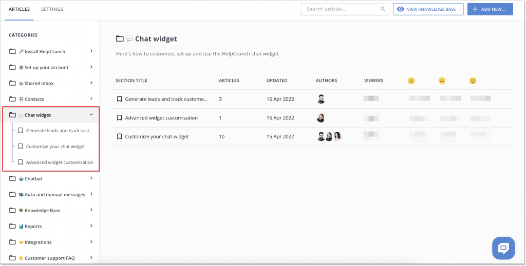
For instance, you can group your questions and answers into categories or themes, such as “Payments” or “Refunds.” Then, in designing your FAQ page, you can mirror the category structure you adopted for your knowledge base. Many tools, such as HelpCrunch’s knowledge base tool, support grouping articles into categories to facilitate browsing.
3. Include important company information
Of course, you should include essential information within the FAQ section to prevent an influx of support requests. But we also already mentioned that you can make your Frequently Asked Questions an easily understandable knowledge base with key facts in a clear and concise format. You can even use a knowledge base document template to maintain content consistency.
- Payment and delivery terms. This information is always necessary. Even if you have it somewhere else, such as a menu item on the main page, repeating it as an FAQ won’t hurt.
- Product differences and choosing guidelines. It may be a good idea to explain how your pricing plans differ from each other and what may be the typical use cases for each of them.
- Company facts and values. You can use the FAQ page to educate customers about your business. Here, you can include things customers did not ask for but may be interested to know, such as the company history, manifested values, fun facts, and trivia.
4. Make answers clear and concise
Show your expertise without overwhelming your audience. Instead, write questions from the customer’s perspective and answer them from your business’s point of view, providing relevant and concise information.
There is no secret about how the text must look exactly, and each business has its unique FAQ page that caters to its specific needs and requirements. But if you really want to learn how to craft a good FAQ page, here are some more tips:
- Provide complete answers: Ensure your FAQ page includes all the necessary details, and use images and media to enhance your answers.
- Avoid excessive linking: Instead of redirecting users to other pages, answer their questions directly. For example, if someone asks about delivery terms, respond clearly without making them click elsewhere.
- Use concise “Yes” and “No” answers: Since FAQ pages are often skimmed, start your responses with a straightforward “Yes” or “No” to quickly address the question and help users find what they need.
5. Optimize your FAQ page for SEO
Instead of treating an FAQ section as a standalone page with a basic Q&A format, enhance its content with internal linking. For instance, include links to relevant sources within your site, like blog posts, to attract more visitors to other pages. Also, make it more search-friendly and improve SEO by including related keywords.
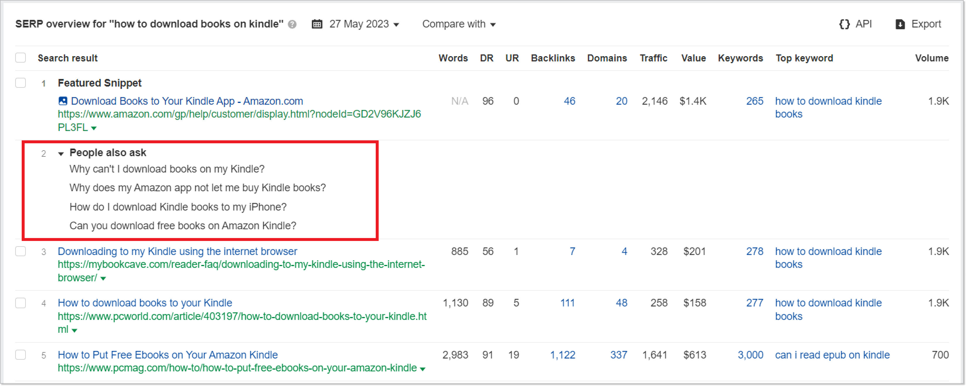
If you use Ahrefs or similar tools for keyword research, pay attention to the People also ask section. There you can find what other questions you can add to the page.
Ensuring the content is unique and original when creating your FAQ with SEO purposes in mind is vital. Avoid duplicating information that search engines dislike. Instead of copying paragraphs from other sections of your website, consider rewriting the content or linking to pages with more detailed information.
6. Monitor the performance and update your FAQ page
Any self-service resource is practical only when people find it useful. To determine whether your FAQ page serves its purpose, you must monitor its performance constantly. To get a complete picture, measure your page performance using different techniques:
- Review support logs to determine if the frequency of questions related to your FAQ has decreased. If you still receive inquiries on the same topic, your FAQ may need adjustments to make it more visible and user-friendly.
- Utilize analytical tools like Google Analytics to gather data on your webpage’s performance. Analyze metrics, logs, and reports to identify areas for improvement; connecting Google Analytics to Google Sheets can ease this process.
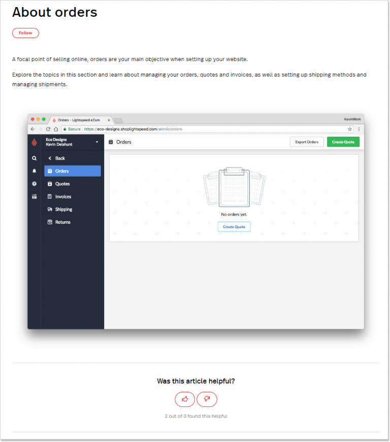
- Conduct customer surveys by adding a rating widget to your FAQ page. Ask customers to rate the usefulness of each article to identify which ones require revision.
For example, this approach was successfully implemented by Lightspeed eCommerce to evaluate their FAQ page performance.
This information should form the basis for regular updates to your FAQ page. Also, add new questions whenever your business accepts new products/services or futures.
Now that we know the basics of how to make an FAQ page let’s look at examples of what your page should look like.
10 inspiring examples to help you make a good FAQ page
1. Pinterest
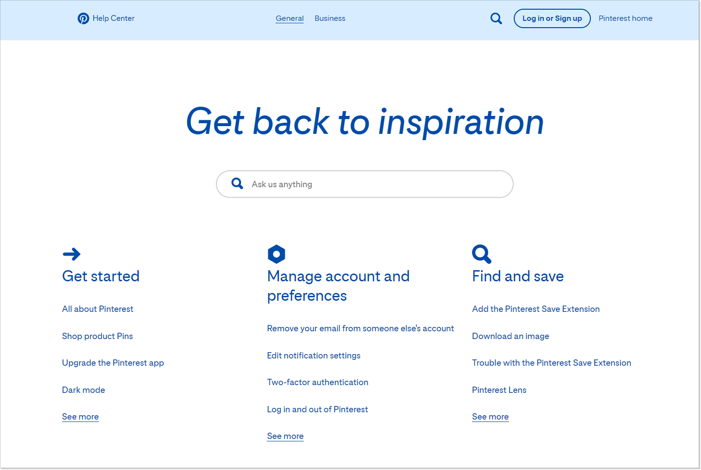
Pinterest’s Help Center exemplifies simplicity in design as the main reference point. Also, it’s obvious that the team prioritized mobile users with a design that combines visual and textual cues, emphasizing function over form. This example demonstrates the importance of placing user needs at the forefront of FAQ resources.
2. IKEA
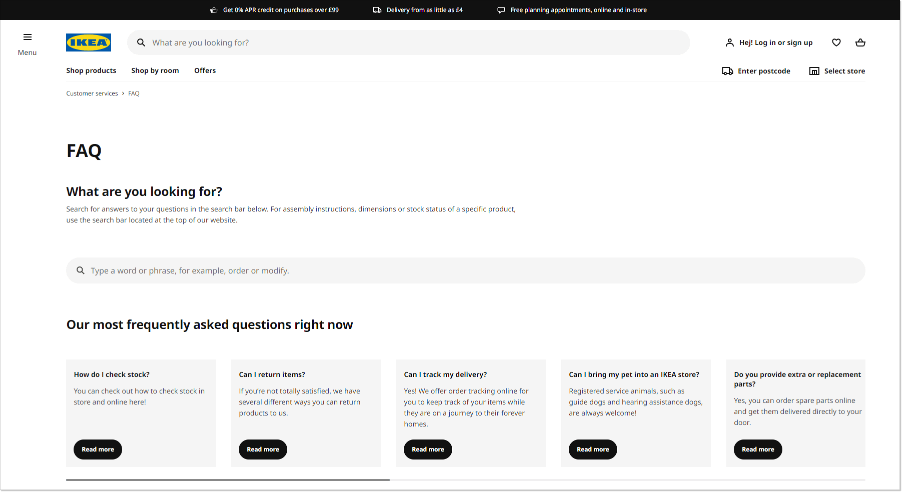
IKEA’s FAQ page keeps it as simple as it can be. There is a search bar to find what you need quickly, followed by common questions and laconic buttons for quick answers. If you want more details, there’s a link for additional information. The critical takeaway is to offer essential information with effortless navigation.
3. YouTube
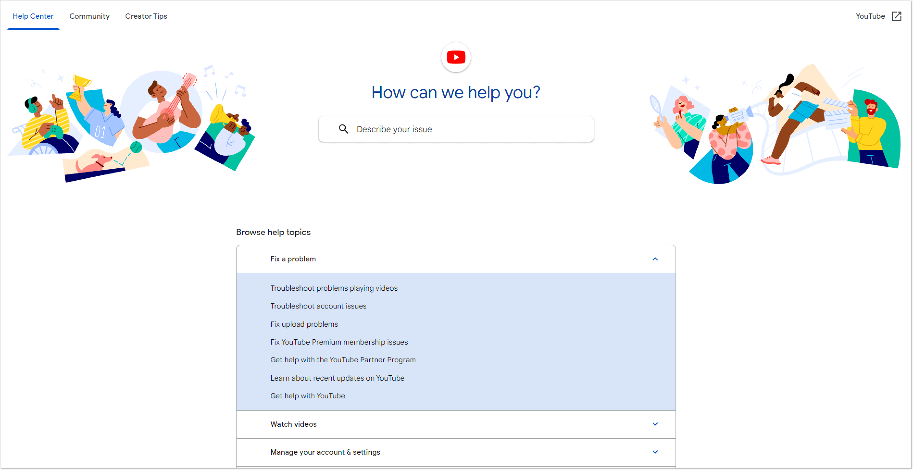
YouTube’s FAQ page is designed with a clean and fresh layout that is easy to navigate, offering access to commonly asked “help” topics. The page effectively combines video and visual content with standard text to enhance content delivery. The importance of utilizing a mix of content types in FAQ pages is often underestimated.
4. Apple
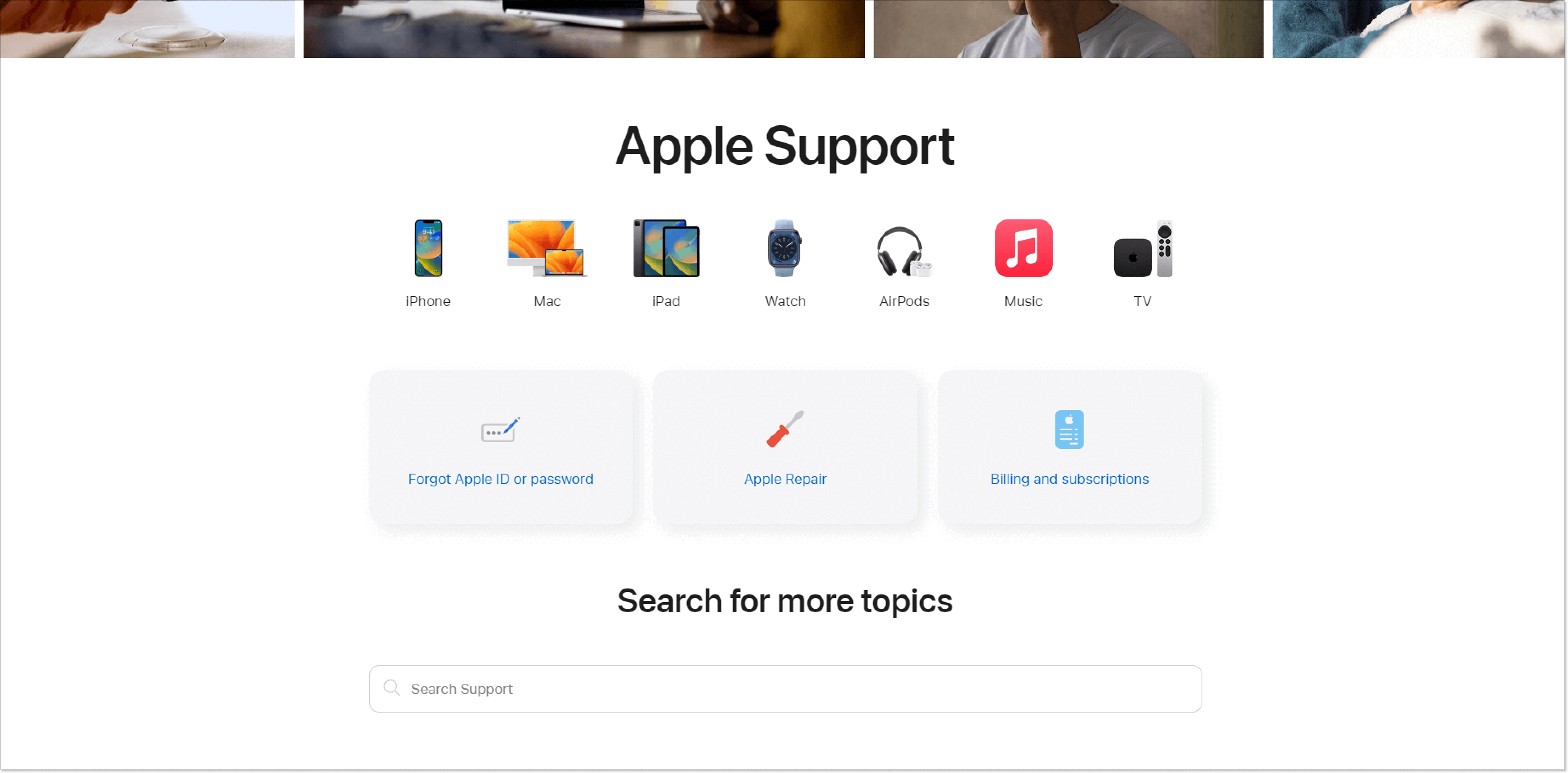
Apple’s FAQ page demonstrates how to create audience-focused content by using clickable product icons instead of text links. Users can easily select the product they are interested in and find relevant questions. The page also highlights common user issues and includes a search bar. The lesson is that you can use different types of content to enhance customer experience.
5. eBay
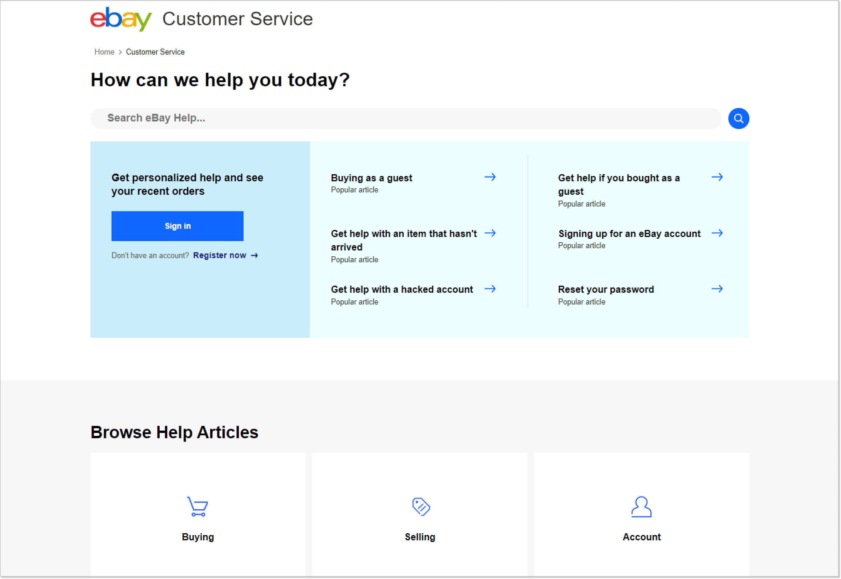
Ebay’s FAQ page is well-organized, neat, and easy to navigate, with links to detailed articles that offer step-by-step solutions. It connects users to a comprehensive knowledge base for more specific inquiries. The lesson is to allow users to explore other related pages on the website easily and give them more space and knowledge if needed.
6. Netflix
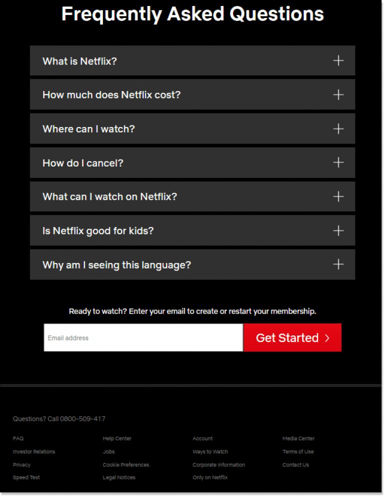
The whole idea of FAQs is to provide help quickly; thus, placing them prominently and making them intuitively recognizable is essential. Take Netflix, for example, where the FAQ link is readily available on the home page, and popular questions are even displayed, allowing visitors to navigate to the FAQ page without delay.
7. Kleenex
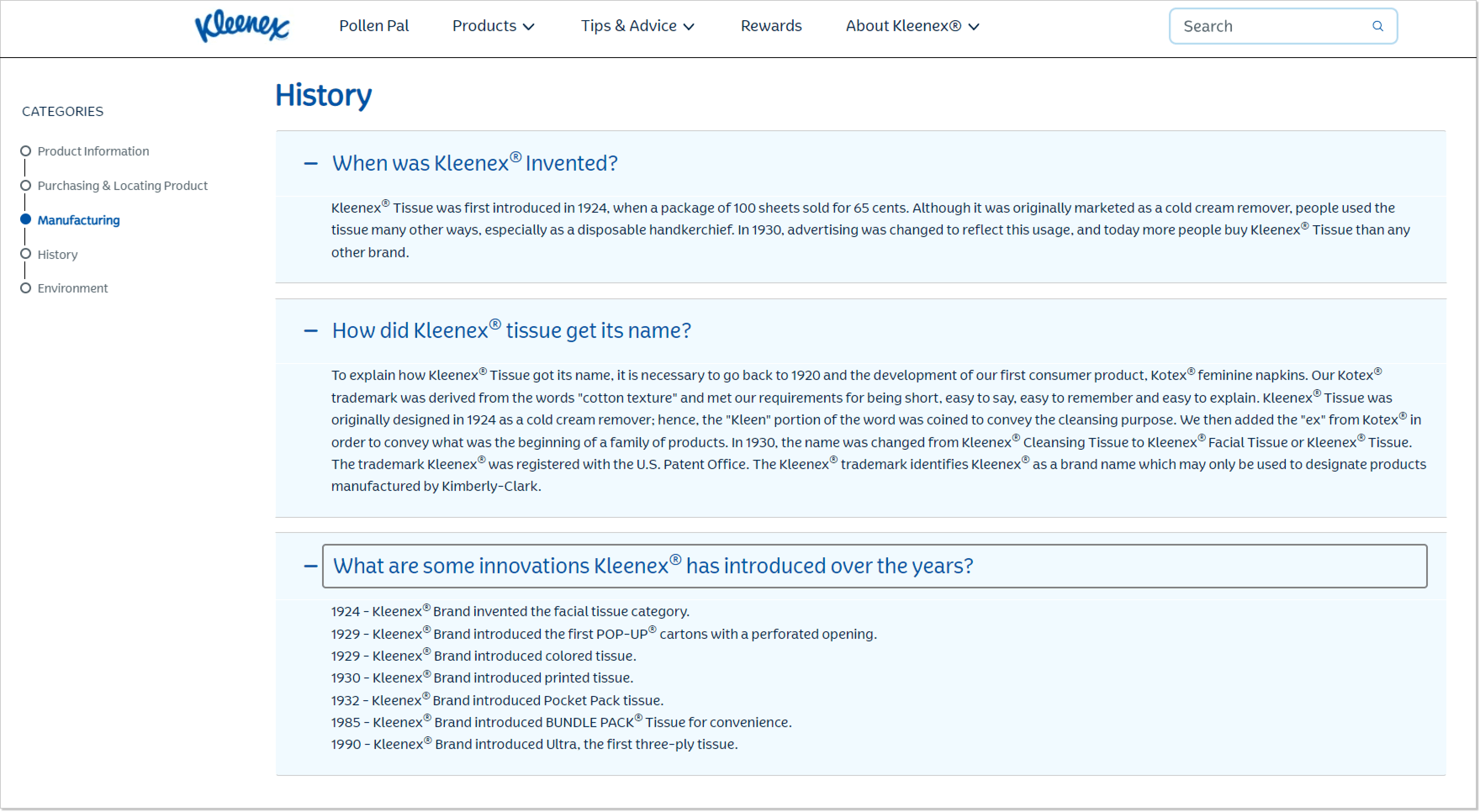
The FAQ page is an excellent opportunity to share values and interesting facts about your company with customers. Take inspiration from Kleenex’s FAQ page, where they share the story of how Kleenex tissue was invented and highlight their innovative practices. The lesson is that you can go beyond just answering questions and include information like company history, core values, fun facts, and trivia to engage and educate customers.
8. Wizz Air
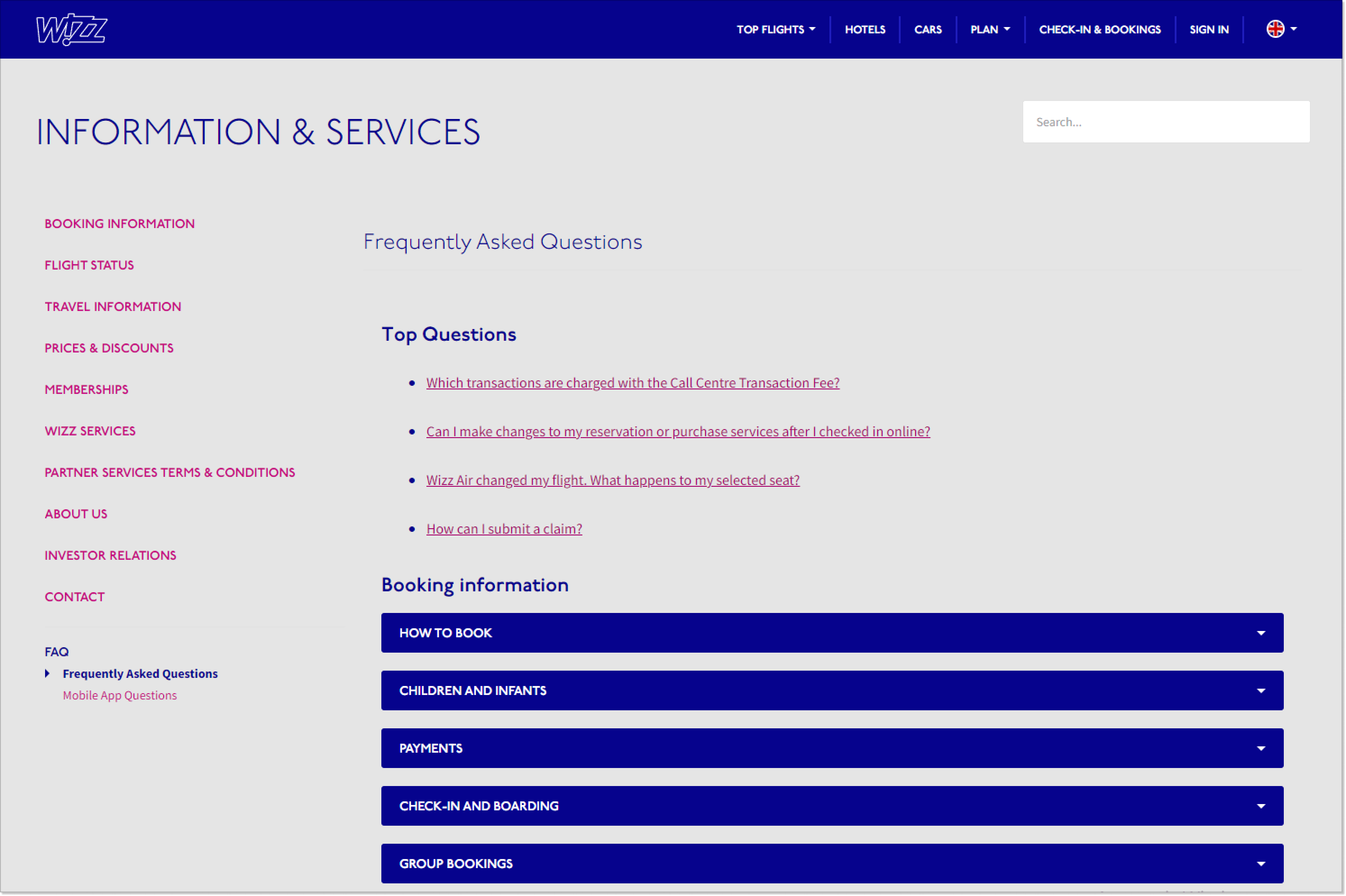
It’s already apparent that categories help find information quickly and see related topics, providing a comprehensive understanding of the product, service, and policy. Look at Wizz Air’s FAQ page, for example, where questions are grouped under headings like bookings, travel information, and pricing, making navigation more straightforward.
9. Microsoft 365
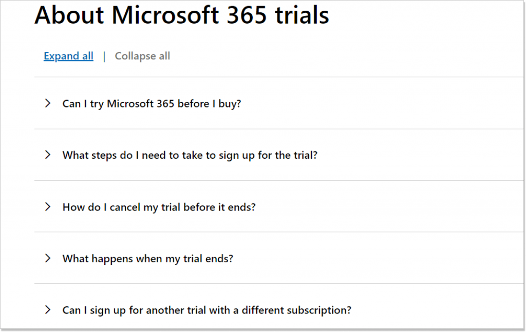
When creating questions for your customers, use language that reflects how they would phrase their search queries, using words like “I” and “my.” For example, rather than asking, “How to terminate my contract obligations?” you can ask, “How to cancel my subscription?” Take a look at Microsoft 365’s FAQ page as an example, where the questions are user-centric, making them clear and easily searchable.
10. Ahrefs
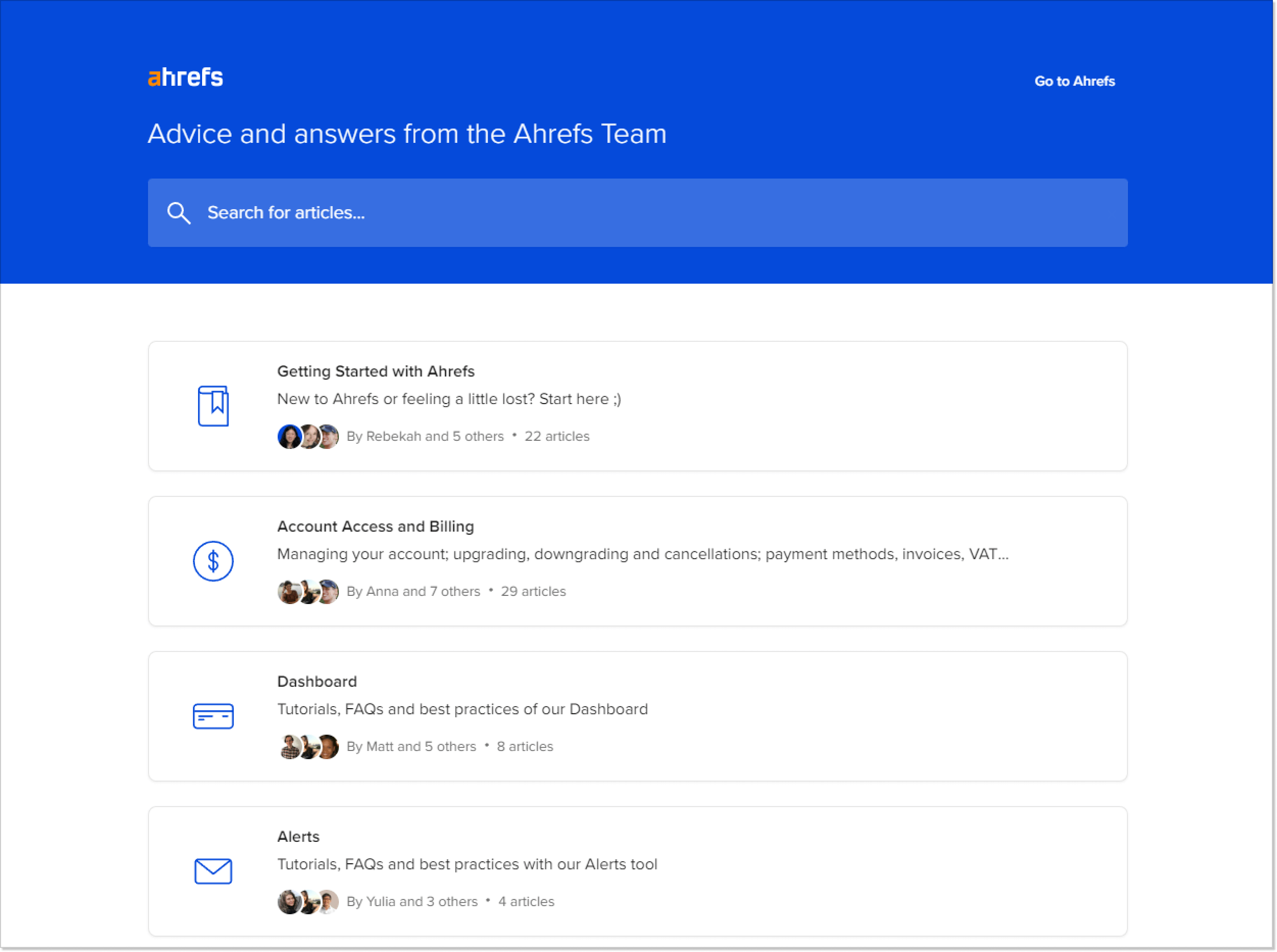
Ahrefs has a very detailed FAQ page and a help center covering various aspects of its SEO platform for website traffic and health. As such, the FAQ page answers frequently asked questions and offers a comprehensive database of the many features and services. In addition, this resource allows users to find information independently and helps Ahrefs capture relevant long-tail keywords through how-to articles.
As you noticed, there’s no one-size-fits-all approach. The general rule is to do what suits your brand, products, and audience best. But you may also have noticed a few common trends that help create FAQ page, which significantly enhances customer experience and loyalty.
Let’s wrap it up
Building a good FAQ base is a challenging task. You might find that being brief and concise may be more difficult than being detailed and verbose. Still, an FAQ is a necessary component of your customer service strategy. I hope this post gave you some actionable ideas for creating an outstanding FAQ page.
In addition, let us know if you want to know more about how our product can help you enhance customer experience and benefit your business.

