10 Brilliant Self-Service Portal Examples You’ll Want to Follow
Looking for a nifty self-service portal example? These 10 solutions will inspire you.
Written by Olesia Melnichenko

Welcome to the world of self-service, where customers *insert THE word* and technology is queen! Today, consumers always crave instant gratification and convenience. Dedicated online portals are just the thing to meet those needs.
From banking to healthcare and ecommerce to education and SaaS platforms – such resource centers come in a variety of sizes and shapes. So when a client scours a company’s website for support (troubleshooting an issue, making a purchase, accessing any information), the odds are they will be mesmerized by a well-structured, intuitive, and content-rich portal.
In this article, we’ll be exploring some of the best self-service portal examples from different industries, and how they’re revolutionizing the way we interact with businesses. So sit back, relax, and get ready to discover how these digital portals are changing the game for customer service! 🤩
What is a self-service portal?
A self-service portal is a specially built place for customers where they can handle their company-related questions without waiting for a support rep’s answer. It can take many forms: from a tried-and-tested knowledge base to a community forum to an FAQ section and even a smart chatbot.
You can think of this self-service software portal as a full-out hub where clients can easily:
- Check their account information;
- Alter this information in any way and update it;
- Scour for product or service details;
- Discuss burning issues with other customers (if it’s a forum);
- See request backlogs.
3 must-have self-service portal traits
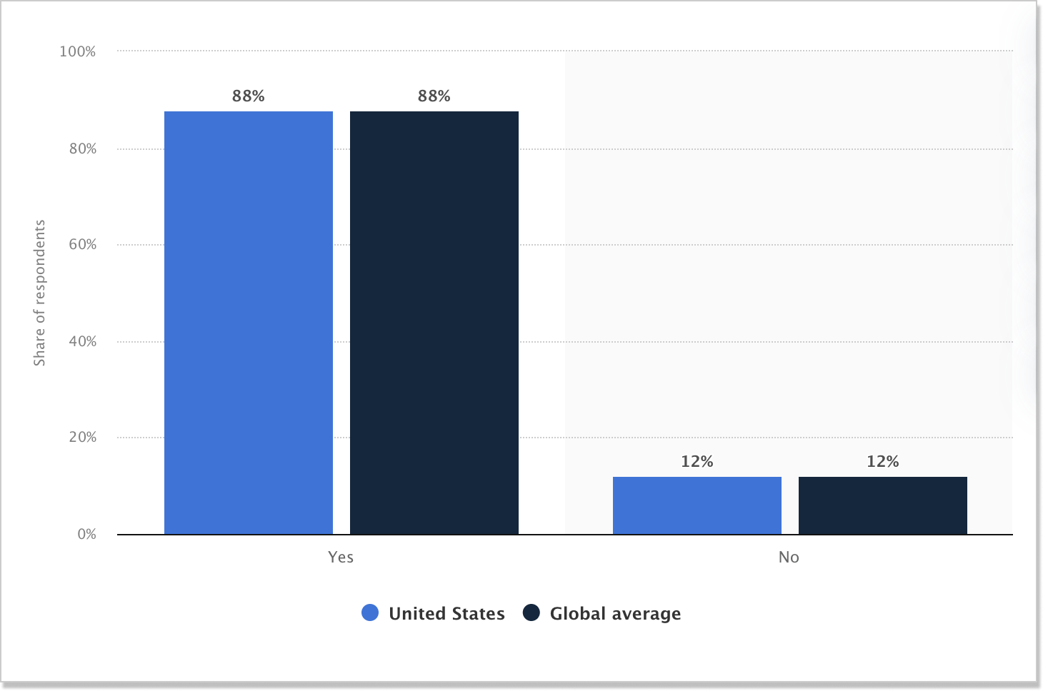
As the statistics say, 88% of clients would rather a company offer a self-service portal. So why don’t you have one for your brand and see how your client base will react?
Before we proceed with customer support tools, let’s have a quick look at the key qualities such a resource should obtain:
Decluttered interface
Imagine walking into a cluttered and disorganized store, with items scattered everywhere and no clear direction to find what you need. It’s overwhelming, frustrating, and makes you want to turn around and leave. The same concept applies to a self-service portal for customers.
If the interface is cluttered and confusing, customers will become frustrated and may abandon their task altogether. Providing a user-intuitive UI not only enhances the user experience but also promotes customer loyalty and satisfaction.
Plus, a clean and easy-to-use portal ensures that customers can easily find what they’re looking for, quickly complete their requests on their own, and leave feeling confident and delighted. So use complementing colors, fonts, icons, and other visual elements on the self-service page. This way, you make it only easier for users to successfully find what they are looking for.
Fresh and replete content
Picture a well-maintained garden. Just like the garden needs constant watering and pruning, so does a self-service resource hub that your customers leverage. Only it should refreshment and updated content to keep being useful.
Besides, you brush up on your self-service content not solely for users. Google can feel that too! That is why you should remove outdated articles and other materials from your resource hub to back up the SEO aspect.
Easy support, easy location
55% of users claim that using self-service portals is difficult. Finding a self-service home base should be frustrating. I mean, it’s not a grocery store with endless isles and confusing labels. Just take all the guesswork out of the process and locating your help hub will be like finding a needle in a haystack – a little victory.
By making your portal easy to locate, you avoid confusion, depressing behavior, and hassle. So do not bury it under layers of log-ins and menus – it’s not a maze and your customer are not going through a quest.
10 self-service portal examples to wield in your business
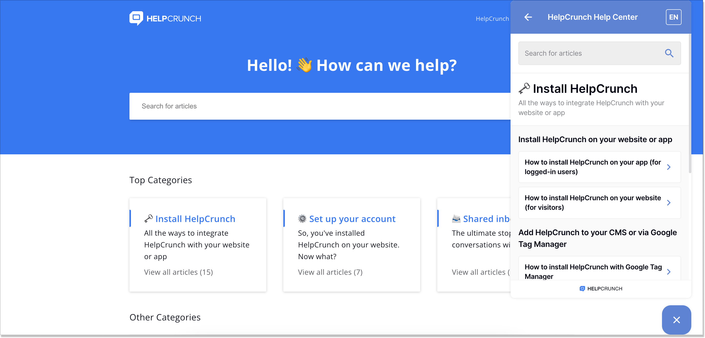
1. HelpCrunch
The first in line is HelpCrunch – a full-circle customer service platform that does cover all your business needs (you may not realize it just yet but take my word for it). Its self-service portal example takes the very classic sense of the word: the company offers a knowledge base integrated into the chat widget.
HelpCrunch’s client portal is all about user-friendliness and high performance. You could actually see what I am talking about at the editing and creation stage. The knowledge base is:
- Multilingual! – that’s right, now you can be on the same wavelength with your audience and speak the same languages for better connection and context;
- Fully customizable – change the color scheme so that your help center matches your brand’s identity, add visual elements, use CSS or JavaScript, and integrate it with a chat widget;
- Available 24/7 – even if your team is sound asleep, the knowledge base can assist them on any device;
- SEO-optimized – specify meta content for articles so that customers can find what they are looking for;
- Well-structured – enjoy the immaculate structure with categories, subcategories, sections, and articles.
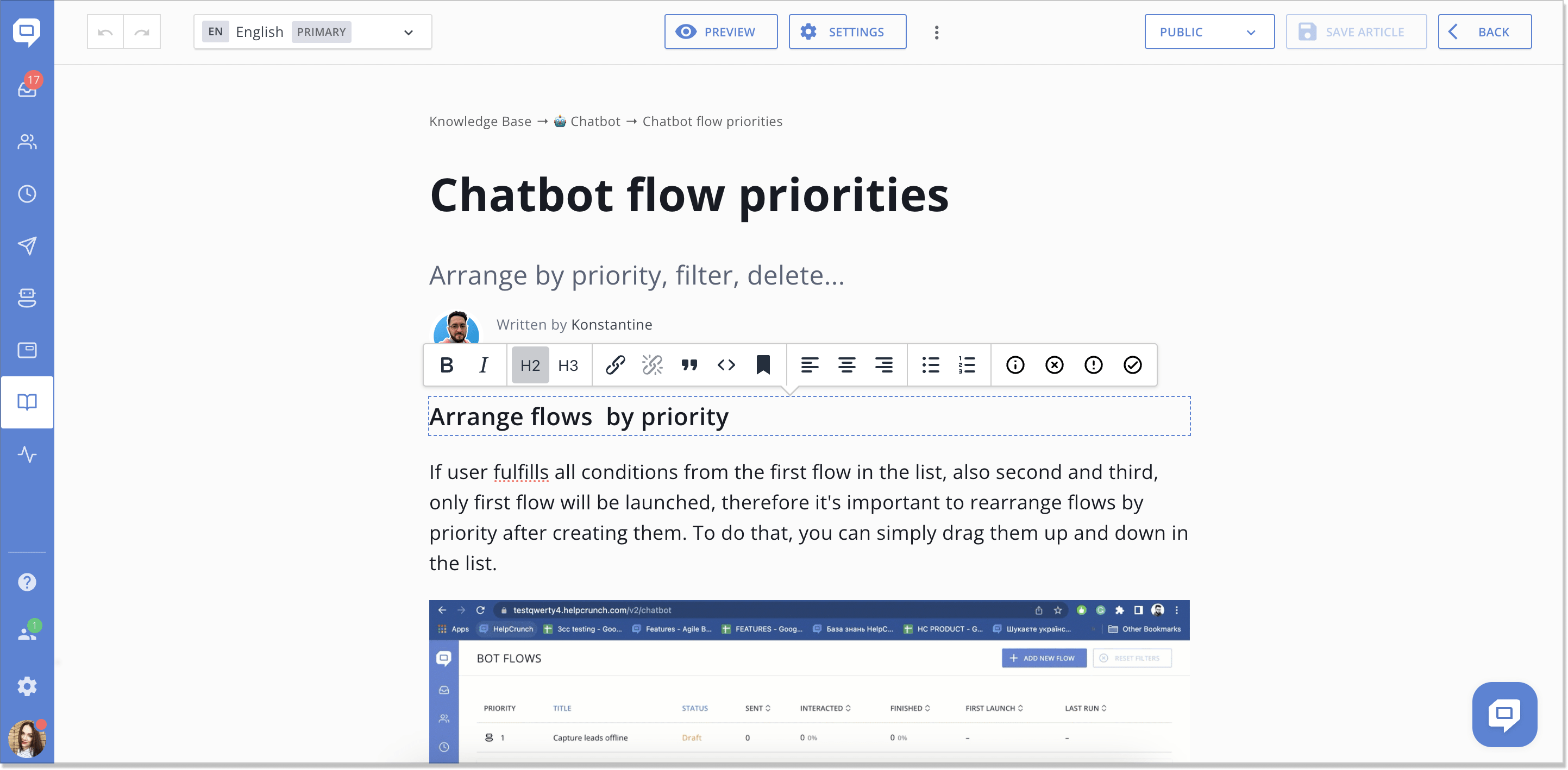
By the way, the multilingual functionality is also available in the HelpCrunch chat widget. All a user needs to do is switch the language pointer at the top right corner of the widget.
This is: a) more convenient for a customer – no need to jump between the tabs any longer, b) time-saving – your customer service can concentrate on the technical pain points and customers won’t wait for their answer:
The HelpCrunch self-service portal example can become a reality for your business and customers! Just register for a free 2-week trial (no strings attached) to give it a proper test ride. Afterward, you can keep using the knowledge base starting from $12/mo. Do not drop this excellent opportunity 😎
2. Grammarly
Grammarly is a cloud-based typing assistant with Ukrainian roots. When I first got familiar with this tool (over 4 years ago), their customer self-service portal was constantly in my sight. So let’s break it down.
A rather stand-out searching panel snaps at you while on the page which is a good thing. As if it nudges you to scour the help hub. What the team behind Grammarly did great is the Featured articles right next to the search field. These are the FAQs customers usually come up with so the logic is understandable.
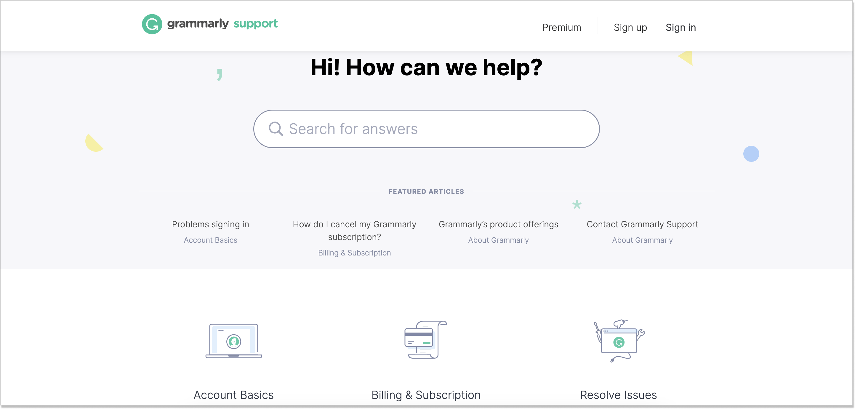
Moving along, you see perfectly composed categories that are in tune with the brand’s colors and overall tone. But this isn’t the only good point that Grammarly can boast about.
As it often happens, a customer can have an answered question after minutes or even hours of searching your self-service portal. For such purposes, Grammarly added the Contact Support link at the top and bottom of the page.
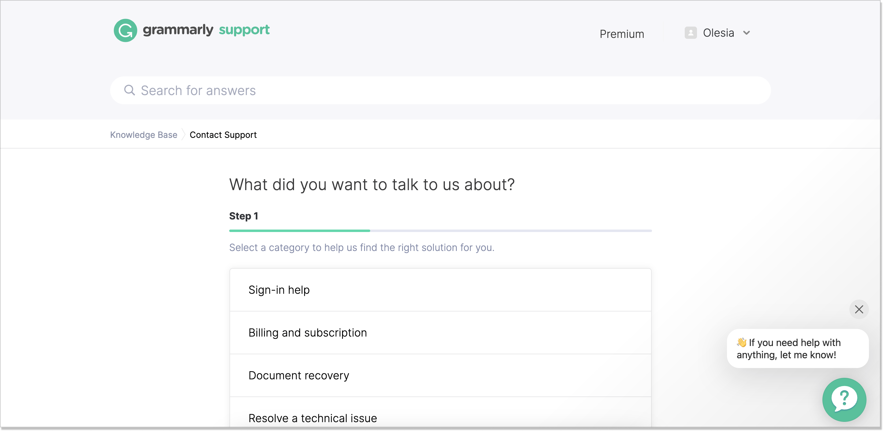
This is a simple 3-step process. You just have to choose a relative category, or topic, and you’ll be offered a solution. If that turns out to be a dead end, you can easily submit a ticket, including a picture of what went wrong and explaining everything in much greater detail. This would be given straight to the team.
👍 The best practices you might want to adopt:
- An in-depth troubleshooting process where you could ask a user for better context
- FAQs written in a simple, straightforward language, with maximum visual support (images, GIFs, screenshots, etc.)
3. Amazon
Amazon – the iconic e-commerce company – knows its way around self-service. When landing on its customer service page, the first thing you notice is the greeting: Welcome to Amazon Customer Service, [your name]. It’s super personalized and already builds an unseen connection between a user and the brand.
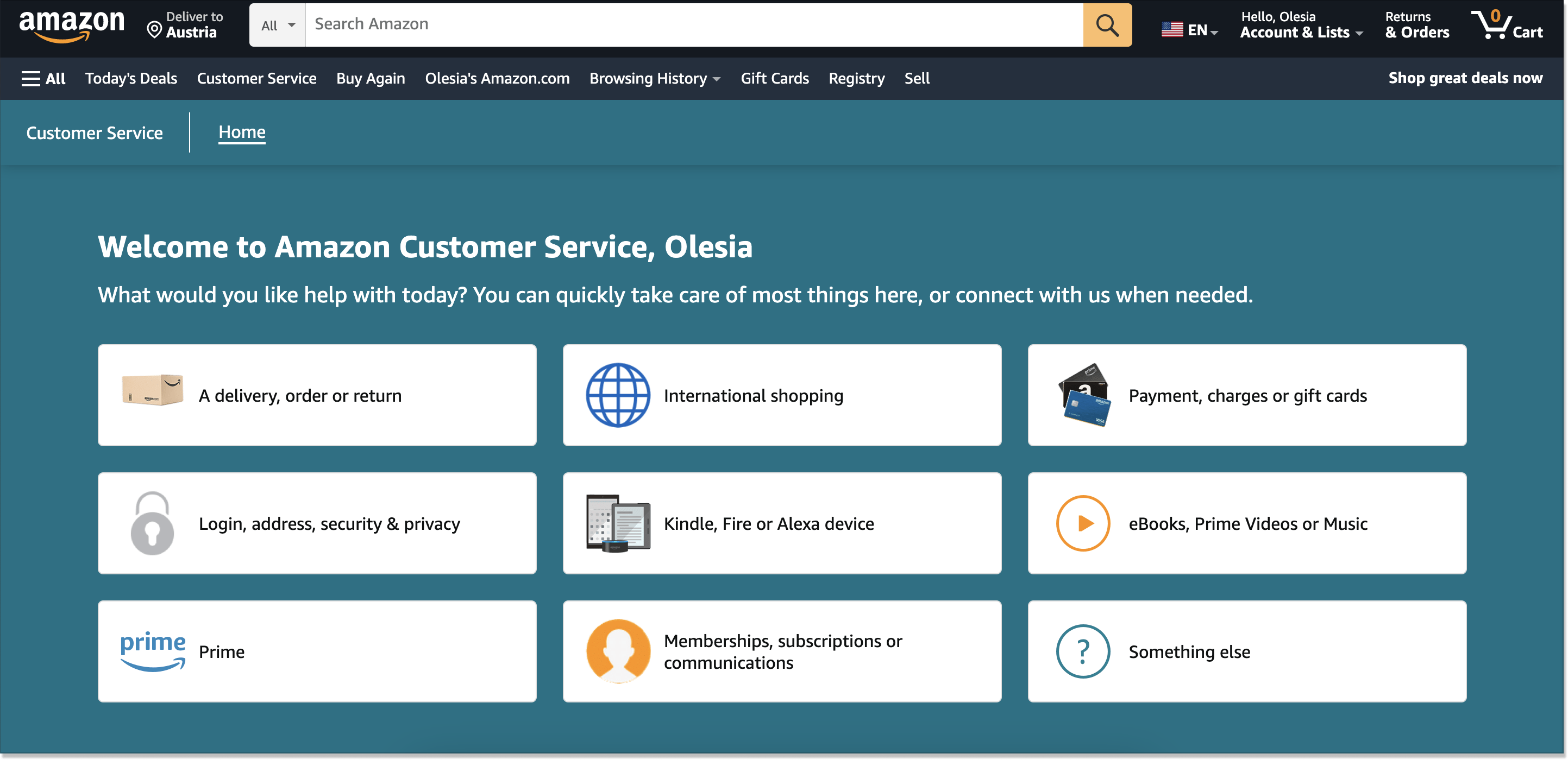
Then, a perfect structure catches your attention. All the info a user might need for troubleshooting is assembled into categories – be it login issues, device troubles, etc. But in my humble opinion, this is not where all the magic happens. Instead, all the beauty of this example starts the moment you hit a category.
Inside, you have a 3-step progress bar helping you get to the answer faster. First, you tell Amazon what kind of assistance you need. Second, you describe what’s going on. And third, you enjoy the solution. Of all the self-service portal examples we break down today, this one shows the most interactivity.
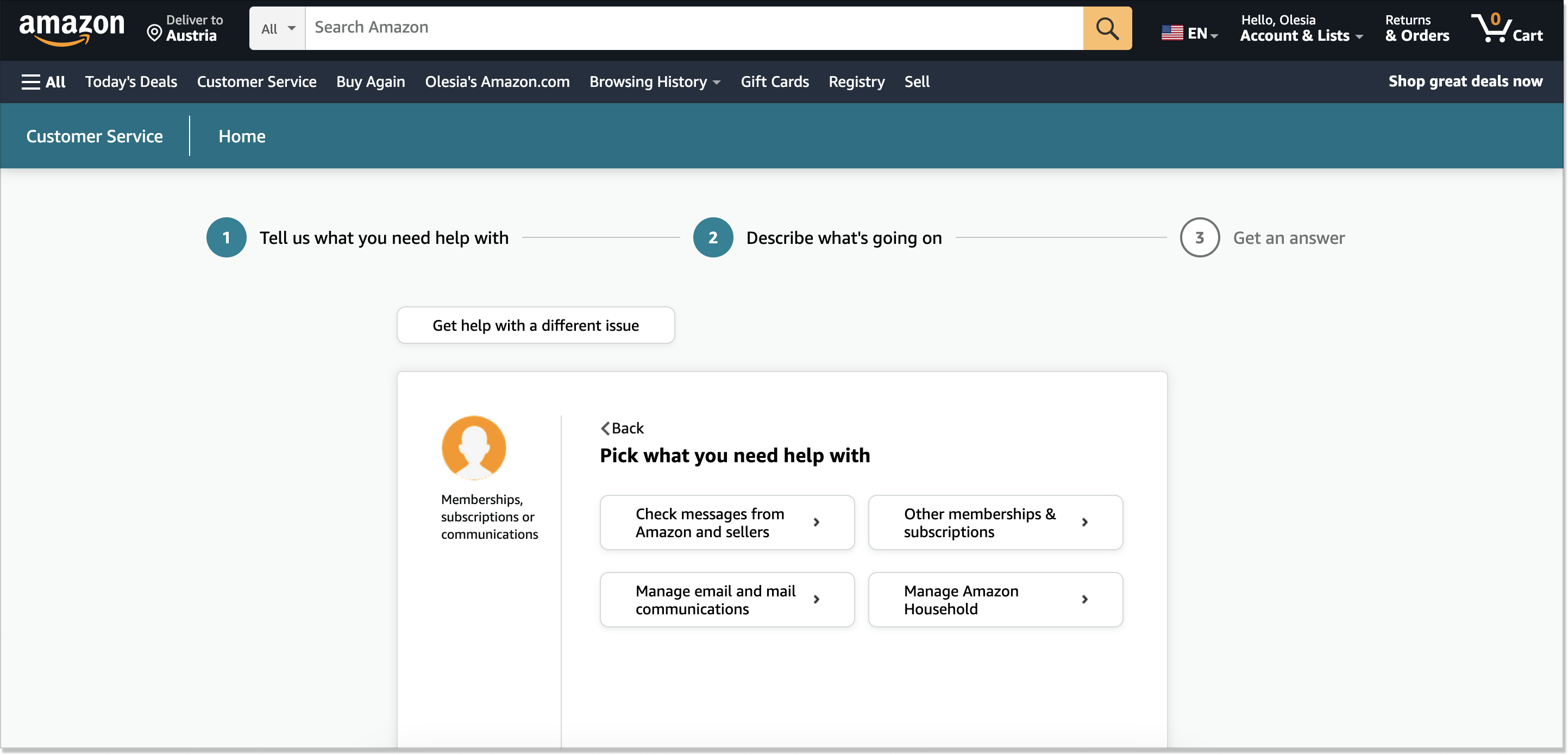
Speaking of the content, Amazon’s portal has specific, up-to-the-point sentences, and clear wording. But what if you failed to find the solution? The customer service team doesn’t leave you empty-handed. For this scenario, you can request a phone call or drop them a line via chat. So take notice when you will create your self-service portal.
👍 The best practices you might want to adopt:
- Alternative means of communication, except for a self-service resource
- Intuitive UI and straightforward content, easy-to-digest sentences
4. MacPaw
Just like Grammarly, MacPaw is a software company with Ukraine in its history. The team deal with Apple applications and so their portal for self-service speaks clearly for it. The main entrance is all about the company’s product portfolio. If you click the Menu button at the top right corner, the MacPaw’s apps will be in full view.
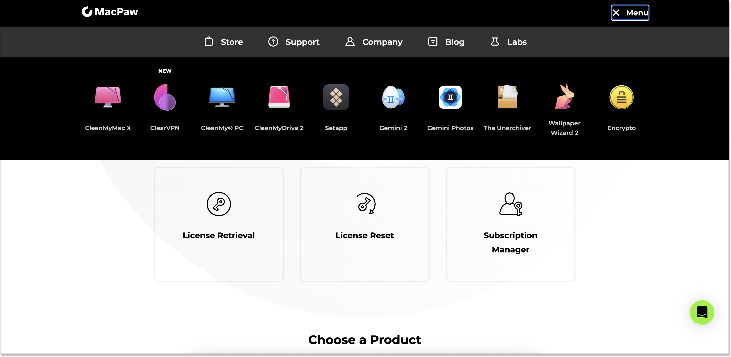
Furthermore, the Menu lets you visit the company’s blog, its store, contact support, and even the Labs – an in-house playground. The latter is a rare case among the examples we discuss here but a common one for SaaS. This is the place where you can fetch MacPaw’s recycling app, check its merch, or download a cute sticker pack (with cats, duh!).
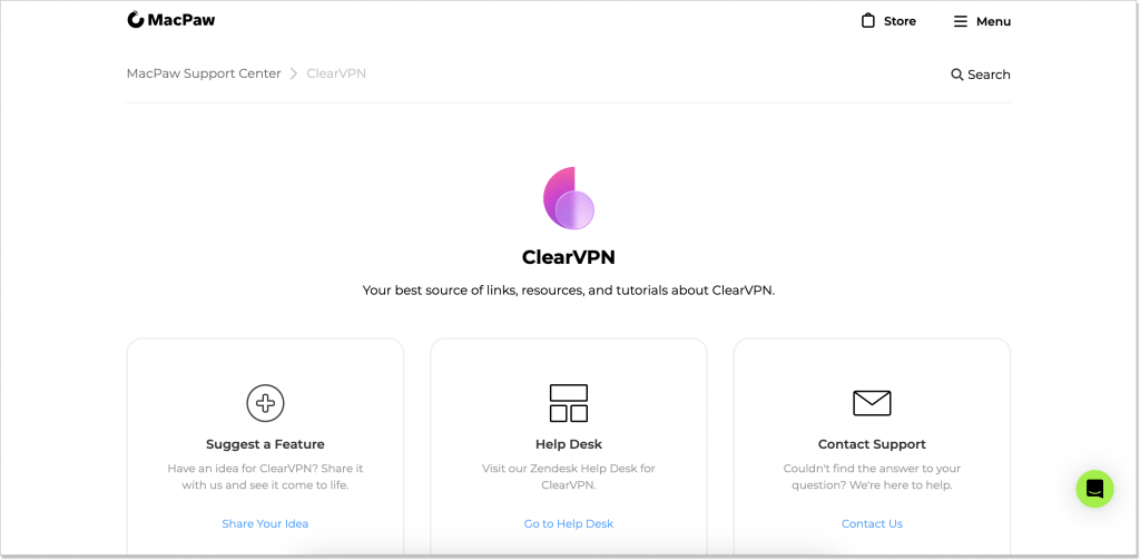
Let’s get back to the portal and look under the hood. Behind each product, there are 3 categories: Suggest a Feature, Help Desk (all-too-familiar articles and FAQs), and Contact Support. Guess which is the most intriguing? That’s right, the first one! Fill in the special form and share your thoughts – that’s what I call a real impact!
👍 The best practices you might want to adopt:
- An opportunity for users to contribute to your company’s product in general and portal in particular
- The structure of the help center in the way that it shows the products/services your brand offers
5. Santander Bank
Just a couple of days ago, I faced a money withdrawal issue with my bank. Tried to reach the bank’s customer service dep – nothing, wrote them in a chat – silence…And here I am, standing in front of the ATM, having no clue where to get the support I need.
But!
If my bank had a well-developed and easy-to-reach self-service system, it wouldn’t even be a problem. So I included the following brand on the list for a reason.
Santander – a retail banking company – has one of the most iconic self-service portal examples. Right from the moment you land on the page, you have the choice either to look for the answers on your own or contact the team via a live chat from the get-go. Their virtual assistant is called Sandi.
As for the overall information tree, Santander did its homework with flying colors. First, they as you “What do you need help with?” and provide the set of categories. Besides, there is a small FAQ section with the most popular queries. Such a hybrid move makes the self-service help much easier.
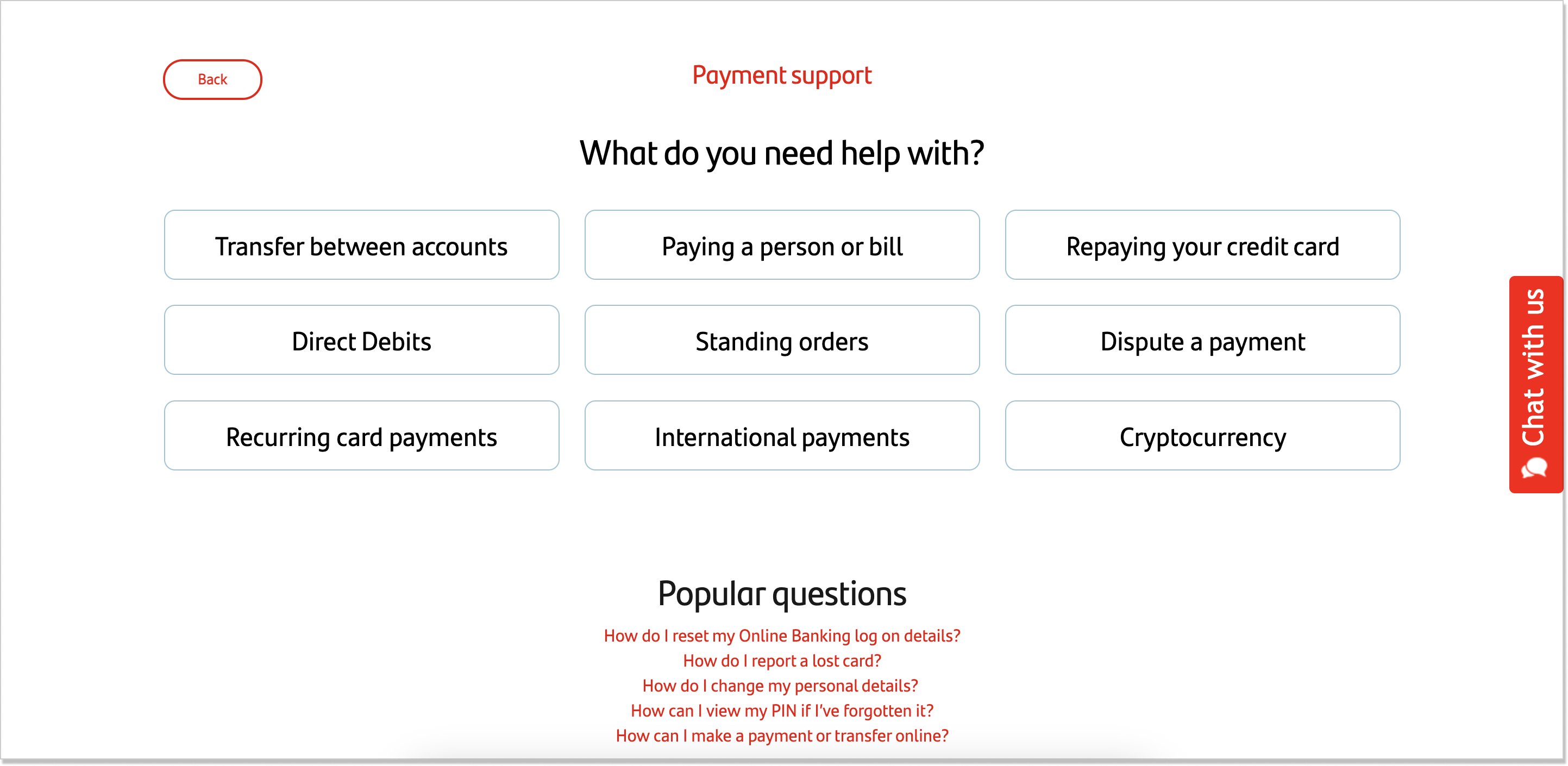
As any self-respecting platform, Santander offers a search box so that you can type in your question and choose an answer from different options. For some users, this might be perfect. However, this isn’t always the case. 63% of customers say they are annoyed with the search field on a self-service help center.
If we look inside the categories, we’ll see how meticulously the information has been conveyed. There are subcategories, the text is structured and formatted, has bulleted lists, and accordion-style paragraphs.
What’s more, Santander makes a wise move and includes a feedback option after each article. This way, the company can keep its finger on the pulse and track which article needs polishing.
👍 The best practices you might want to adopt:
- Opportunity to talk to a chatbot in case there’s no solution
- Ability to leave feedback after reading an article
- The digestible self-service portal structure
6. Zoom
Everyone is familiar with Zoom — a communications technology company. But have you ever visited their help center for customer self-service? I am here to walk you through this example.
Zoom’s online self-service system is designed in keeping with the best traditions (by the way, it’s available in multiple languages). It provides a search engine front and center, a virtual agent called Zoe for those who feel like talking a bit, and also common troubleshooting topics visible.
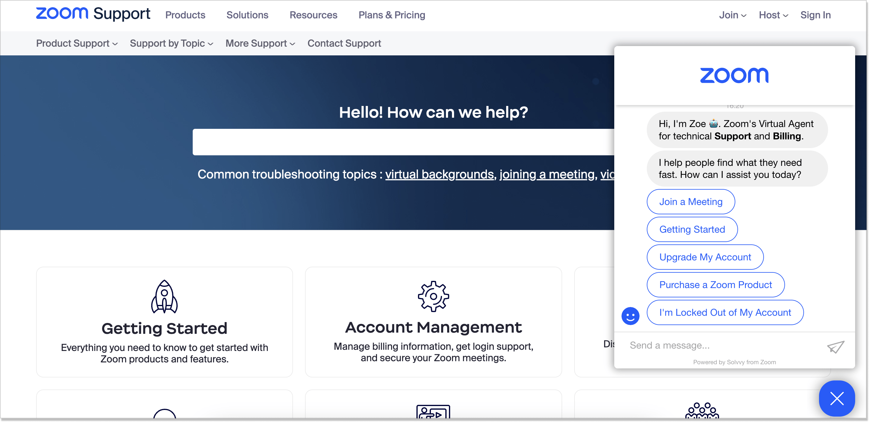
Apart from the standard set of self-service portal specs such as community and a feedback survey, Zoom also offers the Learning Center and Release notes as part of it. This isn’t a widely used practice but totally a smart one! Thus, a user can stay in the loop of what’s happening with the product in question.
Now, let’s take a peek at the self-service article. As you can see, Zoom used a rather unconventional approach to how the content should look like.
For starters, the information is divided into three groups – according to the end user. And the main thing that catches your attention is those Unread labels next to each section. Once you read it, they’re gone. This only adds up to gamification and interaction.
Plus, when you hit the section, you see no ordinary article – the info appears in a separate window, written super to the point + divided into two versions for desktop and mobile. Way to go, Zoom!
👍 The best practices you might want to adopt:
- Learning Center and Release Note as part of the portal
- The content division for desktop and mobile version
- Unorthodox content design
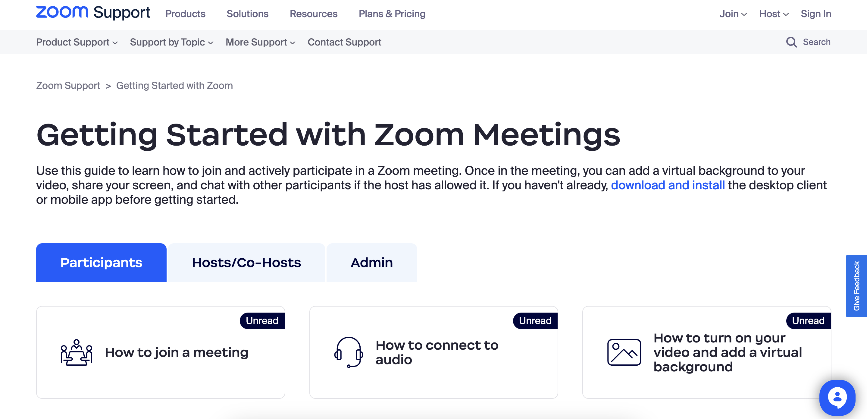
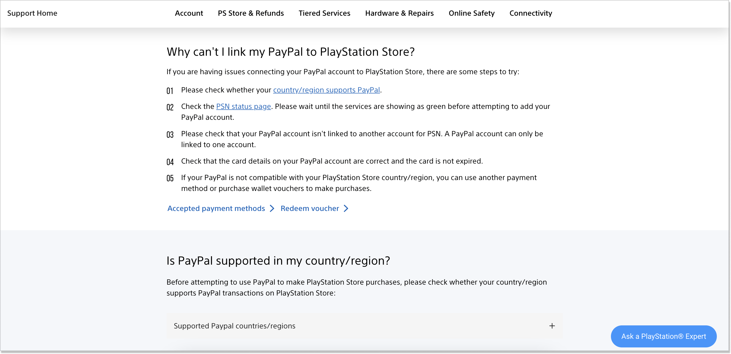
7. PlayStation
Let me be honest with you: I did add this portal example after I played the bombshell Hogwarts Legacy…and, of course, I am a Gryffindorian 🧙♂️ Let’s get to our topic though.
The distinctive feature of the PlayStation’s support section is its simplicity. You know what they say: the less is more. Well, this is the case. But it doesn’t mean the portal lacks substantiality and structure. It contains all the well-known components such as the Online Assitant for additional support, a search panel, and categories.
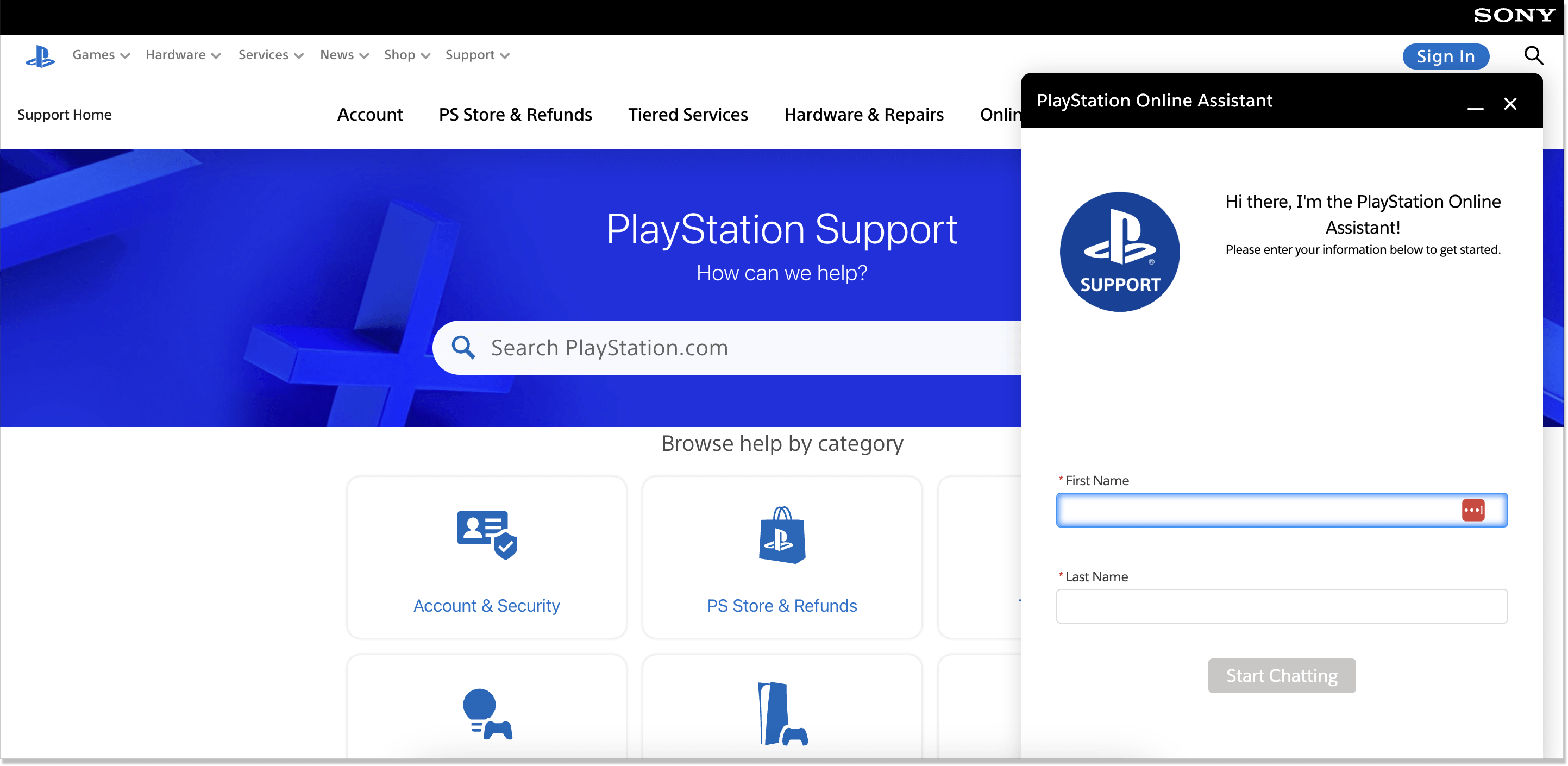
If we talk about how articles are composed and designed, I must say that PlayStation has the most minimalistic method. Just like Santander, this brand also unites two self-service types: a classic knowledge base/help center and FAQs.
But this is just the tip of the iceberg. There is a unique feature (or functionality) no digital portal for customer service we discussed today had – the ability to ask a fellow player for help. All you need to do is press that blue Ask a PlayStation Expert button at the bottom right corner, write an email, and you’re all set. Kind of a forum-like vibe, don’t you think? So if you’re in a gaming business, you have to try this approach!
👍 The best practices you might want to adopt:
- Write clear and concise guidance
- Mix at least two self-service portal options together
- Use numbered lists and step-by-step instructions
- Include visual elements (explanatory videos) to provide a better context
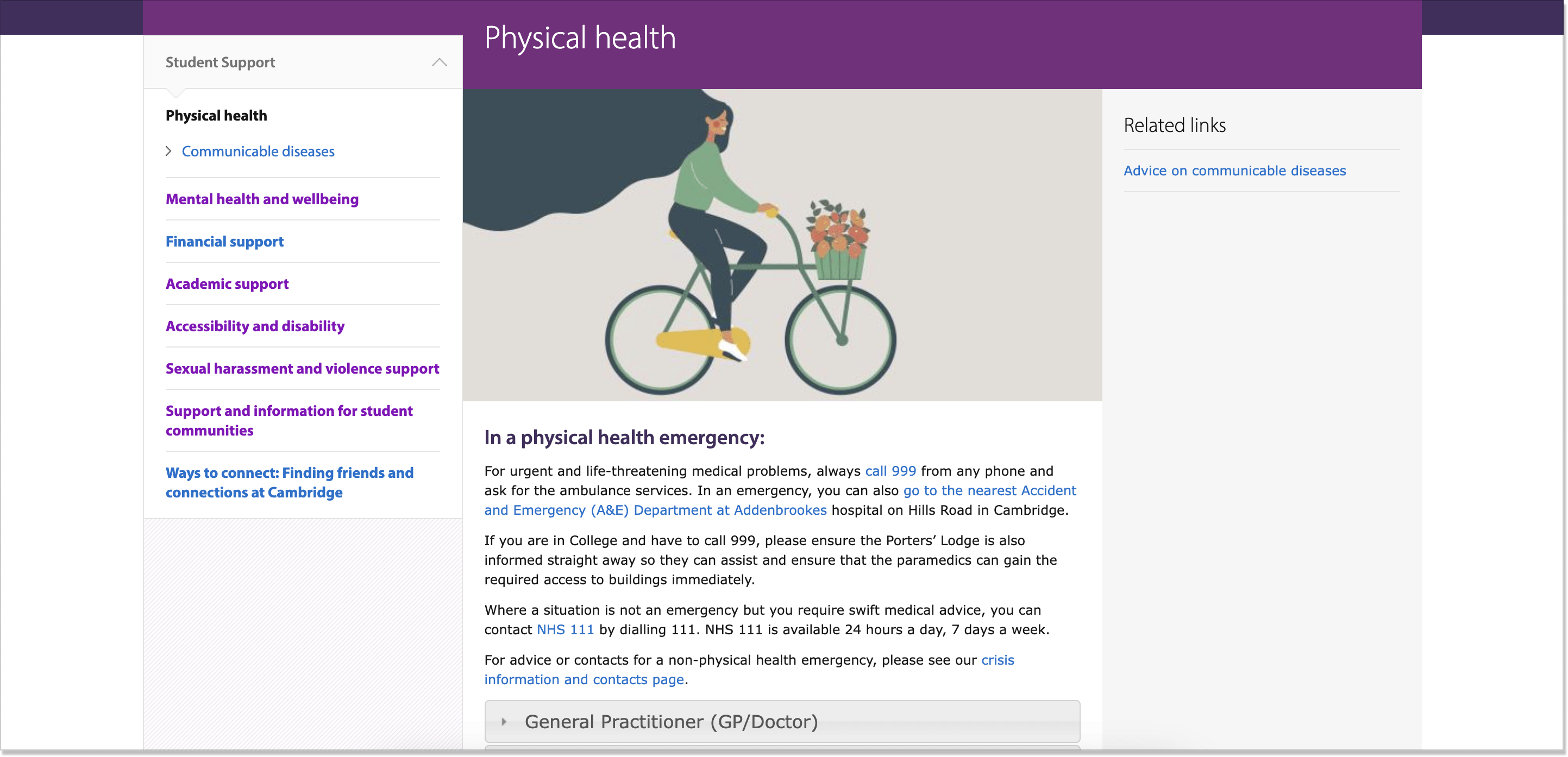
8. University of Cambridge
Treating students as customers doesn’t demand sacrificing academic standards. If you’re a scholar or have an educational institution, you still can (and should!) enrich your self-service website with customer service materials.
To top it off, 30% of students see themselves as customers in the education sector. That is why providing them with a decent self-service option should go without saying.
University of Cambridge has an information-laden online portal where students can get the assistance of all sorts. I would call this example the most present-day relevant. It supports such topics as mental health and well-being, sexual harassment support, and academic support, to name a few.
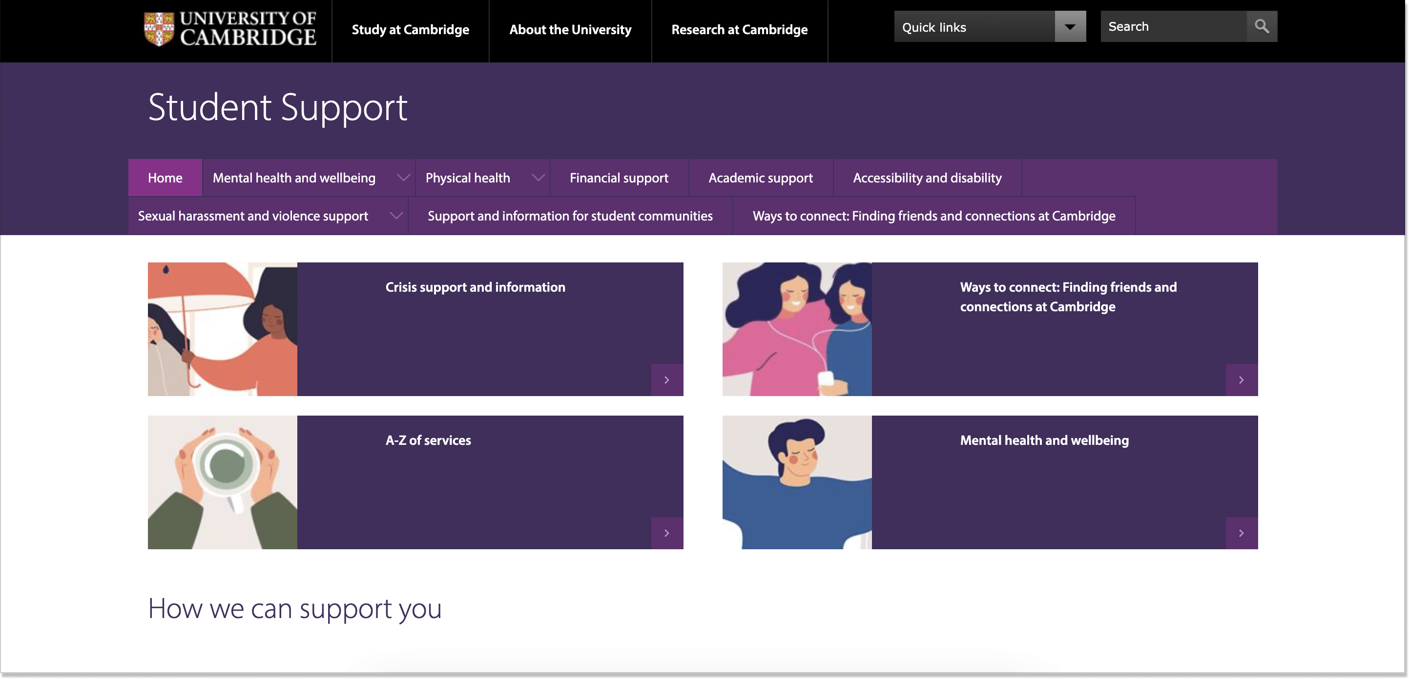
The content of this portal is also worth attention. It’s presented in a menu-like format. Every section has several subsections and an FAQ field. Well, we are already familiar with this trick. Besides, this portal contains strong interlinking which helps a user dive deeper into the question and get all the necessary details on the issue.
The only downside here is that the University of Cambridge’s portal didn’t make the Contact Us option easily reachable. The team’s email is hidden in the articles so you’d better keep your eyes peeled for it.
👍 The best practices you might want to adopt:
- Move with the times and make your student self-service content relevant
- Interlink the content on the portal to create a full-fledged experience
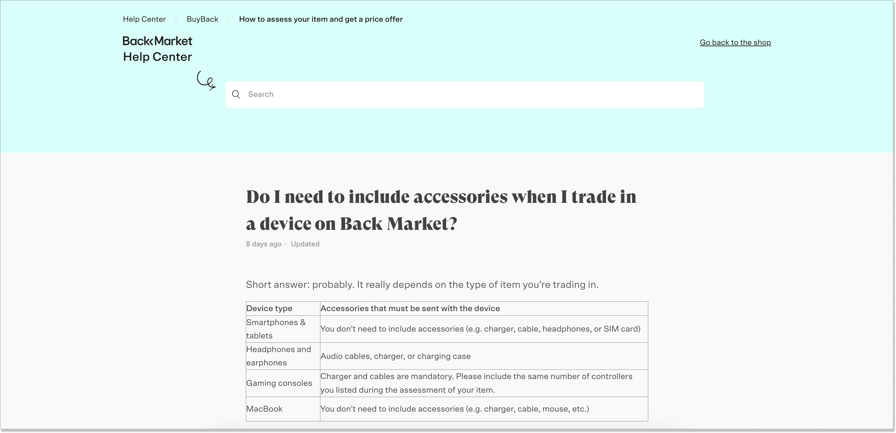
9. Back Market
Truth be told, I didn’t know such thing as a marketplace for refurbished items existed. But it does. Here is Back Market and its great customer portal (it’s multilingual). Well, this is officially the fanciest design on the list.
Somehow this FAQ articles hub has a relaxing vibe and it’s manifested by everything from the mascots and illustrations on the page to the language and the overall information hierarchy. The first you face – the bold, slang phrase We gotchu. Already brushes the old-fashioned style away.
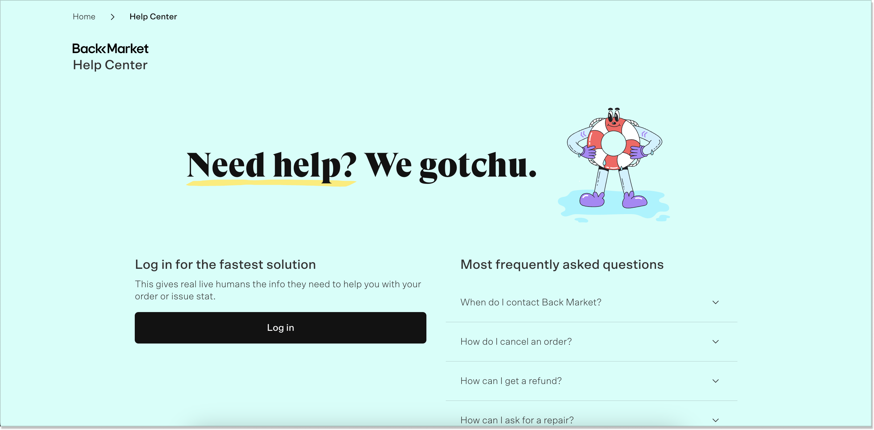
Then, the feature we haven’t seen much in the rest of the examples – the log-in button. Back Market shares it straight on the self-service page and it’s convenient. You can be assisted faster.
Plus, the most frequently asked questions aren’t scattered across the page. They are gathered to your right and combine THE FAQs like how to cancel your order or ask for a repair. Sure thing, you can also search for the articles using the search box if you scroll down.
If we look at one of the Back Market articles, it becomes clear that it is written with an FAQ style in mind. Very to the point, with no long sentences or walls of text. Besides, the table at the beginning makes the content easy-to-read and scan.
👍 The best practices you might want to adopt:
- Match the design of your customer portal with the brand so that it has an accomplished look;
- Make the copy modern, avoid jargon or techy language;
- Edit your help portal so it has a readable structure
10. Fibery
Here we reach the last hero of the list – the Fibery self-service portal example. The guys developed a cool community where their customers can discuss company-related topics, lend each other a helping hand, or even try to resolve issues on their own.
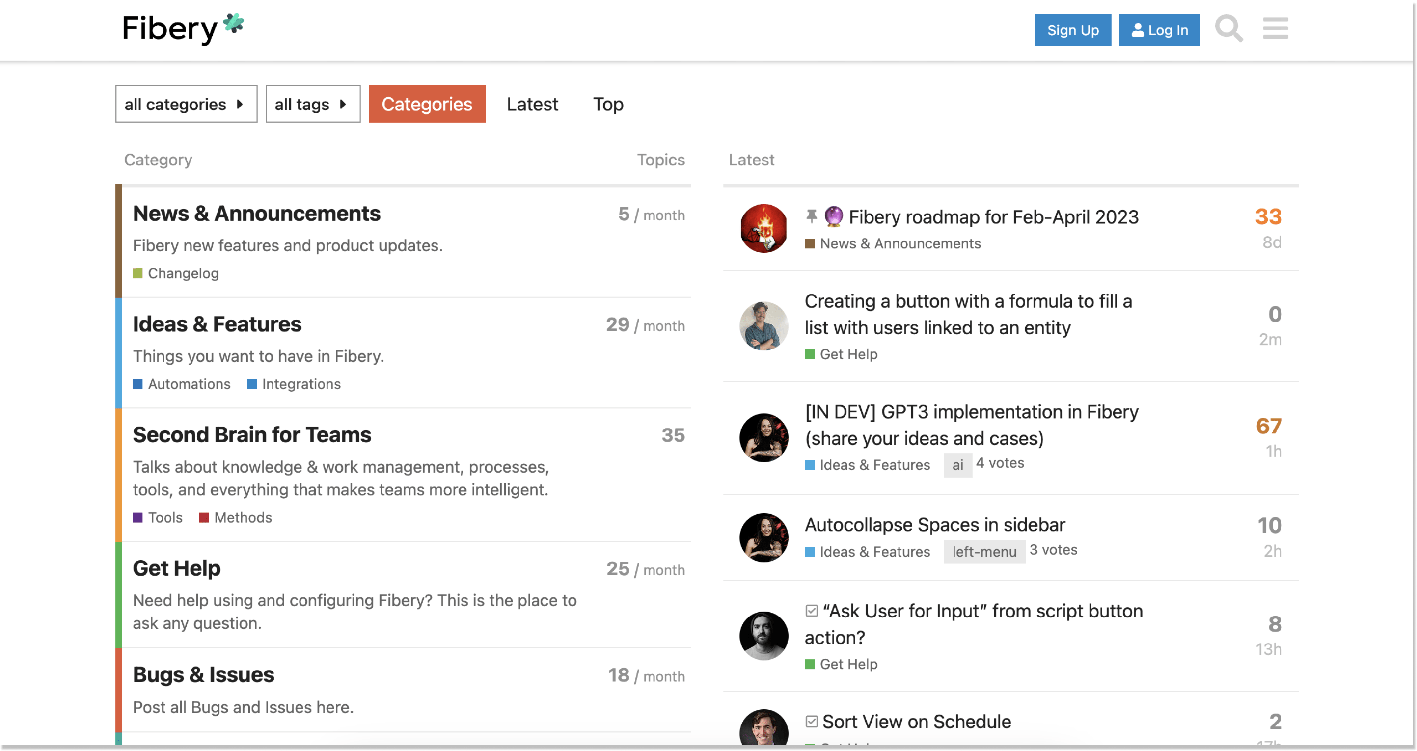
The Fibery forum has a strict structure (which is a pro point for an online portal, remember?):
- Tags
- Categories
- Latest discussions
- Top discussions
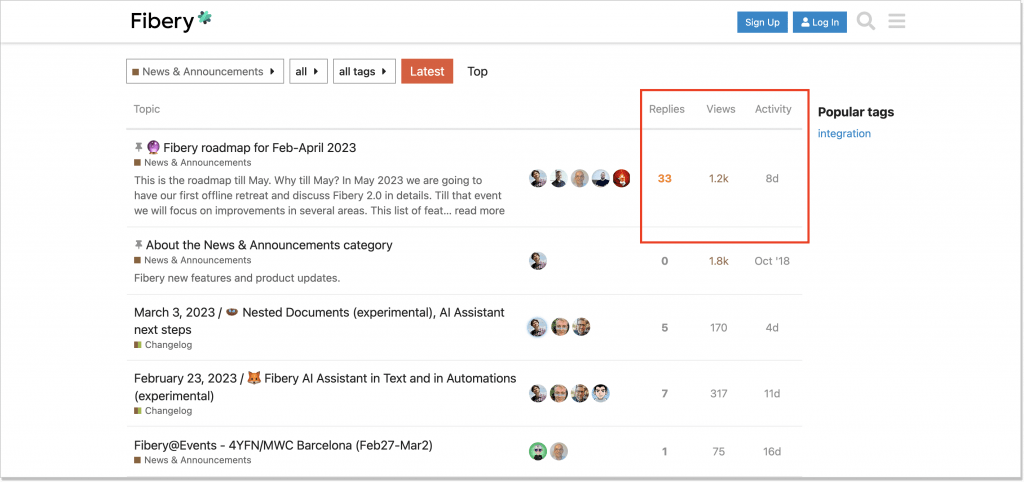
In short, its structure is conventional for this type of self-service community. What jumped out at me is the opportunity to actually see the number of replies, views, and activity for each topic. You can also filter the topics and events in time – nothing will slip through the cracks. Thus, it’s obvious that Fibery’s roadmap for Feb-April 2023 is the leader for now:
On top of it, Fibery created a hierarchy of badges for its audience. You can be awarded Editor, First Emoji, Wiki Editor, and a dozen other rewards. This is a curious experience that fuels the user’s interest in the brand altogether.
👍 The best practices you might want to adopt:
- A vibrant community with almost real-time discussions;
- A wide range of company-specific topics that could help a user handle next to every issue;
- Convenient content hierarchy.
Closing remarks
Living without a self-service hub isn’t the world’s end. Businesses managed to do just that a couple of years, decades ago. However, these self-service portal examples we described today show that having one wouldn’t hurt.
Before you choose the software to build such a customer-centric resource, think of the top qualities it should obtain: 1) modern, 2) intuitive, and 3) customizable. HelpCrunch happens to combine these traits. So it’s your call now! 🛎️