14 Best Welcome Messages for Customers to Spark a Conversation
Learn from these 14 best examples to write effective welcome messages for customers.
Written by Daniil Kopilevych

What are welcome messages anyway? Are they so important that somebody would put together a whole blog post on them? Well, they are. And when used smartly, greeting messages become a truly powerful marketing tool.

After the user has finally converted – subscribed or created an account with you – it seems that your job is done. You’ve got yourself a new customer, so why bother sending a greeting message?
Wrong. A welcome message can seal the bond. It’s the same as the “Can I help you?” question that you hear when you enter a shop. Even if there’s no help needed, you are being attended to and feel important.
If you are still not convinced by all this sentiment, we’ve got some hard facts and statistics. Welcome emails are known to generate 320% more revenue. For such effectiveness, welcoming messages take their rightful place in most email marketing campaigns.
Not sure how to set up an engaging welcome message? Just start with a proper customer service and email marketing tool from HelpCrunch. The platform allows you to set up targeted chat and email auto messages — it’s available for a free 14-day spin.
What is a welcome message, and why should you care?
A welcome message is a message you send to customers once they land on your website or create an account with your service to greet and tell them more about your business.
At the same time, greeting the new customer is neither the only nor the primary thing a website welcome message can do. There are many other great goals that you can achieve with a wisely crafted greeting message. In fact, the format, content, style, and design should pursue a definite goal that starts the user’s journey across your website.
Often, welcoming messages are delivered as email broadcasts, however, you can also use live chat, in-app messaging, or even a third-party messenger, such as Facebook or Slack to send them.
Of course, the channel counts, too, but the most valuable is what your greeting message contains.
In general, welcome messages are built along the same lines as the rest of your customer communication – the style, design, and level of formality should be easily identifiable and similar for all types of communication with your audience.
Browse our collection of the best website welcome message examples that can inspire you to make a unique invitation for your customers to start on a long journey with you. Each message in our list is designed to achieve a certain goal, and you are going to see how they do it.
You can also share these live chat welcome message examples with your support team.
14 best welcome message examples to greet customers with a bang
To add more structure to this blog post, we decided to break down all welcome message examples into two main categories depending on the communication channel you use: email and live chat.
Let’s explore how different companies say Hello to their new clients.
Email greeting messages for customers
You can say a lot in the first email, or be very brief. You can add a huge image to trigger customers for a purchase, or send just plain text. You can be hilarious and add a funny GIF, or keep a formal style of the letter.
There are no rules in these different types of emails, just one task. The task is to engage a user and keep the communication going.
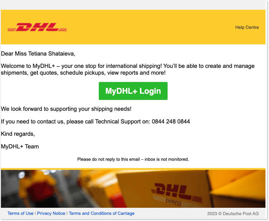
DHL – add a standout CTA button
A worldwide known logistics company bets on brief plain text and a prominent CTA button that is impossible to miss. This greeting message is doing its job just perfectly, making users click the button even if they don’t feel like reading the rest of the message.
But if you do give it a little read, you realize that just in two sentences the company lists the most important benefits that you can get from this cooperation. “Manage shipments, get quotes, schedule pickups, etc.”
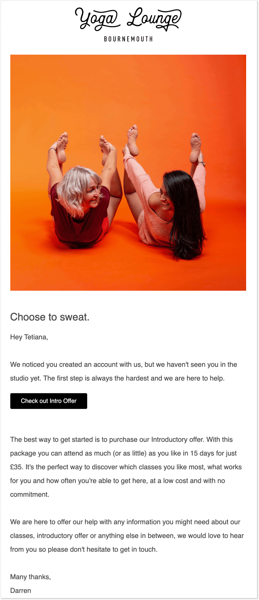
Yoga Lounge – be that little kick in the ass
A welcome message for a new client does not always have to contain the word ‘welcome’, sometimes what a user needs is a little kick in the ass… Especially if we are talking about sports activities and other actions that usually require a little motivation from customers to keep going.
When I registered with the Yoga Lounge company, they didn’t email me right away, but after a little while, I received this. And it just almost made me go to my first hot yoga class 😉
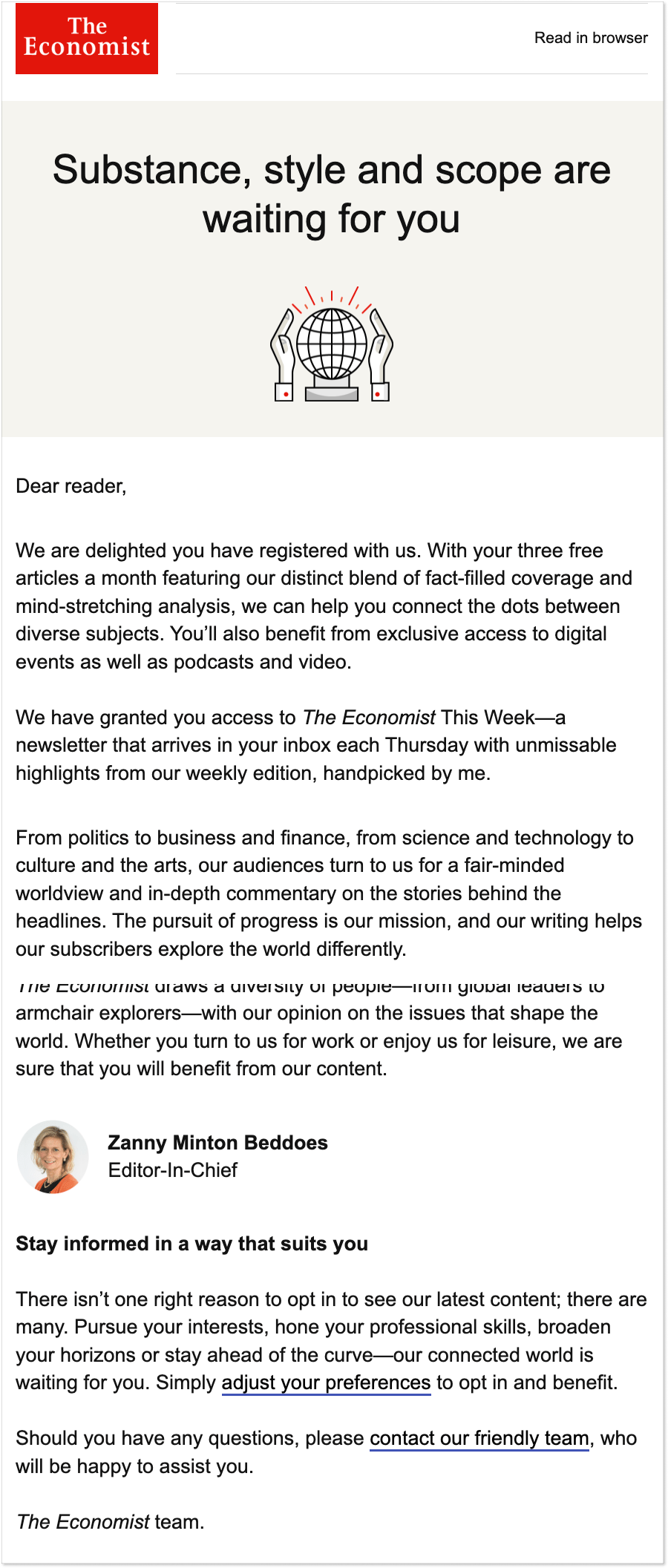
The Economist – say what a user will get from this subscription
As a writer, I am excited to finally introduce you to an example from The Economist publication that might be useful if you search for blog welcome messages.
Since your target audience is people who love reading then it makes sense to compose a longer message, explain what a user will get from this subscription, and show your mastery of the word by including a few quirky phrases such as: “bland of fact-filled coverage and mind-stretching analysis”, “fair-minded worldview”, or “stories behind the headlines”.
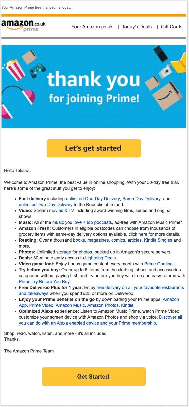
Amazon Prime – list benefits in bullet points
Just recently I moved to the UK, and one thing you can’t go without here is Amazon Prime. It looks like absolutely every household has its subscription to the service for one specific reason – to have all your online orders delivered quickly and for free.
Want to say “Welcome to our store” to your new customers in a way that makes them purchase things? Then this example of a welcoming message from Amazon Prime can be your starting point.
When users register at an online store, what they want to know is delivery/return conditions, the main item categories that you offer, and other opportunities/benefits they get from this subscription.
Amazon Prime didn’t go crazy here, keeping things nice and clear with benefits in bullet points and one stand-out CTA button.
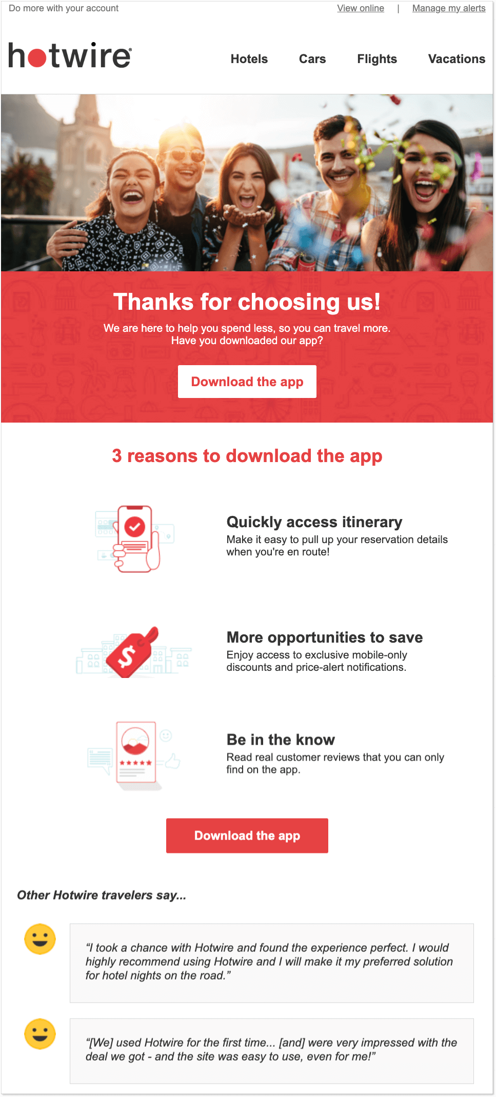
Hotwire – include reviews from your happy customers
How to create a welcome message for a travel agency? Try to evoke positive emotions and excitement about the upcoming trip by adding a radiant image and maybe a couple of reviews from happy customers.
Hotwire is a travel website that offers airline tickets, hotels, and vacation packages for travelers around the world. In this case, in your welcome message, you can’t go with plain formal text or a wall of words, even listing benefits might look too boring for users, instead bet on graphics and interactive elements. In short, your welcoming message should awe and excite clients, giving them little goosebumps .
Guru – offer guidance through the following steps
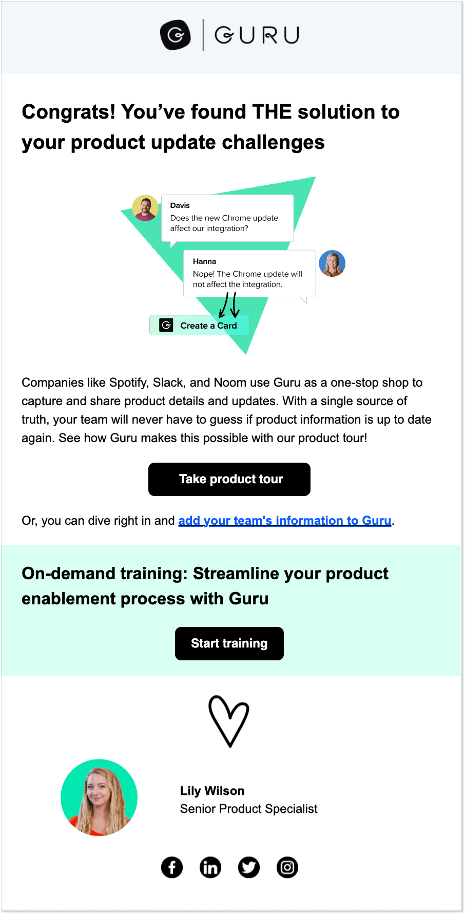
If we are talking B2B best practices, then consider adding a product tour or detailed instructions on the following steps in your welcome email. Complex products might require some tech or programming skills from users, so it’s crucial to make it all plain simple for them and not scare them away with professional terms.
Guru, an intranet and wiki tool for collaborative teamwork, highlights the use case of their software and immediately offers users to take a product tour to learn more. On top of that, readers are provided with an opportunity to take an on-demand training session.
It’s exactly what a new customer needs to feel confident that they have all the support materials and help from your brand to benefit from the product.
MailerLite – show the real people behind your business
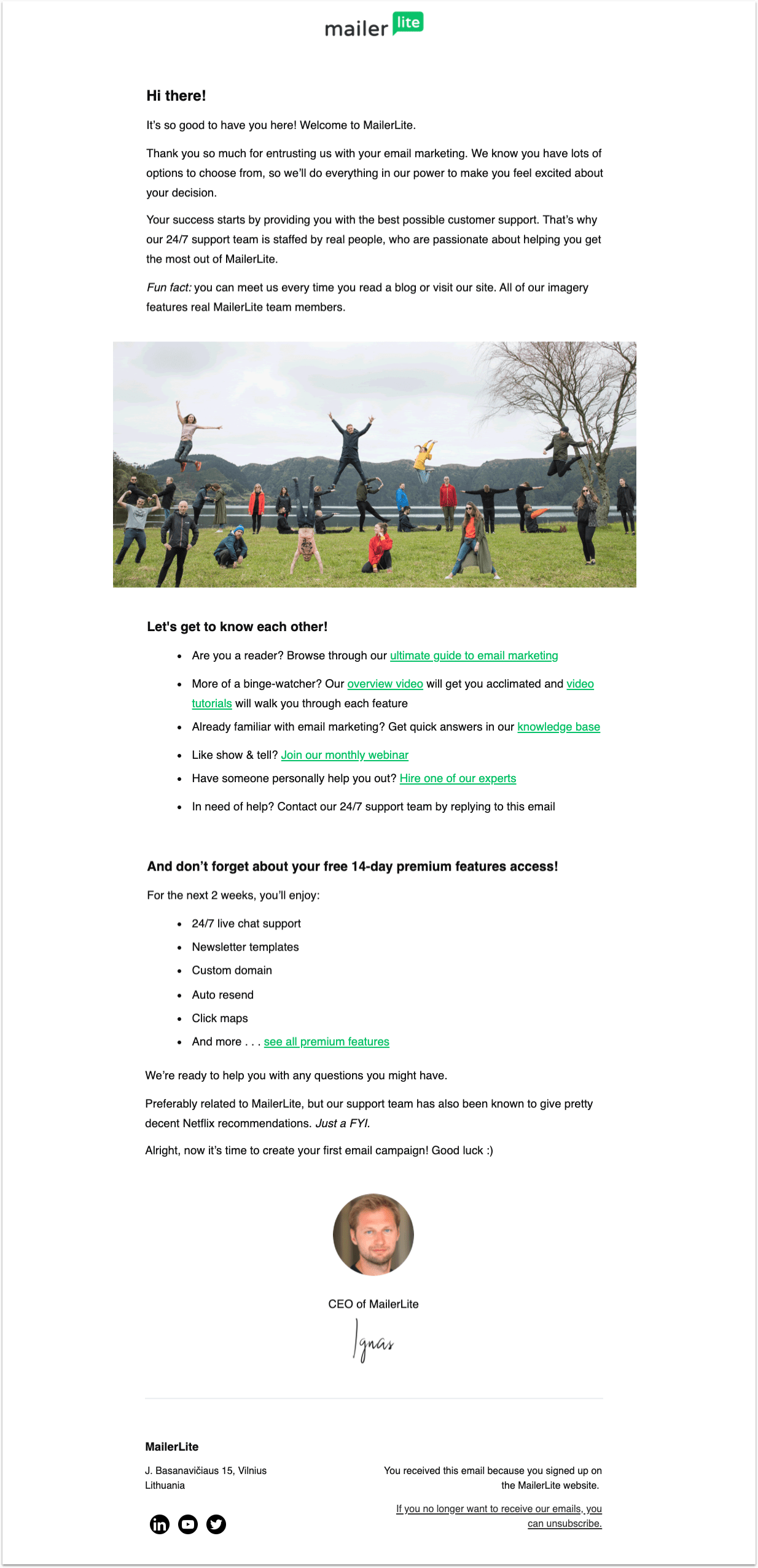
It’s quite obvious that welcome messages should feel heartwarming and sincere. Why bother sending them if you’re going to sound all robotic?
However, many businesses fail in this department miserably. They show all kinds of CTAs, social media badges, promo codes, and relevant links. But nothing feels genuine unless you show that there are real people behind those words.
Look at this sample welcoming message by MailerLite, an email marketing tool. Not only does it tell you everything you need to know to start using the platform right away, but it also features a rather nice team picture. You immediately feel almost like you know and trust those people. And should anything happen, they got your back.
And the part about Netflix recommendations at the end of the message… Isn’t it the sweetest thing ever?
And yeah, use this technique when you send an apology email to a customer – it won’t hurt.
Hustle – go crazy with your welcome messages
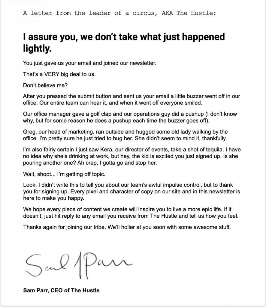
While there are definitely some best practices you want to follow, creative welcome messages are the ones that stuck in your head. You know the type. When you read a message and just can’t help but smile.
Hustle is one of the most prominent examples of creative and unorthodox email marketing. The message they send to every newsletter subscriber is something else. You can find everything here: a brilliant sense of humor, a little introduction from their team, and writing that leaves you in awe.
When they say they hope their content will “inspire you to live a more epic life”, you already know it will.
Live chat short welcome message for customers
Email is a perfect channel to welcome customers onboard right after registration. At the same time, you can send a website welcome message in a live chat to greet new visitors and encourage them to start a conversation, share their contact details, or make a purchase.
In this case, a short ‘welcome to my page’ message will be a perfect solution. No need to list the benefits or provide a guided product tour. Usually, these messages are sent automatically in a live chat based on specific triggers (country, region, time spent on a website, number of visits, etc.)
Keep it brief and concise just like messages you send to your friends on social media platforms. The goal is to start the ball rolling and make a user join the conversation.
SimilarWeb – suggest a number of actions a visitor can take right now
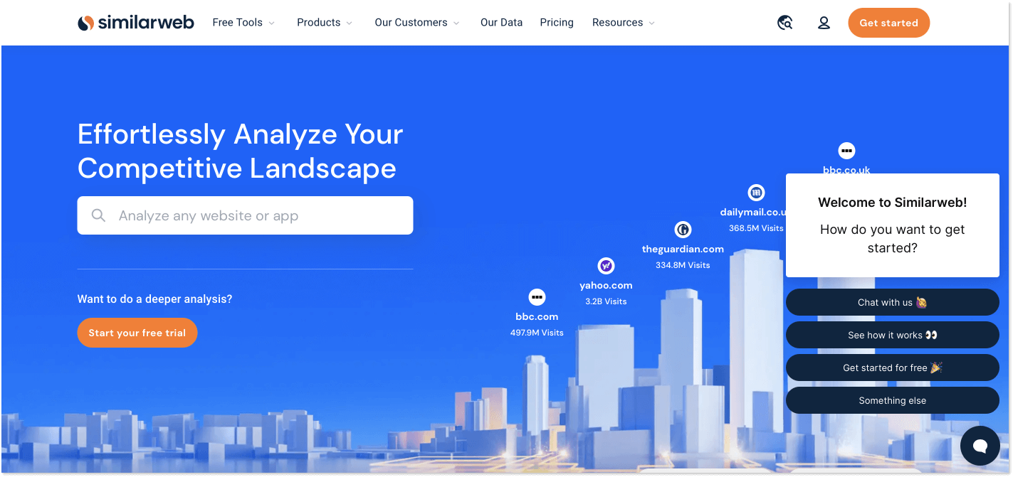
Web analytics company SimilarWeb welcomes visitors with a quick auto message and offers a few action buttons that a user can click on to start the interaction. It’s crystal clear and serves as a nice starting point for visitors.
You can go on with one of the actions, or just keep scrolling through the website. But what is important is that you feel welcomed and know where to seek help in case of need.
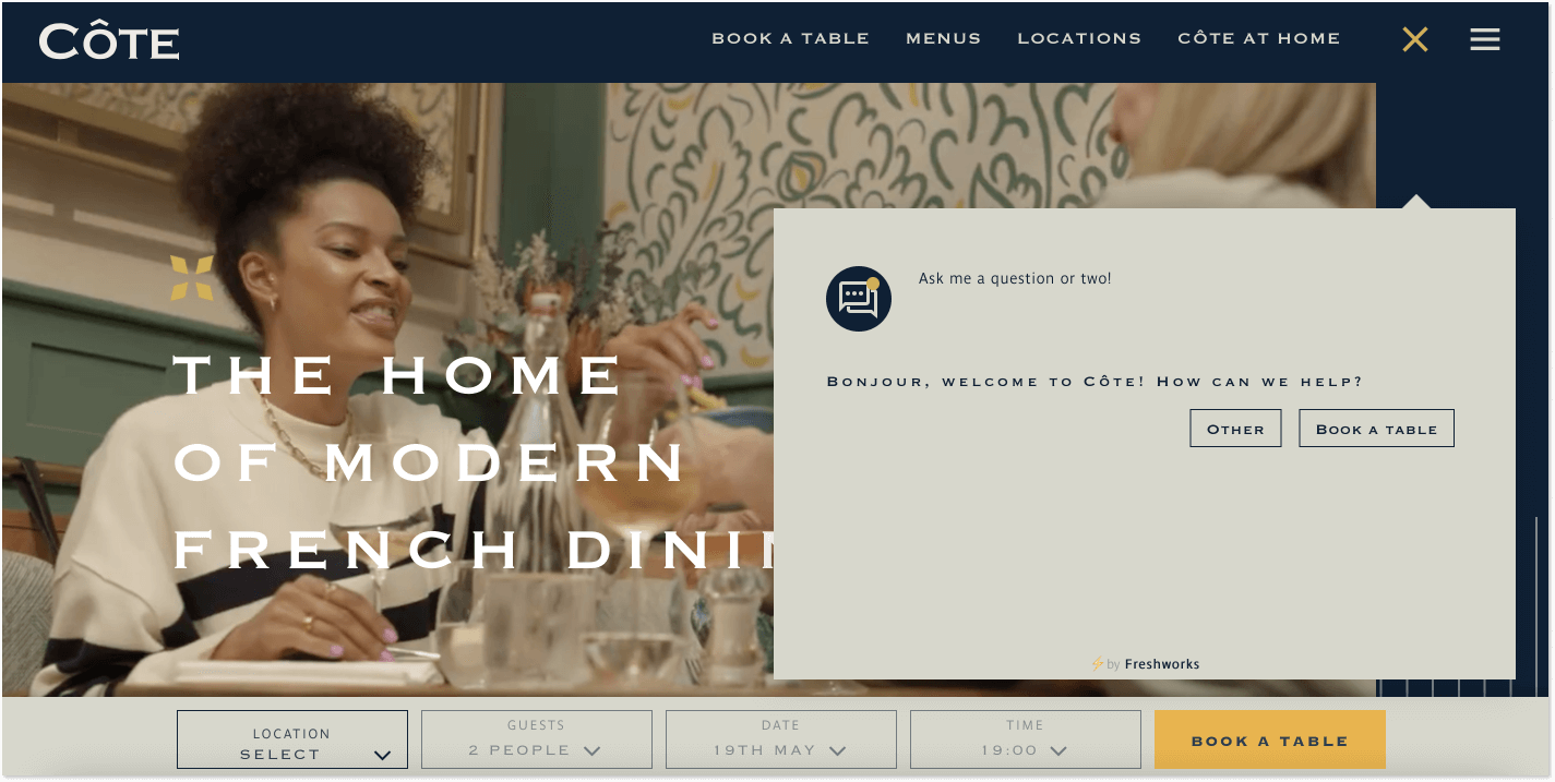
Côte – include one foreign word to greet users
This is not a new technique but a good one. We marketers sometimes reach for little ¡Hola! or Servus! to catch users’ attention. When customers read everything in English all day long and then suddenly come across less-used letters and words, their sight pauses for a second, and the brain takes a moment to embrace what it says.
But be careful and don’t overuse this method, otherwise it just might look odd! It works well only when it’s appropriate, like in the example shown below…
So, what a restaurant welcome message should be then? Côte is a chain of French restaurants that I was lucky enough to visit once or twice. They don’t go wild when greeting visitors and instead ask just a straightforward question.
Prada – say where you are texting from
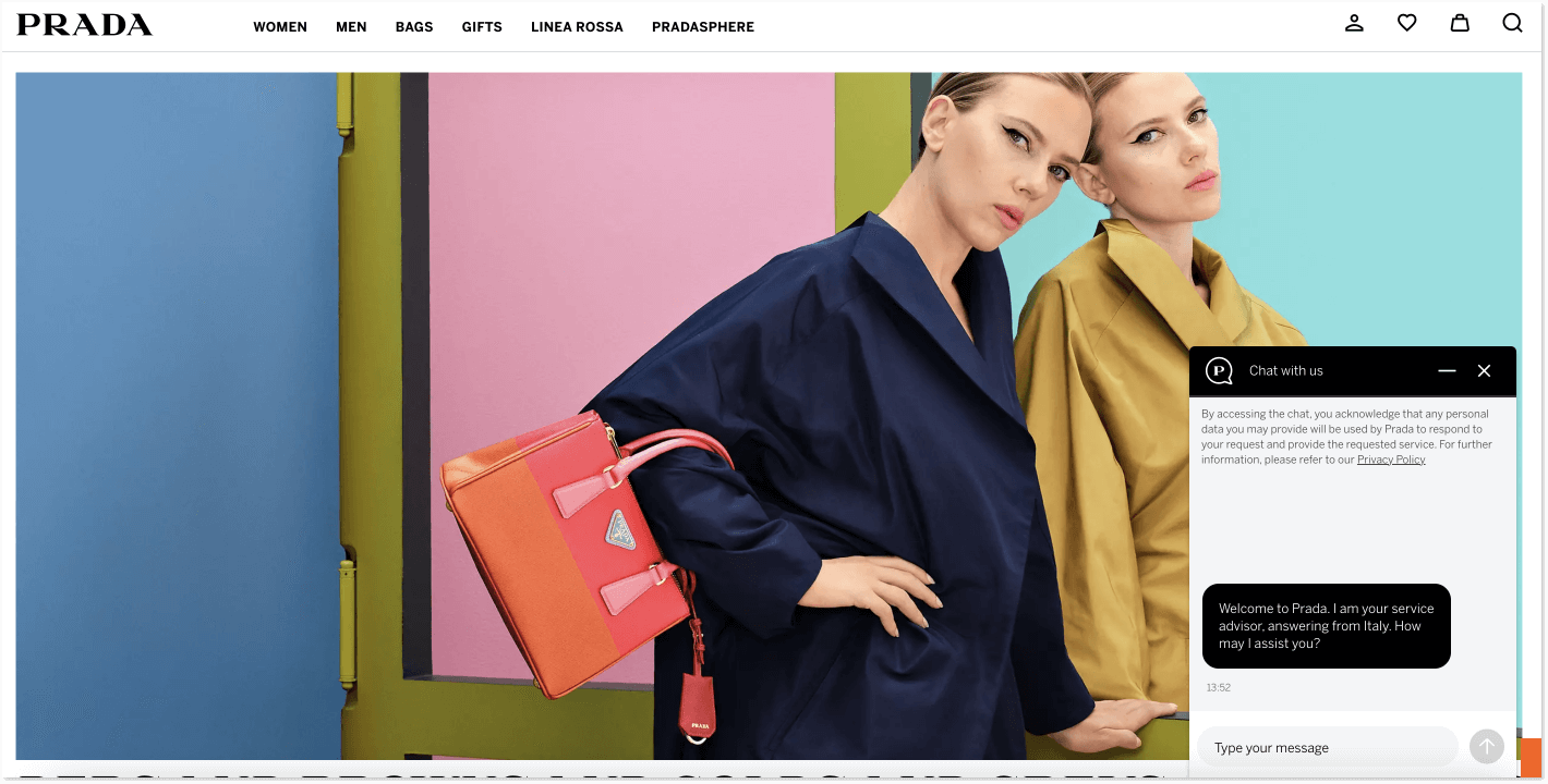
In a live chat welcome message when you have to keep things short, what can be a conversation starter? How to make a user click with you, trust you, and want to talk to you? One of the options is to say the name of the country you are responding to clients from.
Prada is doing exactly this by sharing that an assistant is talking with a visitor from Italy. First, Italy is almost a synonym for fashion and quality clothes. Second, who doesn’t love Italy? Who wouldn’t want to say something like, “Oh, I love Italy. How is the weather out there?” Honestly, I felt like asking this even though I can’t really afford Prada products at the moment.
But this little piece of information, allows a user to build a more personal connection with an assistant (read, your brand), and picture a consultant sitting somewhere in a sunny Rome with a fabulous view of the city. Hm…
HelpCrunch – let users know you are here to help
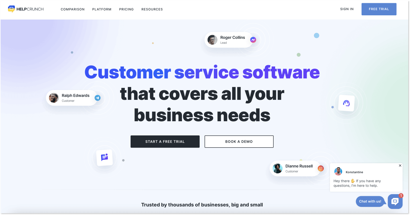
The welcome message in a live chat doesn’t have to be intrusive, interrupting user experience. Instead, it can be just a quick notification, reminding a visitor that they are not alone and in case of any doubts, a company representative is always here to help.
At HelpCrunch we choose to send a welcome automated message in just a few seconds after a new visitor lands on our website. Its text is simple and doesn’t take long to read but assures a customer that the help they might need is just at their fingertips.
Expedia – let a chatbot do the talk, connect with an agent when necessary
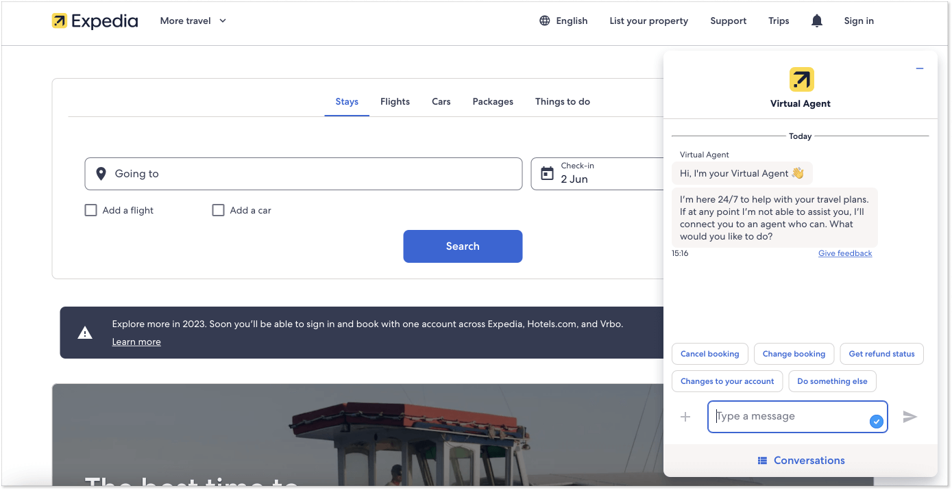
Since welcome messages are usually automated, why not set up a chatbot to do the talking? If your customer service platform offers a chatbot tool (like HelpCrunch, for instance), then create a bot to answer frequently asked questions, share links to knowledge base articles, collect contact details, and qualify leads.
Expedia, a travel fare aggregator, and travel metasearch engine greets visitors with the help of a virtual assistant. From the very beginning, the company is letting users know, that the bot is here to help them, however, if you’re to encounter any difficulties, you will be connected with a support agent. I think it’s a perfect combo when chatbot and live chat work together.
Bonus: popup app welcome message
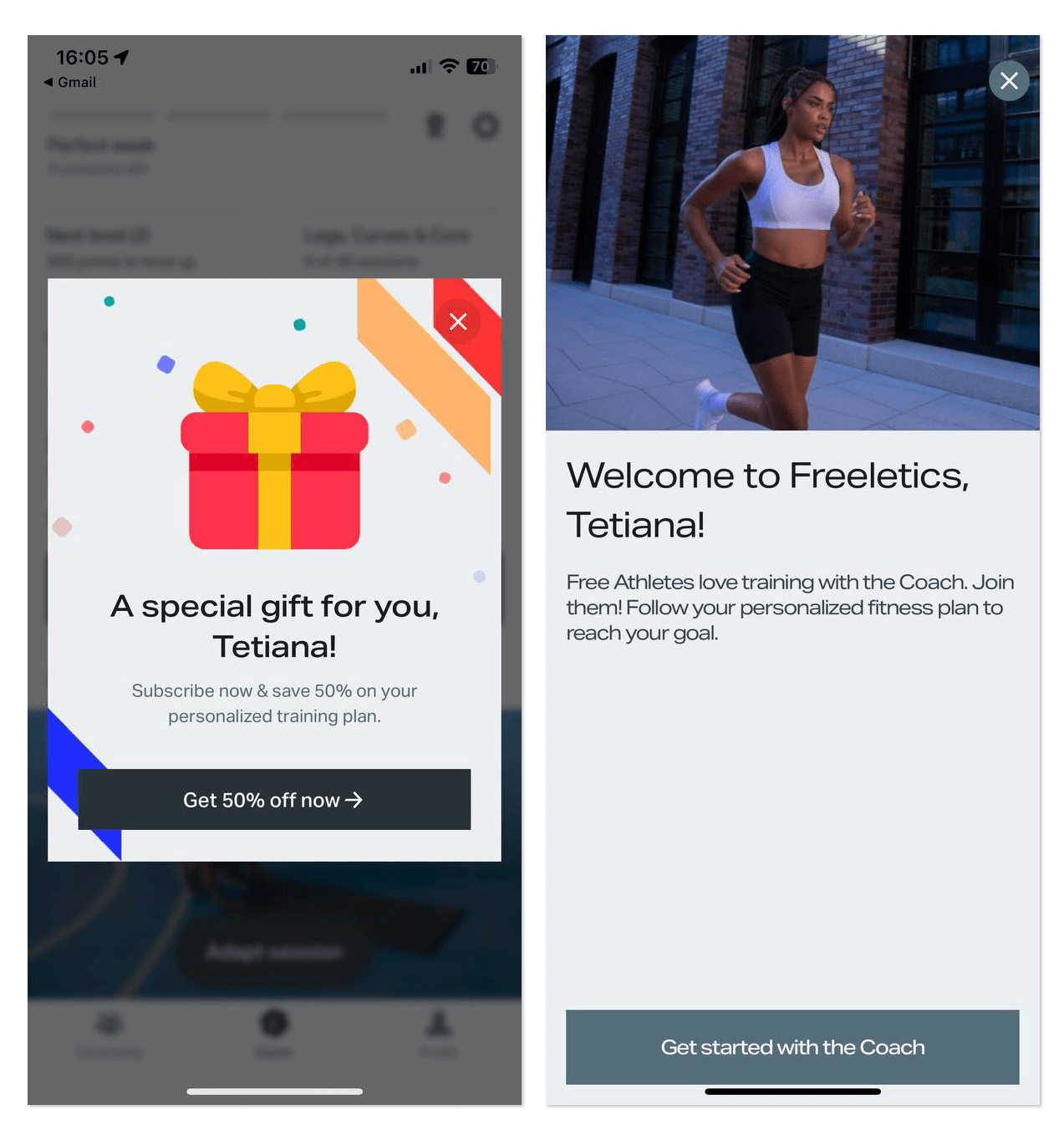
When it comes to an app welcome message, a popup can be the best way to greet visitors. Just set up a prompt popup where you welcome a new user and maybe even offer a discount on a premium subscription available for new customers only.
Freeletics, a workout app, is doing both: provides a discount in their first popup after registration on the app, and a few seconds after welcomes you with a full-screen popup and suggestion you join a Coach program, instead of a free plan.
Copy and paste these welcome message samples
- Take our sincerest welcome hugs! 🤗 We love you choose us, you will never regret that. And while you surf our website, please enjoy our newest read…
- Welcome to the [company]! 🤗 You are one step closer to a better shopping experience.
- We are so happy you joined the [company] family! 😌 May the best discounts and the finest selection be with you!
- Warmest welcome to the club! Here, you’ll enjoy everything from seamless customer service to the most awesome product in the niche!
- Congratulations! You’ve just become a member of the friendliest brand ever. And we couldn’t be more joyous about that 🥳
How to write a greeting message?
Now that we have dissected various types of welcoming messages, let’s quickly refresh what they may contain to serve their purpose:
- Company logo and/or motto
- Personalization (e.g. customer’s name)
- Explanation of what the customer has subscribed to
- “Thank you” message
- Special offer
- CTA
- Social network buttons
- Unsubscribe link
That’s about it, now build your message. Here’s how you can create a welcome auto message using HelpCrunch – a one-stop tool for building customer relations. It allows you to set and test welcome auto messages in a couple of clicks.
The configuration options are quite numerous – you can set a delay, create your own subject line and, of course, compose your unique salutation message for clients. Add custom attributes like personal names and company information and segment your audience based on any personal data and actions.
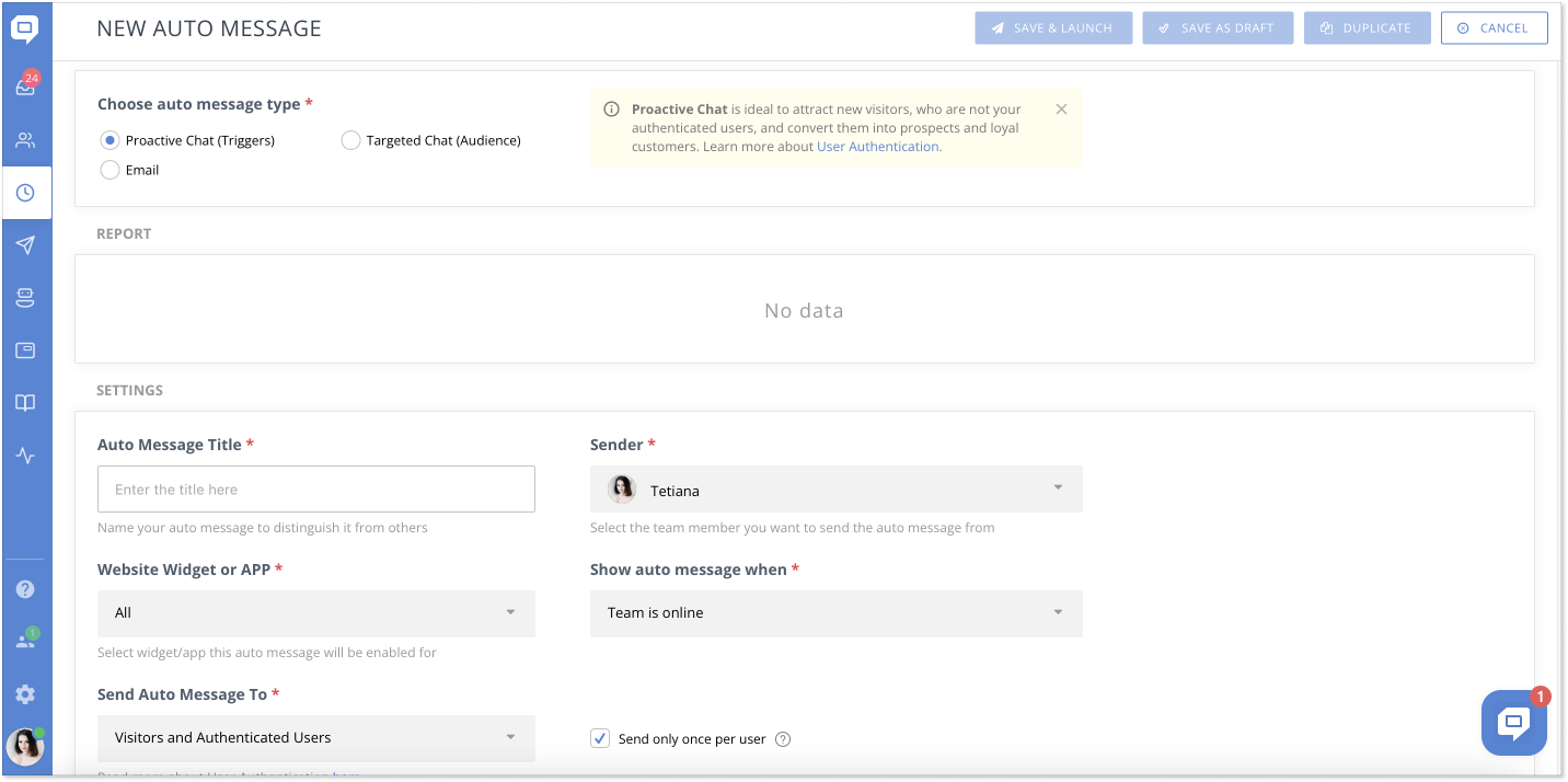
Now, you can make your welcome emails more effective if you target them. With proper targeting, your emails have better chances of reaching the audience they are meant for.
The HelpCrunch auto message tool has an excellent targeting feature where you can filter your user audience by multiple criteria, from the date they first contacted your website to their browser language.
Bingo, you are all set. Enter a couple of valid email addresses (no real customers, please) and test and fine-tune your message to your satisfaction.
Final words
Welcome messages work. They do, seriously. Be it the very first welcoming message for a new customer, a welcome back message for a customer who has fallen out of touch with you, or a thank-you message – they all work. Try to set up one for your business, and you will see the difference.

