In February 2023, we introduced you to the remastered HelpCrunch widget! And we are so happy to know that you love it 😇.
While we were betting on a live chat-focused widget, it turned out that many of you prefer a messenger-oriented widget. Well, say no more!
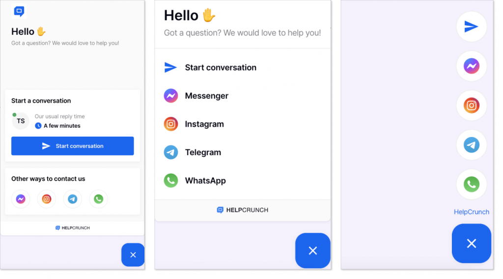
Introducing a HelpCrunch messenger-focused widget
From now on, you can set up your widget to have a compact layout or icon layout with messenger icons clearly displayed on the start screen. This way your customers can intuitively choose any messenger of their preference to chat with your team.
Before we move on to the ‘How-to’ part of this post, let’s appreciate the visual difference between the three start screen options available for you right now on the HelpCrunch platform.
How to set up a compact or icon widget start screen layout?
Go to your HelpCrunch account, click Settings -> [choose the right website widget] – > Widget customization -> Start screen. Then just select the widget start screen layout you love more: default, compact, or icon.
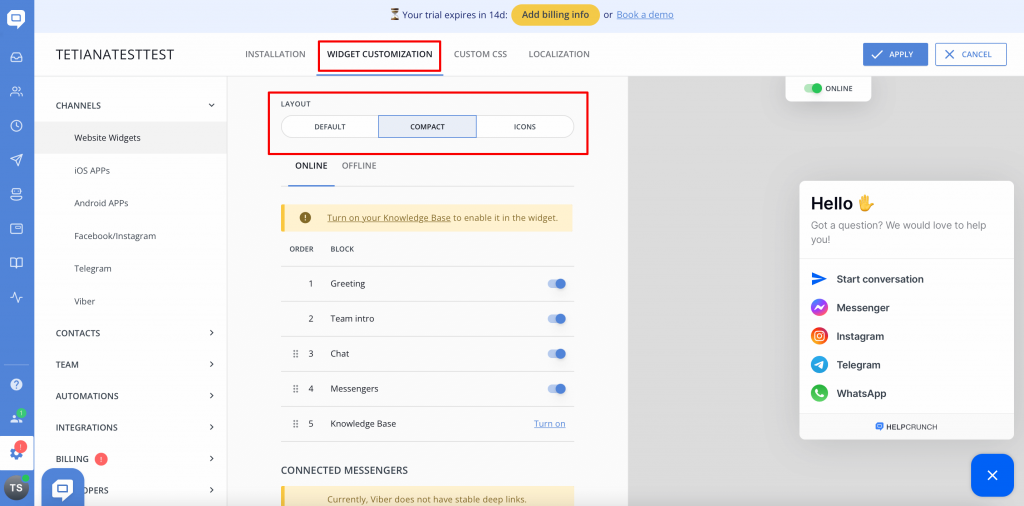
As usual, you will see a preview on the right bit of your screen.
Just like in the case of a default screen, on a compact and icon layout, you can add any messengers and easily adjust their order on the start screen. Simply drag and drop blocks to create the right combination you prefer.
Important! To whom it may concern if you decide to go with an icon layout start screen, keep in mind that other widget button types (like, button and tab) except the icon itself will be disabled, as well as the possibility of displaying widget button text. These peculiarities of the icon layout align with its design and make your widget look stylish and perfectly balanced.
Other improvements
Expand/collapse knowledge base articles in the widget
Before, when users were reading your knowledge base article in the HelpCrunch widget, they had to keep their eyes focused on a small screen. There was no option to expand the window and savor the information in a more comfortable way. But now it is!
We improved this little inconvenience by adding an expand/collapse button to the knowledge base screen in the widget. See how it works!
Improved work speed of our newly introduced widget
Some of you have reported that our new widget was noticeably slower than its predecessor. We worked on this important drawback and fixed the problem! Starting now, our current widget is just as speedy as the previous one.
Read Also
📱 Mobile cleanup: New chat search in apps & SDK stability
Our mobile stack just got a serious cleanup. Enjoy a brand-new chat search in the HelpCrunch Inbox apps, improved message reliability, and a load of SDK stability fixes.
🛠️ Custom domain for chat transcripts, new permissions, and more
Custom domain for chat transcripts, new block/unsubscribe permissions, open link settings for auto and manual messages, and a clipboard paste fix in Inbox. Check what's new!
🧠 AI Agents supercharged: Multi-source answers and enhanced accuracy
Our AI Agents just got a major upgrade: next-gen models, multi-source answer synthesis, and smarter conversation flows. Discover all the improvements.
