Nail Popup Timing to Increase Your Conversion Like a Pro
Trying to figure out the best popup timing to get more leads and increase sales? We know the answer! In this article, find the best tips on when to display a popup window on your website.
Written by Tetiana Shataieva

Tell me, how do you feel when a popup appears in front of your eyes the moment you loaded a page? What if it offers a huge discount? How do you feel when a popup is displayed with a little delay after you had just enough time to learn about the brand and its product? What elements would you prefer to see on the popup, so that you respond to it?
I know, that might seem like loads of questions, but as my therapist says: “If you don’t know what decision to make, just sit down and ask yourself a few questions.”
Even though we are not in a therapy session now, I can definitely advise the same if you are trying to figure out the best popup timing for your business. Imagine your average buyer persona and think of what kind of message and at what moment precisely could they be potentially interested in your popup.
While you are thinking, let me share some basic tips that apply to any kind of business, and all kinds of purposes you might want to accomplish with your popup.
Why is popup timing important?
Whether we talk about business or marketing, timing is forever pivotal. Businesses are always after the best time to launch their brand, introduce new features, send newsletters, offer discounts, or make announcements. Companies that are looking to launch a popup must also determine the finest timing to do so.
The timing of the popup display can make or break the entire marketing campaign aimed to get more leads and increase sales. If the delay time is wrong, your carefully crafted banner simply won’t be able to attract the attention of your target audience. However, the right timing can become your secret ingredient that makes popups work just perfectly for your marketing goals.
Basically, there are two kinds of mistakes when it comes to popup timing: too early, or too late. If you ask me, what’s the least of two evils? My answer is too late.
When you show a popup way too early – less than 5 sec after a visitor landed on your website – you just make users annoyed at your brand. Be sure, part of them will frantically search for a closing button to get rid of that popup window as fast as possible. In this case, your popup will feel like an irritating fly that you want to brush off.
While with late popups you risk losing potential leads, at least your visitors will leave with peace of mind and maybe even return later if your offer is memorable enough. At the same time, I believe that those who left your page immediately after loading it are not your target audience, and they wouldn’t be interested in whatever your popup has to offer anyway.
How to know what’s the right time for you to show popups?
The thing about popups is that they are not made to engage someone who has no interest in your brand. Instead, it’s a great tool to hook an already lured prospect, someone who needs just a little motivation to make a purchase or sign up for more useful content from you.
That’s precisely why all the tips on popup timing presented below aim to catch the user when their engagement is piquing (or, just right after the high point). Except for exit-intent popups that are specifically made to give another shot to hold the user’s attention.
Number of page views
So, one of the ways to spot engaged visitors and spice them up with an irresistible popup is by relying on the number of page views. This data can tell you at what point your customers are most engaged with your website.
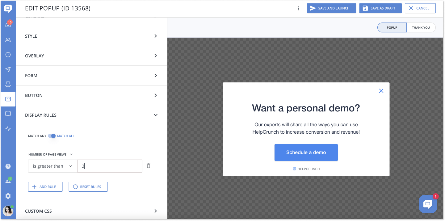
First, define the average number of page views that certain pages of your site gain (you can do it with the Google Analytics tool). Pick out those which attract the largest number of views and think of adding a popup on one of them, as this content is generating the highest interest among your audience. It means that the users might want to sign up for your newsletter or use a special discount for first-time buyers.
Second, go to the popup editor and set it up to display for users based on the page views, when the number is greater than two. So if a person stayed on your website long enough to go from one page to another, it could be a good spot to capture visitor attention and move them towards a purchase.
Time on page
It’s yet another way to find engaged visitors and target them with your popup. To do that, you need to track their engagement with a time-on-page metric. Honestly, this is the most crucial indicator when it comes to popup timing. It will help you find a perfect moment to display your message. And, it will certainly prevent you from making the mistake of showing a popup too late.
If you are wondering what’s the benchmark for the average time on a page, it’s 54 sec across all industries. Here is a quick bar chart to give you more information. (Shout out to B2B fellas, we usually have the highest time per page!)
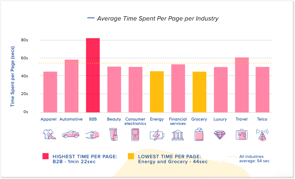
So, first, consider launching your popup on the pages with the longest time per page. As Nielsen Norman Group’s research illustrates, the longer a visitor stays on a page, the less likely they are to bounce off it. In short, they become more interested in your offer, which increases the chances of them interacting with your popup.
Second, try to set up your popup to display at about 50-60% of the average time on the page. Yes, you got it right, it’s better to withhold it for a moment so that users have enough time to read more about your offer. This approach can dramatically increase the possibility of them acting on your offer.
At the same time, if a customer can grasp all about your offer in the first 5-10 seconds, then you might want to display a popup almost immediately, welcoming your guest and inviting them to get a discount or sign in to the newsletter.
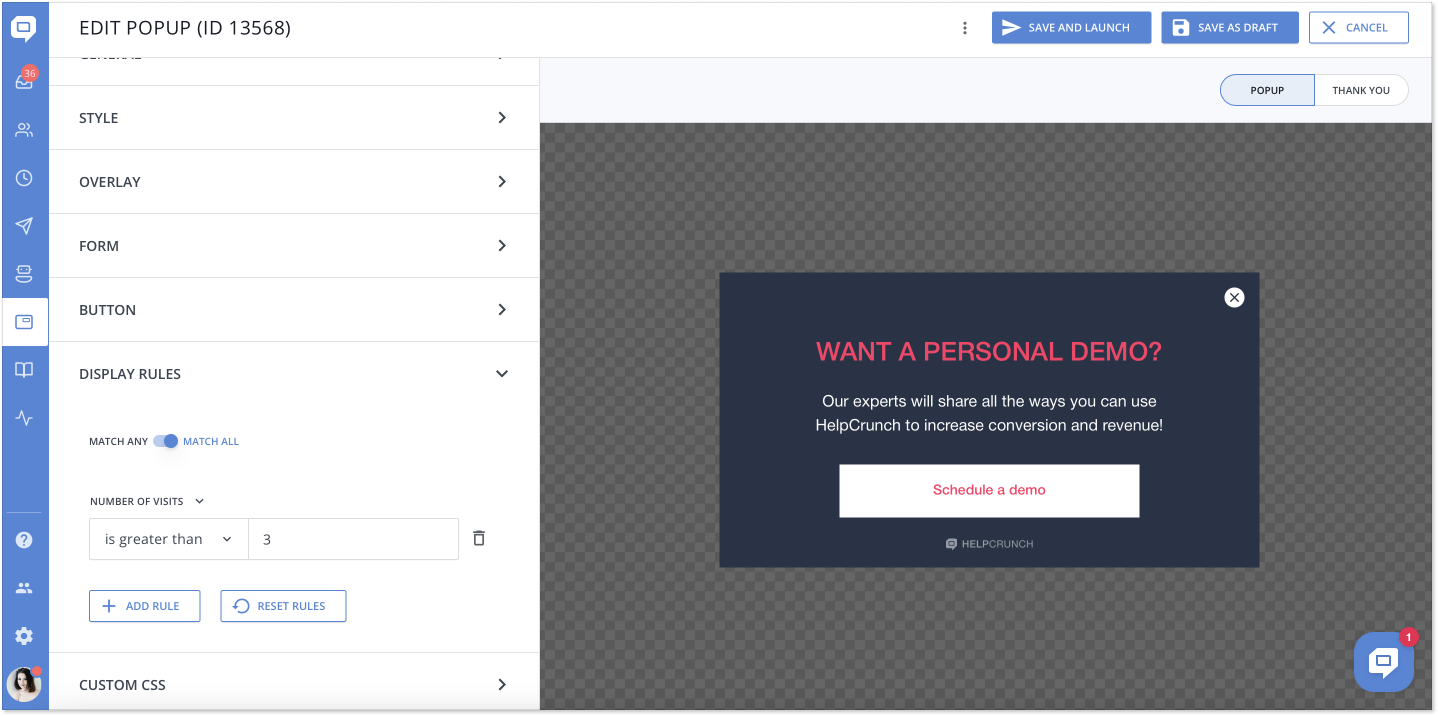
Number of visits
Timing is not always about the exact number of seconds or minutes a user spends on your webpage, but the number of visits. The metric indicates the total number of times a particular user navigates your website.
Say, a prospect visits your website for the second time, then it might be a good moment to show them a welcome-back popup and invite them to get a discount or sign up for a demo.
Also, this approach is more personalized as it shows that you keep your ear to the ground and monitor how many times this particular user visited your webpage.
You can easily set up this popup display rule on the HelpCrunch platform by simply specifying the number of visits you target. We suggest keeping it at 2-3.
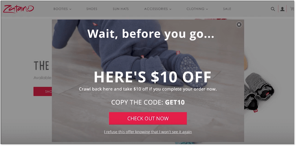
Exit-intent timing
Speaking of popup timing, we can’t bypass the exit-intent web and mobile popups. An exit-intent popup appears on visitors’ screens when they are just about to leave your website. As a rule of thumb, the message contains tempting offers to draw a user’s attention back to the website.
In short, these popups know when your visitors want to close their browser window and move their cursor off of your website page. At this precise moment, a window with a special offer pops up and invites them to use a coupon or represent another reason, why having business with this specific brand is worth it.
Do exit-intent popups work? In fact, they do! 10 to 15% of lost visitors can be drawn back by using exit-intent popups. Simply put, between 10-15% of users who are just about to leave your website will respond to a well-crafted popup message.
Quick tips on how to nail popups and increase conversion
In this paragraph, let’s quickly go through a few tips on how to create a killer popup that your customers can’t help but respond to.
Launch popups only when it’s necessary
As much as I love well-made popups, they might be overwhelming if you display them throughout the whole year to repeat visitors, on each page of your website. Popups are like a delicacy on the top of the main dish (which is your site), they should be served at the right time to impress visitors and attract their attention.
Create a distinct call-to-action
When crafting your message for the popup, keep in mind that you are disrupting your visitors’ browsing experience with a popup. That’s why it’s crucial to keep the message short and to the point. It pays to make the call-to-action button obvious so that a user understands its value of it right away.
Polish your popup design to speak to your audience
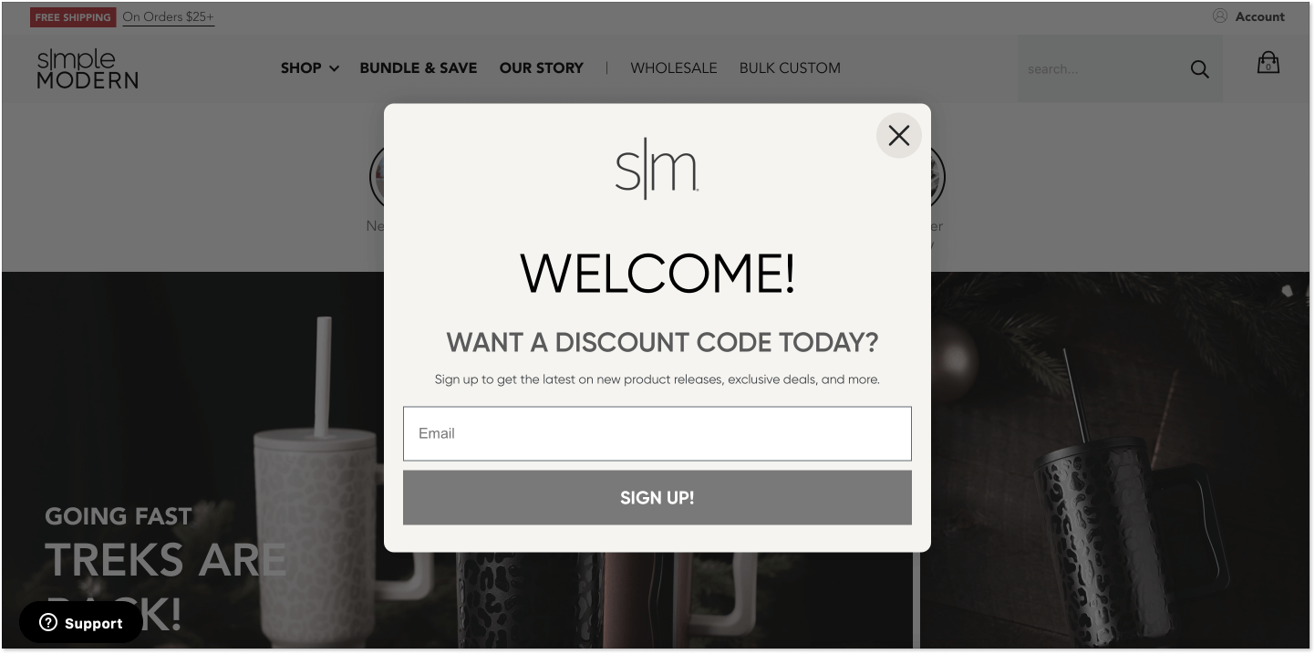
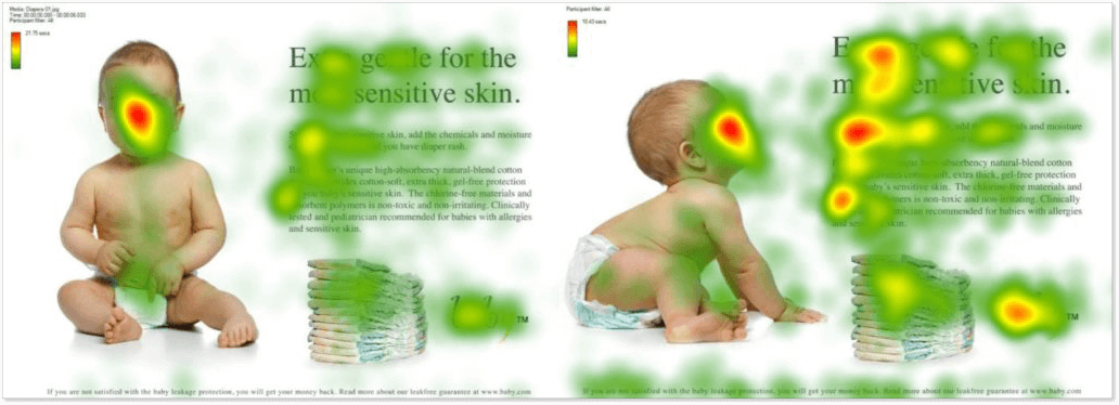
Obviously, your popup has to be visually appealing. First, ensure its look is aligned with your website style. Next, try to make use of images. Research shows that adding a person’s face makes the ads more successful. People react emotionally and remember the ad better this way.
On top of that, you can direct the reader’s attention to the message with the help of a picture, as shown below.
Give value with your popup
As mentioned before, your popup is most probably going to distract a visitor and make them feel a little annoyed. Only if the message on the popup is valuable for a user, they will appreciate it and just might respond to it. Hence, avoid strictly promotional messages that don’t clearly answer the question: What’s in it for me?
Make a closing button obvious
Remember this: hard-to-close popups are your biggest enemies if you are on a mission to attract more leads. Personally, I just leave websites where I don’t know how to close the popup window. Don’t you do the same?
Even if the message offers a 75% coupon and incredibly valuable content, I just don’t want to read it if I am being forced. Thus, avoid closing elements that are too small, located in non-obvious places on the screen, or absent altogether.
Conclusion
Throughout the whole article, I’ve been waiting for the conclusion part to tell you one single phrase: experiment. Take note of our recommendations, launch your popup, and monitor the results. After a while, try changing the text, style, design, and popup display time and launch it again. This way, by trial and error, you will find the perfect option that works just great for your audience.
And if you need a reliable tool to create your popup, check out HelpCrunch. It’s a full-stop tool for communication with customers that offers not just a smooth popup editor, but also a shared inbox, live chat, chatbot, knowledge base, and more. Take it for a spin for 14 days free of charge (no credit card details are needed).