10 Popup Design Concepts That Lure and Convert Website Visitors
Nobody enjoys a muted popup design. With that in mind, we showcase 10 steal-worthy concepts for you to attract your website visitor's attention. Don't let them get bored and say ciao to you!
Written by Olesia Melnichenko

Urgh, this meddling popup keeps offending my eyes over and over again! Do these words ring any bell to you? I bet you’ve said them at least once when landing on a clothing company, grocery store, or any other website.
Let me guess the reason… The popup copy was lame, the overall layout was raw, and you didn’t get any value from it. To put it another way, it didn’t provoke your interest in what a company had to offer, and, as a result, you were annoyed 😞
Have you ever wondered why this was a regular case? That’s the easy part: the popup design was not a winning strategy.
We’ve assembled 10 popup design examples worth stealing to prevent you from making the same mistakes. And who are we not to plant ideas in your mind on how to shape that window and lure website visitors? 😜
4 precepts of the winning popup designs
Before we set to this whole popup design inspiration spree, we need to establish the basis. How to make that little window that comes out of the blue, compelling and lucrative? Fear not, I am here to clue you in on this.
To be honest, popups are a double-edged sword. They can both attract and kill customer engagement. Memorize these cardinal rules to avoid the second scenario. You do this – and your popups will invite website visitors to buy/subscribe with ease:
- Make targeting your priority. A successful popup is one that is targeted at the right audience and sent at the right moment. If a website visitor is searching for clothes on the product page, make them see a popup with the best offers this week. But for those who just looked around and are about to leave your website, prepare an exit-intent popup.
- Don’t be pushy. If I were asked, I would say that I drop obtrusive popups. That’s not just me! In fact, 73% of respondents claim they dislike these windows for their in-your-face fashion. So, instead of dropping “BUY our products no matter what“, say something like “Always wanted such a gorgeous lamp? You now have a chance to get it!“.
- Let your creativity flow. Who likes mundane copy? Nobody. To hook a reader, consider writing digestible, strong texts for a popup. They can be humorous, matching your brand’s identity, and not typical at all.
- Give an opportunity to skip. It’s next to impossible to gather every lead, every user you wish for. So don’t bite more than you can chew – provide that “No, thanks” option for people so that they can move on. Who knows, maybe they will return later?
10 popup design examples that will convert website visitors
From signing up for a newsletter to the sales gimmicks and whimsical options – every popup design inspiration is in here. Comb them through and decide which one you would like to steal! 😏
1. Lure visitors with a special offer
A generic “Sign up for this newsletter” is not a good bet. The main goal businesses pursue is to engage a user, grip their attention, and encourage them to spend more time with the brand. That’s the wording I chose for the article title.
For a high-converting popup, you have to answer a coveted visitor’s question: “What’s in it for me?“. The trick is in providing real value, that is, offering a special deal, once-in-a-lifetime sale – anything you think will hook the reader in.
Dip&Doze – a home fabrics company – has done just that. Their popup design is all about a win-win strategy. They give 10% off for first-time purchasers (here is luring) and gather emails and names to grow their contact base (here are long-term customer relations on the horizon).
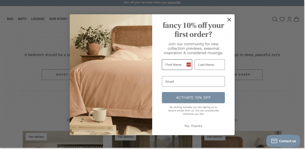
Pro tip! Let users ground on your website and then flash them with a popup (up to 5 secs will be OK). Offer them a little incentive to stick around with your brand: a surprise gift, free shipping, next-time purchase discount – it could be anything.
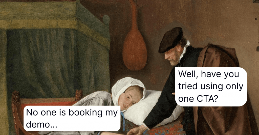
2. Let a CTA take center stage
The naming of a CTA (call-to-action) is self-explanatory – you’re supposed to induce a user to do something. However, it’s easy to skate on thin ice here. Let me elaborate on this one.
Compare the following CTAs and think of which one is the weak link?
- Click
- See it
- Enjoy my 15% off!
- Apply now
- I want to get started
From where I am standing, the first two would be the least attractive to a user. To pull this off, make your CTA stand out either with the words or with colors/shapes, and create a literal CALL to action.
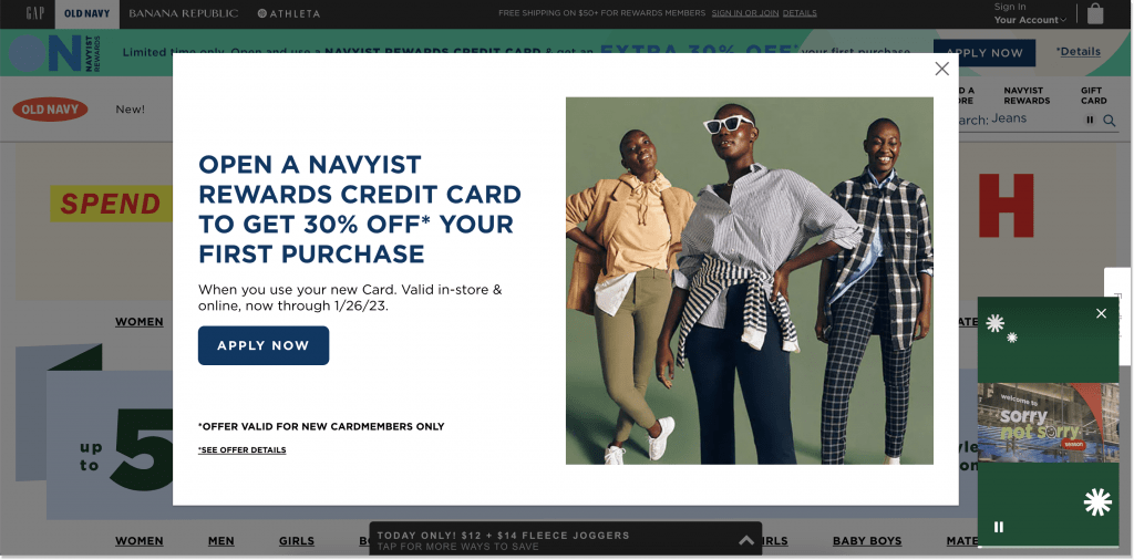
The example below is from the clothing shop – Old Navy. Their web popup design tampers with its elegance and a straightforward CTA. This is what I talk about. Compared to the overall canvass, which is white, the CTA is hard to miss out on thanks to its brand blue color. Would you pay any attention to it if it was in, I don’t know, cameo pink or beige?
Oh, and one more thing. Have you noticed a nice little video popup in the bottom right corner? More on it is coming 😏
3. Take a step toward simplicity
Less is more, they tend to say. It doesn’t matter how badly you want this, but you won’t squeeze everything you would like a customer to find out about your company in one popup. The best case is that it doesn’t conflict with your website functionality.
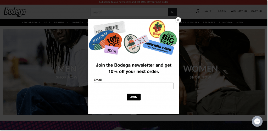
Bodega is a clothing store that puts a premium on simplicity. Its popup design aims at increasing the contact database and is in line with the brand’s philosophy, all hipster-y. The main colors are black and white, which are all-time favorites. Besides, there’s no visual noise – the old-style stickers only accomplish the entire atmosphere.
4. Generate a custom illustration
Ok, you’ve been working on your popup copy for several days, but if you accompany it with a lackluster image – say ciao to the customer crowds.
The best popup design is the one that allows you to speak your brand’s personality and highlight its uniqueness. To top it off, a popup containing any image has almost 12% in conversion rate. Would you like to see conversions skyrocket with a custom illustration? You’d better don’t blow it off.
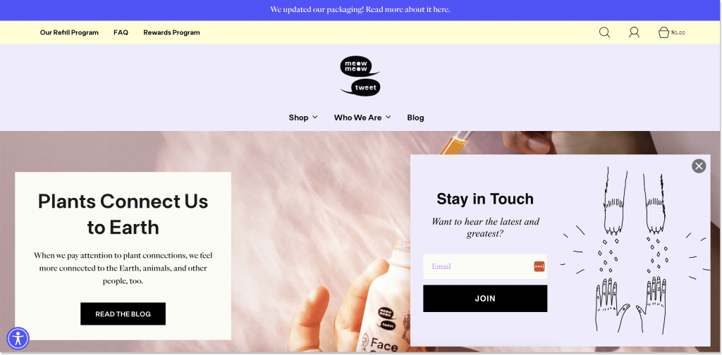
Meow Meow Tweet, a vegan skincare brand, just hits the mark. I would call this the cutest of all the popup designs we’ve mentioned here. Together with the newsletter subscription invitation, they played around with the naming – those are cat’s paws – and embodied their possible key message: “After using our cosmetics, your skin will be as soft as the kittens’ paws“. A definite YES from a cat lover 🐈
Plot twist! Can’t wait to design the popup of your dreams? HelpCrunch is at your service.
Not only are we a full-house customer communication platform with such goodies as live chat, chatbot, and multilingual knowledge base for your support, marketing, and sales, but we also offer a popup builder.
Choose the popup shape, button colors, sizes, and add visuals. Anyway, watch this video on our YouTube channel (or sign up first!) – my colleague breaks the topic down 👇
5. Drive sales wisely
When you nurture your website popup design, it’s essential to take all the aspects into account, from growing your database to sales.
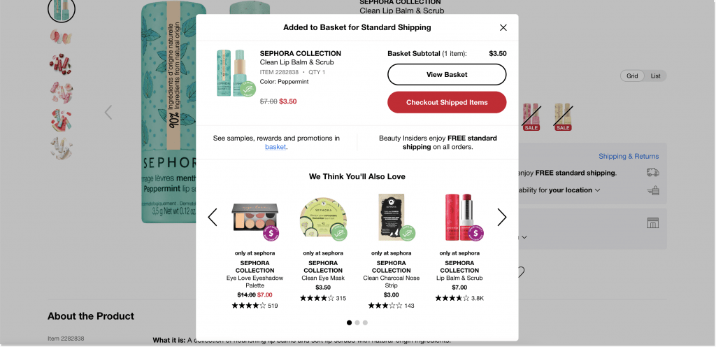
Sephora has made a smart move with its nifty popup. Once you add an item to the cart, it appears, showing every little detail you might like. Here, you get a line on free shipping and additional rewards/promotions.
What’s more important, Sephora shares complementary items a user might enjoy. This is what I call “successful upselling”. Such a nuanced popup design could be your advantage in sales conversions and cart abandonment prevention.
6. Use the sense of urgency as your weapon
You don’t have to be a seasoned therapist to interpret the sense of urgency in marketing. It is used to make people think the product is valuable and if they don’t get it right now, it’ll fall off the grid for good. This sense of scarcity triggers the essential emotion – fear (FOMO or Fear of Missing Out needs to be mentioned right about now).
The given popup design from Bryan Anthonys, a jewelry brand, seems to kill two birds with one stone.
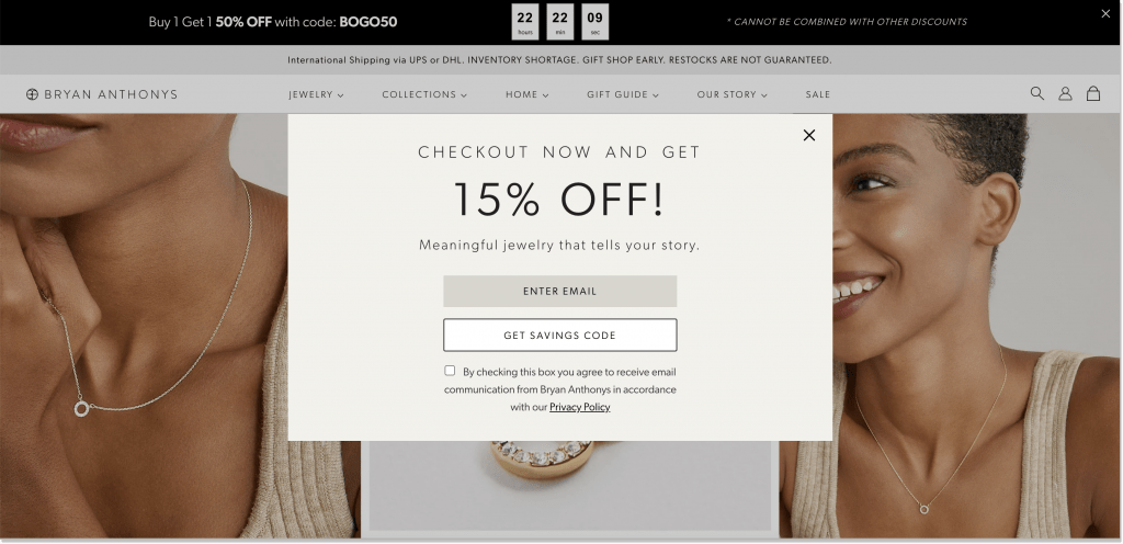
On the one hand, there is the bar popup sticking on top. The company uses a countdown timer, which is claimed to generate more than 112% of conversions. And do I have to mention this BOGO (Buy One, Get One) marketing gimmick?
On the other hand, there’s this main popup nudging a user to purchase now and get an additional 15% off code. Just fill in the email. Smart!
7. Play around with the popup location
The orthodox location for a popup is the center of the page. However, you’re allowed to push the envelope!
Top or bottom corners, left or right – it’s you who decides. One thing to remember, though, is that your popup design doesn’t interfere with the rest of the page’s content.
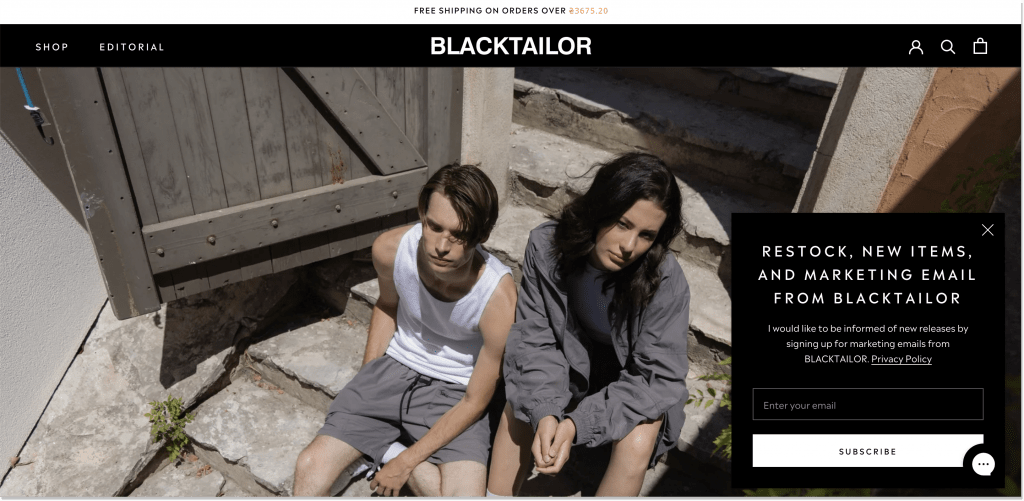
Of all the popup design examples we’ve presented today, BLACKTAILOR, a fashion brand, got the best of both worlds. It placed its popup in the bottom right corner instead of the middle of the screen and made it match the brand’s color. Besides, the team doesn’t inundate a user with stocks of input fields: just an email address is fine.
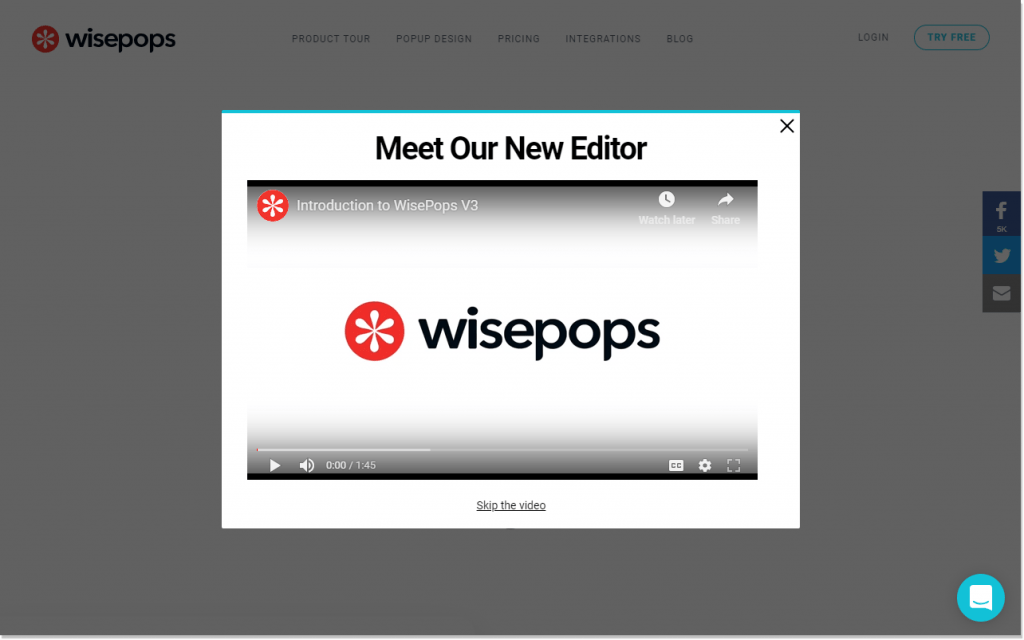
8. Express your thoughts with a video
Remember we promised more on video popups? Here we are! It’s fine to catch people’s attention with an ordinary popup, but isn’t it great to go a little further and actually show what you have to say?
In the popup design, video is rewarding in so many ways:
- It increases the average session duration – people tend to spend 2.6 more times on a page with visual content;
- It enhances trust – a human-like approach was beneficial for 81% of marketers as they saw the positive impact of videos on sales;
- It educates your website visitors – 131% of consumers claim they would likely purchase from a company that offers educational content. Why not make it with a short popup clip?
Where to employ this popup design inspiration? Anywhere on your website! Testimonial page, product page with a new feature introduction, homepage with a welcome video from a company’s CEO, or a holiday landing with the team’s greetings. Make sure your website visitors catch it. Here is a quick sketch of how a video popup might look like:
9. Go beyond collecting just an email
To grow the list of subscribers, one can totally be satisfied with user email addresses for future activities. But who told you can’t go the extra mile?
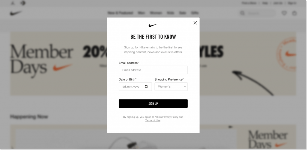
With its popup design, Nike moves a step further towards personalized marketing. Except for an ordinary email collection, they also ask for a date of birth and shopping preferences.
This demographic and gender-specific data will come in handy for newsletters with targeted product roundups, discounts, birthday specials, and whatnot. All of it is perfectly accompanied by their brand color palette and subtle ambience.
10. Consider an unorthodox popup shape
Ta-da! My favorite paragraph of all time 🙈 Before I introduce you to the absolutely creative popup design, I would like to highlight the importance of thinking outside the box.
As you know, a popup is what strikes the eyes of website visitors and pushes them to take action. Use this chance to communicate your business idea. If you’re a cosmetics retailer, make your popup in the shape of spilled foundation. For a gym club, for that matter, a yoga mat popup would be an excellent idea.
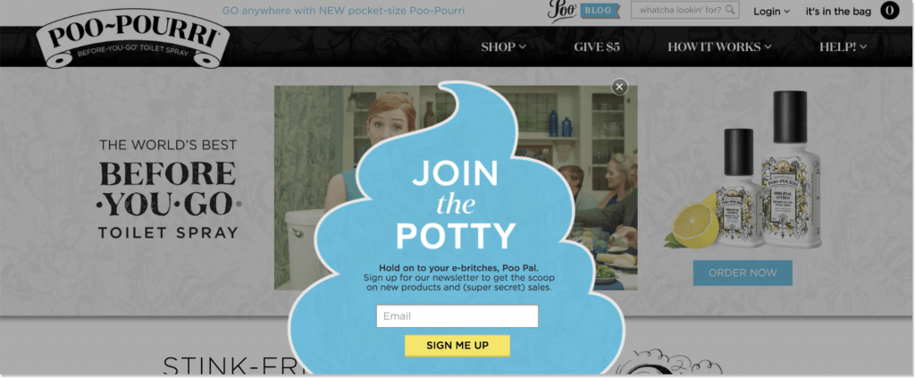
Poo~Pourri, a toilet fragrance shop, has definitely thought outside the box! The queerness oozes out from this poopup (pun intended 😅). The team used an unconventional approach, their brand’s uniqueness, and imagination to create a hilarious popup. Should I also mention the play on words in the copy, like join the potty (instead of the party), poo pal, and get the scoop?
Have you already picked your ideal popup design?
These popup designs might be a lot to take in. What we did is point you in the right direction. So, next time you create that popping window of your own, you won’t be racking your brains on its layout. One glance at our article – and you’re all set.
May the creativity be with you every step of the popup creation! 🖼