Top 7 Mobile Popup Best Practices to Engage Users in 2024 (+Examples)
How to create an appealing mobile popup? We provide you with some great examples.
Written by Tetiana Shataieva
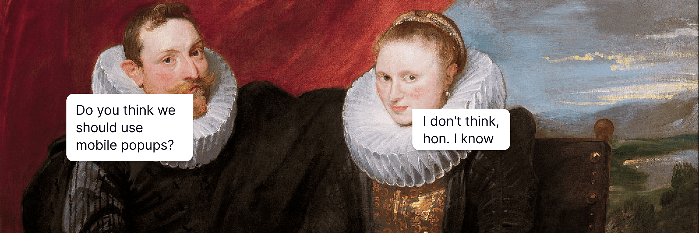
A mobile user experience differs from a desktop one, it’s a well-known fact 💁♀️. So when creating a mobile popup, it’s crucial to take its compatibility with these devices into account so that you can convert users and not irritate them.
The main dissimilarity between a desktop popup and a mobile one is that the latter has much less space. In other words, you need to fit all you want to say into a small square and at the same time encourage a user to take an action. The rule here is simple, less is more.
Nailing your design in this context will result in a boosted mailing list and make Google happy with your mobile-friendly website (yes, the search engine pays huge attention to mobile UX).
From this article, you can learn about the importance of popups for portable devices and the best practices on how to use them for marketers. Follow these simple tips to improve your conversion rate and have a chance to get to the top of the Google search.
Why use mobile popups?
Have you heard the news? There are 6.6 billion mobile visitors around the world and this number is growing irreversibly. Probably, every time you go to a restaurant or ride a bus, you see people fixed on their phones, scrolling their favorite websites – Facebook, Instagram, TikTok — or looking for just the perfect product to buy. There is no better device to consume it all on rather than our phones.
It means that mobile popup campaigns have huge potential to help you reach your target audience.
The rule of thumb is that on average people spend over 3 hours on their phones per day. I don’t know about you, but for me, it’s even more than 5 hours of daily screen time (guilty 🙈). That means marketers focus a lot on producing mobile-friendly content for their users. My guess is that’s exactly what brought you here.
7 mobile best popup practices to learn from
Alright, time for some practical tips! In this section, we are going to do so many things! First, bust the myths about all-screen-only windows that interfere with the rest of the page’s content. Second, discuss their ideal positioning, displaying rules, and UX writing. And third, explain the fields needed for your popup to slay!
-
Choose the right popup type and position
So basically there are a few types of them, mainly we talk about full-screen and standard-size windows. Their position can also differ depending on your settings, like in the middle of the screen, top or bottom of the page. The question remains as follows: which one to choose?
A mobile popup, if done not so smart, interrupts a mobile experience with your website.
Especially on smartphone screens with little space, it’s easy to drive customers nuts with a huge full-screen window. Try to hide your close button, and you will lose them forever.
That’s why we suggest leveraging the standard-size window with a huge X sign. They take up less room on the display, which means they are less intrusive. They prove to work particularly well in welcoming visitors to your page and inviting them to use a discount coupon for first-time buyers. See how Rails and Karen Millen fashion brands show their popups to mobile users.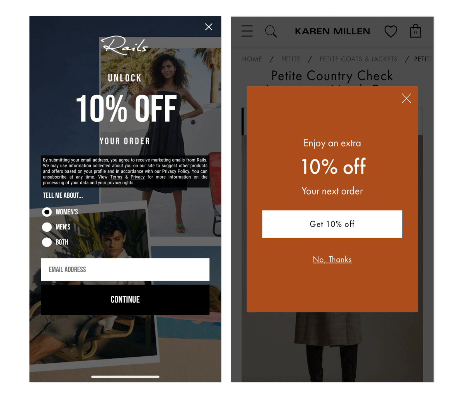
I, personally, prefer the one on the right. Full-screen banners annoy me enormously as they prevent me from exploring the product page and put pressure on me to take advantage of a discount on a product that I have not even chosen yet! And after this banner… maybe, never will…
Karen Millen’s mobile-friendly popup looks much less overwhelming and doesn’t take control over my website experience. I can still see the item I was interested in in the background (so no stress about losing it in hundreds of other products) and it’s very easy to spot the closing button if that’s what a customer is willing to do.
Of course, you may say now that full-screen popups also work. You are right, but if you show it immediately to the users who landed on your website for the first time, there is a chance Google will demote your site for this intrusive popup.
Instead, if you really want to go with a huge banner, adjust its settings to show up after a user visited at least a couple of pages and showed clear interest in your site. This type might work.
-
Prioritize correct targeting
Just like with any other marketing tactic, targeting is everything. In terms of mobile popups, they are annoying enough to show them to non-relevant users who are obviously not gripped with your offer.
For example, at HelpCrunch we show popups only in extreme cases when it is absolutely necessary. Thus, we love inviting our users to book a demo with us because that’s when we can demonstrate all the perks of our platform and discuss the specific needs of our prospects.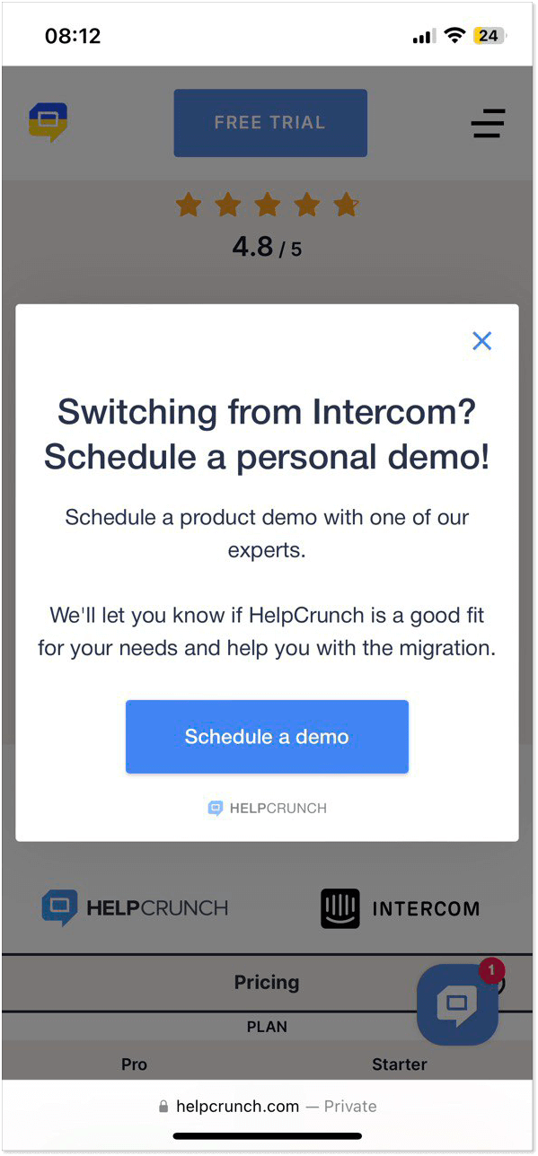
But if we showed an invitation popup on every page of our site, we would only scare customers away. We understand that not every visitor is at the demo booking stage, so our team decided to set up a piece only on the page where we compare our tool to the most prominent competitor. If a visitor is ready to go in-depth with the capabilities of our platform, then it must be a perfect moment to invite them for a demo.
When talking about the right targeting, it’s display rules that matter the most. Who and when will be able to see your small window? Adjust the settings in the dedicated section on the HelpCrunch platform. For it to be displayed as shown above, we picked the following rules: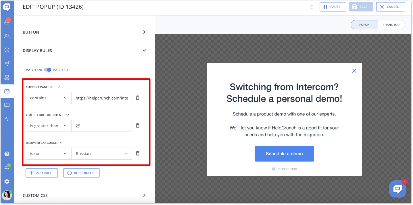
You can create the same popup with our platform, or even better! If interested in testing HelpCrunch opportunities for free, just sign up and get a 14-day trial at no cost. I promote it because I love it and use it myself 🙂
-
Nail your CTA
There are not many things that can help you stand out with a mobile popup. Since the screen space on a smartphone is limited, you should attract user attention with a stylish CTA button and a clear message that leaves no questions.
Usually, brands ask visitors to respond to two requests:
– Share an email address (I mean, who wouldn’t want to replenish their contact list this way
– Click a CTA button (to book a demo/get a free discount/download an eBook)
When designing your action button, make sure it’s large enough so that a thumb can easily click on it. In terms of a color palette, it should definitely stick out and be intuitive for visitors to push. Also, take care of the message, it has to be concise and simple: Get 10% off, read the marketing guide, grab free delivery, or book a demo.
For example, let’s have a look at the Deliveroo app example. Its design is easy and perfectly matches the app’s color scheme. A little icon at the top only enhances a user’s wish for food and proves great customer service. The CTA button to “Turn on notifications” stands out and makes a visitor press it automatically, while the “Not now” option is pale and almost invisible to the user’s eyes. By the way, app notification is a good way to improve user engagement as well 😉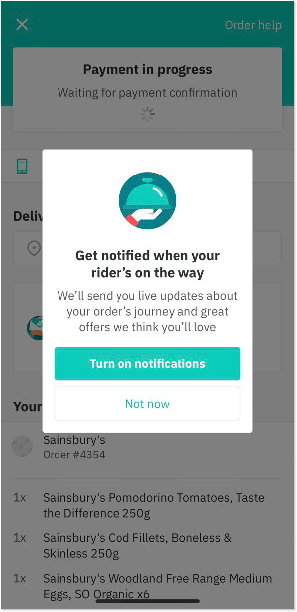
Mobile version windows are small, so in order to work out, they need to have a single goal, with a design that makes a splash. The Call-To-Action button has to be obvious about what you want your users to do.
-
Avoid using images
You might have noticed that the mobile popup examples above have almost no images. The reason is simple – less space and less content can fit on the banner. On mobile devices, small windows with a form to fill in, a CTA button, the message itself, and an image look busy. Images attract too much attention and leave the actual CTA button in the shadow. Like this example from JD Sports.
Yes, the product photo looks amazing, but it draws too much attention to itself, leaving the most important, the CTA button, in the background. Then ask yourself, what is the main goal: to show a product photo or to encourage the user to take a certain action?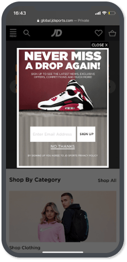
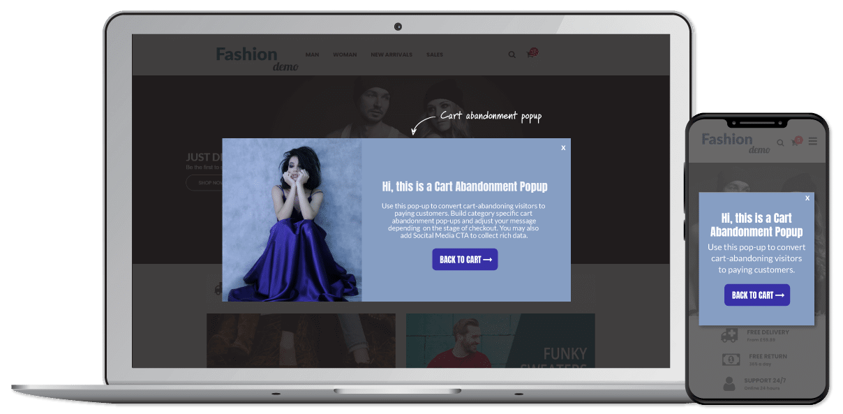
Instead, opt for a simple design with high contrast, and let the product images on your website speak for themselves. Here’s how you can solve that problem by adding a picture to the desktop version and hiding it for mobile devices:
-
Add fewer form fields
I will never stop repeating that with popups on mobile gadgets, the main issue is limited space. Some brands ignore that fact and create long-form questionnaires asking users to share a full name, email, phone number, job title, age, gender, and ethnicity. Too many input fields!
If you ask me straight from the shoulder, I don’t know a single person who would provide all this data, apart from my grandmother, probably. She would assume that it’s an obligatory action, and you can’t skip it. (Yep, my granny is just learning how to use a smartphone. She still believes that she won a million dollars every time a lousy scam banner pops up.)
Of course, all this information from a user can come in handy for your next marketing campaign and more granular targeting. We suggest you focus on the most important question: the email address. In the end, popups are a great email lead-generation tool, so use it to your advantage.
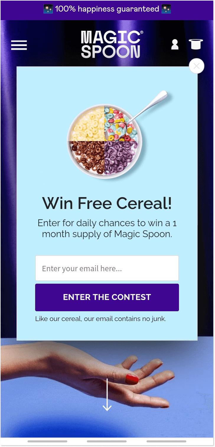
Have a look at this mobile popup from Magic Spoon. Nice catchy design, a non-intrusive image, and just one form to fill in. Quickly weighing all the pros and cons as a user, I will most likely agree with this proposal. I feel okay to share my email to get the product for free.
-
Allow users to close the window easily
I know. I know. We’ve mentioned it a few times already, but many brands still play hide-and-seek when it comes to a closing button. In particular, when we talk about the mobile device experience, it can drive anyone off their head.
To be fair, it happens by accident when a team just forgets to add an X button to their mobile campaign (which will never happen if you use the HelpCrunch platform 😁). Also, it may happen that a visitor’s screen size just cuts the button off. How to avoid it? Well, by proper testing on different mobile devices or adding a closing text instead of a button.
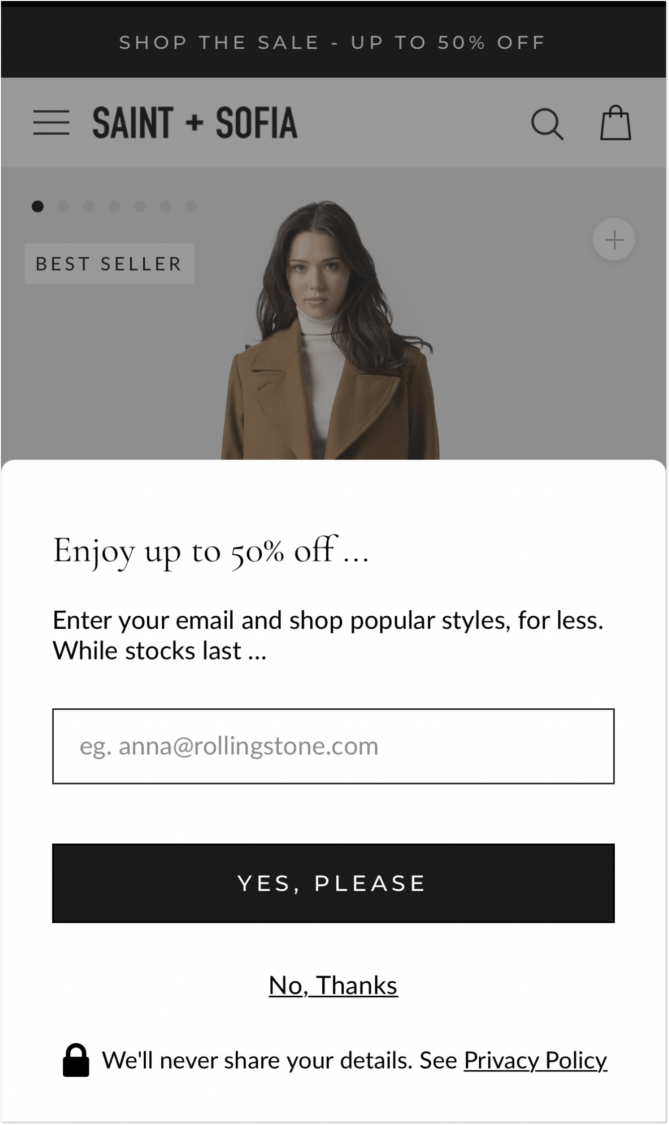
See how the Saint and Sofia brand solves the case. They adding a “No, Thanks” option just under the CTA button.
-
Finally, test across various mobile devices
The peculiarities of displaying a mobile popup are tricky. There are all different kinds of gadgets and a piece that looks just perfect on iOS may look wrong on an Android device. That’s why we encourage you to check it out after the launch.
How can you do this? For instance, in our team, we just drop a message on a marketing chat asking everyone to go to a particular page and take an entire screen screenshot on their smartphones.
Another way is to reach out to your QA team and ask them to check. To be honest, we’ve never encountered any displaying issues. But as they say, better safe than sorry, as a ruined customer experience may cost a lot.
Keynote
I want to take this opportunity to remind everyone one more time: a mobile popup is not a place for interviewing users or flaunting another eye-catching photo of your product. Instead, it’s a perfect tool to guide visitors in the direction that leads to more benefits for them.
More valuable information, beneficial offers, and opportunities to succeed with your product.
But it can’t be created out of thin air. What you need is a reliable platform that provides you with an easy-to-use builder, a bunch of templates, and possibilities for a unique design, like HelpCrunch, for instance (yeah, an obvious prompt, I know 😉).
But no popup can be created out of thin air. What you need is a reliable platform that provides you with an easy-to-use popup builder, a bunch of templates, and possibilities for a unique design, like HelpCrunch, for instance 😉.