Best Landing Pages for Lead Generation: Real Examples That Convert
What’s a better way to improve your landing page than by looking at real, effective examples? I’ve also sprinkled in a few tips and tricks to help make sure it all works out for you.
Written by Olena Zinkovska

A landing page is probably the most straightforward way to get some leads. But it doesn’t always work perfectly: often, people leave due to a vague value proposition, a messy lead capture form, and weak motivation. As a result, a landing page fails its main task.
How do you fix it then? The best landing pages for lead generation are free of distraction, offer real value, and guide your visitors to the single action you want them to take. Sounds simple, but not so easy to do.
What about starting by exploring some successful lead generation landing page examples to get inspiration and steal a trick or two?
This guide shows you real-life examples of high-converting landing pages, expands upon the essential layout elements, and gives you step-by-step lead generation landing page creation instructions.
What is a lead generation landing page?
A lead generation landing page is a standalone page that drives visitors toward a particular action and includes a form that captures their contact details. Usually, it is their names, email addresses, or company-specific information.
As part of a broader digital lead generation strategy, the lead gen landing pages help businesses identify prospects and move them through the sales funnel.
Why do you need lead generation landing pages?
Lead generation landing pages are efficient in converting anonymous, faceless visitors into prospects you can work with. It also helps qualify leads before passing them to your sales team.
Other benefits of using lead generation landing pages include:
Improve conversion rates
When you build a single-purpose landing page, visitors aren’t distracted by various offers, navigation menus, or competing messages. With a clear value proposition and a path to conversion, they’re more likely to complete the form.
Such simplicity greatly reduces friction and brings better conversions. Just consider: multi-purpose landing pages have a 266% lower conversion rate compared to single-action ones!
Support marketing campaigns
A dedicated landing page keeps messaging consistent and supports any of your marketing efforts. When a campaign goal matches the landing page, trust is built, and visitors are motivated to act.
Scale paid acquisition efficiently
Every click has a cost, so it only makes sense to send traffic to optimized landing pages to enhance your ROI. Paid advertising can be expensive if visitors don’t convert after clicking an ad. Lead generation landing pages help maximize the click value by creating an experience aligned with your offer and audience.
Types of lead generation landing pages
The page needed depends on both your offer and target audience. Here are some landing page types used across SaaS, e-commerce, and B2B services:
- Webinar registration: You plan to invite viewers to a live or recorded event – you want to equip your landing page with the topic, date, time, location, speaker details, and agenda. Plus, you need the registration form to remind them about the event and nurture leads after the webinar.
- Free trial: This one gives leads immediate product access. Expand on the key features and benefits of the product or service. Ask only for the essential information and do not waste your client’s time with long forms.
- E-book download: Offer to exchange your valuable educational content for the leads’ data. That is the most common landing page type. Such pages show the value, along with an annotation, and with or without a cover image.
- Demo request: Demo request landing pages are suitable for leads who are ready to decide and simply need a nudge. Focus on product value. Unlike standard pages where short forms are a must, this is the very type of landing page where you can also expand your form a bit for better lead qualification.
- Newsletter signup: These present an ongoing value instead of being a one-time resource. Explain to the leads what they get and how often. It may be tips from experts, industry insights, or product updates. Keep the form simple and focus on a value proposition here.
Key elements of a lead generation landing page
There are endless landing page design and copy options out there, but do not forget about the core elements that effective pages have in common. They work in synergy and coerce the users into the required action.
-
Clear value
The main task is to immediately grab the visitors’ attention and show them what they get and why they need it. Think about an “Improve your marketing” headline. It can offer literally anything, from a campaign optimization tool to inbound lead generation software. Instead, highlight your main benefit through the headline and use subheadings for the less crucial details.
-
Persuasive text
There is never enough time for a product or service showcase. Use brief yet informative paragraphs, bulleted or numbered lists, and simple writing. Texts for 5th–7th graders convert 5.8% better as compared to more complex writing.
-
Brief form
You want the leads’ data captured. It’s best to get to the point and include only the crucial questions (a 4-field form performs 120% better than forms with 11 fields). If it’s a newsletter signup landing page, ask just for an email address. Extra fields for company size and role to qualify leads will be required for a demo request page, though.
-
Compelling CTA
CTA buttons should encourage visitors to click and step forward. “Submit” is never enough. Phrases like “Download the guide”, “Save my spot”, or “Get a free demo” work much better.
-
Visual cues
Provide images: include screenshots, illustrations, or GIFs. For an online course landing page, show a lesson module preview or a dashboard screenshot.
-
Social trust
Testimonials build credibility. For a SaaS demo landing page, you can place logos of your customers and a short text testimonial, along with a subheading “Trusted by 5,000+ marketing teams.” Do not oversell.
Weak, unclear, or absent elements drop your conversion.
7 best landing page examples for lead generation
Let’s look at some practical examples of the best lead generation landing pages to understand what works.
We chose examples with different modern B2B lead generation strategies, so pay attention to the structure, copy, and form design as these elements often have the biggest impact.
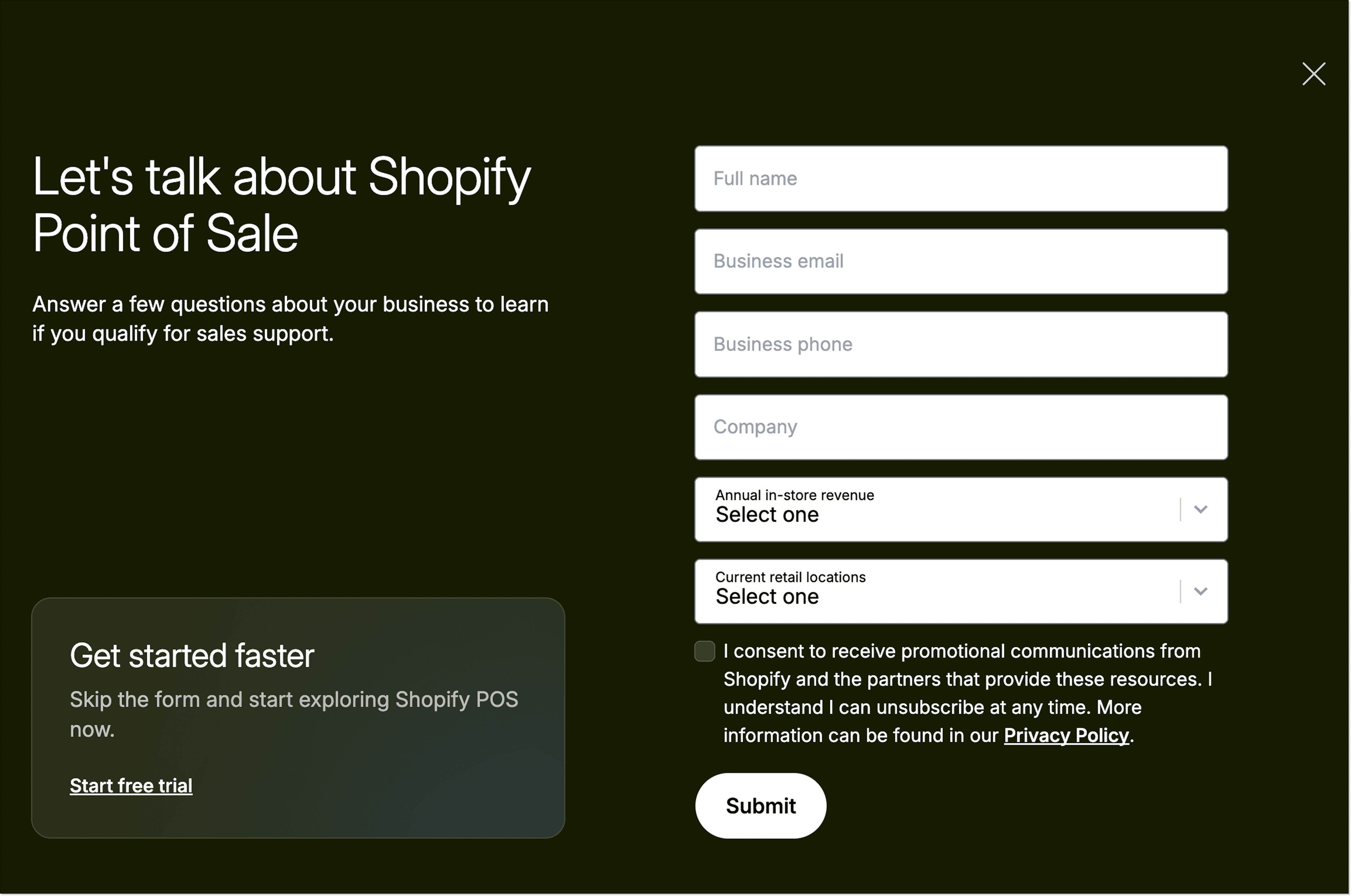
1. Point-of-sale landing page by Shopify
This landing page from Shopify guides visitors toward using point-of-sale hardware and software. There are multiple calls to action on the page, but the main ones (“Start for free” and “Get in touch”) are placed both at the top and bottom of the page to keep visitors’ attention.
The company also builds trust by adding logos of their renowned customers and presents copy in a brief, simple way, making it easier to scan through the page and understand the value proposition.
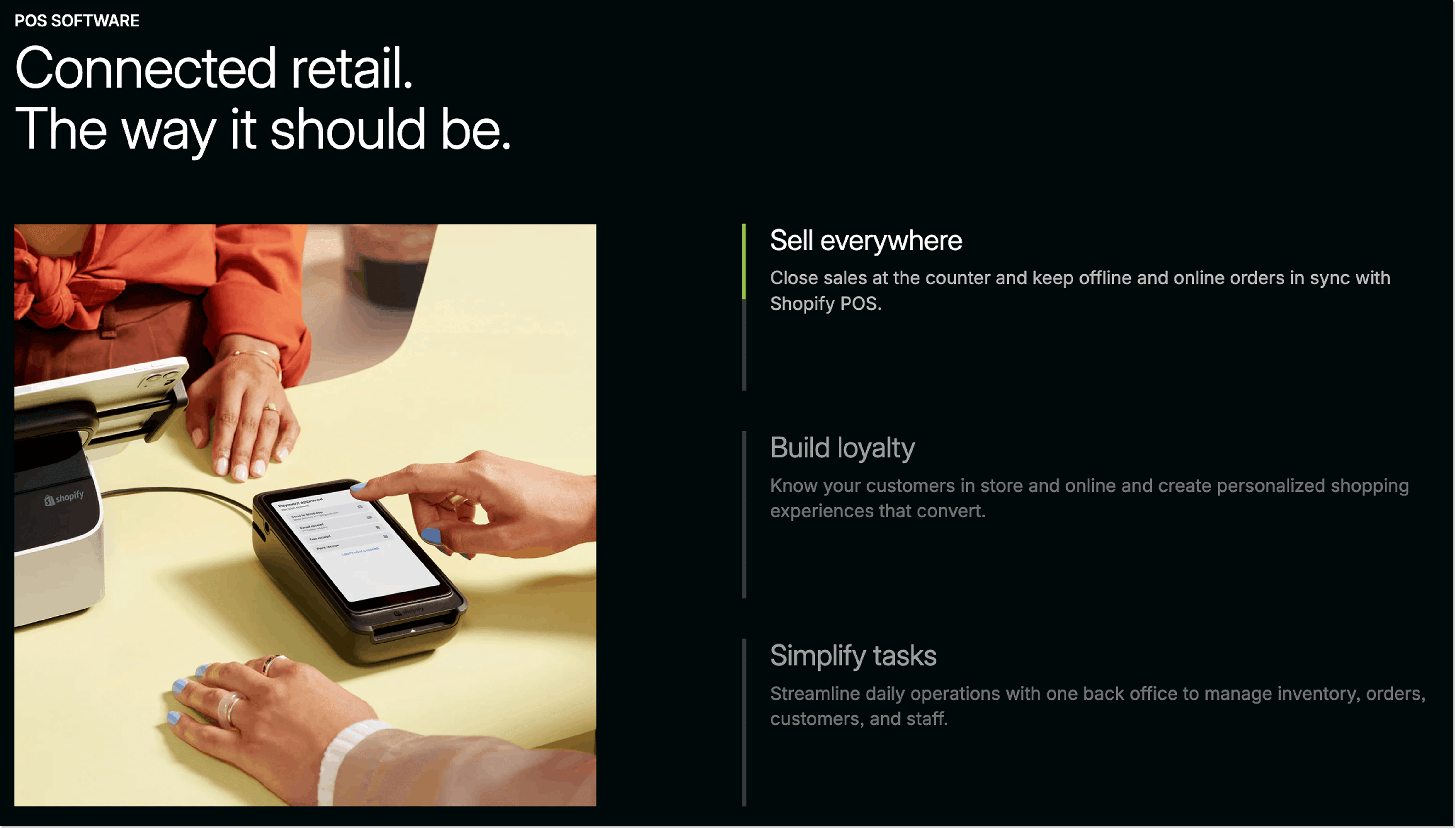
Why it works:
- The main heading provides the core information.
- The subheading offers more details.
- Main CTA buttons are placed strategically throughout the page.
- There are free guides to learn about retail trends.
- Informative FAQ section that works with objections.
- A 6-field lead-qualifying form.
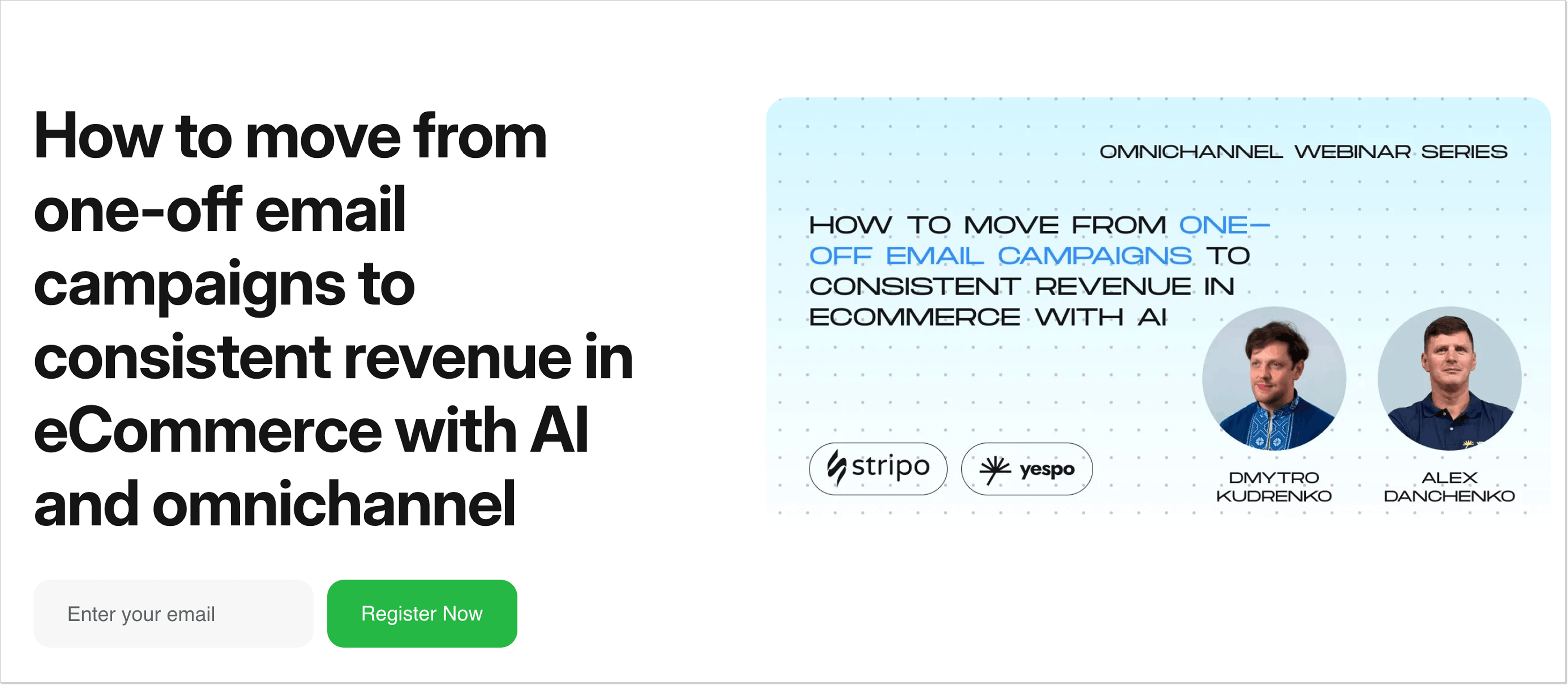
2. Webinar registration landing page by Stripo
A convincing webinar registration landing page should have a strong topic, interesting speakers, date and time information, and a short form.
Page benefits from a trendy theme, a brief numbered agenda, speakers’ info, and a single-field form with a clear CTA.
Why it works:
- Catchy headline explains the value proposition from the start.
- Brief yet informative landing page copy helps to grasp info quickly.
- Speakers with expertise on the topic.
- Visitors only need to fill in their email address to join the webinar
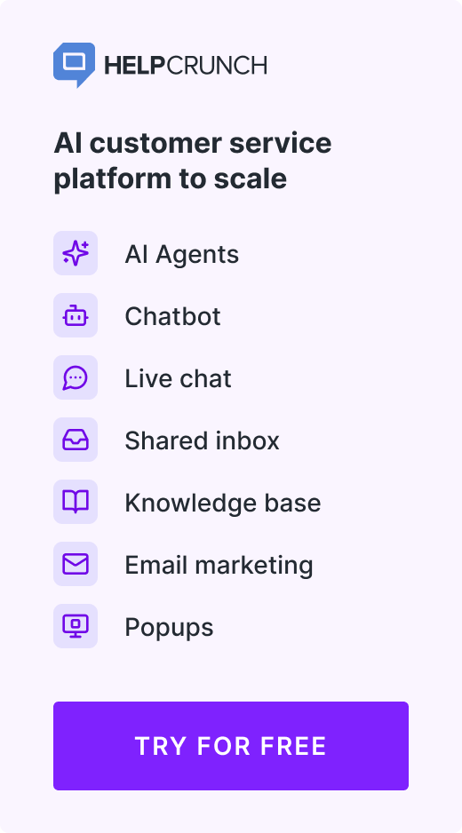
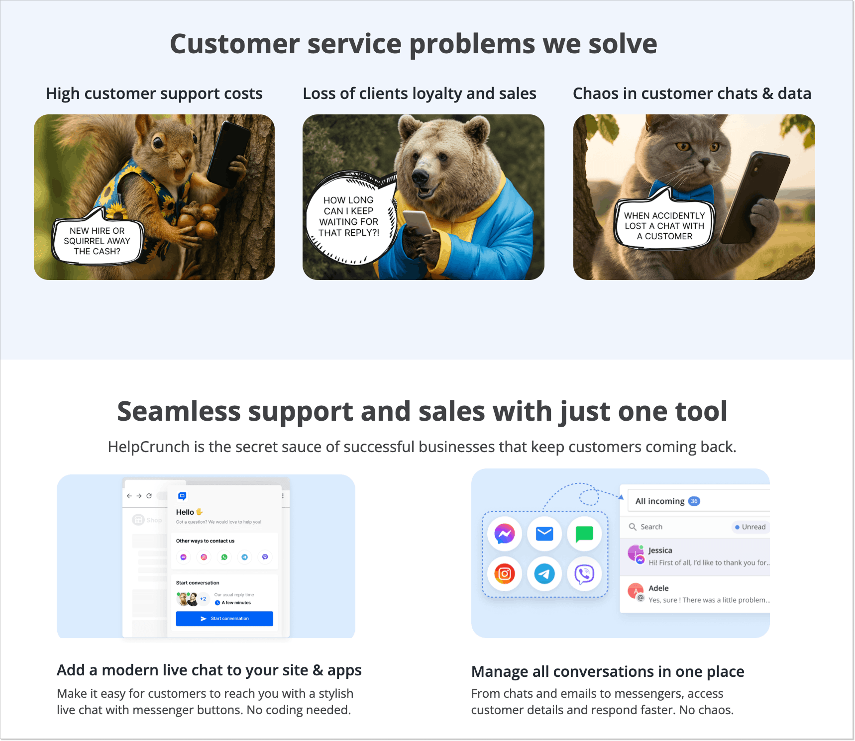
3. Customer support landing page by HelpCrunch
This landing page by HelpCrunch is focused on guiding visitors to book a demo of an AI customer service software. It’s centered around credibility, the result-oriented copy, client company logos, reviews with customers’ photos and names, and numerous G2 badges.
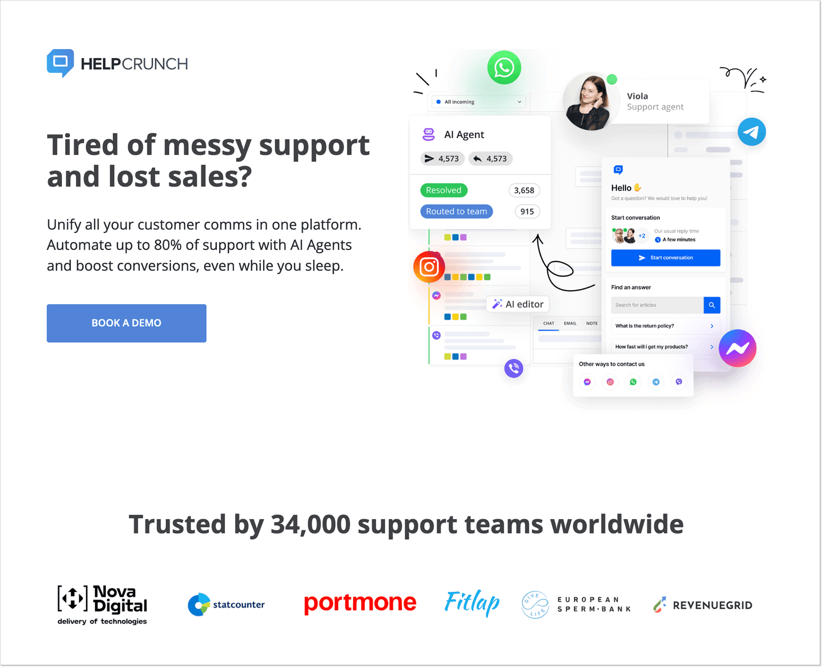
Why it works:
- Clear CTA.
- Trust triggers.
- Sections that work with potential objections.
- A slightly bizarre but catchy design with AI pictures of animals, which makes the page memorable.
- The entire messaging is focused on specific pain points and provides solutions in the value proposition (“Tired of messy support and lost sales?” –> “Unify all your customer comms in one platform. Automate up to 80% of support with AI Agents and boost conversions”).
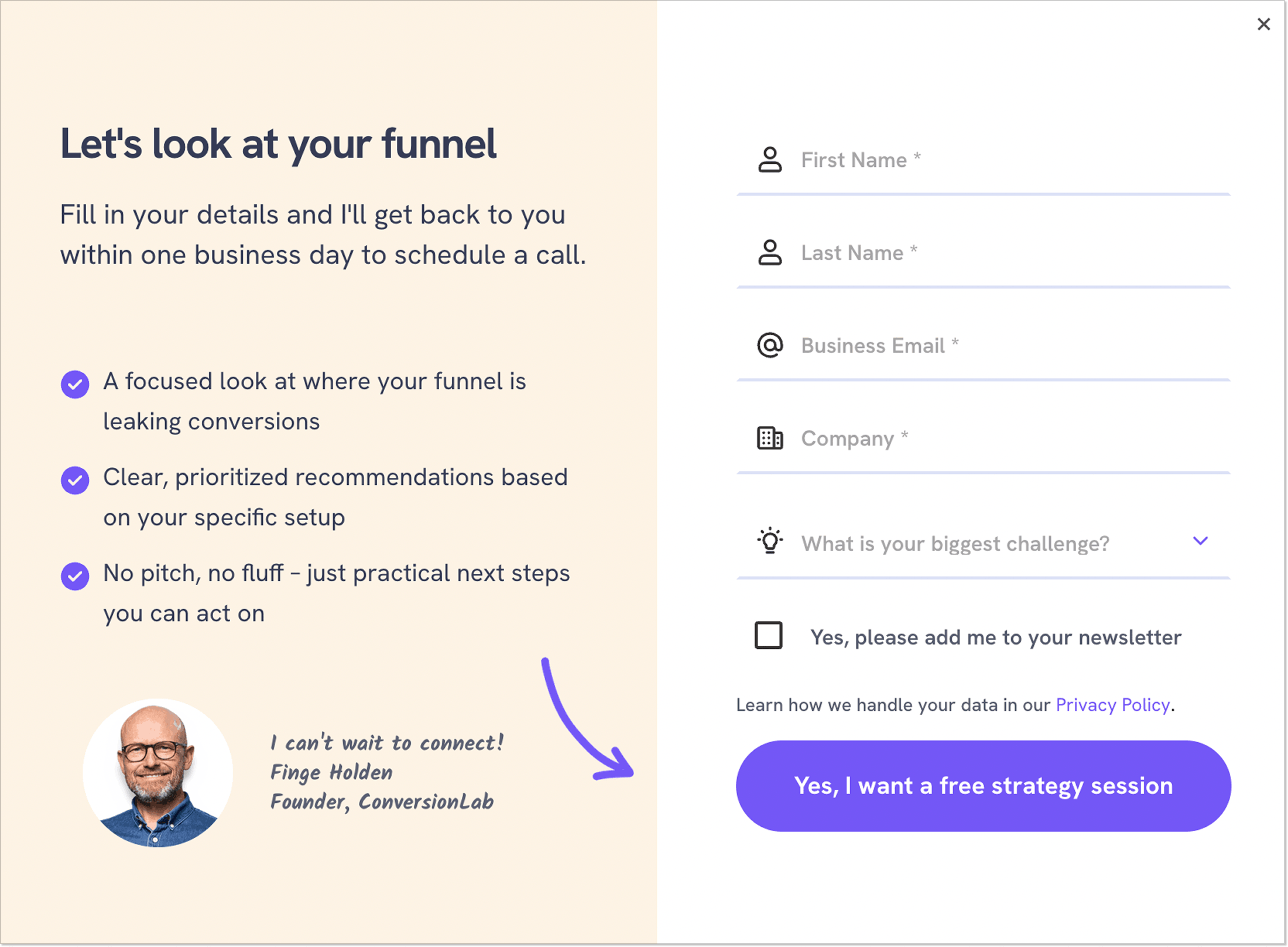
4. Case study and strategy session landing page by ConversionLab
Here, ConversionLab shows how they helped Campaign Monitor enhance conversions and reduce customer acquisition cost. The page coerces the visitors to book a free strategy session, and the best way to achieve it is to share actual results. The case study starts with a pain point. Then, we can see the steps the agency took to solve the problem.
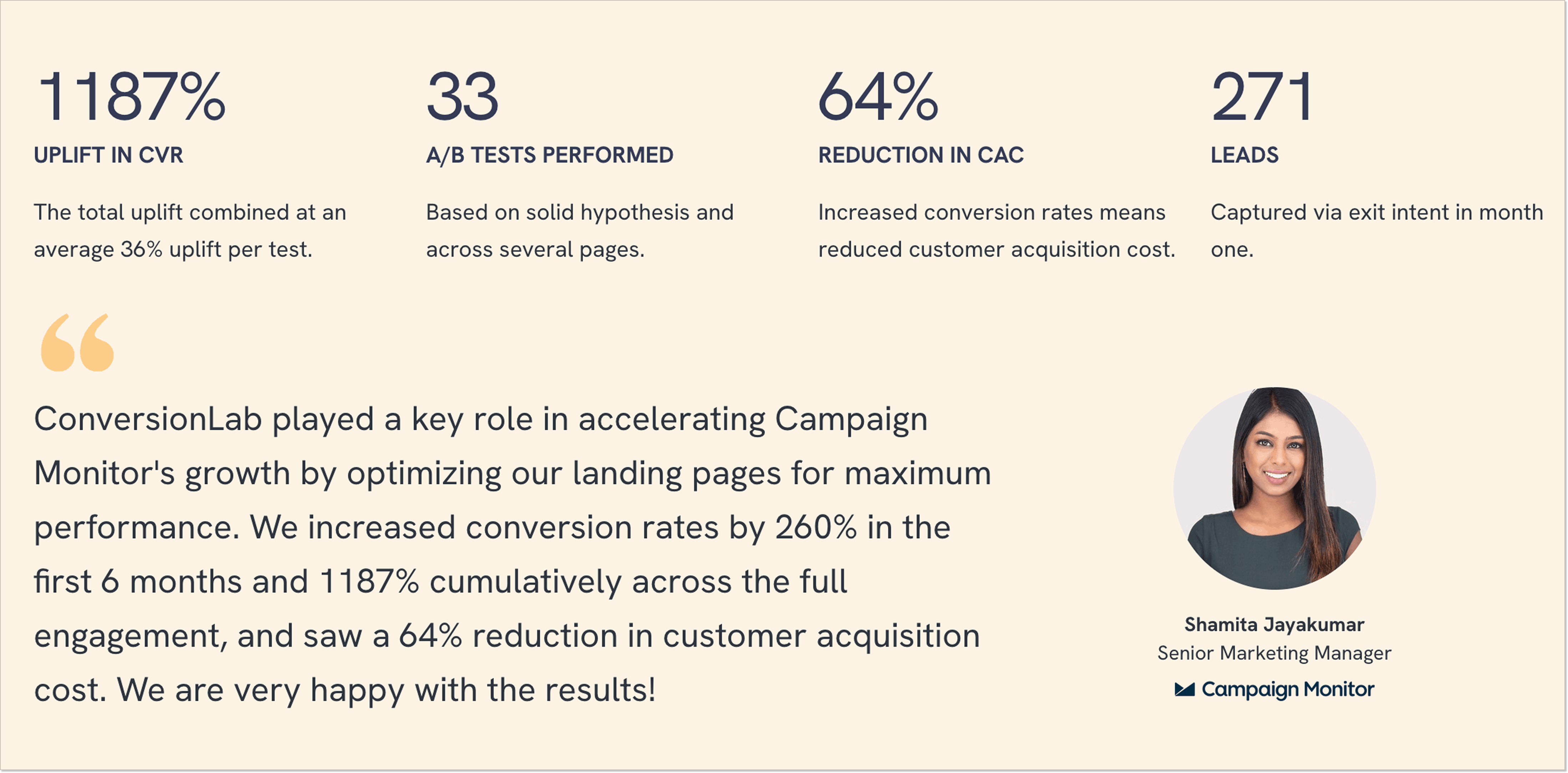
Why it works:
- The “challenge → process → solution” approach, so it’s easy to imagine the company solving the visitors’ pain points.
- A single CTA (“Get my free strategy session”) is visible all the time while scrolling the page.
- A detailed process that shows how the agency works with customers.
- Hard data results (1187% uplift in CVR, 33 A/B tests, 64% reduction in CAC, etc.).
- Customer reviews with the names and photos.
- A relatively brief form, considering the high-value offer (a free strategy session).
5. Funnel builder landing page by Perspective
This page by Perspective is focused on working with pain points and building credibility to show visitors why they need a mobile-first landing page builder.
There’s a single call to action (“Start my 14-day free trial”) placed several times throughout the page. The benefits are shown through comparison, with pain points in the “Before” section and actual results in the “After.”
The sections are also highlighted in different colors to evoke emotions throughout the design.
There is a lot of information on the page, but it doesn’t look cluttered thanks to some expandable text blocks you can click on to read more.
You can also look through customer reviews, and some even include videos.
For those who need more information, there’s an extensive “All Funnel features” section where you can find everything, from engagement blocks to fast editing.
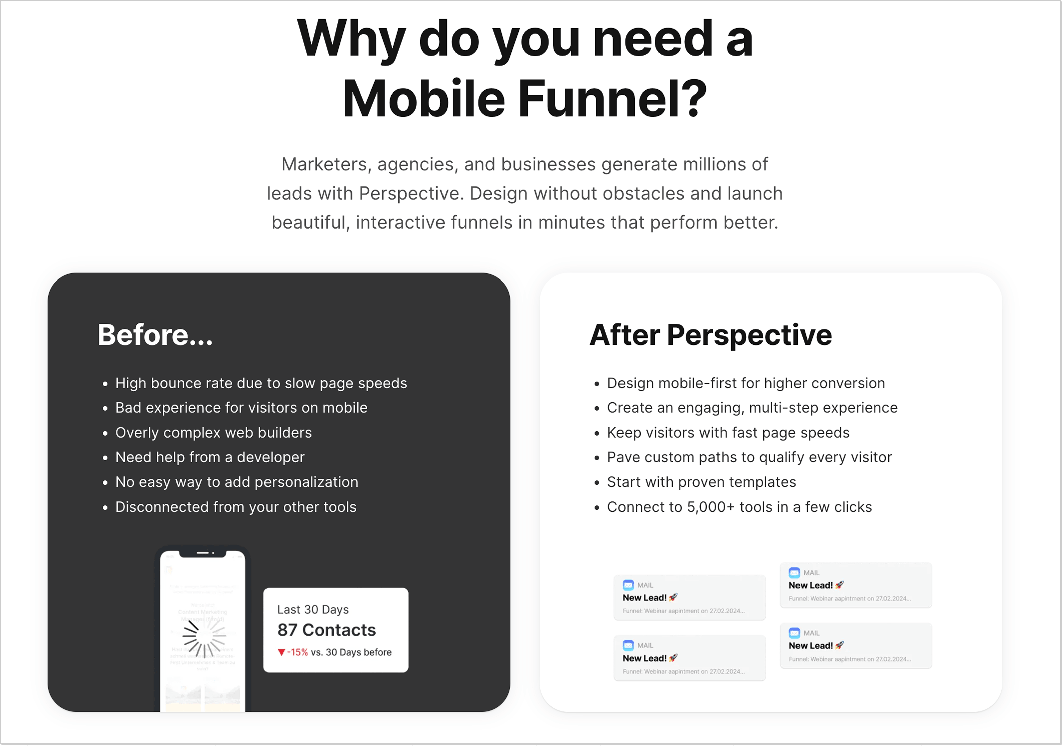
Why it works:
- A clear heading with an understandable value proposition (“The mobile-first funnel, form, and landing page builder”).
- Compelling CTA button copy (“14-day free trial”).
- Effective content hierarchy for easier perception.
- Video customer reviews.
- Informative block with features.
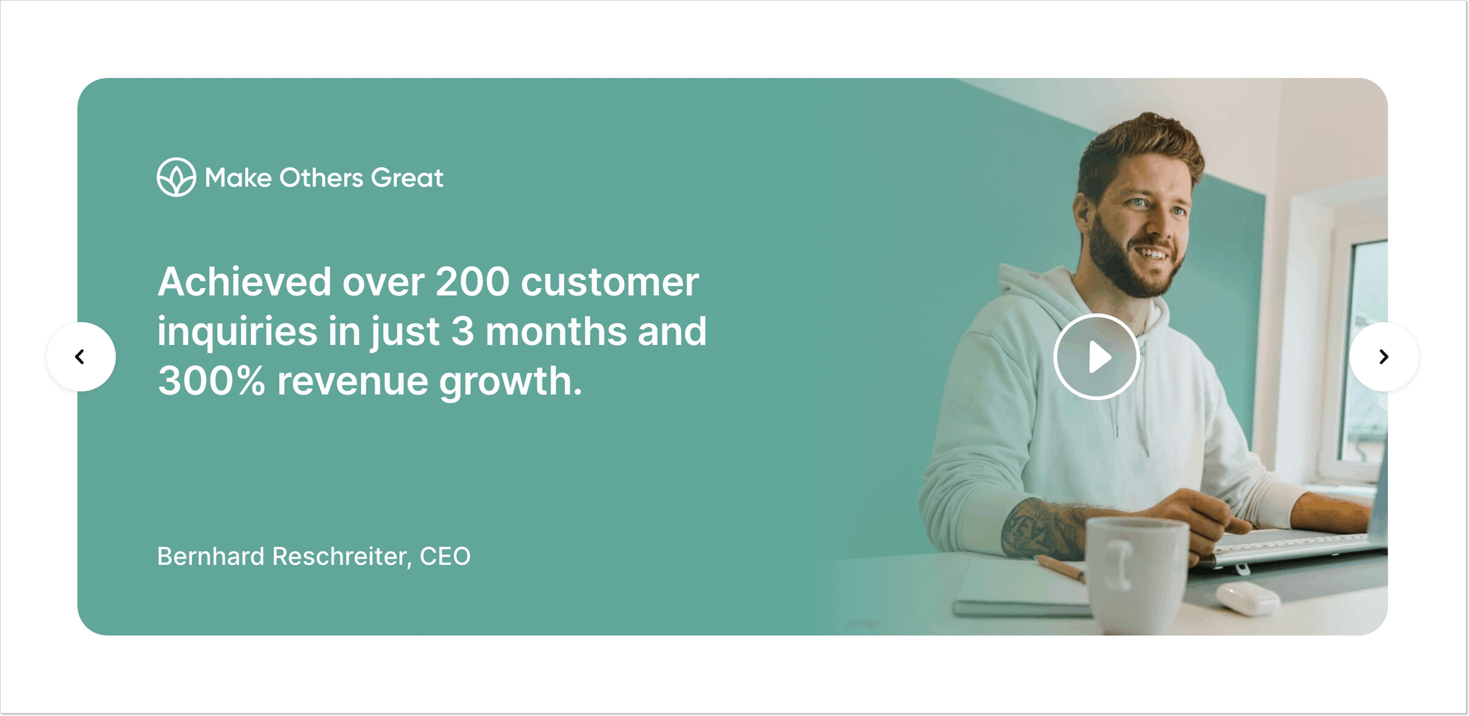
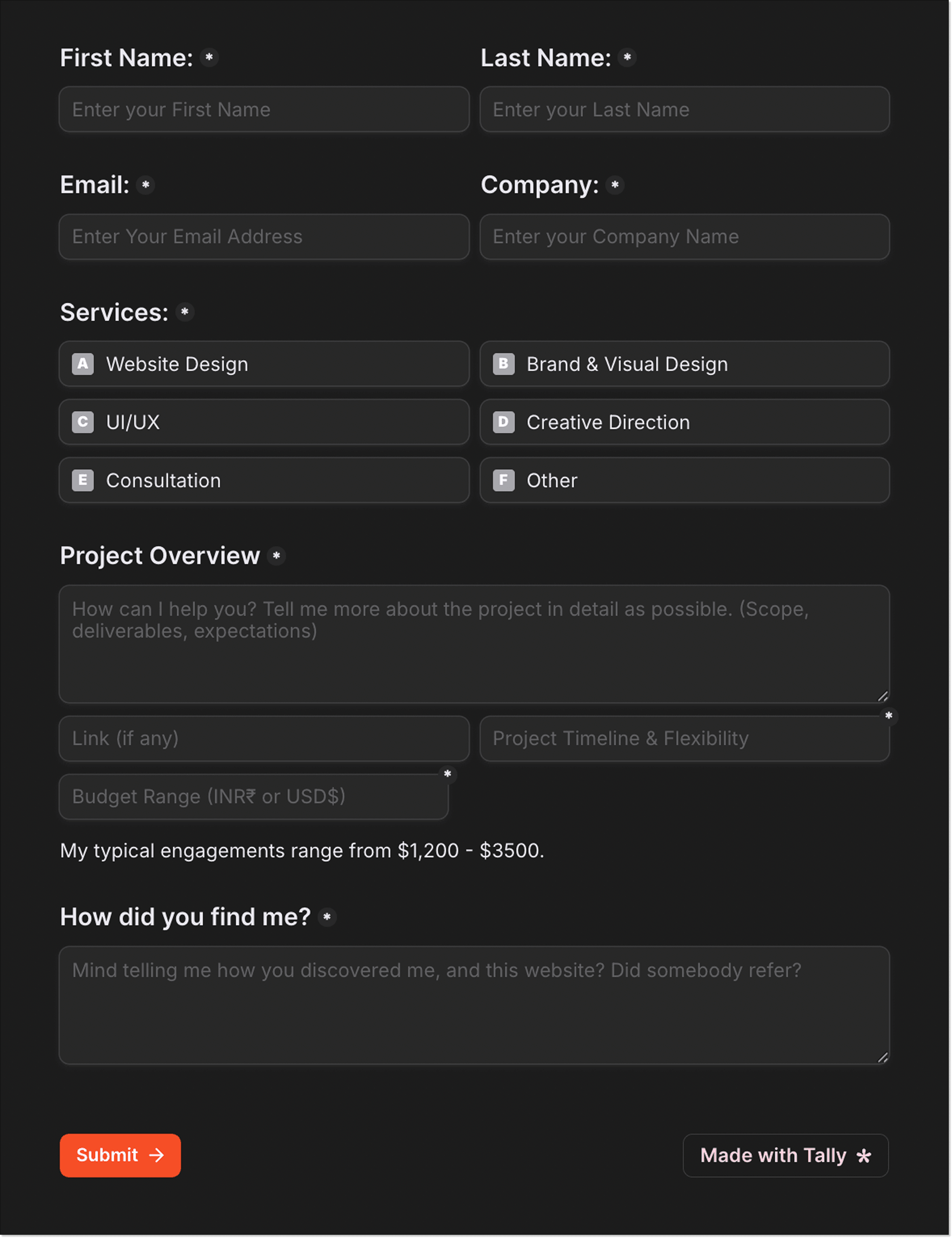
6. Design services landing page by Vishal Krishna
This landing page by Vishal Krishna showcases the brand designer’s services and nudges visitors to contact him. The author added fancy animations that both grab the attention and help navigate the page.
The writing is simple and divided into sections with catchy headlines, so finding the necessary information is a piece of cake.
The portfolio section links to Behance and Dribbble to understand the designer’s style.
You can find clients’ reviews with photos and names. The great advantage is their LinkedIn links, so you can verify they are real people and even contact them if necessary.
Why it works:
- Attention-grabbing design, extremely easy to distinguish from other pages.
- Digestible chunks of text along with expandable sections.
- Direct headlines and value proposition.
- Extensive portfolio section.
- Client reviews with LinkedIn links.
- More lengthy form, but all the fields are relevant for project requests.
7. Data source analysis landing page by Dovetail
This Dovetail page is all about giving visitors a sense of the product’s workflow, as once you open it, you feel like you are already their client. There is also a dashboard example and a screenshot from a discovery call to reinforce the sense of immersion in the product.
Then, the page benefits from social proof by displaying logos of famous customers.
The testimonials section is engaging. You can also read the entire case study. The FAQ section helps with questions and objections.
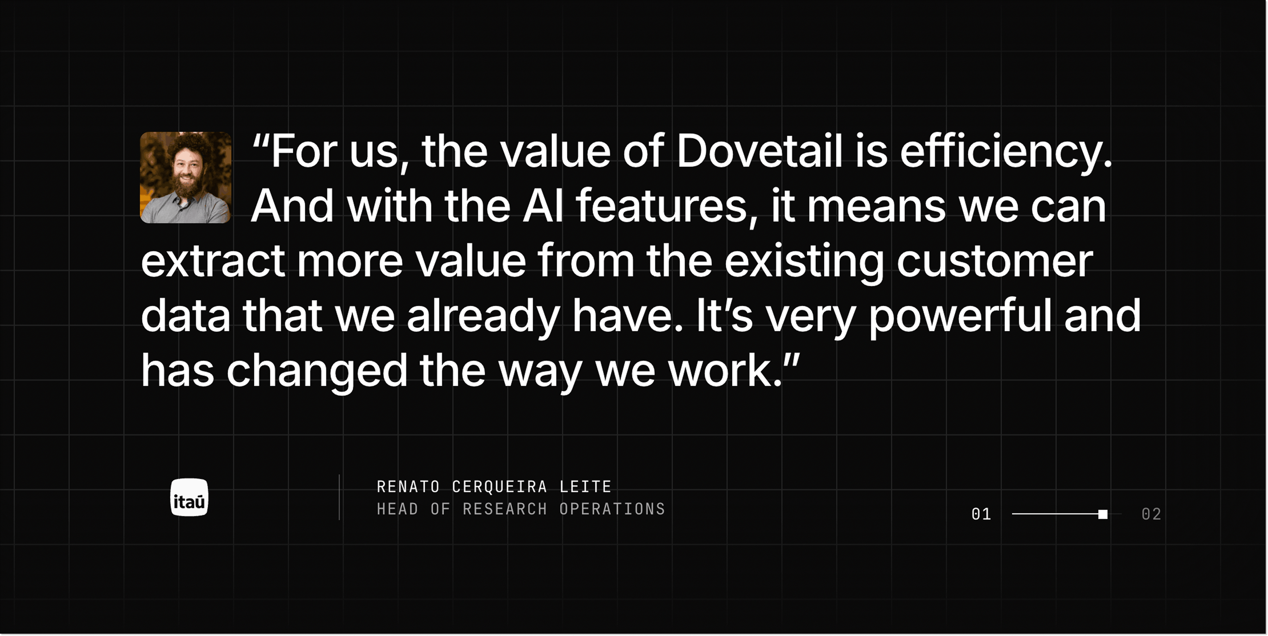
Why it works:
- Brief headline + subheading that provides details.
- Workflow screenshots.
- Building credibility through real reviews.
- Detailed FAQ section.
- Two CTA buttons are put throughout the page (“Contact sales” and “Try Dovetail free”).
How to create a lead generation landing page
Now that you’ve seen some of the good lead generation landing page examples, let’s walk through some steps you can take to create your own high-performing landing page.
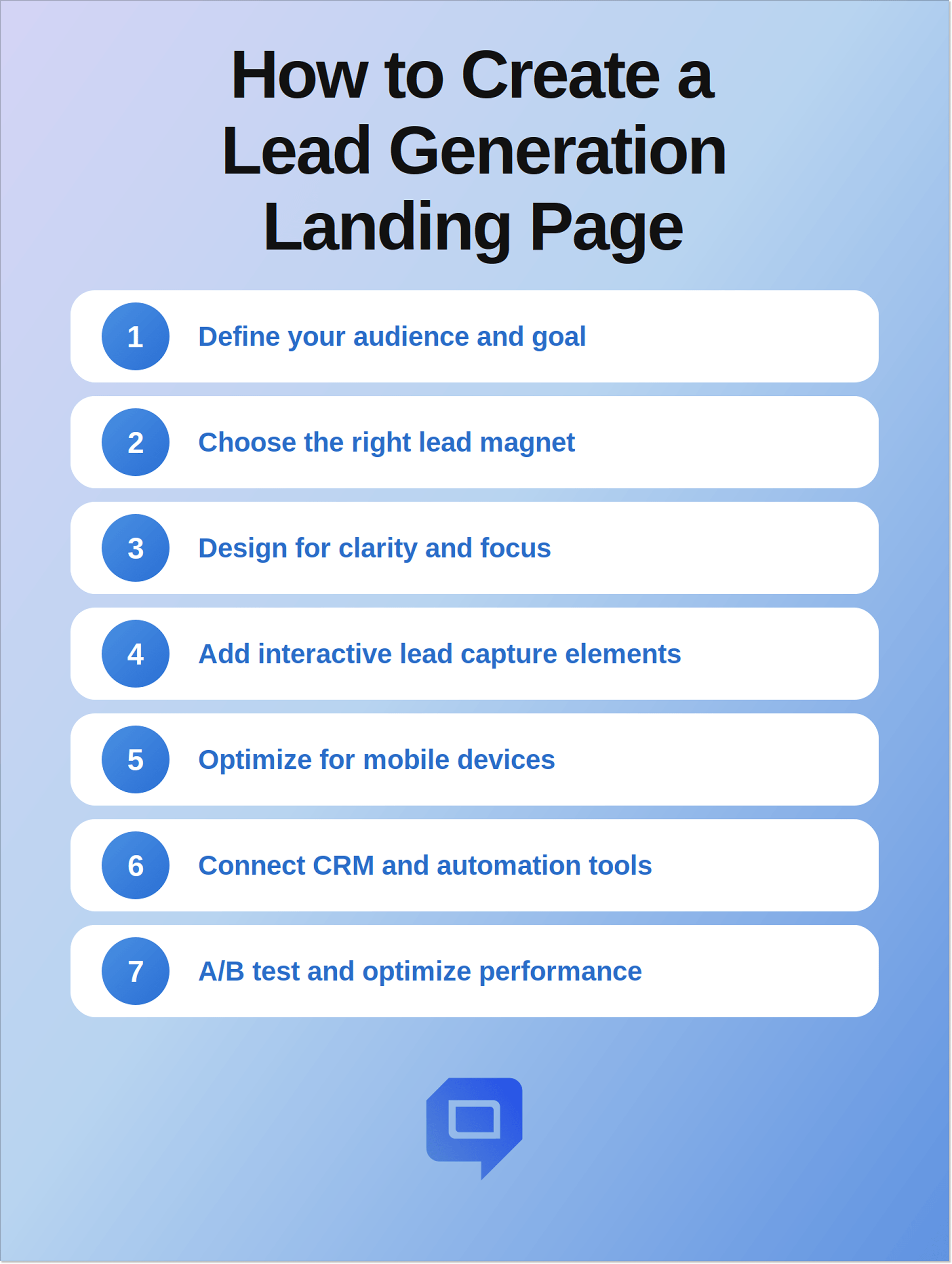
Step 1. Define your audience and goal
The first step is not the design itself. Ask the questions:
- Who do you want to reach with your page?
- What action do you want them to take?
Now answer these questions and proceed to the core landing page elements.
If you aim for big players, your page will be different from the one designed with early-stage startup founders in mind.
Or imagine that you need a page to generate demo requests from SaaS companies. Then your copy will center on ROI, automation, and scalability.
Step 2. Choose the right lead magnet
It can be an e-book, checklist, webinar, free trial, or consultation. Ensure this incentive is valuable to the targeted leads.
If a person clicked a top-of-funnel article, they may want a free guide. And if your visitor came from a product comparison page, you can interest them in a demo. Match the offer with intent.
Step 3. Design the page for clarity and focus
You have aligned the offer with visitor intent to highlight the value. Now, you can start working on a clean, easy-to-navigate layout. Avoid clutter and keep the structure simple (just like you did with copy).
A visual hierarchy helps visitors process information. Make sure to place your headline and value proposition prominently, break up content with headings and whitespace, and keep the CTA visible and clear.
Step 4. Add interactive lead capture elements
You worked hard on the best landing page for lead generation to encourage visitors to fill out a form, but there’s still a risk of form fatigue. Interactive elements can be lifesavers here. Use behavioral popups, live chat widgets, conversational forms, quizzes, or AI assistants.
It’ll be a good idea to add a behavioral popup when your visitor’s going to leave the page and offer a free guide. Or a chat widget answering questions in real time and working with objections. If you work with AI agents, you can qualify leads automatically, offer relevant resources, or schedule demos.
Step 5. Optimize for mobile devices
Many will view your page on smartphones or tablets (83% of landing page visits come from mobile). Make the design responsive, avoid horizontal scrolling, work on forms to make them easy to complete, and design buttons that are large enough to tap.
For example, if you decide to go with a longer form, it may be fine on a desktop, but feel overwhelming for smartphone users. A good solution would be to adopt progressive profiling to enhance mobile conversions.
Step 6. Connect CRM and automation tools
Once visitors fill out the form, their answers should go to your CRM or marketing automation platform. It’s important for effective lead nurturing and follow-ups. When someone signs up for your newsletter, automatically send them a welcome email to keep them engaged.
Step 7. A/B test and optimize performance
Test different variations. Experiment with everything, from headlines and button copy to layout and form length. Refine your pages, fix mistakes, and scale what works.
Common mistakes to avoid in lead generation landing pages
Here are some mistakes to avoid to make the best landing page designs for lead generation easier:
Treating the thank-you page as a dead end
What actually happens after a visitor fills in the form? Marketers often focus on the conversion itself and forget to reap the benefits of the checkout page. Don’t make it generic and dull: invite people to book a demo, join your newsletter, follow the company on socials, look through interesting materials, or subscribe to your updates.
Optimizing for lead volume instead of quality
The more-the-merrier approach doesn’t work for lead generation landing pages. When the page is optimized just for low cost per acquisition, it can attract lots of unqualified prospects who won’t become your customers and will just overwhelm your sales team and CRM. Try to attract the right people and don’t worry if your conversions are a bit lower: it will be worth it when it brings you qualified leads and a healthy sales pipeline.
Delaying access to the incentive
If you promise a visitor an incentive and then make them wait for it, it will just kill momentum. These people don’t know your company yet, but they decided to share their data in exchange for relevant information, and they expect access to it immediately. Your email may get delayed or land in a spam folder, which leads to frustration. Consider giving direct access to the resource and also sending it via email.
Making the page about your company
It may be tempting to use a landing page to put your company in the best possible light by telling its history, achievements, and processes. Unfortunately, visitors are not primarily interested in your company. They want to know if your offer solves their pain points and get the incentive. Don’t boast but offer help instead: focus on pain points, results, and benefits.
Leaving navigation menus visible
As I mentioned before, a good landing page has one purpose, so normal website navigation can turn into an escape route. Remove unnecessary navigation so that visitors don’t get distracted by your blog, pricing page, and other destinations.
Ignoring objections
Visitors who are not yet familiar with your company may naturally hesitate. Will their data be safe with you? Why do you need their credit card information? Will they get dozens of promo emails from you afterward? Add brief statements about privacy, pricing, and what happens after users fill in a form to reassure them.
Conclusion
A high-performing lead generation landing page can be hard to create, and the scope goes far beyond the well-designed layout and compelling text. You also have to define your audience and goal, pick the right lead magnet, optimize for mobile, build the right form, add social proof, and more.
After seeing some lead generation page examples and dissecting them, it’s clear what successful pages have in common: a clear value proposition, a structured information hierarchy, benefit-driven messaging, a single-purpose layout, and minimal form fields.
Apply tips from the article and test different page variations so that your results and qualified leads may follow.