In-App Experience: 10 Takeaways from Top-Rated Mobile Apps
We've taken 10 top apps for a weeklong test - this is how our in-app experience transformed!
Written by Olesia Melnichenko
Being a vivid mobile user and, obviously, in the picture professionally, I often catch myself thinking: why do most app developers take us, consumers, for granted? They do their technical part – deliver an application – and then… no one becomes immune to possible slip-ups.
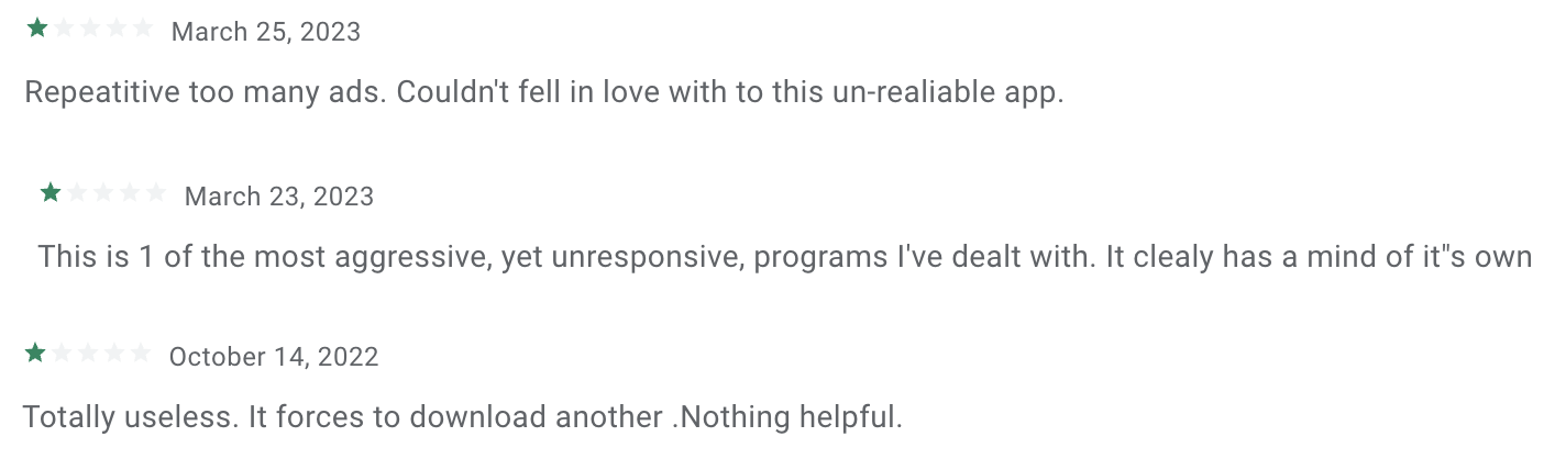
It’s actually in the smallest things! Like repeating in-app ads, constant glitches, non-responsive UI/UX, no regular updates, etc. Just look at some user reviews on Google Play. They seem not too satisfied with this random app (and there are thousands of them!), for that matter:
These little big issues kill user experience inside the application! You do not want to repeat this app’s destiny, do you? Then read on. In this article, you will find out the latest trends in the world of mobile user experience as well as 10 tips on how to power it. Off we go!
Modern in-app experience trends to know
One of the brands that skyrocketed its users’ in-app experience significantly was Marriott International, a luxury hotel chain, and its Marriott Bonvoy – a convenient mobile check-in app.
But as of the second quarter of 2022 and the beginning of 2023, user engagement has slowed down globally. People download fewer apps, spend less time on them (social media are the exception), and, as a result, their experience becomes turbulent. The reasons for that may be the post-pandemic trends or the world economy or a general decline in our attention spans, to name a few.
However, with the AI buzz and ChatGPT entering the stage, everything can change for the better. It’s predicted that AI-based apps will enrapture the market in the nearest future. Plus, 5G will allow devs to build new features without negatively impacting user experience. Well, we’ll see.
I wonder, though, how do things stand with the in-app experience people usually get from developers today? Which is why I decided to carry out an investigation and download top-rated applications from App Store to be really immersed in the issue 🧐
10 tips to enhance in-app experience based on the original research
When I said I would download top-rated apps from App Store, I wasn’t kidding 😌
Yep, the topic got me inspired. So I am proud to present you this original mini research – 10 hand-picked applications from Sports, Entertainment, Lifestyle, and Travel as well as 10 real-life tips on how to spruce up your in-app experience.
1. Make onboarding your hallmark feature
Everyone knows this famous saying: “as you name the boat, so shall it float“. And it fits perfectly well with onboarding inside an application because the majority of mobile users do install an app and abandon it right away! That is why onboarding is so vital for mobile applications.
To hook a user in from the first seconds + walk them through your product or service, create smooth onboarding that is: 1) straightforward and digestible, 2) highly entertaining, with bits of gamification, and 3) depicts the gist of your company.
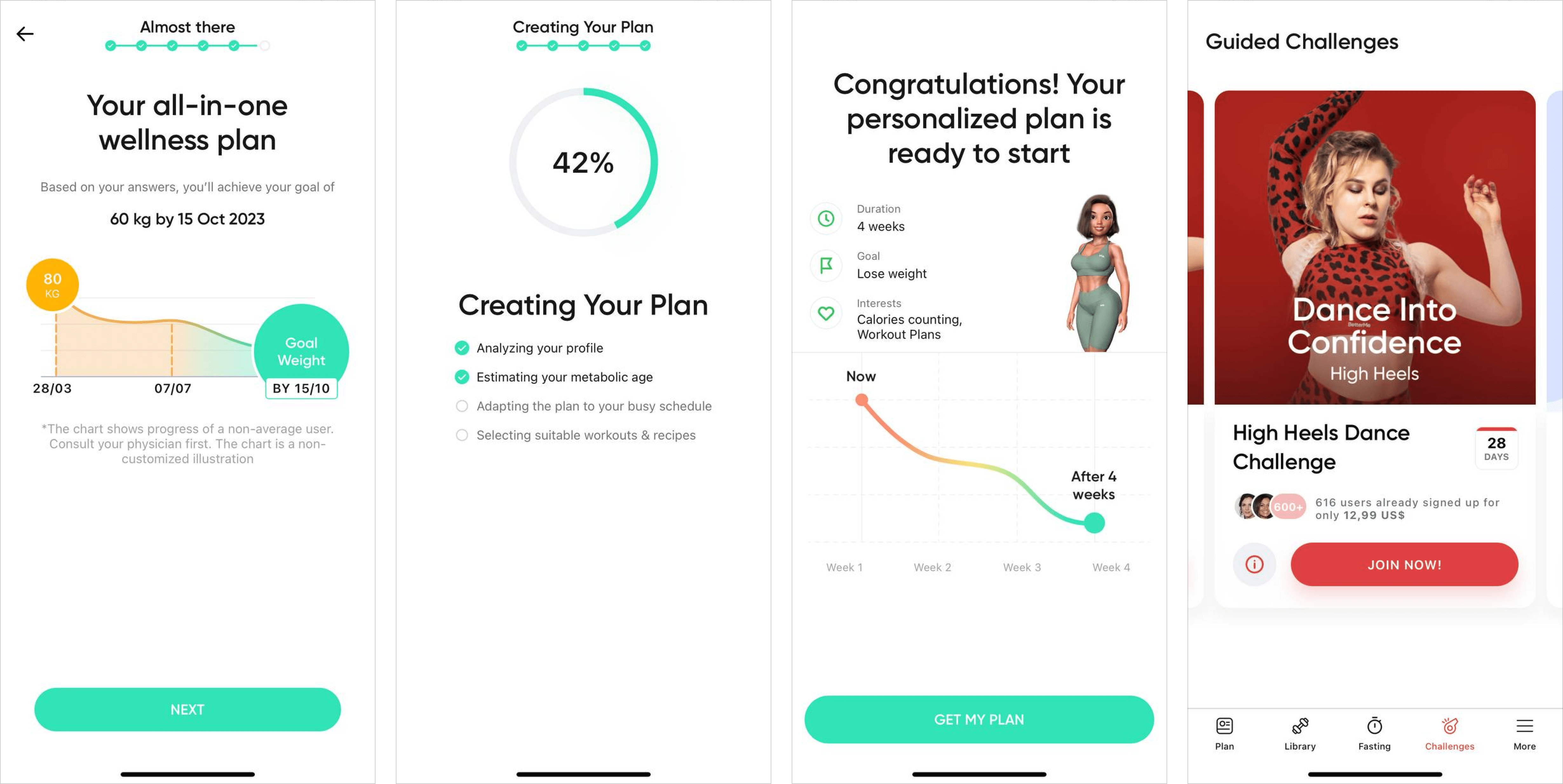
Meet BetterMe – a behavioral health app that can cross this checkbox with the head high. The first thought that crossed my mind was “Wow! The visuals are awesome!” and then this feeling positively multiplied. By the way, they made a shrewd move by showcasing their merch in-app – training outfits. If you have some, too, do bring it to the fore, your users will love it.
The BetterMe onboarding inside the application involves a progress bar that is divided into several logical paragraphs, such as About You, Nutrition, or Bad Habits. In fact, the process resembles my getting into a gym a few months ago as I filled out a similar form offline 💪
As you go, you answer relative questions that could help the team behind BetterMe and their smart algorithms design a personalized workout/diet/fasting plan for you. It only adds to the brand’s awareness, mobile engagement, and overall real-life experience.
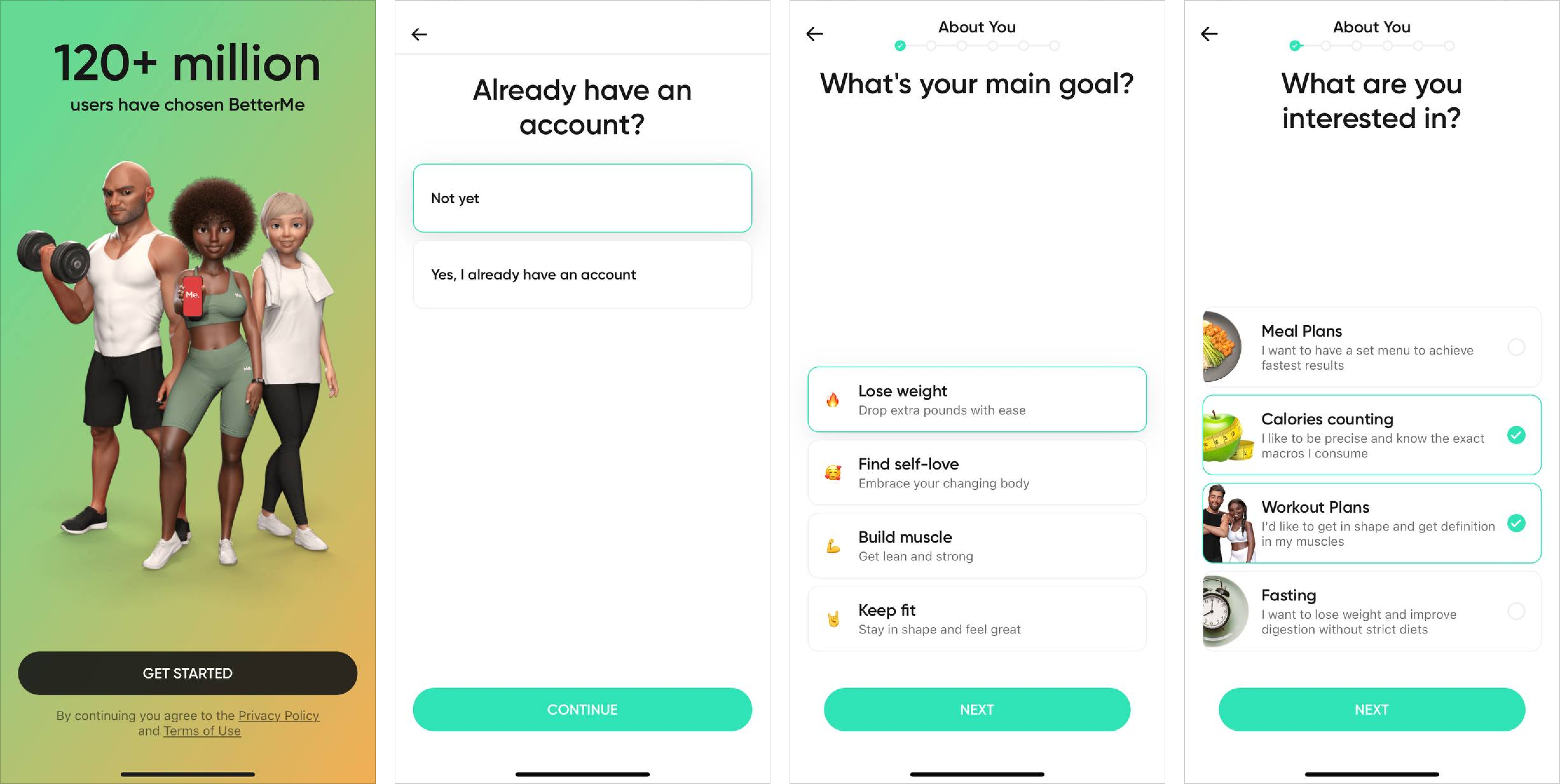
What struck me most is how questions are assembled, their accuracy, and precision. On top of that, the company sends push notifications throughout the day to remind you of staying hydrated, having a wholesome breakfast, or proceeding with your training. Honestly, you will rarely face such a concept offline.
The next best thing that BetterMe does is asking your current activity level and daily water intake. I reckon that this is a model approach for a healthcare company. Without this data, you can’t provide your customers with an adequate training schedule. As you approach the end, you tell your parameters (weight, age, height) and the app miraculously tailors the program for you!
Plus, BetterMe provides the goal you are supposed to achieve during some period, all based on your answers. And so, when you’re done with onboarding, you can leverage the company’s special plans, training, guided challenges, and whatnot. This is the in-app experience we all deserve!
2. Provide steady in-app assistance
While onboarding goes a long way, another crucial part of the user experience inside an application is the ability to get support. Preferably, the one that won’t give people the willies. And this is my pet peeve!
When I was in Austria last year, I tried to get into my apartment rented online. On arrival, I put in a code to the entrance door I was given beforehand, and…the machine didn’t react. For the fourth time in a row! Can you imagine how furious I was, standing in that shady hall in the middle of the night?
Sure thing, I contacted the Vienna Residence’s so-called “support” via Airbnb and even gave them a phone call, also with no success (this was the moment all the German cursing words miraculously rang the bell). All I got was bouncing from one rep to another, with no distinct answers and no appropriate customer service. Then, I reached Airbnb support.
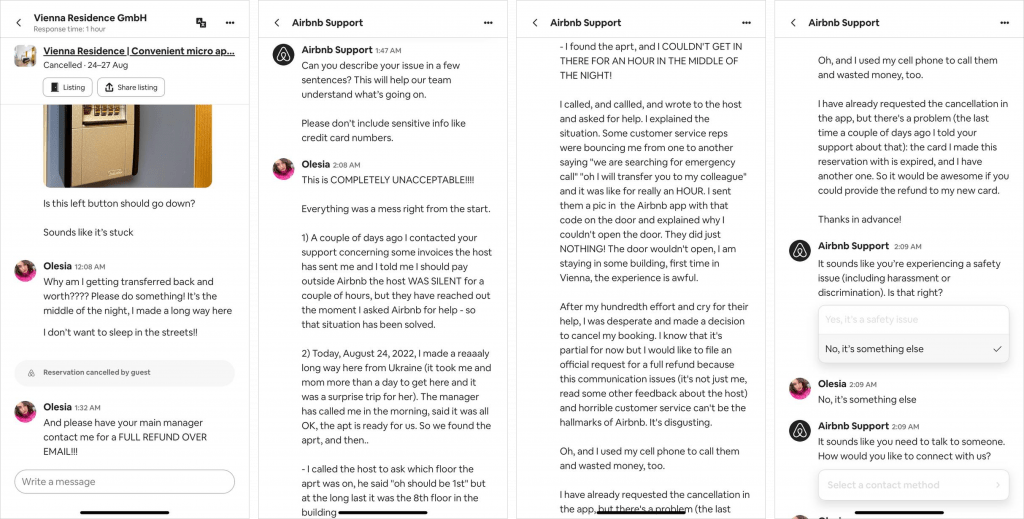
The point is that you should deliver flawless (and preferably real-time) support inside your application not to spoil the in-app experience users generally expect.
By the way, my story ended happily (kind of): it turned out the code was changed not long before my arrival and someone JUST forgot to update it. So I found another stay across the street which was a blessing.
🤓 Quick note! As this is a burning problem not only for me but for many of you, too, I developed a special acronym to characterize the in-app guidance and support businesses should always strive for:
I for Intuitive
N for Nimble
A for Accessible
P for Proactive
P for Proper
Have a look at this excellent example. Airalo provides local and regional eSIMs for travelers and has a handy app. I have already used it! Thus, if you come up with a question concerning eSIM installation, data protection, or purchase, to name a few, there are a few options:
- To use an integrated self-service help center and call it a day;
- To contact the Airalo team via a special form where you put your name, phone number, and the issue.
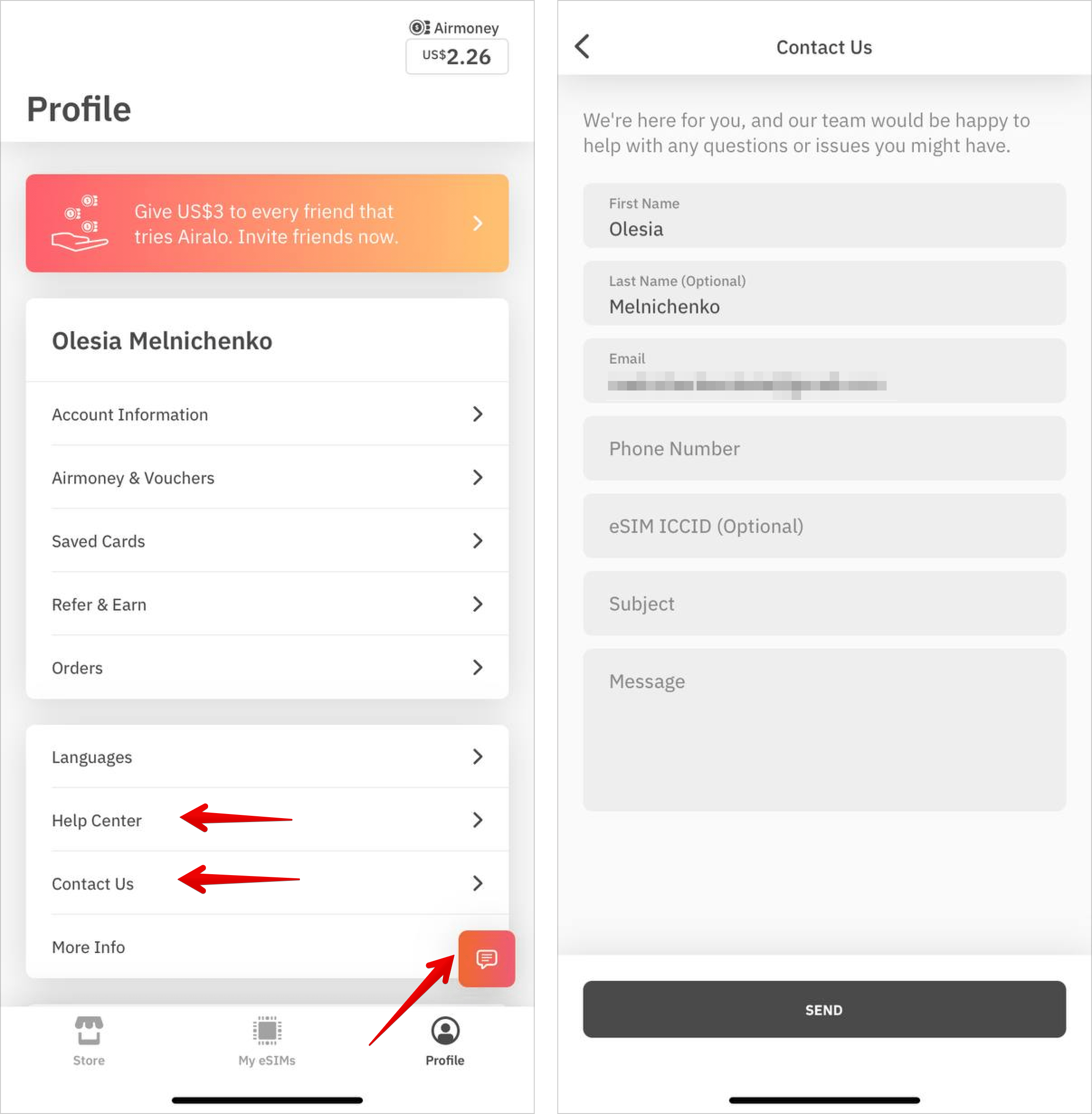
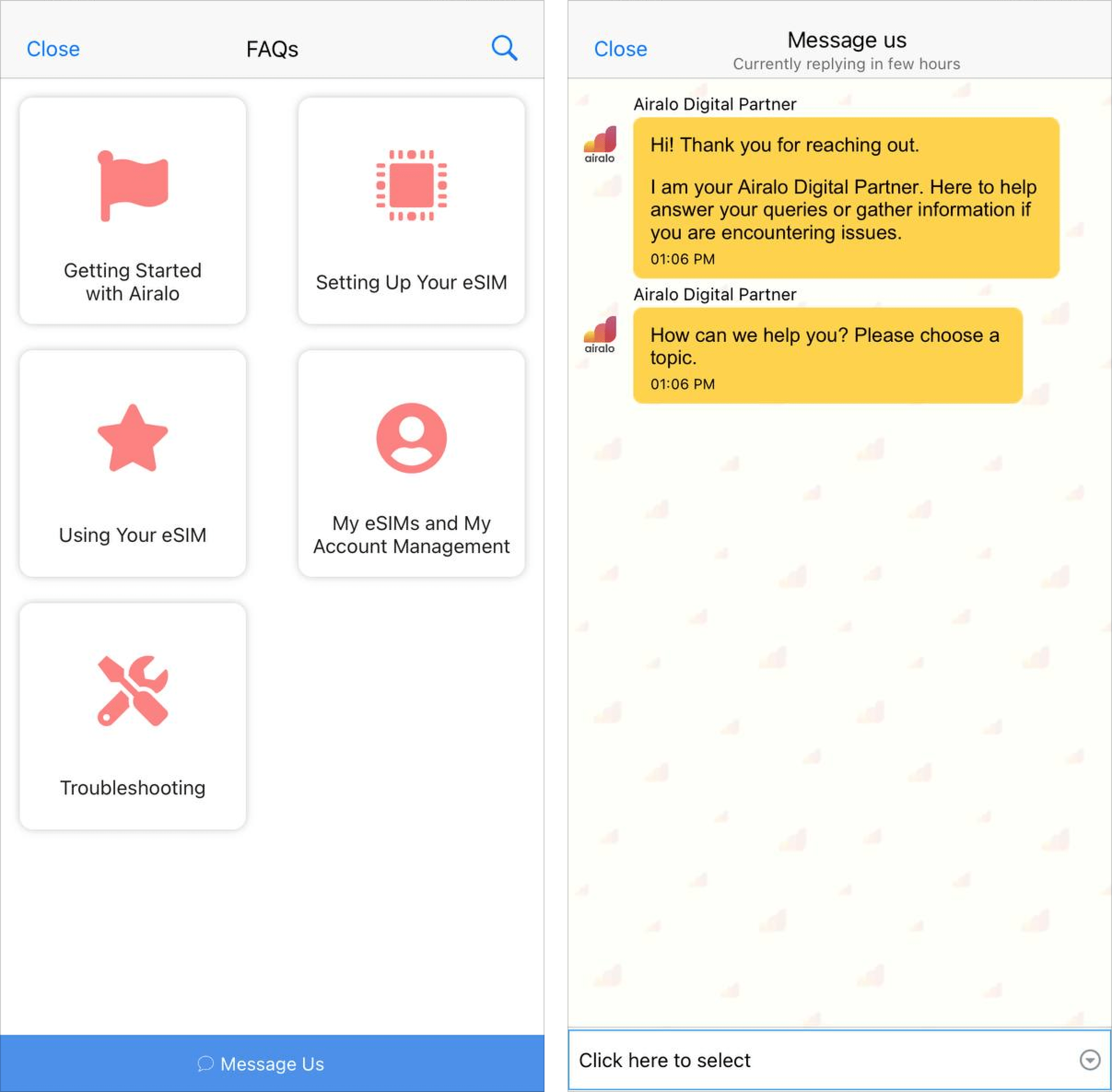
But there’s more to it. As shown in the screenshot below, you can also reach out to Airalo customer support via a built-in live chat feature right from your Profile tab. Besides, you can scour their detailed FAQ section without waiting for a service agent to get back. Getting started with the app, eSIM usage issues, troubleshooting – it’s all here.
The rule of thumb is that companies snap their fingers at such a feature. I mean setting it up is not rocket science. Thanks to mobile SDKs and other technical docs for developers available on the market, delivering support in-app wouldn’t even be an issue – you just click a few buttons.
So yeah, if you’re already intrigued, this is your cue to test the HelpCrunch free trial for 2 weeks completely: no need to provide any credit card details to grab those SDKs.
3. Ask for permissions queasily
In the era of digitalization, not all users are giving up their personal data easily.
Statistically, 85% of global adults want to do more to protect their online privacy. The concern is totally understandable. So if you make your in-app permission sound not-so-sweet, the chances are a user will bounce off.
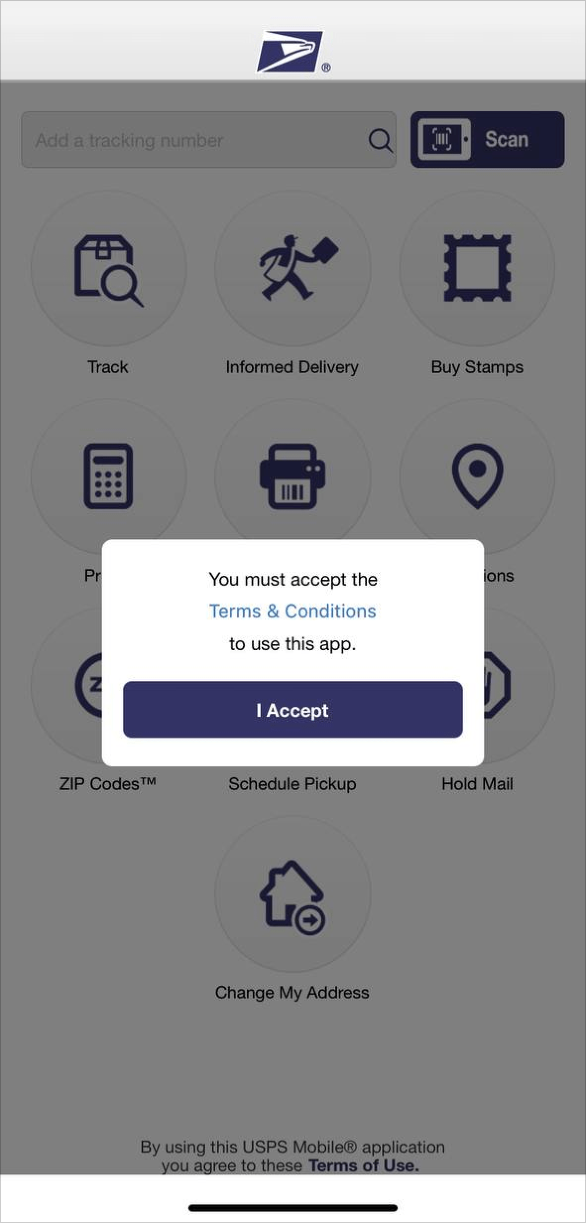
In this paragraph, I wanted to showcase two polar examples. The first one – negative – originates from the USPS (United States Postal Service) application. By the way, memorize this brand, we’ll get back to it later.
So once you install USPS, you MUST accept their Terms and Conditions. No option to drop it. Or else you simply wouldn’t be able to use the app. Anyway, they make it too mandatory and the word choice is repellent:
The next examples are softer and more customer-oriented. On your left, there is PlantIn – a plant identification and care app. On your right, you see JustWatch – a streaming guide app. Both chose a user-oriented path (with the help of iOS, though, but still). Look at their in-app permissions:
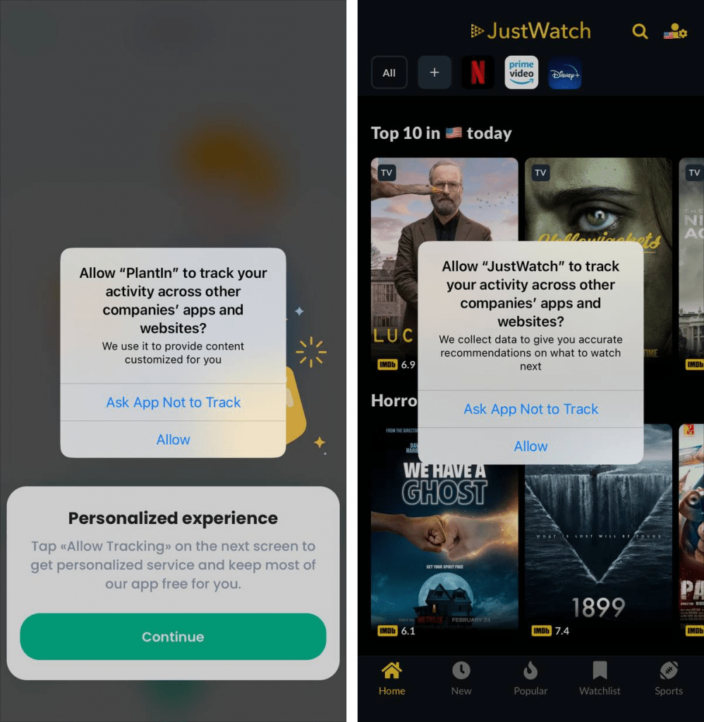
PlantIn even went the extra mile by pre-asking a user to tap “Allow Tracking” on the next screen for a tailored experience. Besides, both brands provide exact reasons why the user should allow the app to track their activities. This way, you get background, additional knowledge about the app, so you don’t step into darkness. Analyze these cases and take them into account for your business.
4. Go for a minimalistic design
Who likes a bulky layout? Without a proper and easy-to-digest design, it’s hard to get the most out of the in-app experience. It’s not just me! As the numbers show, 94% of users’ negative reviews are connected to mobile app design, while 74% will return to a brand if it has a good UI. Let’s traverse this subject, shall we?
The name of the paragraph got me thinking: what if there is an app on the App Store that is literally brimming with a minimalistic design? And you know what? I beat the odds!
Here is MinimaList – a planning & tracking app with minimalism oozing in and out. Thanks to the general idea of the brand, the app is simple (maybe even too much), highly intuitive, and unpretentious.
The team behind MinimaList has thought it all out: the tutorial is a carousel with 2-line explanations and low-key visuals, the app’s main dashboard contains minimum buttons, and even a Pomodoro tracker is designed with simplicity in mind. Thus, nothing burdens your eyes and keeps you concentrated on what’s important – your to-dos.
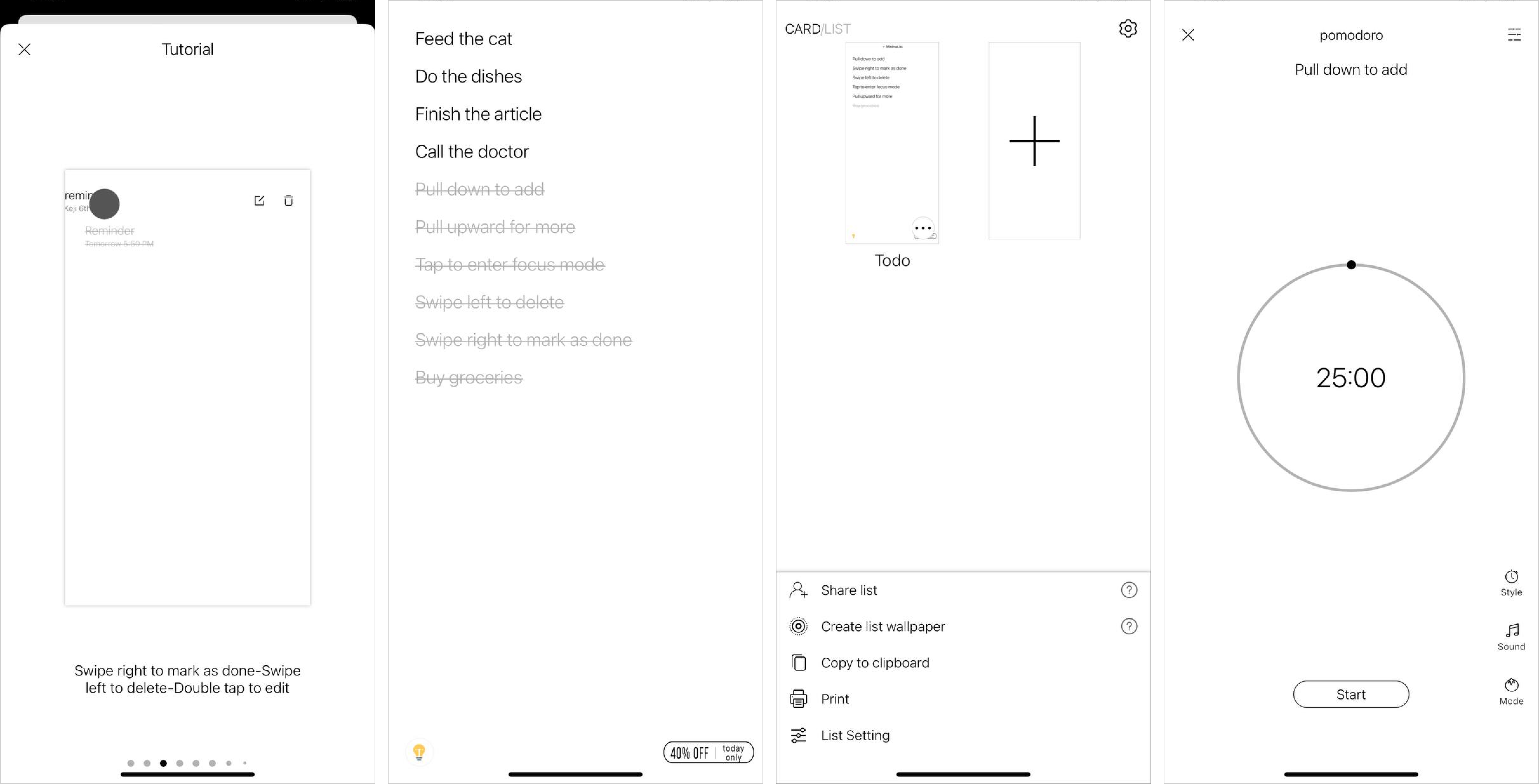
Of course, I could call such a find sheer luck. However, if you want users to really feel your business, its “face”, try to design your app channeling your key visions, philosophy, and identity just like MinimaList did.
5. Make log-in and registration optional
I, for one, appreciate it when the application I open for the first time allows me to sign in/subscribe/register later. There is no shame in moving a user through an app slowly, helping them experience its value firsthand before forcing them to give up contact details. In fact, this process is called lazy registration (sometimes gradual engagement).
These two apps I’ve downloaded from the App Store have done that expertly.
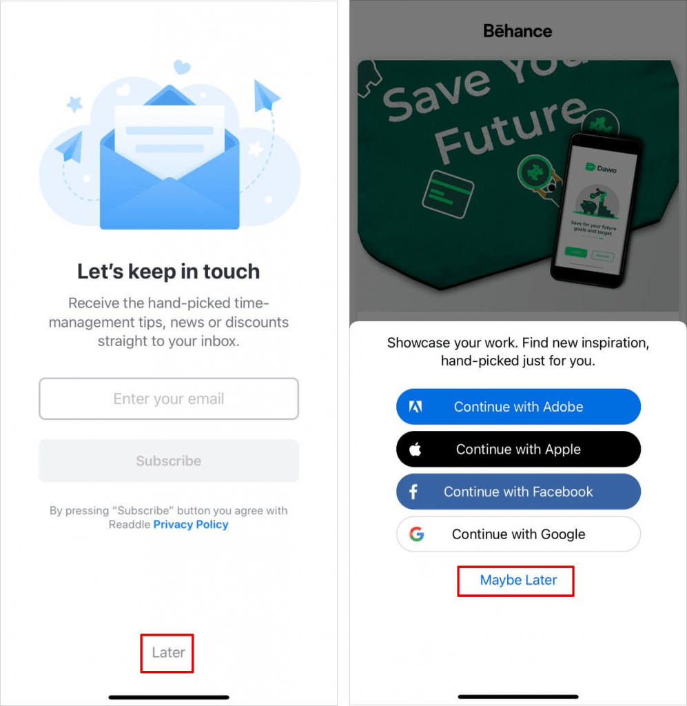
On your left, there is Calendars: Planner & Organizer. Once you play around with some primary settings, the app suggests you subscribe to its newsletter. Good that the devs let us get back to it later (I didn’t want yet another pack of letters to flood my inbox).
On your right, there is an app for UI/UX designers – Behance. As I was just exploring what the application has to offer, registration seemed like the next level. Such a trick gave me, a potential Behance app user, an opportunity to interact with it more before making a real commitment. Besides, this usually leads to reduced churn and a better in-app experience.
6. Introduce new product features in-app
If you have an app that you update regularly, why not use it for visually highlighting new product launches/improvements and driving direct users’ attention?
Such an announcement may take many forms. From lightboxes to tooltips to badges, modals, and hotspots.
If you have had the chance to scan this article and check the author’s info, you know that I am currently learning Spanish on my own. So I could not but lay my eyes on the following application and give this in-app experience a try.
Rosetta Stone is a language learning platform that moves with the times. Recently, they’ve launched the Live feature in beta. How do I know? The team added a contrasting black box with the CTA Explore and the badge New! right in the middle of my Home screen.
This latest catch-up can help you engage with real tutors, talk to natives, check on-demand grammar/vocab clips, and learn the language as if you’re in THE country.
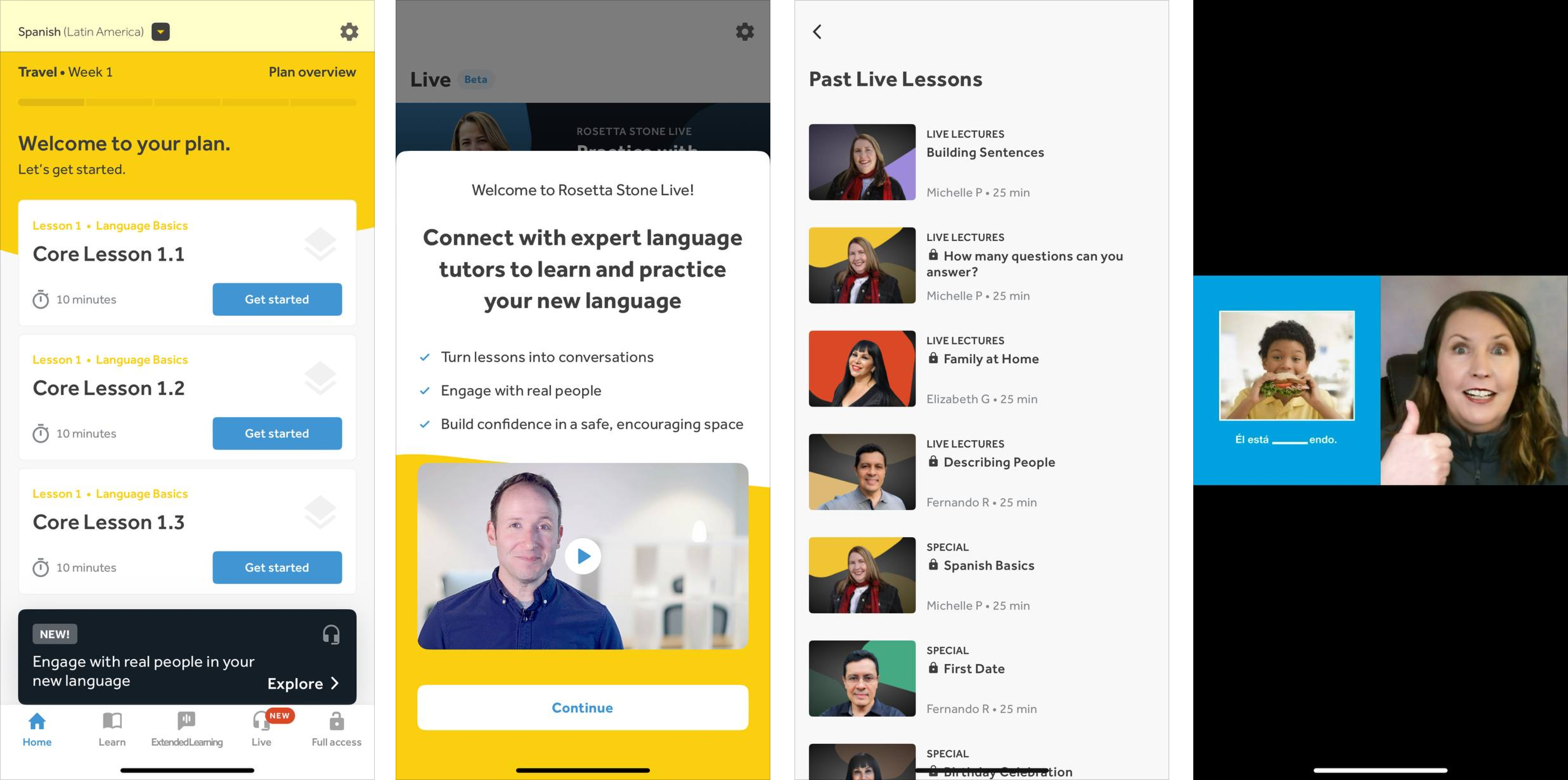
Inside this Live feature, there is an introductory video as well as dozens of live sessions with teachers on topics you might be interested in. Sure thing, I’ve tasted their first live streams on building sentences in Spanish. If it weren’t for that contrasting box, I really wouldn’t pay attention to this release. Me gusta! 🇪🇸
7. Make rewards & loyalty programs a part of your app
Truth be told, I get sooo adventurous when it comes to winning prizes, VIP memberships, or even free drinks. Plus, this is a win-win! I get something valuable in return while the business can enlarge its audience, increase its app retention rates, drive engagement, or build a dedicated community. Do you want to enjoy it, too? Here is a tried-and-tested method.
Everyone knows Booking.com which is, by the way, the most downloaded app of 2022. And so, as I was pretty consistent in using the app last year, I unlocked the Level 1 award of the Booking.com loyalty program – Genius. As a result, I already have a 10% discount for bookings and free lifetime access at properties worldwide! 😱
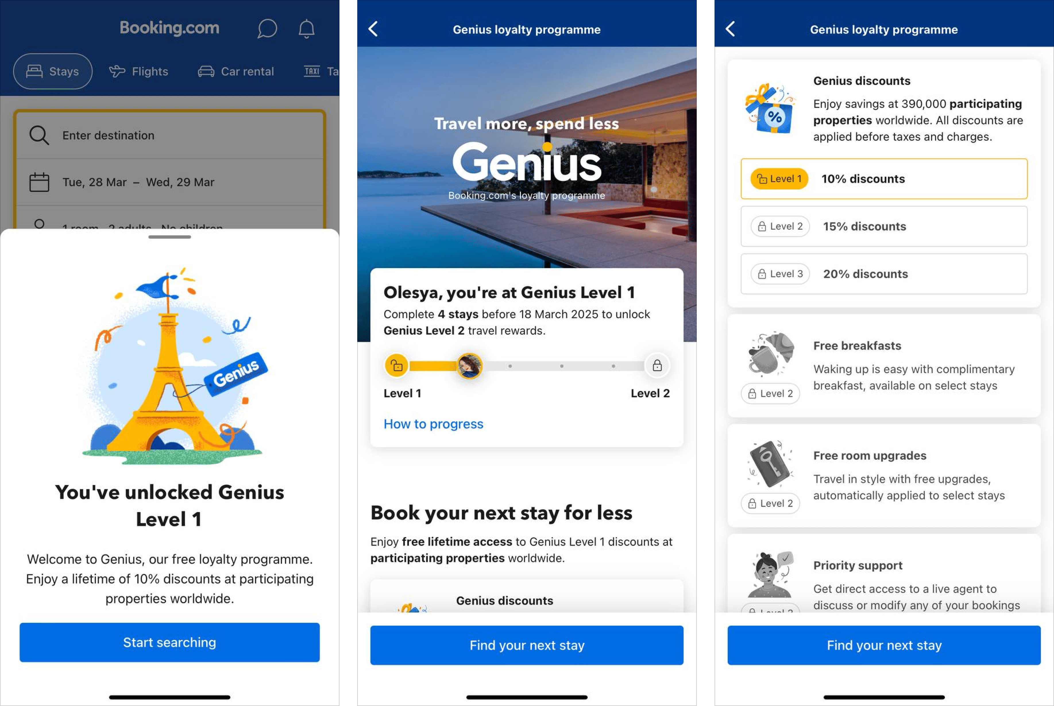
Booking.com makes a smart move by dropping numerous hints about the loyalty program once a user becomes a member. They show how much time you have to unlock other levels and what perks await them. I already sense that risky spirit of yours, too! 😁
8. Implement gamification
Generally, gamification is used for user engagement, traffic increase, and, well, fun. By 2024, its market is estimated to grow by at least 30,1%. Can you imagine?! That is why in-app experience should go hand in hand with this technology. And this is what I found out.
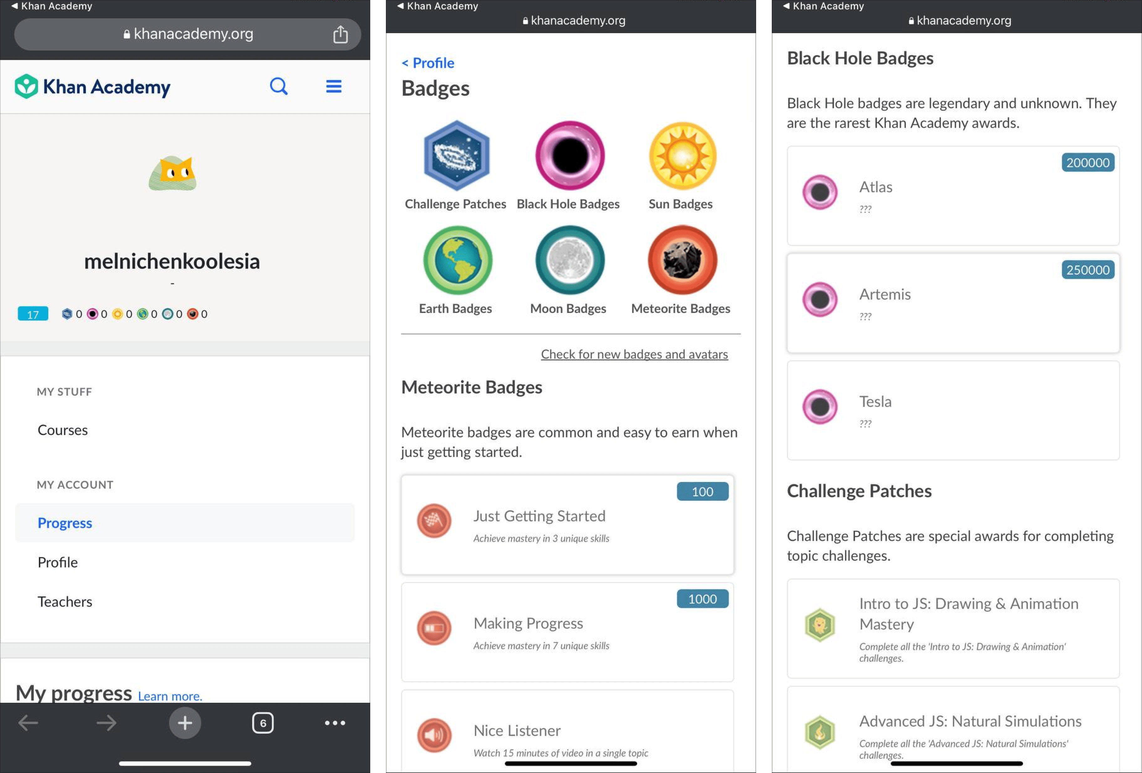
Khan Academy is an American non-profit organization that offers tons of educational materials for students all around the globe. History, art, science – you name it, the Khan Academy app provides it.
Apart from masterfully created lessons and videos, the app also includes a gamification system. It comprises of:
- Badges – they are divided into different categories and themed as celestial bodies/planets. For instance, for just getting started with the app, you can earn a Meteorite and or an Earth badge. Oh, and the fun names, like Work Horse, Sequoia, and Benjamin Franklin 😁
- Skill tree – to monitor your progress, there is a dedicated bar that depicts the whole user path;
- Points – once you fulfill an assignment, you are awarded energy points (by the time I wrote this, I got 17!). This only cheers a user up and drives them to go forward.
9. Set clear expectations right from the onset
One way or another, every user has certain anticipation before using a mobile application. It refers to every aspect: app design, onboarding, payment options, etc.
To put you on the right track, I picked this fantastic case presented by Joom. It is an international ecommerce company that prepares its users for their journey once they install the app. Instead of bluntly flashing a log-in form first, Joom trumpets its benefits aka expectations: why does the app tick all the boxes for a user?
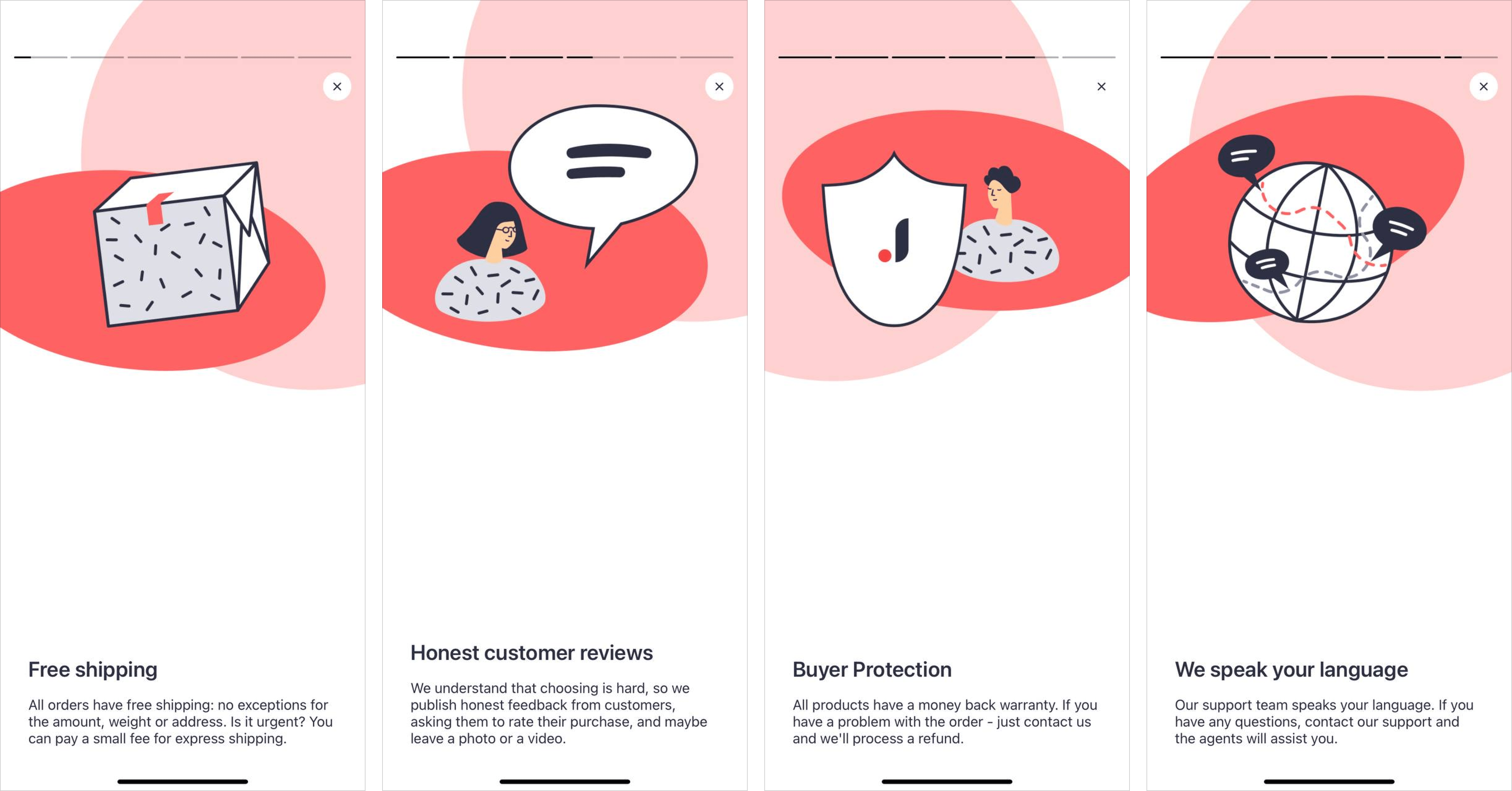
They are non-intrusive and resemble Instagram stories. From my point of view, the in-app experience in question is a success for several reasons:
- The app brings about a great first impression;
- A user won’t be in the dark – they already know what the app has to offer;
- The brand doesn’t overpromise and is honest from the very start.
10. Showcase user testimonials
The opinions of the crowd play a major role in a decision-making process, be it mobile use or pizza order. If you run a successful app and have your fair share of thankful customers, why don’t show off in plain sight – in-app?
User testimonials are a powerful form of social proof and come with a pack of goodies as they:
- Increase the trustworthiness of a brand;
- Attract new customers;
- Establish an emotional bond with users;
- Grab attention.
Searching for an application that displays user testimonials in-app wasn’t a daunting task whatsoever. 5 out of 14 apps I’ve downloaded for the research walk this path. And so, I introduce you to these vivid examples.
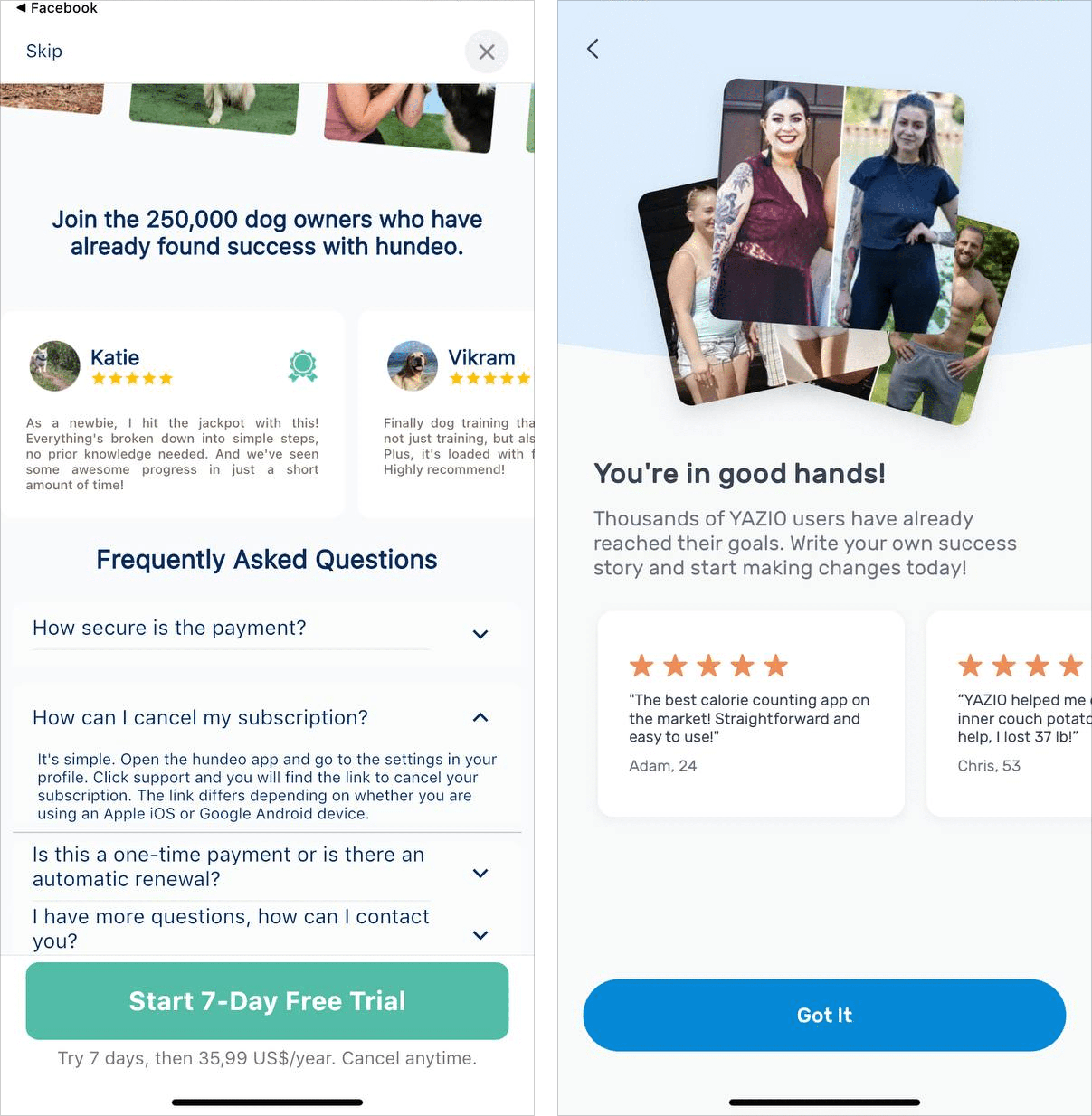
The first one is Hundeo (right, I have a cat so I got the app specializing in dogs) which helps you train your pet, play games with it, and even feed it healthily. Its user testimonials come as a part of the free trial screen. What did they do right? Mention the exact impressive number of dog owners who used the app – 250K – along with the FAQs that could tip the scale toward starting the trial (or maybe even buying a subscription).
The second one is YAZIO – the app for healthy eating and weight loss. In my humble opinion, these guys hit the jackpot. They included customers’ before-after pictures for a greater effect. Not only quotes from thankful users. It’s pure psychology!
❗️ Extra pro tips
- Constantly refine and add in-app payment options (for ecommerce businesses and brands connected to sales);
- Make sure your app is loading swiftly – an optimal speed for mobile is 2 seconds;
- Share customer testimonials inside your application – this is additional proof that you are a credible and successful business;
- Gather customer feedback in-app to generate higher response rates, monitor application performance, or plan your product roadmap;
- Include in-app referral programs to boost your client base and better engagement;
- Promote special offers, once-in-a-lifetime discounts, holiday deals, and make them stand out (with fonts, banners, extra buttons, popups, etc.);
Final take
The research is officially finished! My verdict: modern mobile applications are ready to go the extra mile for their users but some may not really know how to listen to their audience. At the end of the day, an in-app experience is all about what your customers want.
However, one last thing before you close this tab: do not overwhelm your users. If you set up push notifications, do not send them in bulk and too often. Do you want to show off testimonials? Make them short and straight to the point. If your design is minimalistic, follow it across all your in-app communications.
That is why boosting it is closely related to clients’ demands, fine-tuning your strategy respectively, and constantly developing your product. Otherwise, users will switch to a competitor with 5 stars on the App Store or Google Play Market. But HelpCrunch won’t let you fall down the rabbit hole 😏