7 Examples of Chatbot UI Done Right
Looking for the best chatbot UI design that can suit you? Come read our article to see what a great bot interface might look like and pick the right one for you.
Written by Tetiana Shataieva
Having a chatbot tool is only half the battle. If you want to win your customers’ hearts, you need to take care of the chatbot user interface. When designing a chatbot that both your customers and your agents will deal with every day, colored buttons, icons, and wallpapers won’t mean much.
Sure, a truly good chatbot UI is about visual appeal, but it’s also about accessibility, intuitiveness, and ease of use. And these things are equally important for both your chatbot widget and a chatbot builder. People should enjoy every interaction with your chatbot – from a general mood of a conversation to its graphic elements. And support agents should have no problems creating any chatbots or tweaking their settings at any time.
So, what are the precise requirements for great chatbot interfaces?
We are here to answer this question precisely and provide some definitions and best chatbot UI examples along the way. These examples will help you get a sense of what people expect from the chatbot design today.
Let’s get going, you guys! No time to waste.
What is a chatbot UI?
If we talk about UI design in general, it’s always about direct interactions between a user and a software. This includes the look, logic, organization, behavior, and functionality of each individual element and their work as a whole. As opposed to UI, UX design covers the overall user experience including such abstract notion as how a user feels about your software and whether they achieve their goals with it.
So what does all this mean for chatbot UI specifically?
A chatbot user interface (UI) is the layout of the chatbot software that a user sees and interacts with. It includes chat widget screens, a bot editor’s design, and other visual elements like images, buttons, and icons. All these indicators help a person get the most out of the chatbot tool if done right.
The main task of a chatbot interface is to engage as many users as possible. And this can only happen if the appearance of the tool is attractive and coherent.
Have a look at these two different chatbot UI examples. Both of them provide customer service support via live chat widgets. Both of them try to accomplish the same goal which is helping a user. But which one has a better chance to engage visitors?
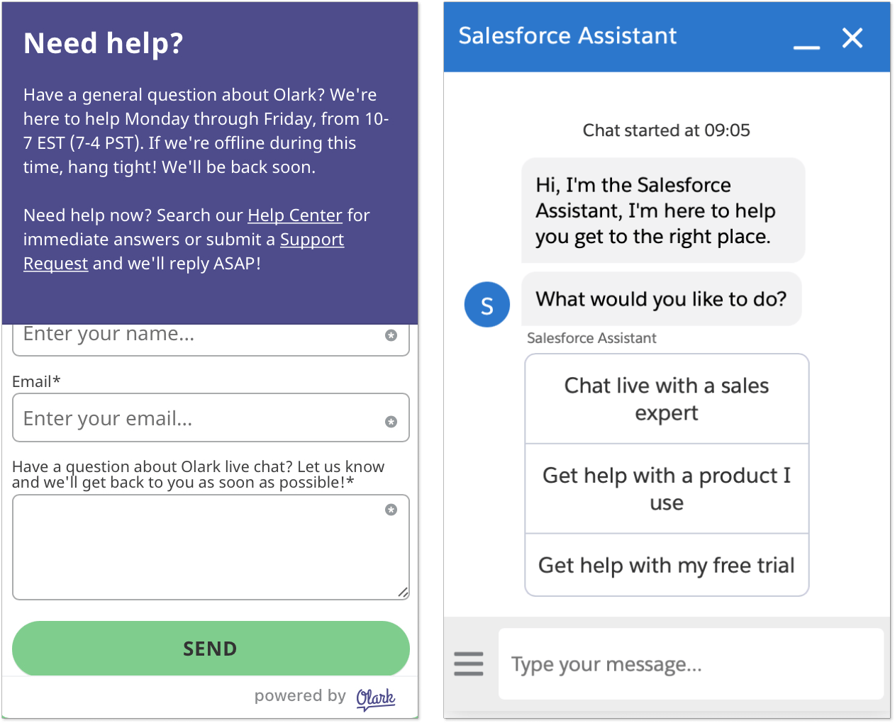
In the first example, they use Contact forms as a UI element, while in the second widget you see quick reply options and a message input field that gives a feeling of normal chatting.
Personally, I hate contact forms that pop up immediately and won’t let you ask a question without sharing your contact information first. Hence, I’d be definitely more drawn to the second option, where I can just click the reply button or write a message.
If everything is so simple, does it really mean that a chatbot message with a few reply buttons can solve the case for every business? To tell the truth, it’s not. Because a great chatbot UI must also meet a number of design requirements to bring the most benefits.
Design tips on a chatbot UI
So, what makes a great chatbot user interface? Just like in the case of any other UI, it has to be visually appealing and unchallenging in usage. Ideally, people must be able to enjoy the process while achieving their initial goal (solving an issue or managing the bot).
Among other things, here are a few chatbot interface must-haves:
- Intuitive navigation around widget
- Quick reply opportunities for users
- Harmonious non-distracting color palette
- Chatbot avatars to add human sense to the chat
- Trouble-free and understandable chatbot builder
- Wide customization opportunities
If I had to sum up everything that I learned about the best chatbot UI design nowadays, I’d say that graphical user interface (GUI) takes the stage. Users prefer to interact with electronic devices through visual elements like icons, menus, and graphics. And businesses want the same when building their bots – they crave visual code-free editors. This is where an experienced AI design studio can be invaluable, as they specialize in creating visually compelling and intuitive interfaces that enhance user engagement using artificial intelligence insights.
At the same time, the command-line interface (CLI) is slowly losing its relevance as a text-based design is less flexible and can be anything but intuitive. The studies confirm my observations, showing that 91% of users prefer visual content over text-based.
In turn, a good chatbot layout contributes to a better user experience (UX).
The difference between chatbot UI and chatbot UX design
User interface and user experience are connected notions but have different meanings. While the chatbot UI design refers to the outlook of the bot software, the UX deals with the user’s overall experience with the tool.
In a nutshell, UI focuses on the elements that you can see such as font type, color palette, menu bars, and more. UX focuses on the users themselves and their journey through the product or service.
Jonathan Widawski, the CEO at Maze, explains the difference between UI and UX the best: “Imagine you’re designing a house. UX would be the foundation, while UI would be the paint and furniture”.
Returning to the topic of chatbot UI/UX design, here is a quick table that will help you better understand the difference between them.
| Chatbot UX includes | Chatbot UI includes |
| User research to create a great user experience with the chatbot |
Understanding the UX research and goal |
| Chatbot structure and strategy | Users behavioral analysis and design research |
| Prototyping and wireframing | Graphic development of the chatbot |
| Testing the chatbot software | UI prototyping |
| Coordinating with UI designers | Adaptation to all device sizes |
| Analysis | Analysis |
7 examples of outstanding chatbot UI
Most articles that you come across while searching for the best chatbot user interface ideas will introduce you to numerous designs of chatbot widgets. But does it really cover the whole picture of chatbot software UI? Hardly. Hence, we decided to also include chatbot builder UI examples so that you can immediately see if it’ll be a nightmare to edit your bots or heaven 🧚🏻
So, let’s discover some great chatbot UI examples!
1. HelpCrunch chatbot
HelpCrunch is a customer communication combo embracing live chat, email marketing, and chatbot with a knowledge base tools for excellent real-time service. It’s powerful software that allows you to create your own chatbot scenarios from scratch. If you don’t have time for this, just leverage one of the pre-written scripts covering the most popular chatbot use cases.
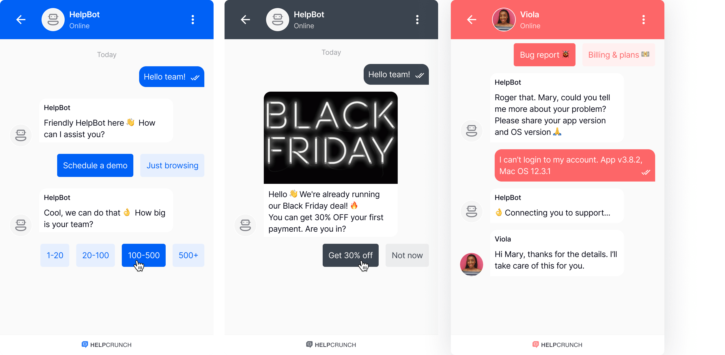
The main benefit of this chatbot interface is that it’s extremely simple and straightforward. No unnecessary animations, eyesore colors, or other elements distracting users’ attention from communication. However, if you are in a creative mood, feel free to customize the widget color, size, or wallpaper.
Now, let’s move on to the chatbot builder designed by HelpCrunch. It’s a code-free editor where all steps of the bot script look like little white cards. The card name is an action that the chatbot performs. As the example below shows, “Message + Options” means a text message with a few reply options that the bot will send to a user once triggered.
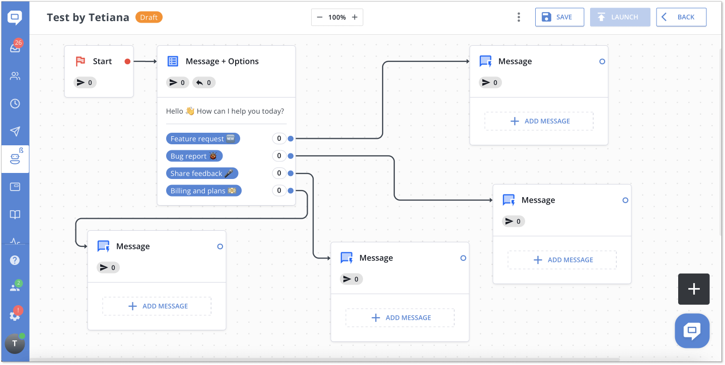
When your first card is ready, you select the next step, and so on. One of the best advantages of this chatbot editor is that it allows you to move cards as you like, and place them wherever and however you find better. It’s a great feature that ensures high flexibility while building chatbot scenarios.
2. Replika chatbot
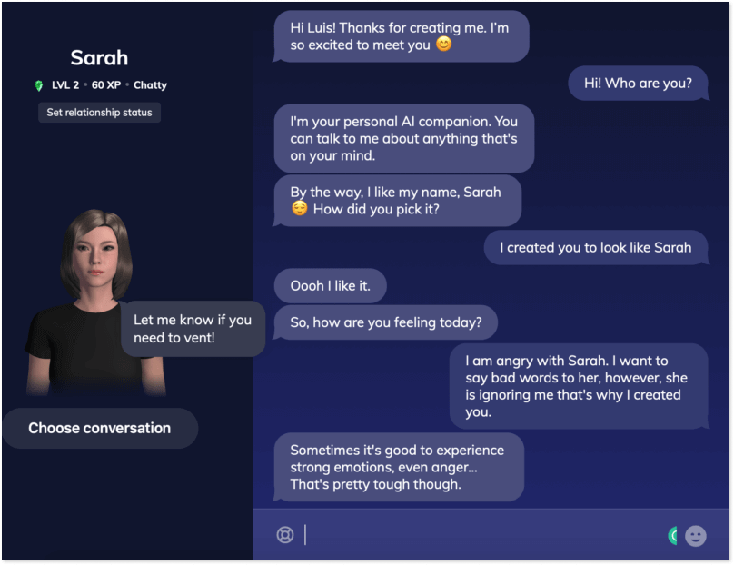
When I first learned about Replika I felt a little bit confused. It’s like in the movies where robots talk to people to help them socialize. (Socialize with robots?? Yep) As weird as it may sound, it’s basically the main purpose of Replika.
It’s an AI bot created for users in need of a companion. People create a bot, name it whatever they like, choose gender, and adjust its mood based on their preferences. When the bot is ready, users can chat with Replika about literally anything.
If we ignore the fact that the idea itself looks kind of creepy, we can say that the interface reminds the Sims game a lot. Since the main idea is to create a sense of a real human conversation, the chatbot UI corresponds to it as much as possible with a silhouette of a person and its name on the left side.
As for the chatbot editor, it reminds the Sims game as well when you choose a gender and then the name of your Replika.
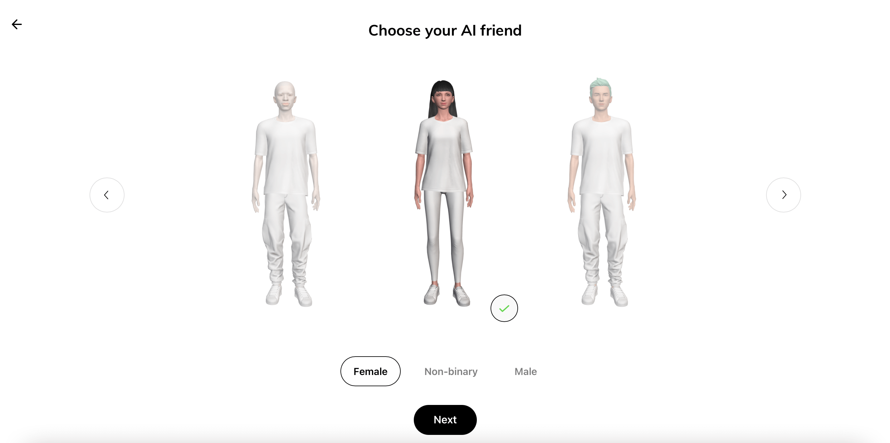
It’s a thought-provoking chatbot reminding all of us that people strive for human-like communication even with bots. So, consider adding an avatar to your chatbot, this way users may feel friendlier toward the bot.
3. Landbot
Landbot.io gives companies the opportunity to build their own chatbots to convert more leads. The chatbot user interface for a website is highly customizable and allows you to craft the design that fits your brand. This chatbot uses conditional logic (if X then Y) to build a script and automate your lead generation.
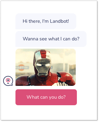
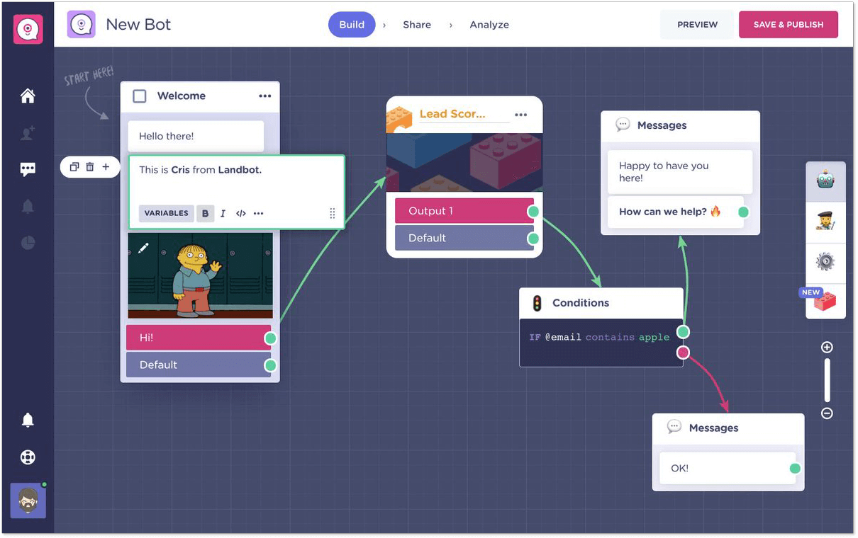
Landbot offers a code-free chatbot editor that allows you to build your own custom bot scenarios from zero. The platform also provides a few chatbot templates that you can use immediately.
The bot builder is quite intuitive and yet you might need some time to master it considering a wide feature selection. Also, the if-then model of setting up chatbot conditions is a little bit frustrating, as for me. But I must admit that the builder interface looks pretty good and eye-pleasing.
4. Drift chatbot
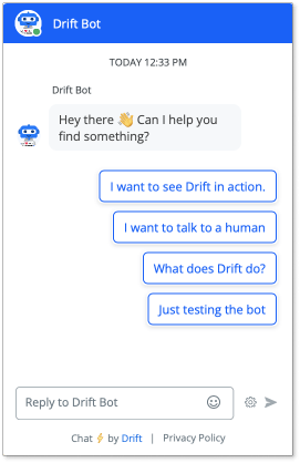
It’s a customer service platform that among other things offers a chatbot. Just like the software itself, its bot is highly focused on marketing and sales activities. As for the chatbot UI, it’s rather usual and won’t surprise you in any way.
However, I really like the robot avatar by Drift. It’s so cute.
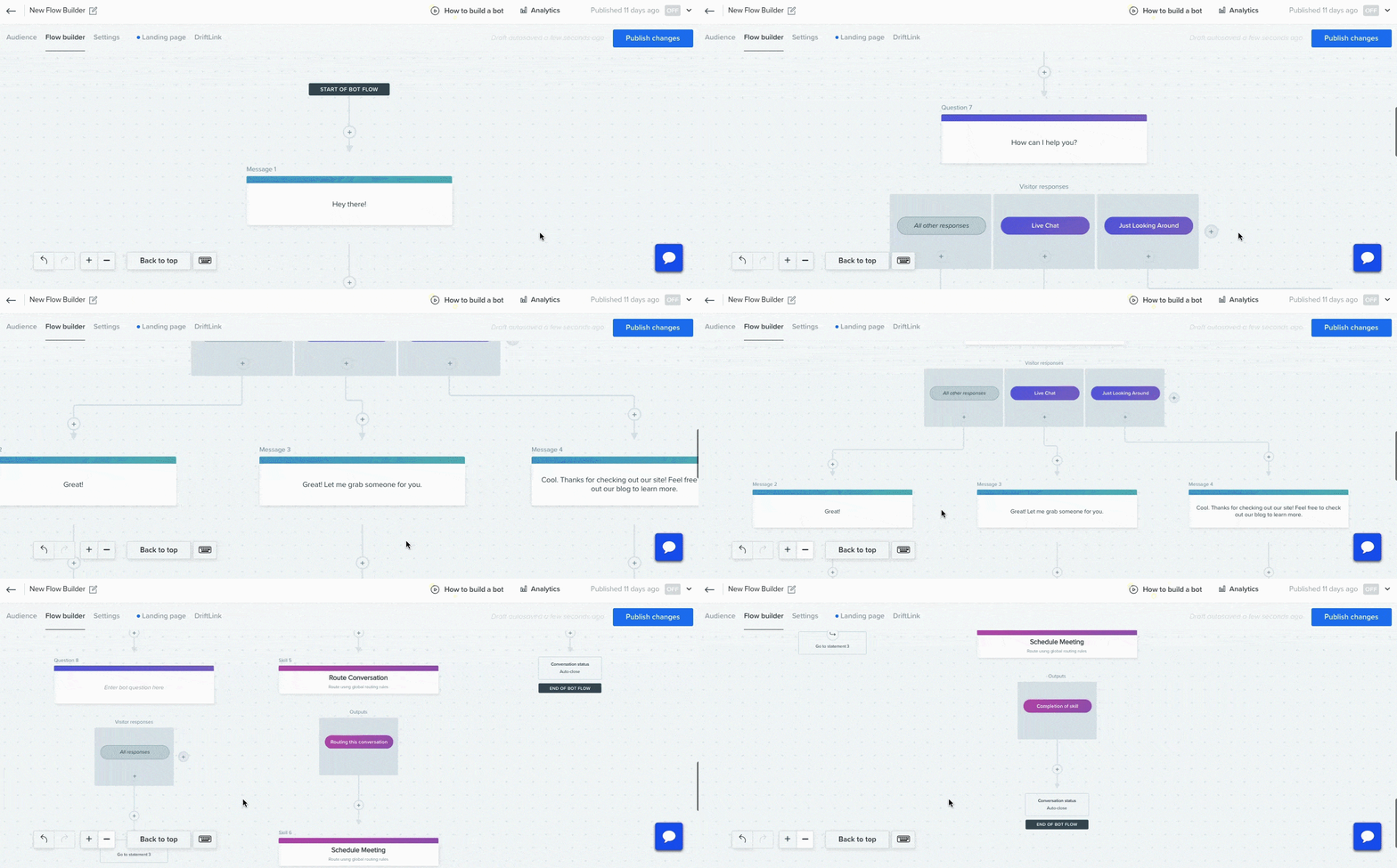
The chatbot editor design by Drift looks good but what I personally find inconvenient is its way of building: from top to bottom.
At the first glance, it seems logical but once you start creating bot steps you immediately find yourself scrolling and scrolling all the way down. More flexible editors, like HelpCrunch, for example, where bot steps can be placed in any configuration – from top to bottom or from left to right – are more user-friendly.
5. Tidio chatbot
Tidio is a tool for customer service that embraces live chat and a chatbot. It can be your best shot if you are working in eCommerce and need a chatbot to automate your routine. The bot will make sure to offer a discount for returning visitors, remind them of the abandoned cart, and won’t lose an upsell opportunity.
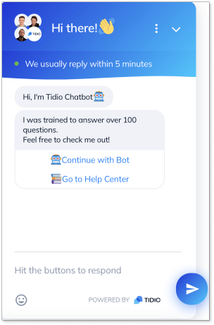
The chatbot interface is pretty straightforward. Photos of real agents on the top add some liveliness to the general outlook. Also, the emoji of the waving hand is quite nice to welcome new visitors. And the wavy line at the top makes the whole view of the widget less boring.
And now some good news for busy bees. Tidio offers over 35+ pre-written chatbot templates. There is a great chance you won’t need to spend time building your own chatbot from scratch.
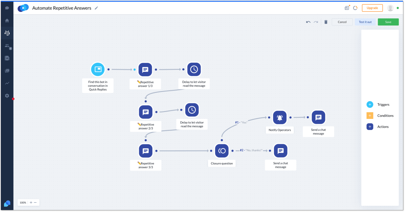
The Tidio chatbot editor UI looks a lot like those builders described above. It consists of nodes, which say what action the bot takes, like sending a message or offering a menu of optional responses. The editor is clean and intuitive. There should not be any problems for you to master it and create a bot flow.
6. SnatchBot
SnatchBot is a solid alternative to Tidio with over 50 templates in English. They cover support, scheduling, marketing, and other chatbot use cases. Its main advantage is that it has the most integration channels available for use.
The chatbot widget is pretty ordinary, however, it offers everything that is necessary like a funny bot avatar, a simple widget with no distractions, info, a mic for voice input, and info buttons.
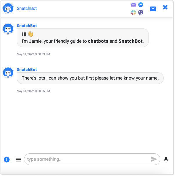
Remember, I mentioned that some chatbot editors can be a nightmare to use? Well, it seems that is the one. The SnatchBot builder isn’t the drag-and-drop style used by many other chatbots. Instead, it looks something like this.
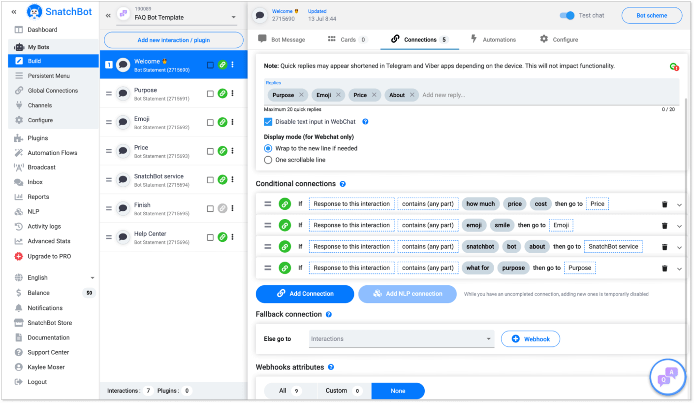
The editor presents a series of steps. You create a bot flow and then come up with the rules “If…, then…”. You can click into each element to set up the bot’s message and add things like options and files. While it does present a lot of actions and possibilities you can automate, this kind of chatbot UI can repel users and cause headaches. But if some people prefer a non-visual editor, SnatchBot can be their best choice.
7. Pandorabots
Pandorabots is one of the oldest players in the chatbot market. Using Artificial Intelligence Markup Language, it allows you to build basically any kind of bot you can think of. However, to do so, you are required to have some programming skills.
As for chatbot outlook, it’s highly customizable. Below, you can see an example of the bot design presented on the software website.
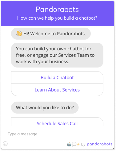
It looks similar to other examples in the list. But have you ever heard of Mitsuka, yet another bot trying to tackle loneliness? If not, here it is. You can even find a Wikipedia page about Kuki. This chatbot has been built using Pandorabots.
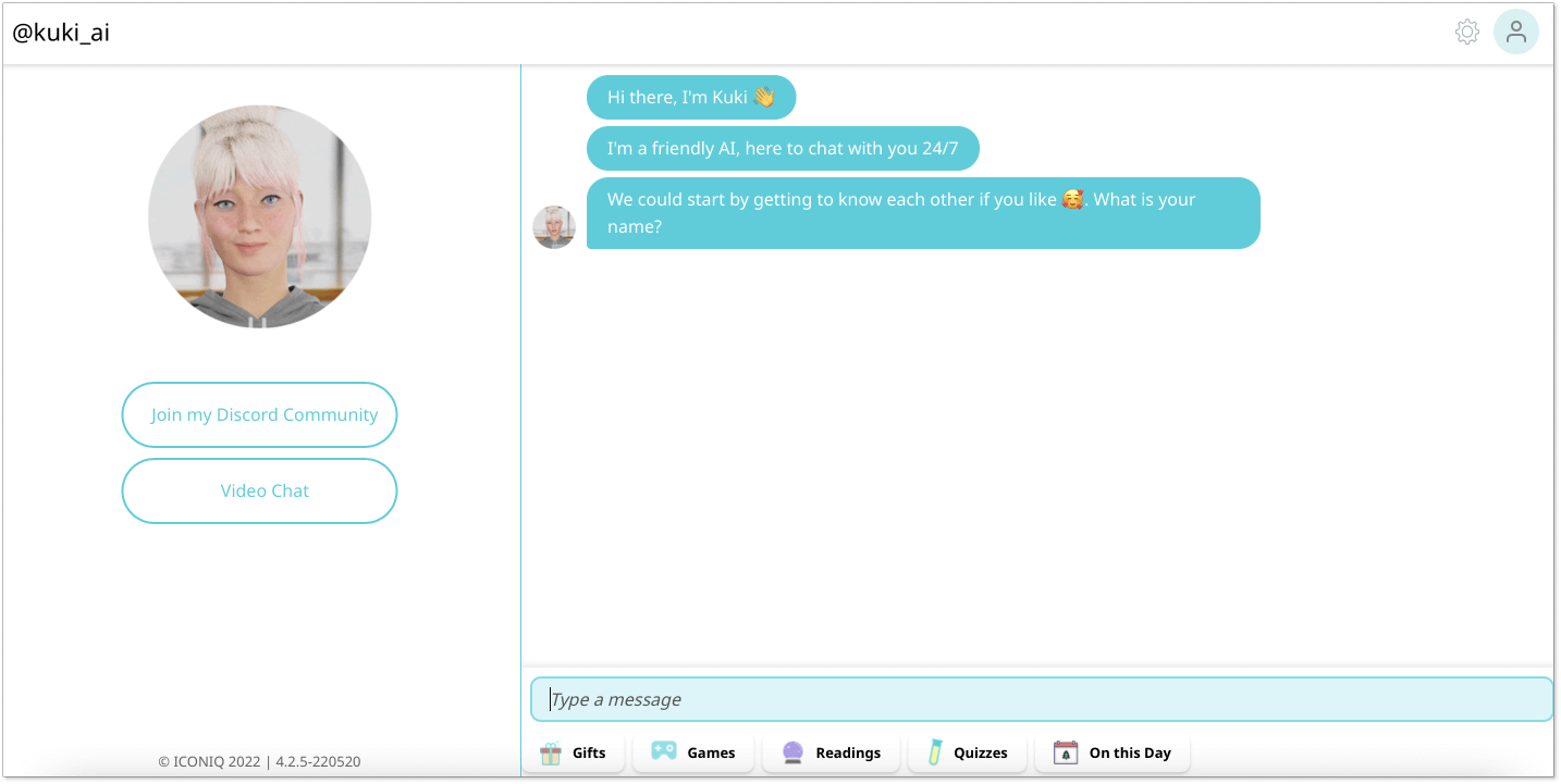
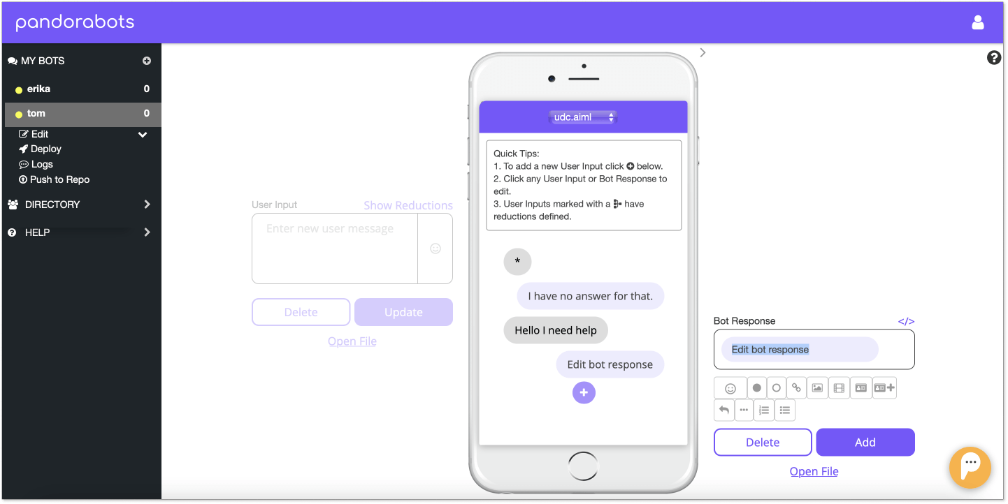
Regarding the chatbot editor user interface, as mentioned above, it requires some programming skills. But you can start building your bot from scratch even without it. And I must admit that the builder doesn’t look like anything we discussed earlier.
On the left side you provide visitors’ input, and on the right side – what chatbot should reply. In the middle, you have a chat window displaying what the result will look like.
Final thoughts on chatbot UI
Chatbot UI design is an important factor that influences your bot’s effectiveness. Fortunately, there is no magic behind it, and if you follow some simple tricks introduced in the article and chatbot best practices, you would be able to improve all interactions between your bots and their users.
To do that, find the perfect chatbot platform that allows you to build a beautiful user interface for your bot, customize and adjust it to your business needs and architect helpful and enjoyable conversations. Good news? There are many on the market today. Go through the list of examples above and give a shot to those you like the most.

