The Ultimate Guide to In-App Messaging
Do you want to put in-app messaging to work? We can give you a little nudge here.
Written by Olesia Melnichenko
Remember the days when people used pigeons to deliver a message? First, it was time-taking. Second, it was highly inconvenient. And third, poor birds. They had to carry wrappers tied to their tiny paws and fly with them. Thanks to the progressive world, we have something user-friendlier today.
By the way, if you own a web or mobile application, no birds will come to the rescue. Are they able to take a message on time and without sacrificing the context? I doubt that.
In today’s competitive world, businesses are leveraging hyper-targeted and personalized messaging to connect with their customers on a deeper level and drive engagement. You can easily communicate whatever it is you want to tell your users with in-app messaging. That’s right. If you’re a business with an application (either desktop or mobile device), go ahead and craft your unique message. But let’s learn the ropes to be ahead of the game.
What is in-app messaging?
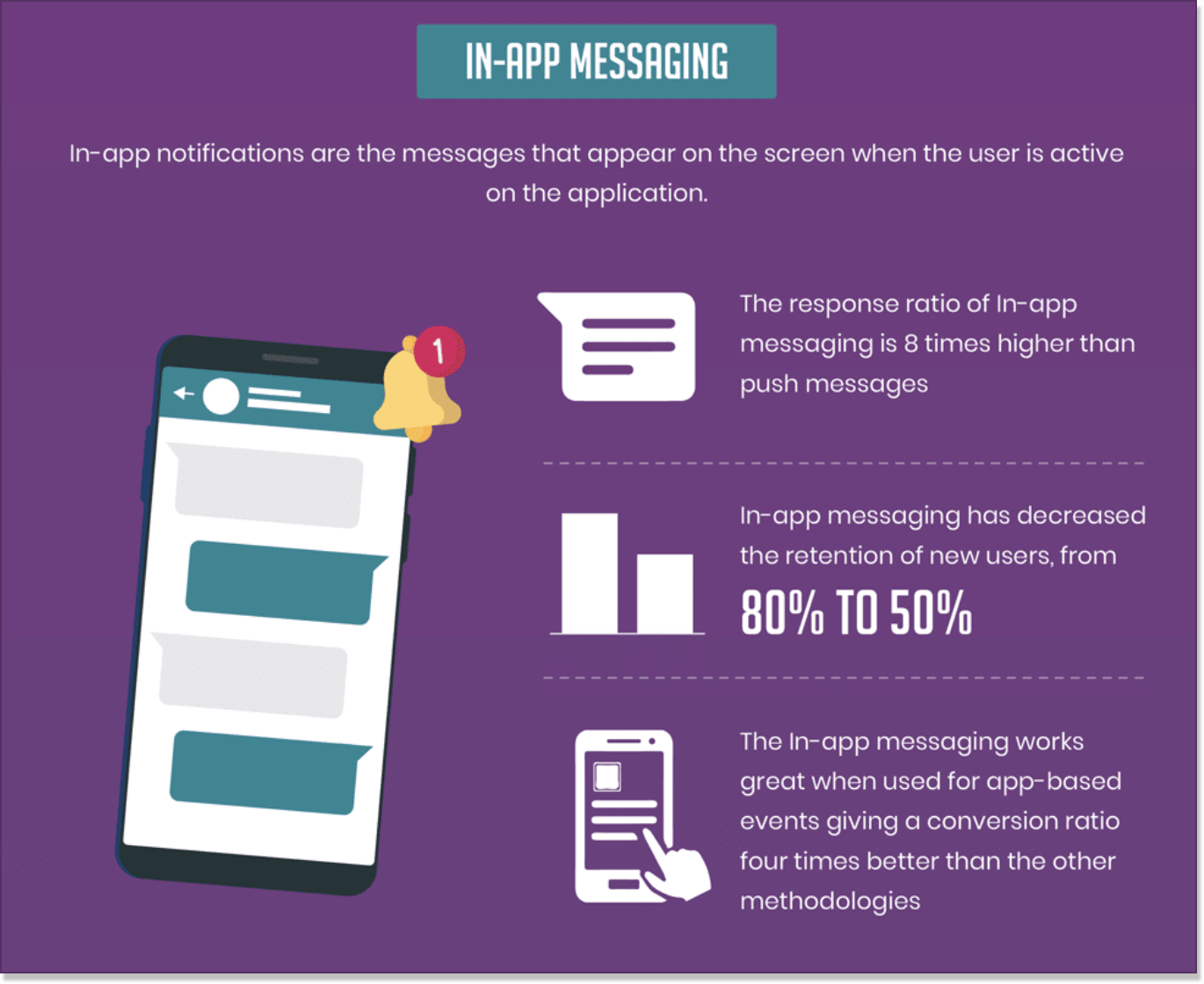
In-app messaging (sometimes referred to as in-product messaging) is a marketing technique that allows a brand to communicate with a user while they are active inside an app. Such communication is usually expressed with tailor-made targeted app notifications that appear at a fixed time. The goal is to interact with a user and walk them through the app experience successfully.
Getting ahead of your questions, in-app messages, and push notifications have some key differences. The former is conversational, engaging, and context-specific, while the latter is quick and needs a user to opt-in for receiving them. Push notifications are used to prompt customers who are not currently using an app to engage with it in some way. Moreover, contextual messages inside an app show better open rates and, consequently, response rates as compared to pushes.
Because of its nature, an in-app message creates seamless progress from an initiated session to conversion. It should feel like an intrinsic part of an application, be neither sales-y nor pushy, and can be used to fine-tune your promotional app messaging strategies and overall customer engagement. Can you fire in-app messages only inside a mobile application? Not necessarily. They can be sent through both web products and mobile apps.
Why app messaging matters in customer support and marketing
You can benefit from in-app messaging in various customer service scenarios. Identify possible pain points across the product or service and highlight them throughout a customer journey with your app.
Streamline your in-app support by engaging with users about an issue they’re trying to solve in a conversational way. Besides, after you finish the chat with a client, ask them for frank feedback while engaged users are in your app.
Speaking of, sincere customer reviews can be game-changing. It can help you either transfer unsatisfied clients straight to your customer support representative without changing for the worse or protect you from negative reviews on social media.
Apart from the statement “conversation matters”, you might have to take in-app messaging metrics into consideration. This way, your customer service team can always keep its finger on the pulse and adjust the strategy accordingly. Consider at least such metrics as:
- User retention rates for checking the in-app messages’ ability to hold users’ attention no matter the case, even after a set period of time;
- CTR (Click-Through-Rate) for seeing if your in-app messages are convincing and effective enough;
- Conversion rate for making sure your welcome, onboarding, or other notifications inside the product are appealing and can convert a user from the first seconds;
- Feature adoption rate for monitoring how well newly announced app features via messages are adopted. The better the feature adoption rates are, the more you can rely on your messages.
NOTE! Looking for the best massaging tools? Sign up for a free 14-day trial with HelpCrunch and test its chat SDKs. They are simple, straightforward, and developer-friendly. Unite the SDK with your app in minutes to interact with users inside your app via a sleek chat.
To increase customer engagement, you can also leverage user retention apps like Mixpanel, CleverTap, Amplitude, and Firebase Analytics, which can help businesses enhance customer loyalty.
Types of in-app messages
-
Chats
That’s right. Our good old proactive chat messages are in this in-app messaging huddle, too. They can have many use cases, from initiating a conversation with a customer and offering help to messaging for product updates to just greeting new app users.
This is the HelpCrunch installation wizard and the proactive message a user sees once they sign up for the product. In our case, we invite a client to book a demo with our specialist if the setup process needs a caveat. This approach improves customer experience notably.
This is HelpCrunch installation wizard: proactive in-app message.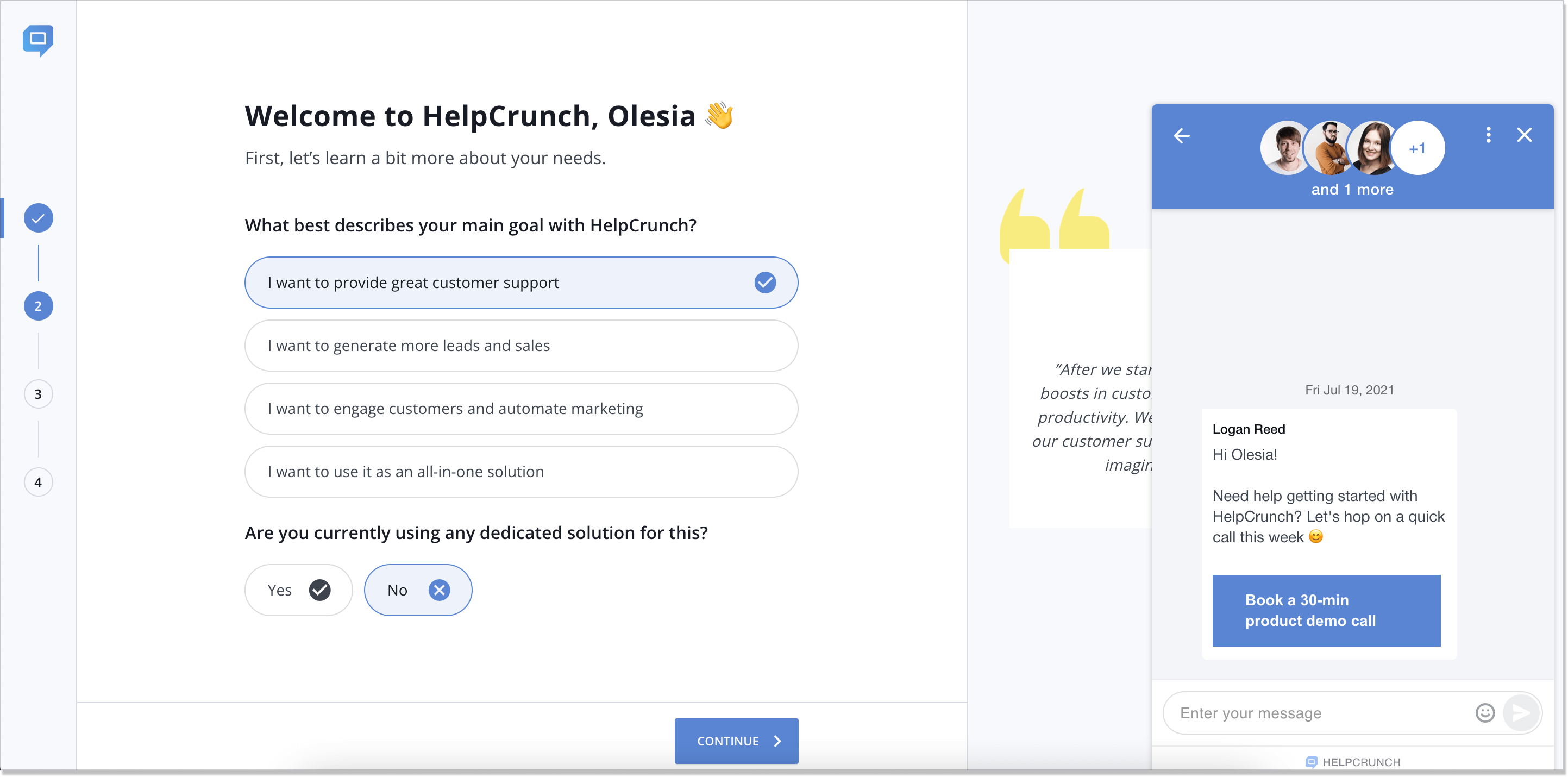
-
Popup
As the name suggests, this is a type of in-app message that appears on a website at a certain period of time. It can fade the rest of the page to highlight the content or cover it all up. You can easily set them up based on app behaviors with such rules as time before exit intent, time on page, and number of page views, to name just a few.
This is what the popup powerful tool from HelpCrunch chat API provider looks like. Sure thing, you can have such an in-app message inside your web applications, just like you do on your website. So, add images, videos, or GIFs, set up the Settings, or just say “Thank you” after a user clicks a popup CTA or subscribes to your stuff. Would you give it a try?
HelpCrunch popup message on a mockup website 👇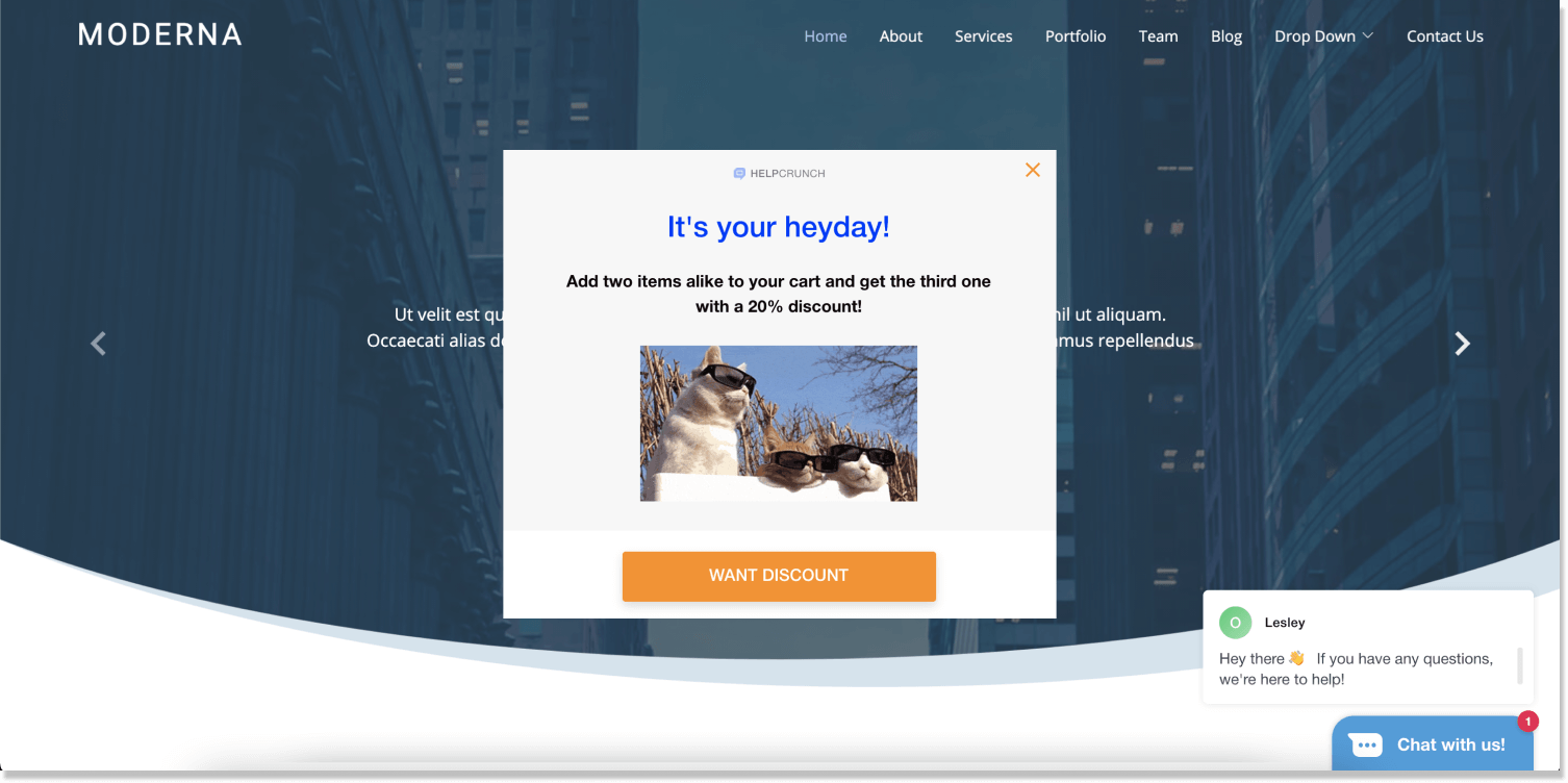
-
Tooltip
Tooltips can be much shorter than other in-app messages we discuss here. These are brief, informational notifications that are anchored to a certain element in your product. They appear while a user mouses over a feature or a text in your product and disappear when they mouse out. “Hovers” (tooltips can sometimes be called this way) are perfect for answering FAQs or providing more context about product features.
Tooltip in the HelpCrunch account 👇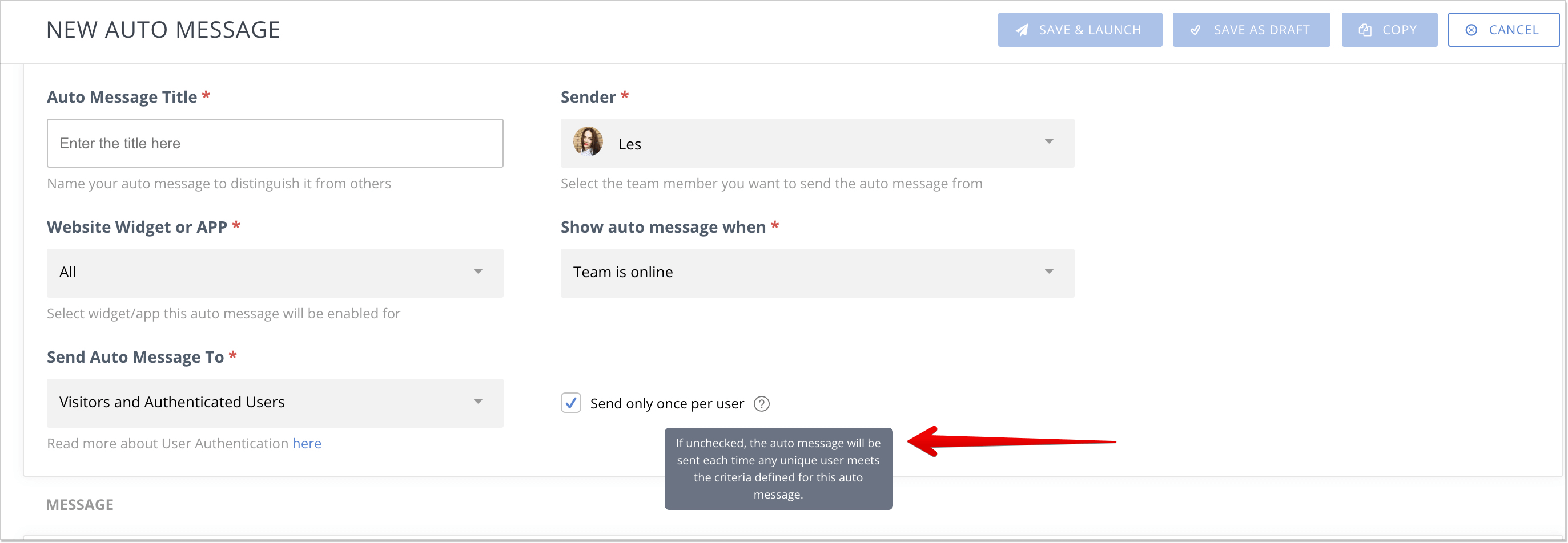
-
Banner
Probably, you are already familiar with banners. These types of in-app messages often represent an informative short line of text and are tied to the edge of a browser window or phone screen. However, you can’t draw a parallel with popups here. Banners are less obtrusive: the rest of the page stays clickable when they spring up.
To give you an idea, this is how Smart Banners implemented their in-app messages. See, it’s not necessary that a banner sticks to just the upper edge of a screen, as it can also offer full-screen experiences to users. So, it’s up to you how to design yours:
Smart Banners (in-app messages) 👇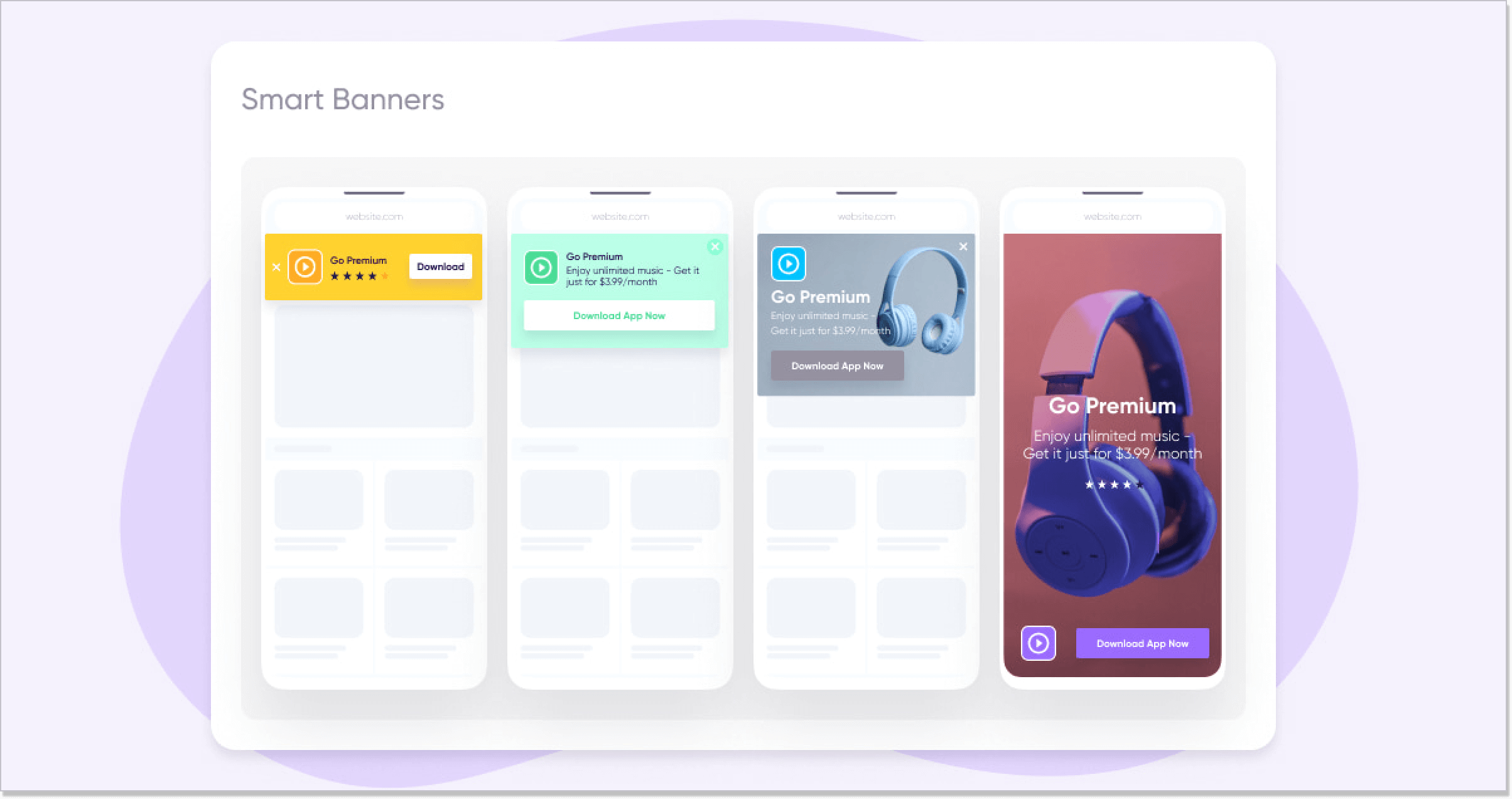
-
Survey
Surveys can have as many forms as you want: drop-down menus, yes/no questions, multiple-choice questions, etc. You can send this in-app message after you finish chatting with a client and ask them to assess your service or wait for a while and shoot a survey in your follow-up message. Surveys usually invite users to interact and help you gather valuable feedback. This is what an in-app survey might look like.
Mobile app survey by Survicate 👇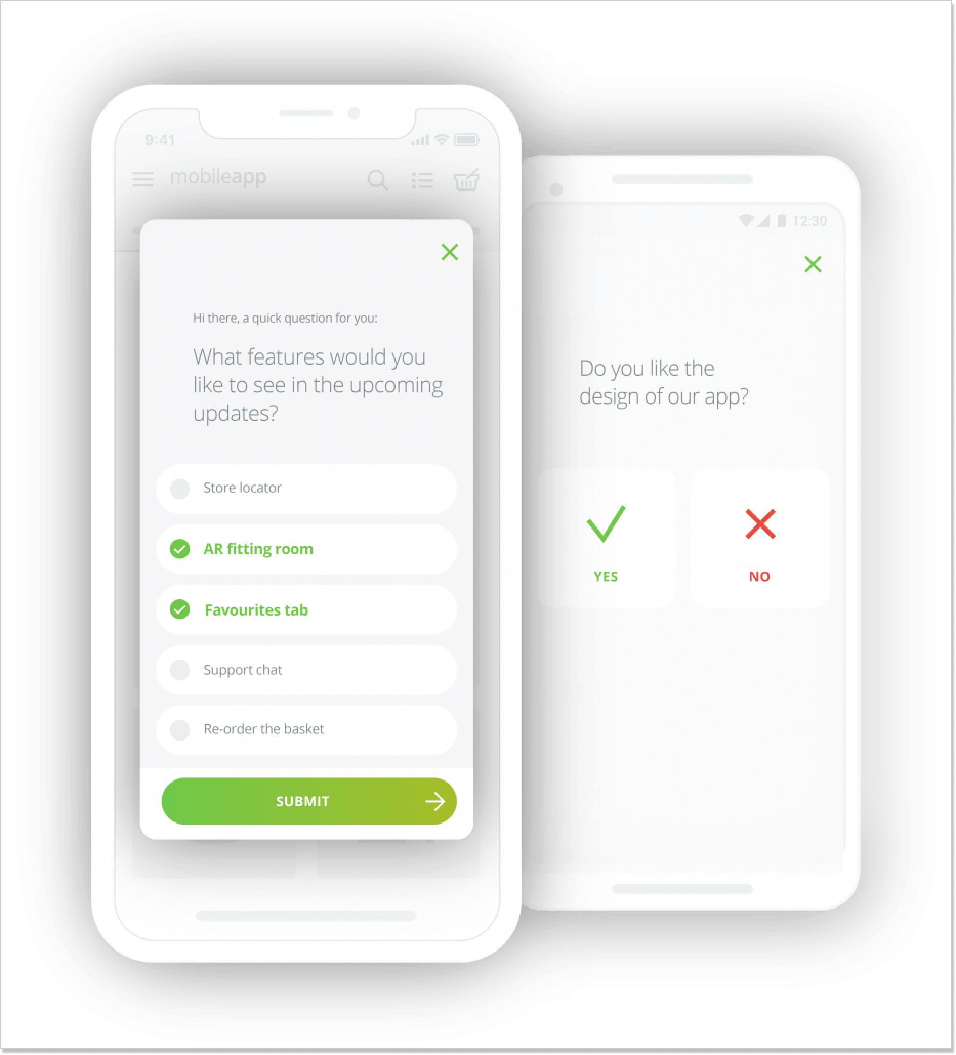
-
User guide
User app guides can be a mixture of all in-app messages explained in our article and are usually aimed at delivering smooth client onboarding. So, make sure you create an intuitive user guide with minimum fuss. If it’s not the case, you risk losing customers just because the steps are unclear or there’s too much excessive information.
This is how Grammarly, an AI-powered writing assistant, uses in-app messaging to lay off the land: 4 steps, 1 sentence each, plus helpful animations (nothing extra is needed).
Grammarly user guide 👇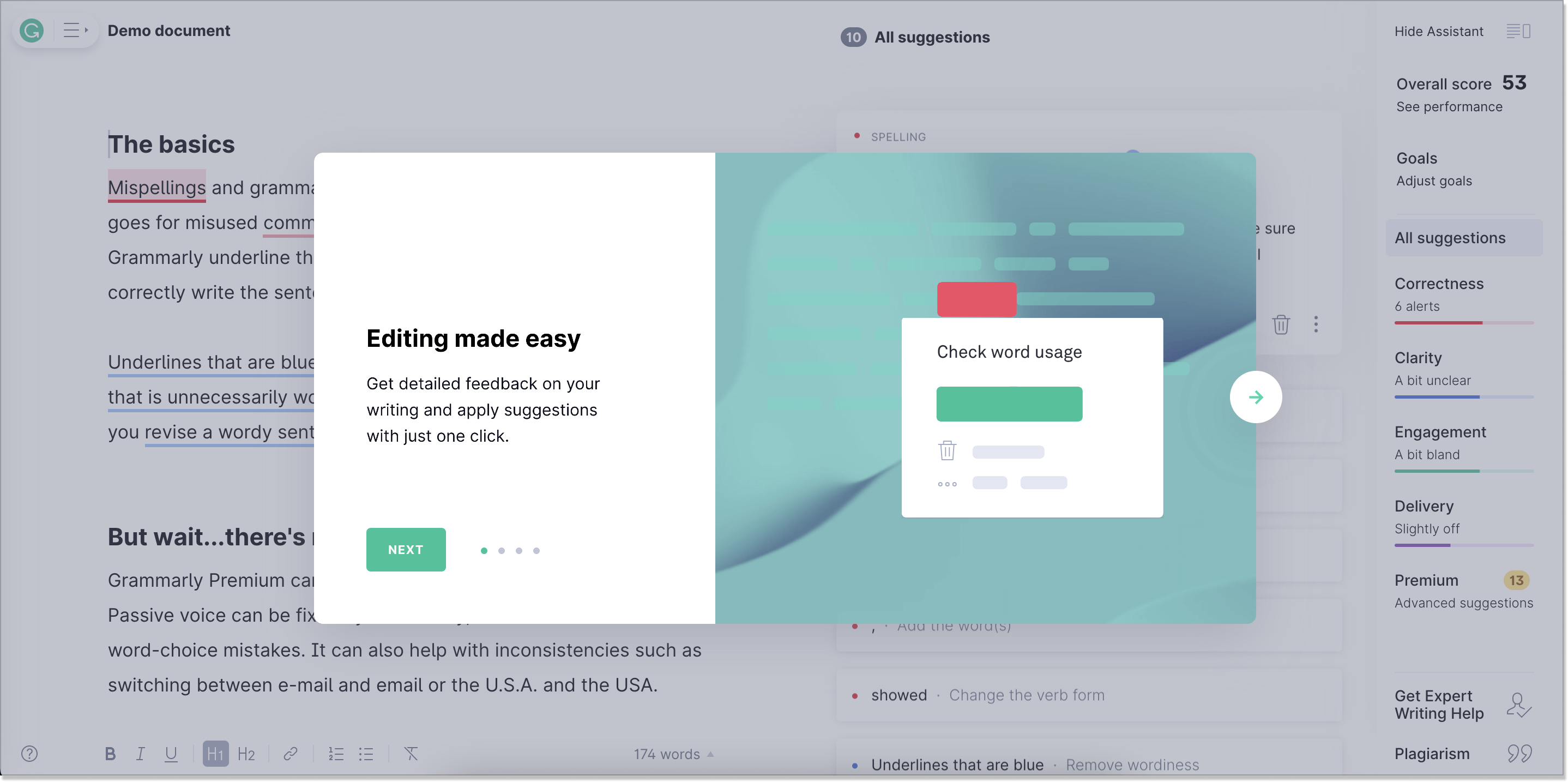
-
Product tours
Product tours (or product walkthroughs) are another sort of user guide and a bare overview of a product (though they’re more in-depth). It is a sequence of messages explaining the ropes to a user so that they know where to start. In other words, they are just scratching the surface. But maybe one major drawback is that when a product tour is over, a customer is left high and dry without any in-app messages coming.
Look at how Zenefits, an HR tool, implemented its product tour. A compass bubble involves steps you need to take, shows the progress bar, and has short texts to walk you through the whole process. They even offer fake employees for more credibility.
Zenefits demo account 👇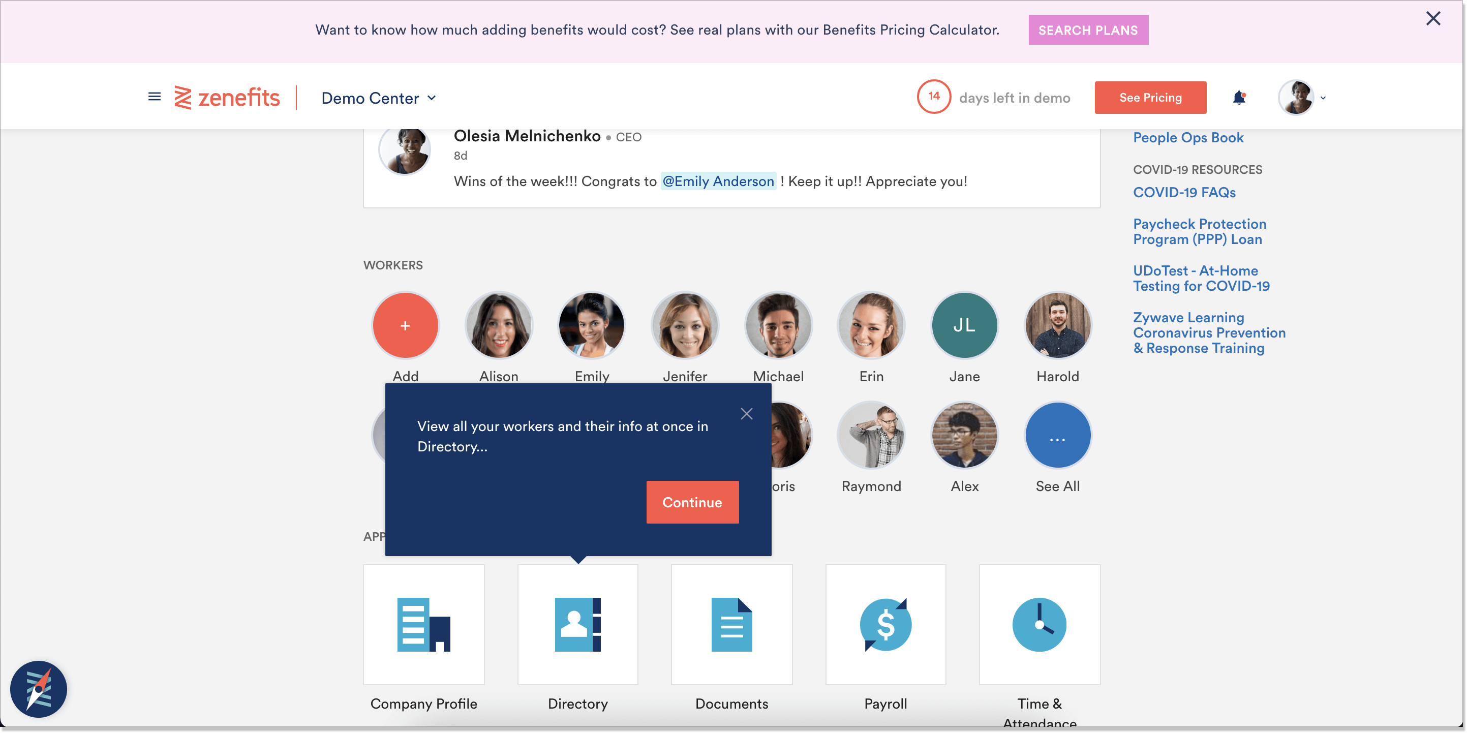
Pros and cons of in-app messaging
App messaging does increase customer retention and loyalty but it can’t be a silver bullet for any business. My recommendation is to weigh up all the pros and cons before adopting it just to be on the safe side. Spoiler alert! Pros do outweigh👌
Pro: Endless word count
Stuff happens, so you never know how many words you will need to share information. And what if you have bigger product announcements to make? With in-app messages, you can have as many words as you wish.
Con: Only for active users
Since the logic is that users have to be active in your product to spot in-app messages, it might not be the best option for re-engaging inactive users. In this case, push notifications might be a better option.
Pro: Better timing
You can set up your in-app message, so users get it at the most relevant time. Let’s say you want to show a user only step 2 of your product guide after they sign up. Make your message pop up just at the right time.
Con: Can be annoying
When done wrong, in-app messages can be a pain in the neck. Know when the right moment is and don’t shrug off a clear copy. Taken as a whole, they shape not only the overall impression about your brand but also build an effective long-term marketing strategy.
Pro: Win-win for customer engagement
In-app messaging campaign can become a great weapon in the hands of a marketer. Thanks to its opportunities, you can highlight the most attractive features of your app to a user and make them engage with it more.
6 in-app messaging best practices to try ASAP
How can you infuse in-app messages into your workflow without even catching up on its best practices? We always bring crème de la crème to our readers, so this time is no exception. Read the ways to interact with users inside your applications and walk the walk!
-
Use concise language
As the number one in-app messaging use case is the user onboarding process, it’s in your best interest to be meaningful in what you say and make that first impression seamless. All in all, the whole point is to get the user’s attention without being annoying.
Don’t try to be a Shakespeare here. I mean, keep things as simple as possible, don’t overuse high-toned words, and write the copy that gets to the main point quickly. Narrow down your in-app messages to what users REALLY need to understand and learn to go on with your app at that moment.
Consider also adding some visuals. This is how HelpCrunch decided to point the way for every new platform user: with a thorough explanatory video and a small informative intro in-app message right next to it: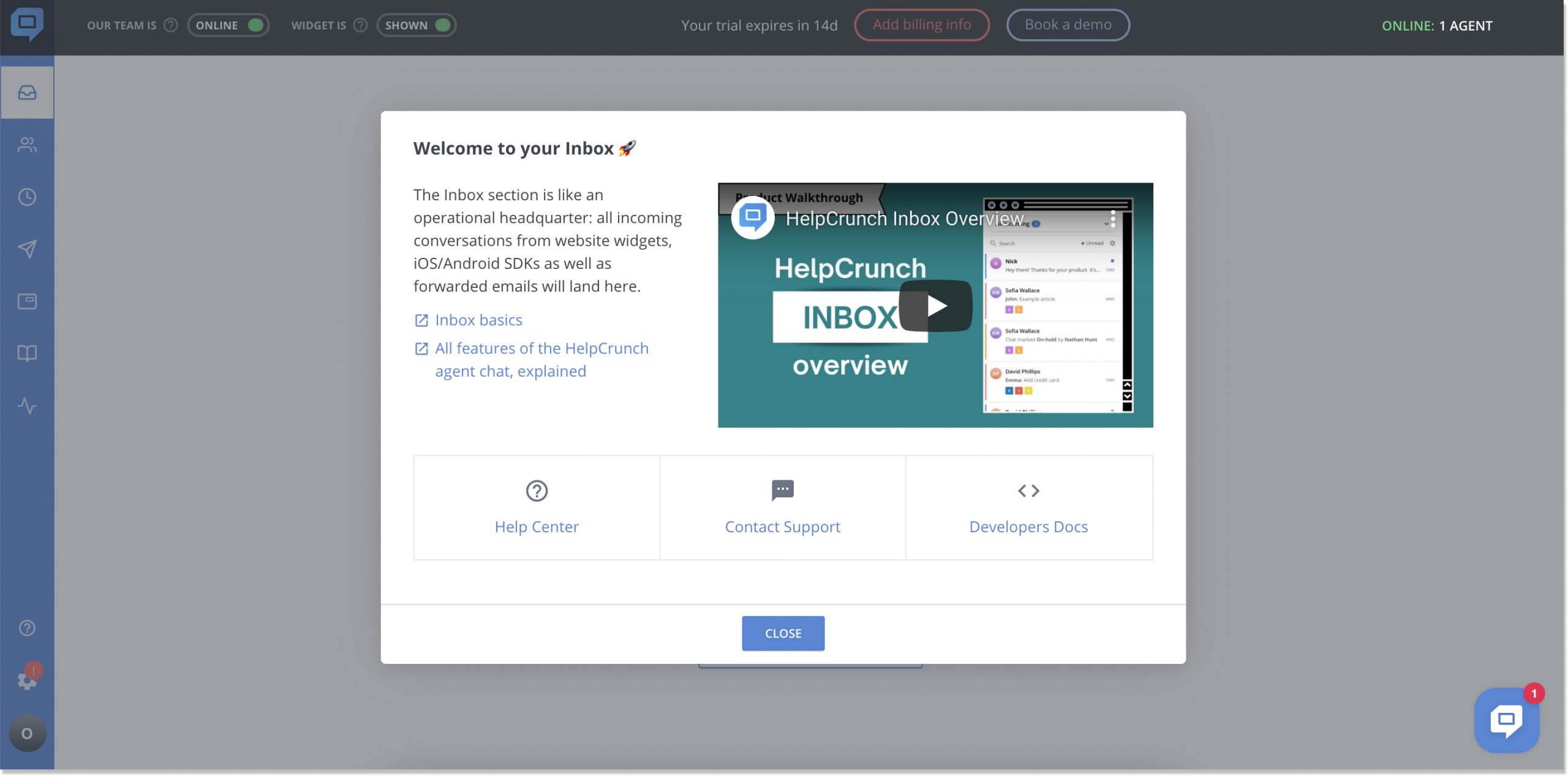
-
Let creativity step in
Nobody wants to see a mediocre promotional message with black words in it. So, make your message inside an application stand out from the crowd. Design it in a way that matches your brand’s color scheme and identity.
Don’t be afraid to add a pinch of humor, emojis, or some other nifty things. Besides, creativity = eye-catching designs. So, make sure you have offbeat illustrations up your sleeve. For instance, BetterMe, a fitness app, developed bright in-app messages that are accompanied by emojis, CTAs, and thematic visuals. They could’ve cut corners with just plain text, though.
BetterMe fitness app in-app messages 👇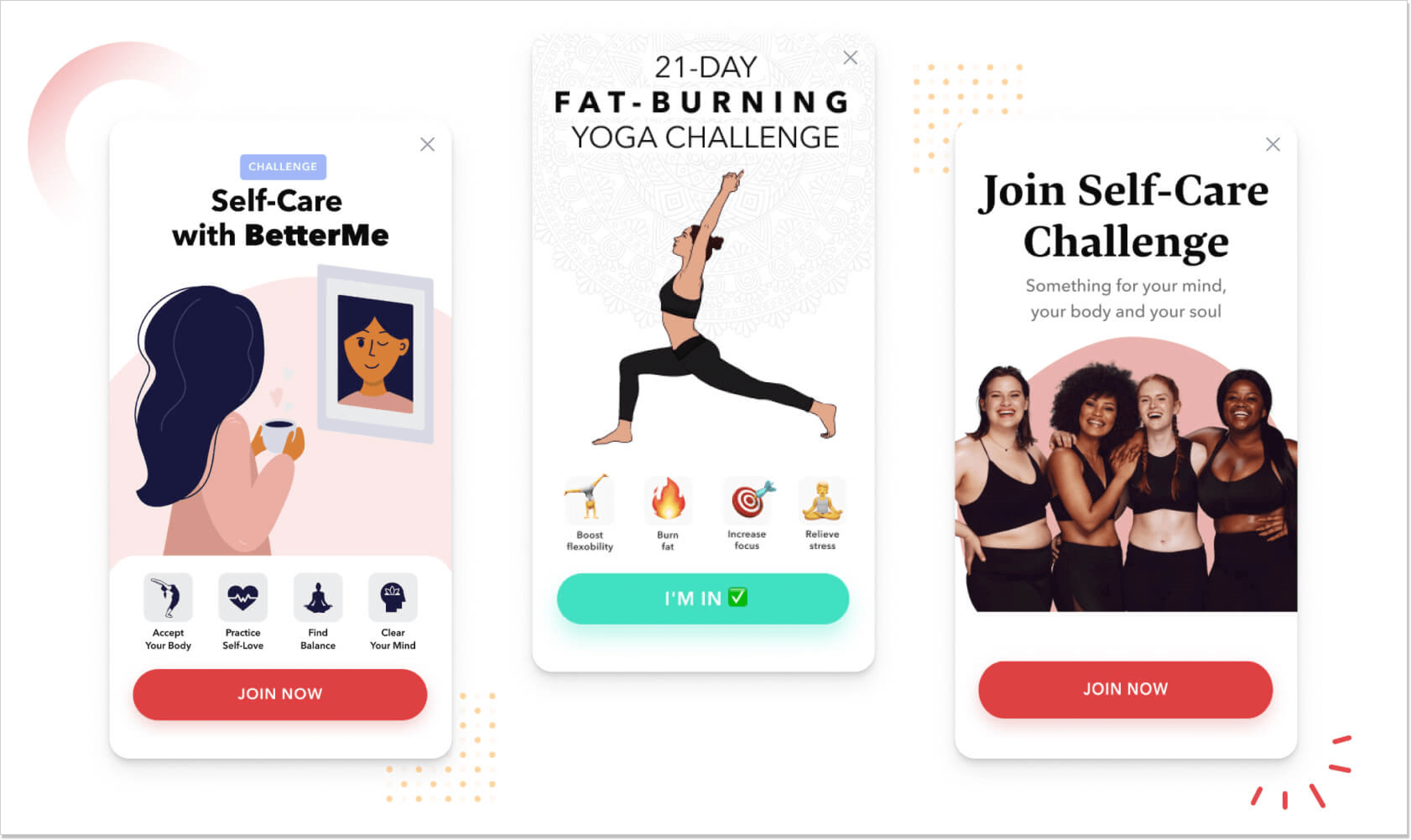
-
Focus on personalization
Imagine an already subscribed premium user who navigates through your app. Out of the blue, there is this upsell message displayed. It doesn’t make much sense for them. To avoid such situations with your in-app messaging routine, try to apply customer segments and craft personalized content with certain groups of users in mind. Understanding the diverse needs of a segment of users is crucial for designing effective in-app messages.
For instance, spiff up proactive outreach by sending a meaningful in-app message to the right crowd at the right moment. With one robust software, you can cram your chat blasts with hilarious GIFs, important links, and even CTAs. Plus, you can decide on what app sections to put those personalized messages on.
At the end of 2020, Spotify launched this new personalized “Spotify Wrapped” feature. The whole point is that you get tailored messages in the form of year reviews, top artist showdown, or the number of times you listened to your favorite song. The whole thing is that in-app messages appear as Instagram stories.
Spotify in-app messages in a story-shaped format 👇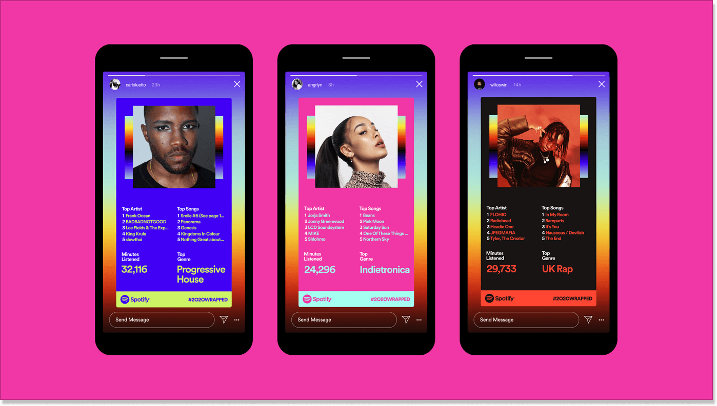
-
Be as relevant as possible
Communicating essential information to the user base at the wrong time is as bad as never reaching out to them. Check that your in-app messages appear at a time that flows well with your user experience.
To show you what I mean, look at the IMDb application – the world’s largest Internet Movie Database. Once I sign in to the app for the first time, I see these two in-app message bubbles. The first says how I can use the Search option, and the second explains briefly my account under the hood. Being a first-time user, this is the moment I need this info the most.
IMDb in-app messages 👇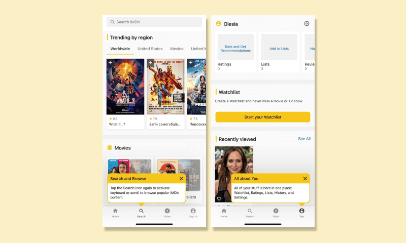
But everything isn’t limited to just announcing some features while onboarding. With app messaging, you can enunciate company-wide webinars and meetings or even send congratulations messages for their personal events, and offer value propositions.
-
Gather feedback
If you think that in-app messaging is all about sharing updates, think again. It’s quite a nice way of gathering some intel from your users, too.
Admit it: the best way to find out what a customer thinks is when they reach a milestone. This is called contextual feedback. Let’s say you finished chatting with a client. Don’t miss out on the opportunity to send them a chat user satisfaction survey inside your app instead of composing those boring follow-up messages.
Another option for getting user feedback is by NPS (Net Promoter Score) surveys. No rocket science here: the question “How likely are you to recommend our product to family and friends?” with a scale from 1 to 10, where 1 is “not likely” and 10 is “very likely”. Moreover, you can extend the survey and ask what made a user choose this score.
NPS surveys could be your best shot when, say, your freemium users are staying with your product for a while and can say whether your app is good for them.
NPS survey from Apptentive 👇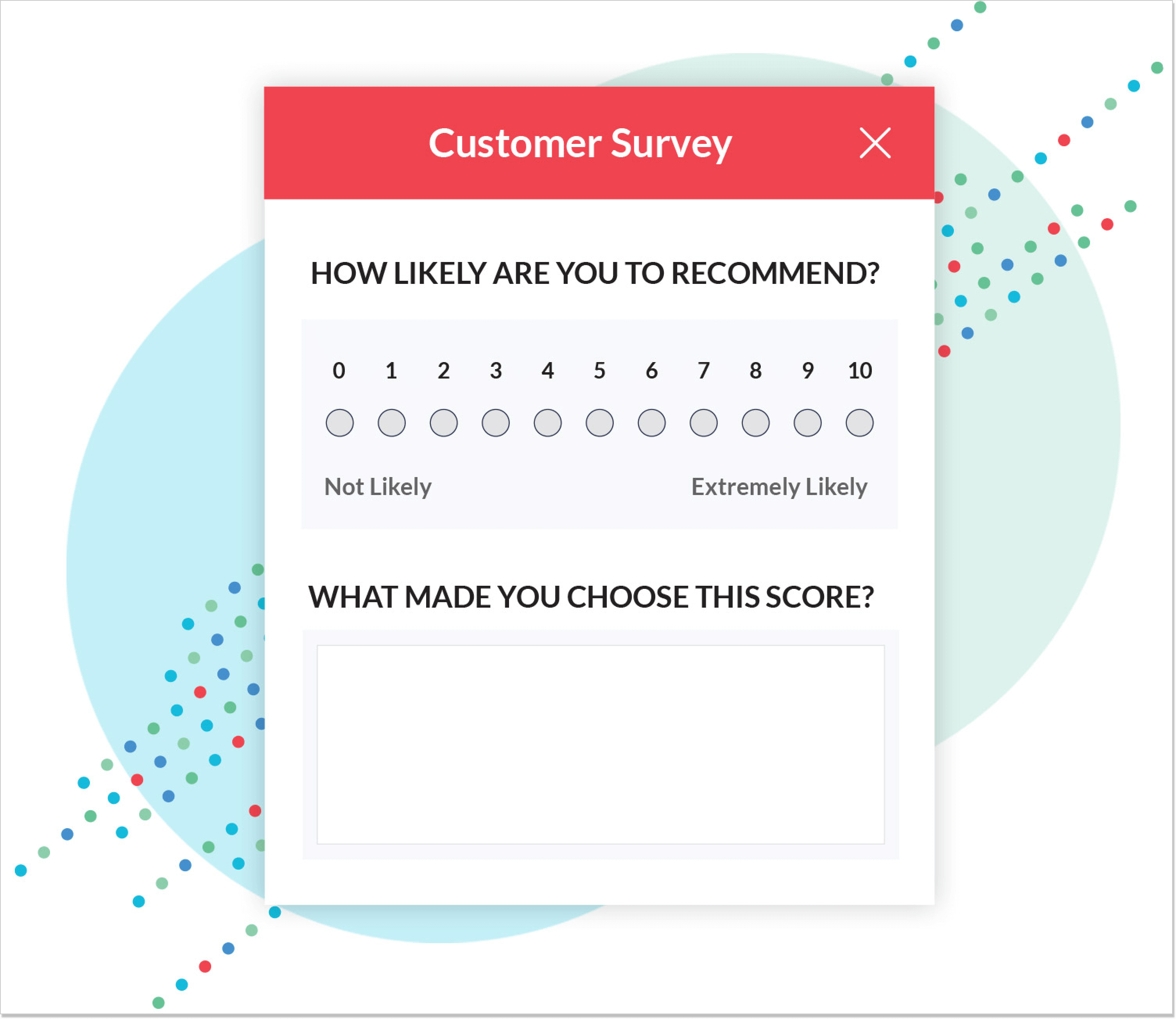
Those were rather common solutions for customer reviews in apps. How about something fancier?
Rate my app! Millions of users during their mobile experience face such rating mechanisms. Everything is as easy as ABC: a user is engaged in an application when a small box with 5 stars saying “Enjoying our app?” or similar pops up. This way, it can not only help you form product decisions but also support growth. And if your reviews are good, they can help boost your app’s popularity and credibility in the app store.
Shake-to-send feedback. To be honest, I’ve almost never encountered this one. The point is that while in an app, a user has to shake a smartphone to trigger a special notification that allows leaving a review. It’s really subtle and doesn’t need additional guidance. Besides, users always have the best context of where they’re in an app when they want to leave feedback.
-
Build a fool-proof CTA
A CTA (call-to-action) button can make or break your in-app announcements. First, all the tricky part lies in the naming: you call a user to act with a phrase on that button. Second, remember to craft a message that would clearly tell customers what their next step will be after they hit it. Otherwise, a client can bounce without even diving deeper into your product.
Here is the demo account from SE Ranking – an all-in-one SEO platform. Some insights to grab from its messaging:
– The CTA’s tagline “Start work” is straightforward, without some hidden meanings
– The button itself has an optimal shape and color, which makes it stand out on the contrasting background
– The main narrative is on eye level, no chance you won’t know how to get the ball rolling
In-app messages in the SE Ranking demo account 👇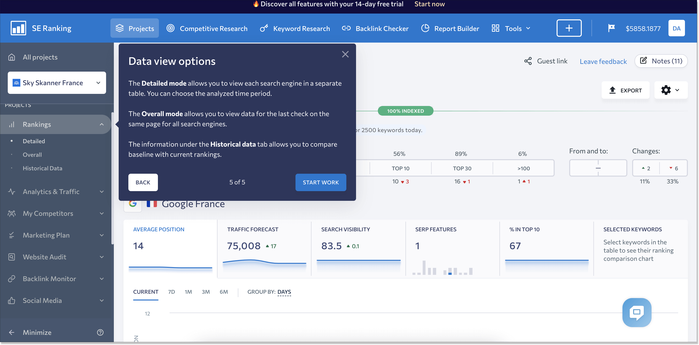
Are you in for in-app messaging?
Now you know how to start enjoying app messaging to see some results. What are they? Such app communications can help you improve your onboarding routine, provide efficiency in collecting feedback, boost attractiveness for new features or company-wide events, and better customer assistance.
One last thing: remember to perfect your in-app messages every once in a while. The better they are, the stronger your engagement will become. And that means greater customer loyalty is around the corner.

